Thanks to CG Cookie I have a decent first attempt at creating a realistic laptop, but, it's not quite finished, there's something about it that gives it away. I used an HDRI and 16 transmission/diffuse bounces, but, how else can I increase the realism? Does turning up the samples always tend to increase realism? Because here I'm using 64.
Here's a random add I found online, and then below that is mine
One approach I thought of is to create other miscellaneous theme items, like let's say a cup of coffee and a notebook, and place them a little distantly out of view but still on the backdrop, though I don't know if that's actually going to help or not.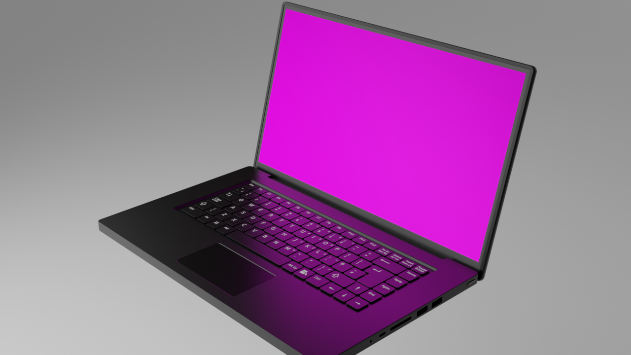
It takes a lot of practice, various disciples come together to recreate realism. It's not a one click, one setting solution nor is it something you can just point to, it's lots of small decision that add up in the end. You can start be trying to recreate exactly that add and study what is it that is making it look real.
Lighting and imperfections are the most common culprits. 3D model often times are too perfect and too clean. Imperfections add to the realism. Lighting and materials are also very important and go hand in hand.
Well what about adding misc objects to the scene, which I actually prefer because I can build my library? Does creating a closed scene with misc objects added do anything to the various light bounces and color variations that add to realism? Or is that a waste of time compared to using material settings and adding more light sources?
Adding objects doesn't make the laptop more realistic, but it can hide things. Plus with the right composition it will draw in the audience. Look at the ad. notice the gradient behind the laptops. Gradients are the bomb. If you don't believe me then ask Kent about them. You may want to watch cubicity before asking him :-) The lettering(aka copy) is done in a way to point to the laptops. There's even a literal arrow. The laptops are stacked. This keeps the lighting inconsistency from even being noticed.