Greetings! I'm excited to start trying out blender for professional purposes and I'm glad I just found CG Cookie since I've been looking for courses and a community.
My first goal is to develop the skills to produce photorealistic assets for the design projects I do, studying the aspects of studio quality lighting in blender.
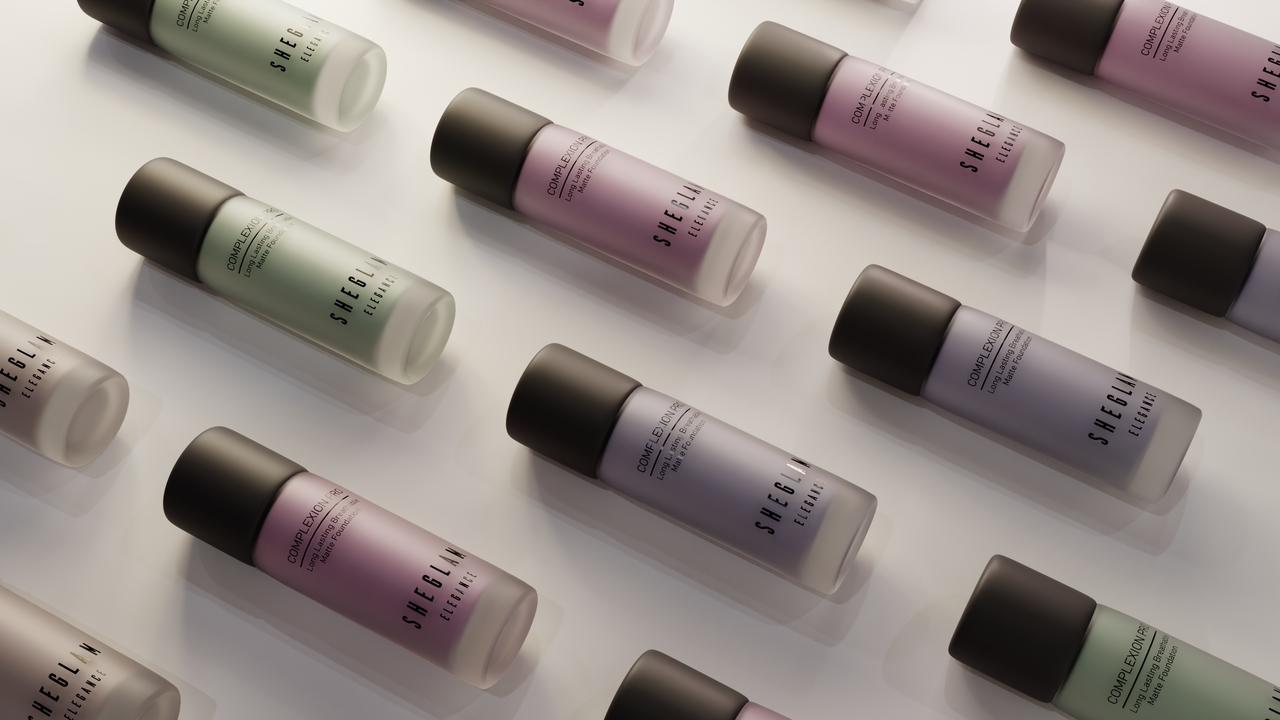
To start, I bought a tutorial from BlenderMarket here https://blendermarket.com/products/blender-3d-cosmetic-product-modeling-texturing-lighting--rendering?search_id=34487061, which offered some cool techniques to achieve a studio setup. Thanks to that video I achieved the attached result which I'm neither proud nor ashamed of as my first attempt at photorealism.
I'm wondering if experienced blender users can comment as to how to improve the realism of this scene so that I effectively understand it as a practice and can rely on studio lighting setups in the future.
The file I'm using contains two HDRIs (making it too big to upload), one for the environment and using Filmic color management with the exposure and gamma turned down. Another HDRI attached to the Node mapping as an environment again of the singular Area light source itself, as opposed to using Blockers since that seems kind of clunky to me, and I'd like to be able to easily revolve the shadows as needed. In practice though, this hasn't quite panned out, it may be the mapping that is not setup correctly so as to spherically project the silhouettes around the area light.
Additionally, I use a mix shader between the Glass shader and Principled BSDF while also Frac-ing them with the Ray Depth setting of the Light Path node to produce the bottle exterior. I believe this adds to the fuzziness and believability of the glass bottle, and then also a masking setup for the sticker (image texture) with a transparent background that plugs into the Base Color of the Principled BSDF.
So, this is the setup I have, but, there's something about this scene that gives away that it's not quite 100% photorealistic. Can someone with experience comment as to what gives it away? I'm using 2048 samples with a 64 tile size and 40 light bounces.
Well, you're giving various technical aspects, but none of that really matters so much in the end if you ask me. I used to ask Kent all those sorts of questions all the time, as if there was some button on Blender that I was missing that I needed to push and things would start looking better. But it's not a technical issue so much as an artistic one. What you actually discover as you practice more and more, is that an appealing image is not that easily put into a procedure that you can follow, as if it was a dish you are preparing. Even dishes in the kitchen go wrong no matter how well you follow the cooking instructions, that's because cooking is an art form in itself. It has to do with taste or a feel, same with 3D art, it is taste, eye, judgement, micro decisions here and there that add up.
Sure you can follow a tutorial step by step to get an exact result, but that person already went through the artistic decision making process to arrive at that result you're already looking at. Now you watch the tutorial and you get the sense that it's about following some steps. What used to happen to me was that I watched a thumbnail on a YouTube video, the render looks amazing, and you're like wow I want to know how to get that result, I will surely learn some trick here that will unlock all the wonders of rendering, some setting that I'm missing. Typically I watched the video and felt underwhelmed because the person did everything I already know how to do, he pushed all the buttons I pushed. So I slowly realized it's not technical, it's artistic, judgments, feel, moving lights a lot, tweaking materials a lot, changing camera angles a lot, re-lighting again, oh look I like how shadows give volume to objects in this situation, scene framing and composition, let your eye and senses guide you, etc.
Lighting and presentation are ultra important. The most awesome and detailed model can fall flat with bad lighting and presentation, while the most simple model can be elevated with pure artist beauty on lighting and composition alone. I know it's not the answer you're hoping for, but again, it's all about practice and doing it a lot. You start to develop the sense. You'll use 10% of the features in Blender 90% of the time, and in that tiny margin is where all the magic of awesome rendering can happen.
Oh and by the way, your render looks super cool and realistic. Yeah you can push it even further, but most of the time we are our worst critic. Get that scene and start it from scratch and try taking different approaches to lighting and composition, start experimenting. Make bold moves, light colors that you might not use or use extreme camera angles. While you fool around there's usually an Aha! moment where you feel things look nice and different and something clicks, so you pursue that.
Cool, I appreciate your reply about taking time to find the right artistic setup and I'm studying lighting fundamentals on CG Cookie. In design work that I do, realism has always been a given when we desire it, and the things you consider "compositing" in blender are the post-processing that I would do in photoshop/illustrator.
So for me, the priorities are: believability first, then, mess with the settings and post-processing second to make the realism be more punchy and well-composed. If something looks computer generated and (most often) isn't conducive to the aesthetic of the site or collateral, it's likely to be useless. In different cases you'll have abstract shapes or designs by choice, or isometric or cartoon-like illustrations, but for me I'm focusing on photorealism first before trying to stylize lighting in blender.