Hi,
I am still learning my way around low poly modeling, subdivision surface, good practices etc. and trying to juggle all of them together while practicing, so I apologize in case my question has an obvious answer, but - I often find myself confused when it comes to low poly modeling and round(-ish) shapes.
For example, in the case below, I am trying to model a guitar headstock. I want to keep it low poly, but the headstock has a more custom defined shape at the top where its border kind of undulates and it’s asymmetrical.
To be able to achieve the shape, I added more vertices than I wanted. (See the blue markings).
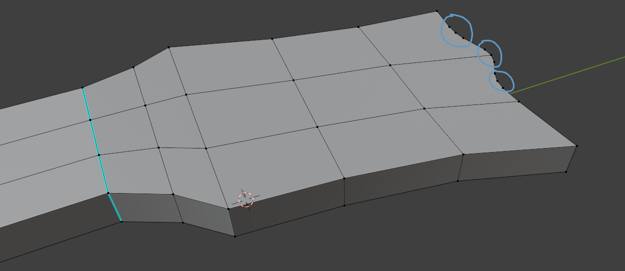
The headstock is not fully straight/flat. It bends slightly downwards (true to the guitar model).
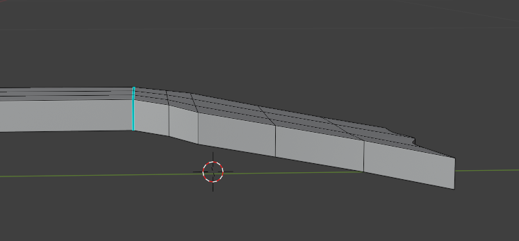
And this causes some ugly shading due to the extra vertices:
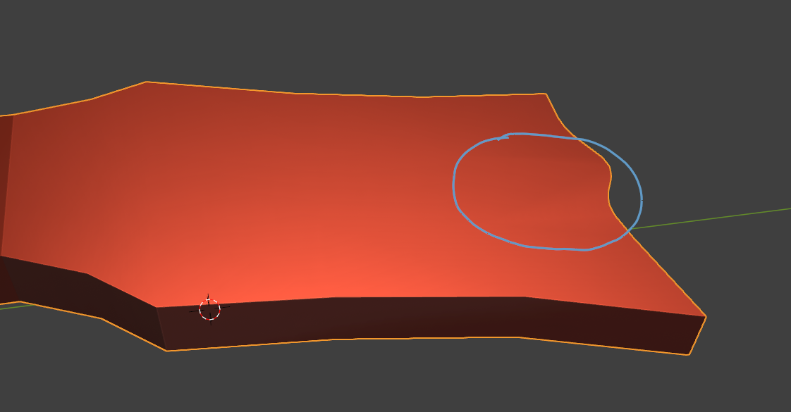
So my question is:
What is the right way to achieve this type of shape while keeping it low poly and free of shading issues? (Do I need to add quads all over to adjust to the new vertices?)
Thanks in advance!
Extrude the end(the part with all the extra vertices) just a little bit. This should get rid of the shading issue. More accurately it hides it in a small area. There are some tricks with adjusting the normals, but that gets into some advanced stuff that I don't fully understand myself.
Thanks! I tried it, but the issue still persists unfortunately: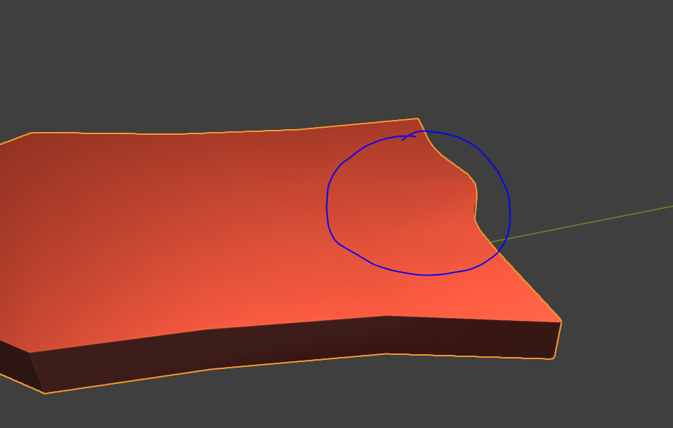
I am not sure how extrusion can help me in this case though, as it would still leave behind the extra vertices that I began with. So I expect the shading in that area to still be broken.
But maybe I misunderstood or am I doing something wrong?
This is how I extruded: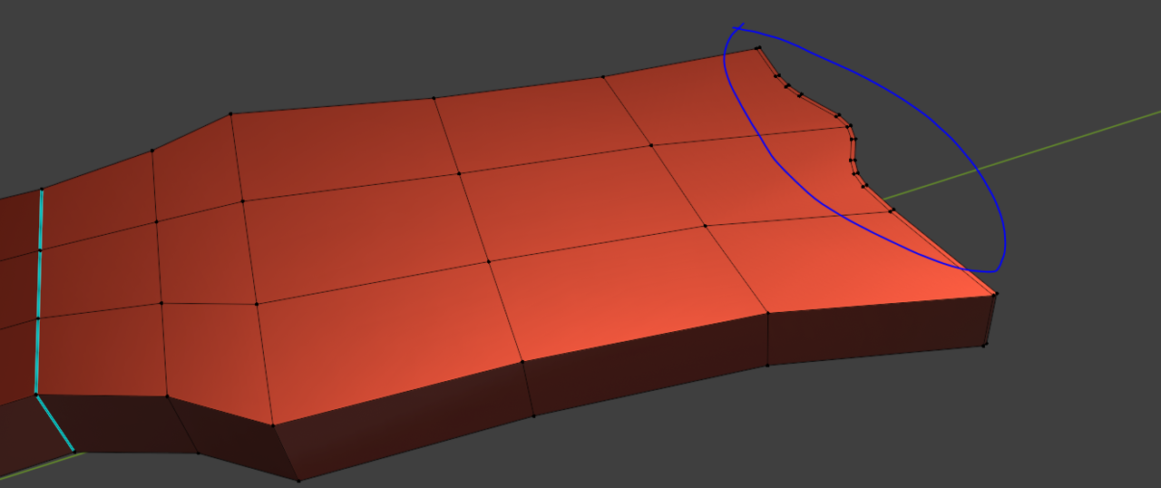
Hi Roxana,
My guess would be, that the flat side of the head (those 15 Faces) is not completely flat.At least, I get no Shading issues with a slightly simplified version:
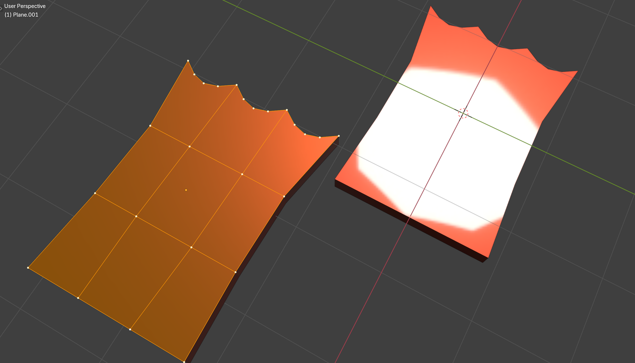
I recommend enabling the Loop Tools Addon (might need to install it from Get Extensions) and use the Flatten Option (with those Faces Selected).
As Dwayne already said, if you keep the areas small, the smaller the distortion will be. If you use a bevel modifier and a SubD you will achieve this. I would try this, as your face is not bent there. It still wouldn't be nice, but maybe this will help you quickly.
Otherwise I would probably remove the vertices and then put in loop cuts CTRL + R. (Depending on how the complete mesh looks and it is possible) The more loop cuts there are in a smaller space, the sharper the area becomes, so you have to be a bit careful with that.
My example is not perfect but there are certain topology guidelines where you can clean up your mesh. You can do this with the KnifeTool (K key). Becareful with double vertices. Merge is your Friend.
Image from https://blog.yarsalabs.com/blender-topology-guide/
Hi Martin,
Indeed, the flattening solved the shading issue - thanks!
Hi Leo, I truly appreciate your examples. I am still wrapping my head around the topology conversions from denser to less dense portions of quad meshes. So the images help a lot!