I made pliers in blender and I would like some feedback please.https://drive.google.com/drive/u/0/folders/1mBuyz2e3WdB2vApHF3BCn0bMQmc7wpst
Not too bad! Nice modeling job!
Handles:
The normal map strength of 10 is way too high in my opinion, the scratches should be much more subtle, a value of 1 or 2 works better.
The roughness value from the finger print texture is too extreme, on the color ramp, lower the white flag value to around 0.4 and the black flag value to 0.1 maybe. The fingerprints are too rough at pure white and the handle is too shiny at pure black, especially when compared to the rusty metal part.
Adding some dirt/grime would also be a benefit.
You have merged vertices where the two handles meet.
Pinchers:
The color ramp plugged into the metallic is not really doing anything because there is no texture controlling the color ramp distribution, moving the flag is the same as moving the slider on the principled BSDF. You can plug the same noise texture for the and switch the black and white flags.
The two mapping nodes used on the bump, not doing anything with default values. You basically have a noise texture plugged into a Voronoi texture ???
To be honest! I would scrap the metal part of the shader completely, just use the principled BSDF with a Metallic value of 1, roughness about 0.2 and the grey color you have, and add the rust over top of that.
Looking at the rust, Switch the texture coordinates to use the object output.
Now I just noticed the scale is not applied to any objects. This is why the material looks different on the pinchers and the hinge.
Once you apply the scale, you will need to adjust the materials.
Very cool indeed. I think my only note would be the texture of the handle, all the scratches are all over in a very unnatural way. You can just isolate them to where those scratches would naturally coalesced. Also there's bump map missing in the rust iron part, it is very smooth, you need to add a little bit of bump so you have breakup in the reflections. And lastly I'd say you need a world, a floor plane, a background, so you have shadows and lights for the presentation of your model. That's about it, it's a great job and some nice modeling. Keep on rocking 🤙🏼
Okay enough said about the Materials already.
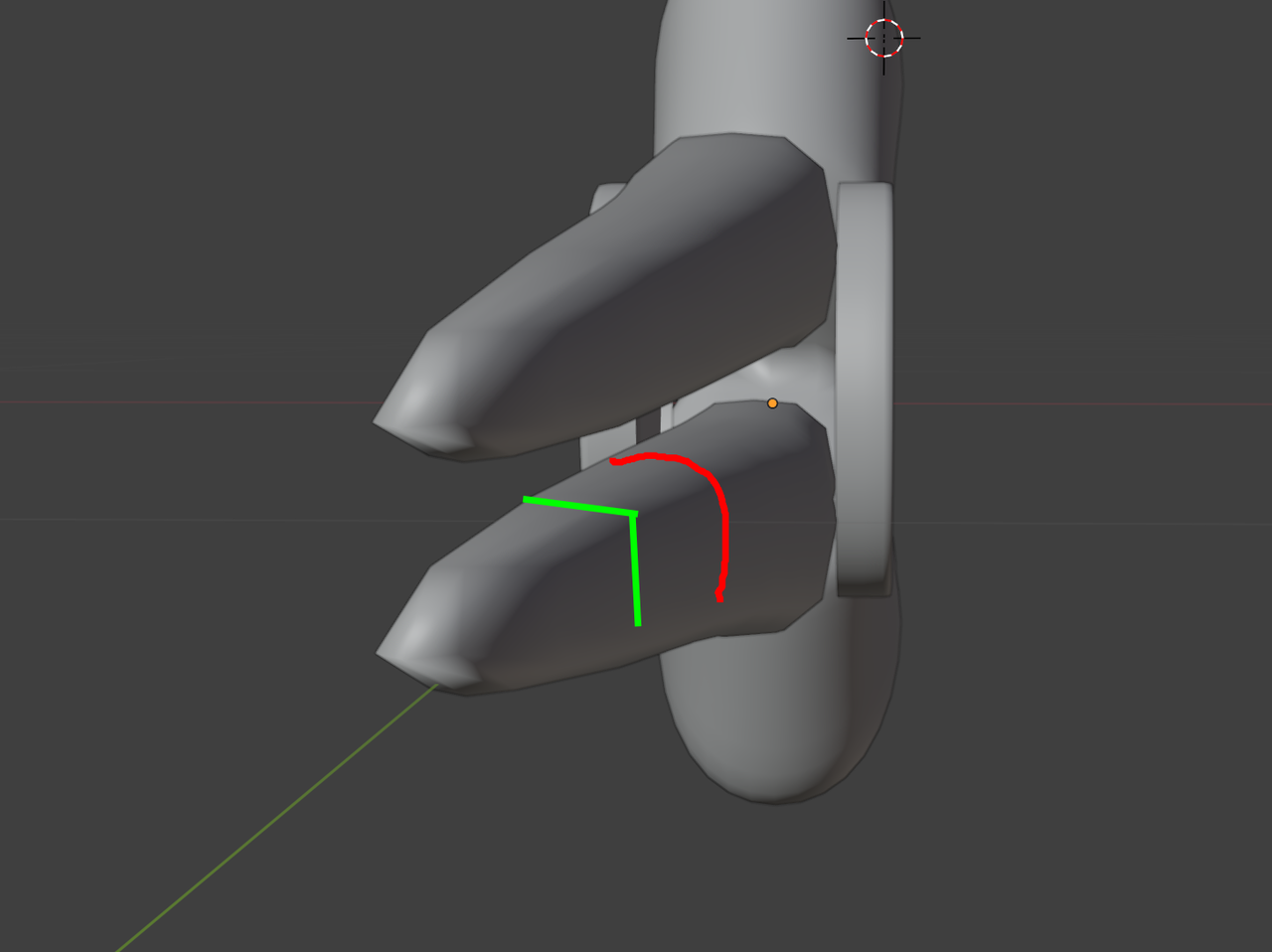
As for the model (and don't get me wrong, it does not look bad!), I think the Pliers edges are too muddy/rounded:

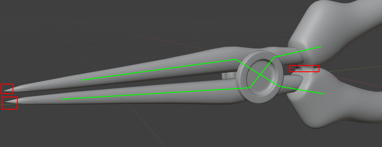
Also, the handles seem stuck together, also I don't know how they should open and close because the upper handle connects to the upper plier. And I also don't like the pointy ends, at least not how they are now (the points can never touch each other):

But still, not a bad job!