Starting with the Kun fu panda poster. It's a colored and brighter poster, so i tried to stick with that properties. Also i wanted to make that rays effect on the background, at first i didn't know how that effect was called, so making a little searching, i found that it's called god rays or crepuscular rays, i added a plane with an array modifier to make that shadows
this is my favorite of all.


The next one is for the mandalorian. Perhaps with the lighting it was already nice, i wanted to make that background too.
The result:

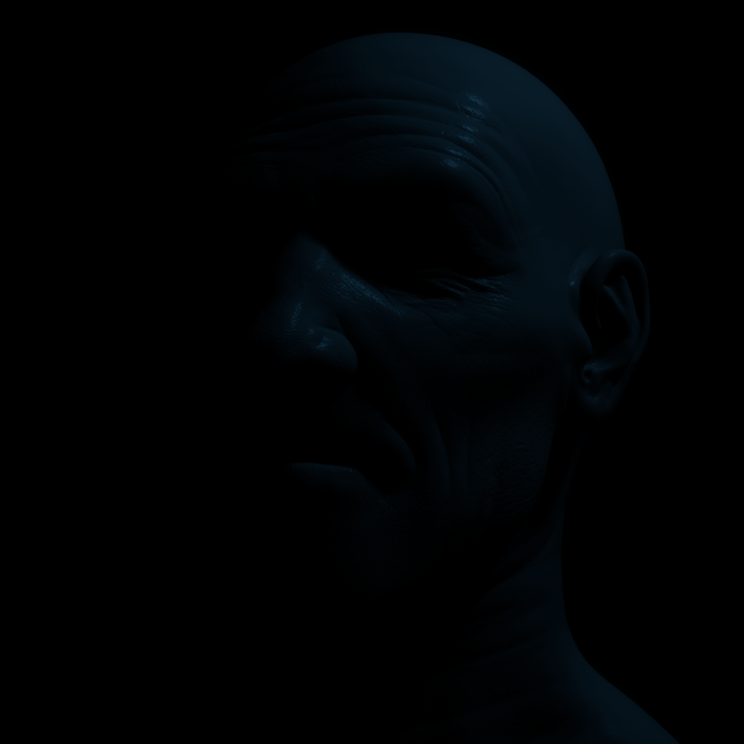
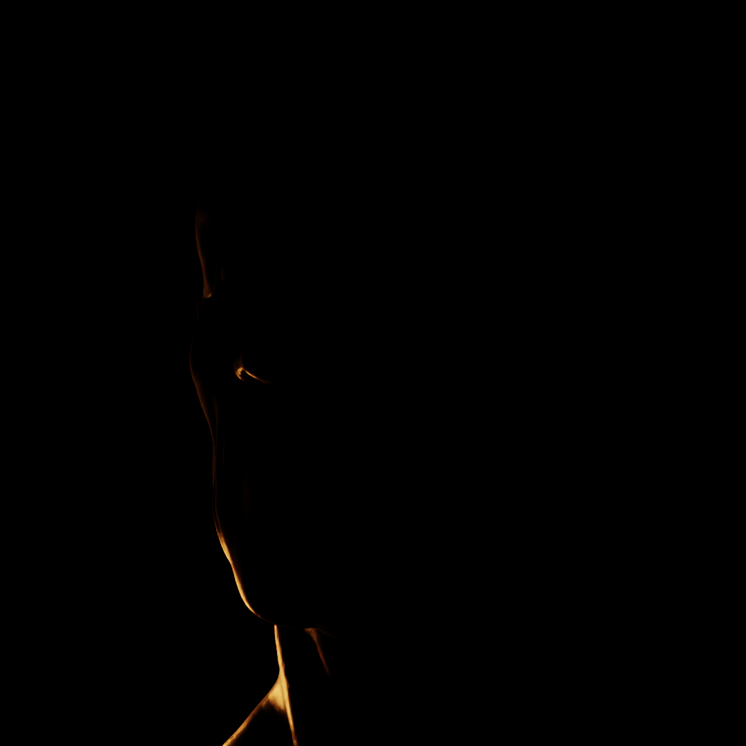
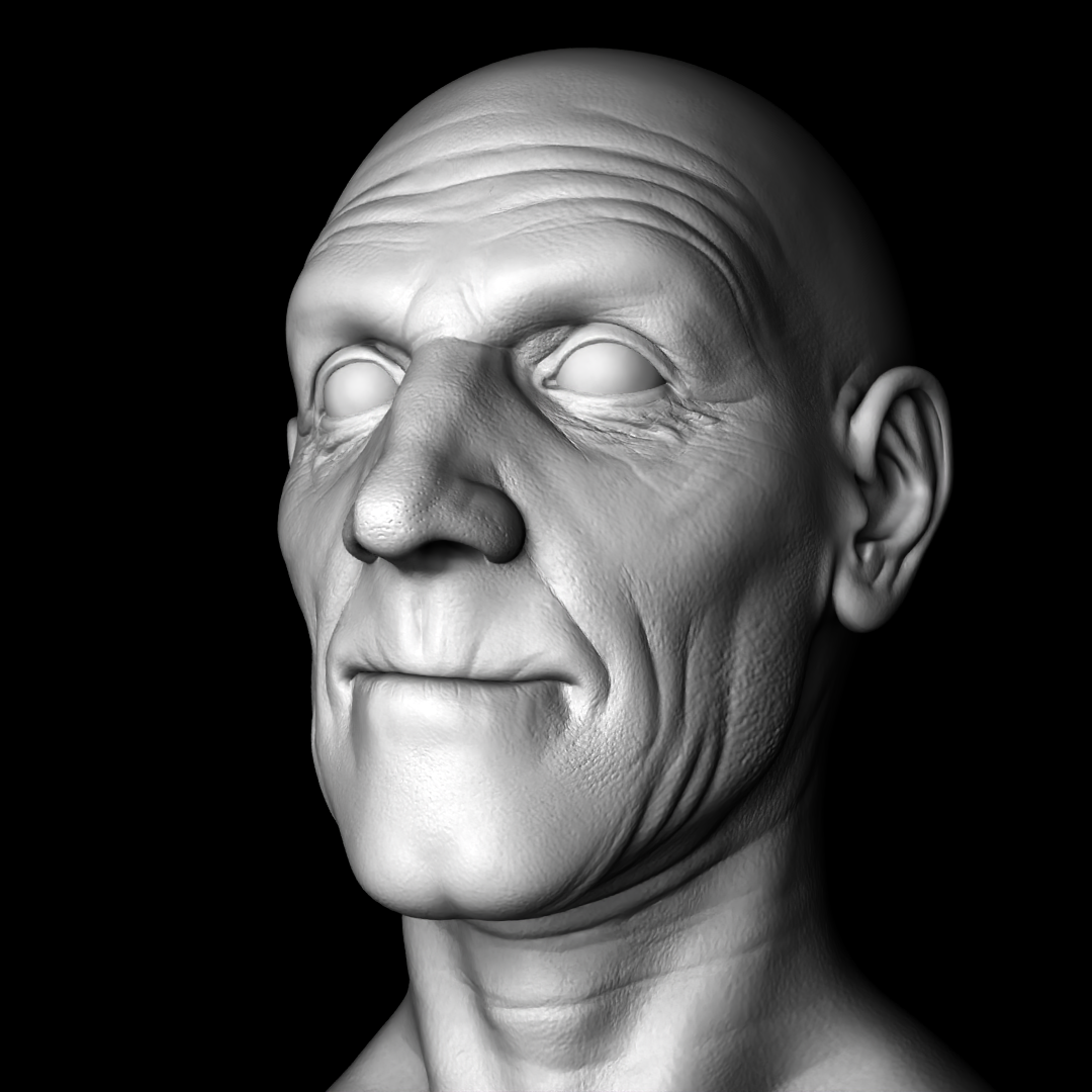
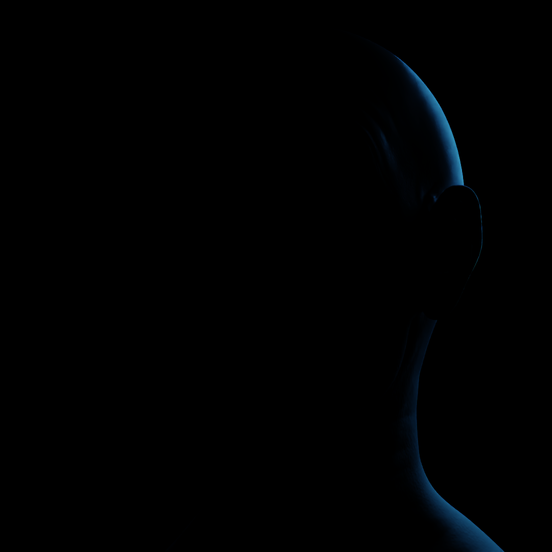
The process:
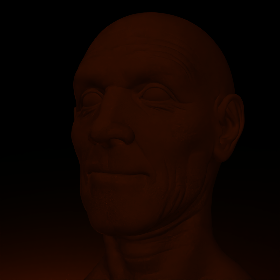
I started with the glow lights on the side of the character. So i added two rim lights and adjusted the exposure to ensure that it wasn't too dark.
At first it was too dark, but in the kunfu panda, i learned that adding more objects close to the character to make reflections was very useful to make brighter the scene.
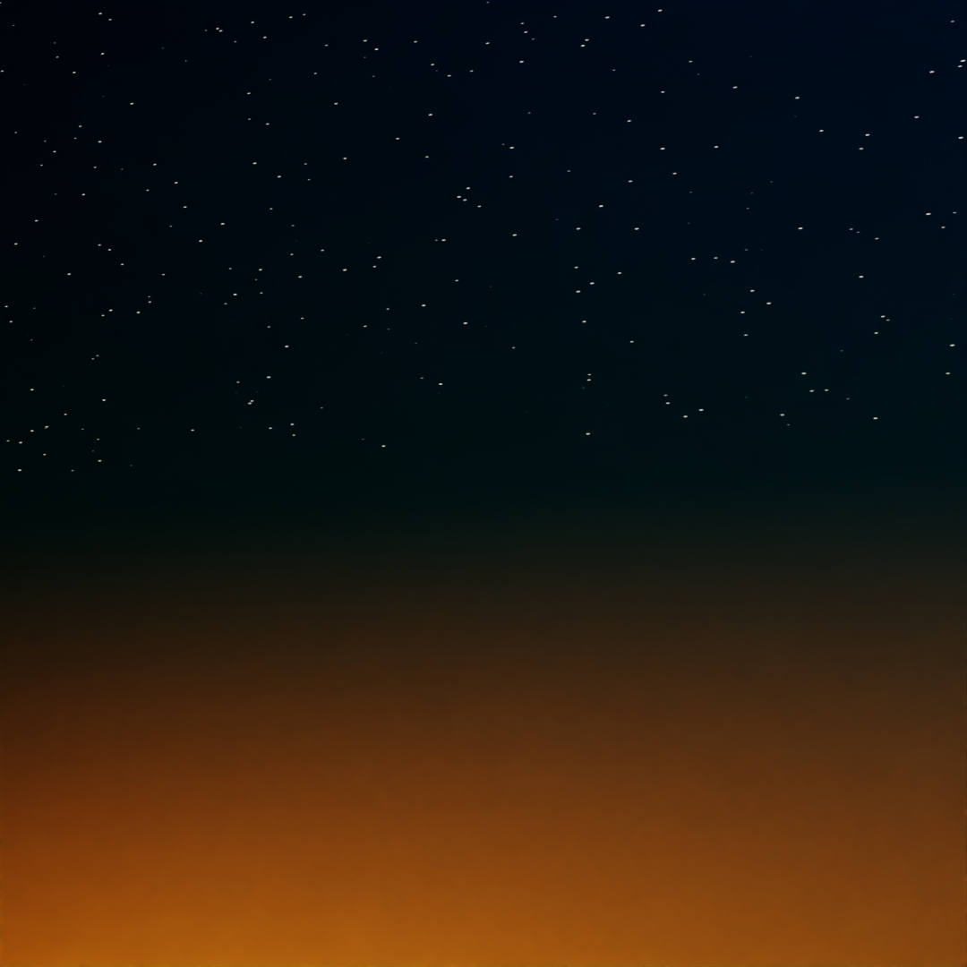
I I left the background for last, because i wanted to go further and make the better result possible, as i don't know very much abaout the shaders so i tried the best i could, it's just to planes one that is a gradient between orange and dark blue, and the other plane was for the stars with a voronoi texture.
