Hi,
This is my first ever polybook and it's gonna be a collection to record my progress with Digital Lighting since it's one thing I'd like to master.
This is the exercise from Fundamentals of Digital Lightings in Blender's Course (Didn't do the other ones like the bedroom ops) from @jlampel (don't know if the tag is working but anyway.
Looking at the model I decided to pick references from various things.
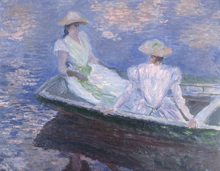
Classic Artwork - Claude Monet's soft pastel lighting:
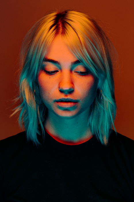
Portrait from a photographer - Nick Fancher and his colorful lighting
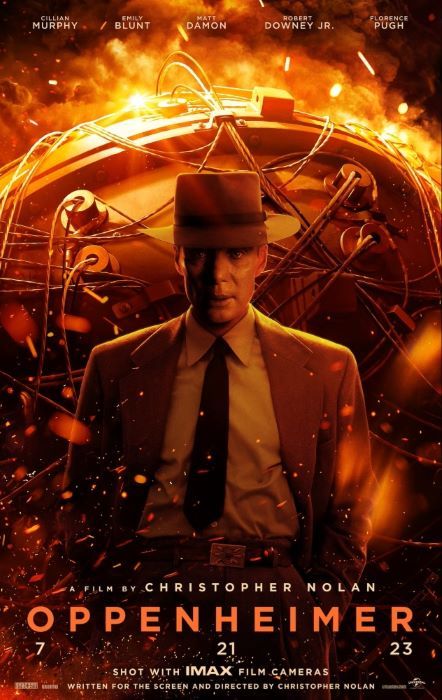
Movie Poster - Oppenheimer, moody and warm lighting
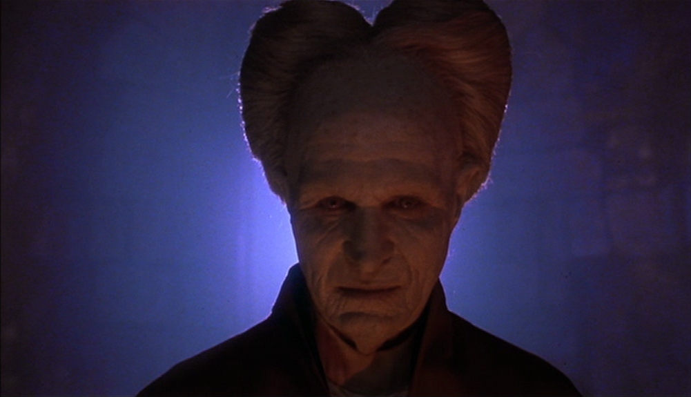
Movie Scene - Dracula night scene with moonlight and candlelight
Soooo, these are the references, coming back with the setup I came with. They are not gonna be match perfectly because of the different head position, but I hope I can match the overall mood and lighting (finger crossed).
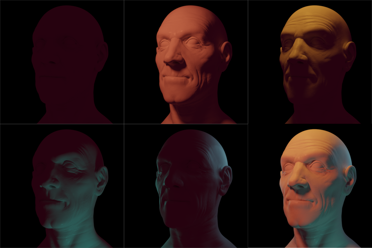
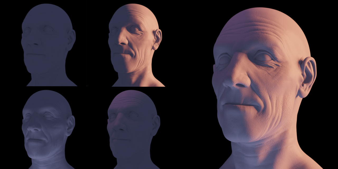
Here's my lighting setup for this reference:

And this is the result:

The reference picture is definitely more saturated, but the overall vibe is the same with the warm lighting from above and the cool lighting below.
The light sources are in different positions because of the head rotation, I decided to start everithing with a pink/purplish light as background light because I noticed this overall dark pink color in some places.
When I started to place the main light I figured it was best to split in two lights: a more reddish one from left and a yellow stronger one from above to get that beautiful gradation from yellow to orange and also to get back the forehead wrinkles.
With the fill light I simply filled the shadows on the right and below with a teal color like in the refernece and it's softer compared to the main lights.
There are also two rim lights: one of the same color as the fill, to get the shapes I lost with the two main lights and the backhead one is to fill the ugly ear shadow ahhaha
So I hope I was clear with my process since I'm pretty proud of it!
Coming back with other lighting setups!
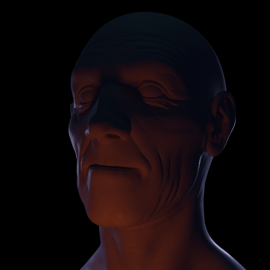
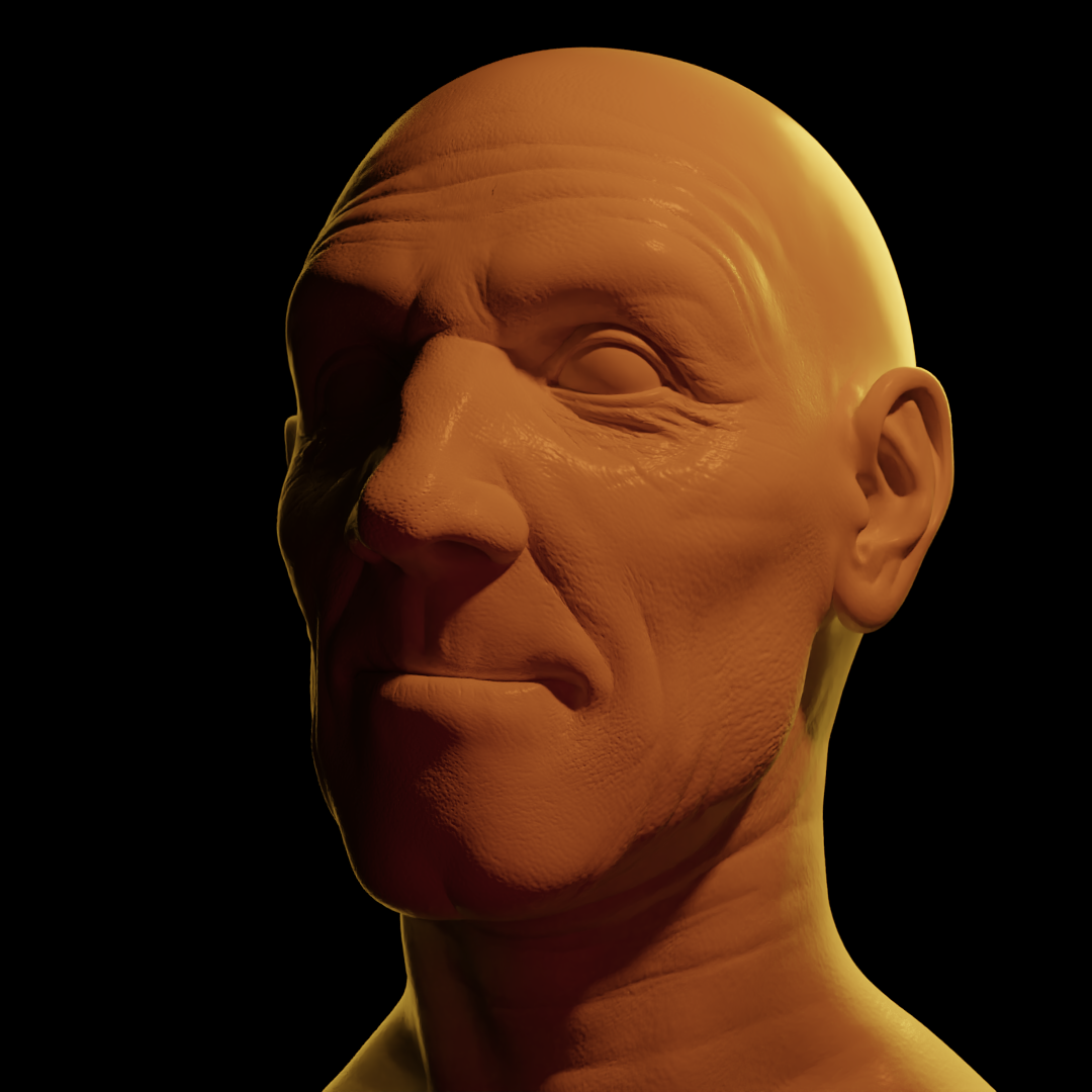
Hiya, here's my lighting process for the Dracula reference, based on this scene:
ù
(Also noticed that my renders are darker when I upload, wonder why)
Here's my process:
Like the other one, I started with a really dark background color, with blue tones and for the Main Light I used the candle from the add-on (without chancing the power and radius)
I noticed in the reference a small hint of teal/green (color of dracula's smoke so it's accurate lol) so I put a weak Kicker/fill light to enhance the wrinkles and a little bit of the nose shape otherwise it would be really flat in those spots.
In the end, for the moonlight from behind i took a small creative liberty: I put two lights instead of one to define the shapes and contour a little bit (so we can think there's two moon or what? haha) 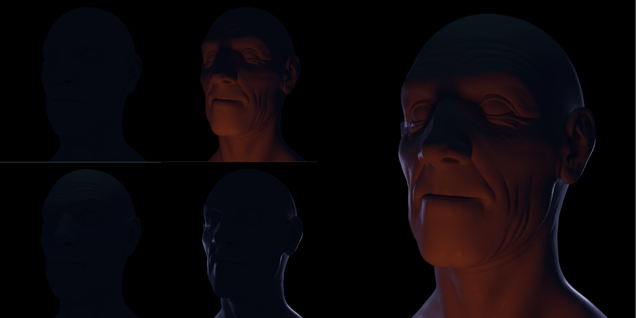
For those following my journey thanks!
Another one!
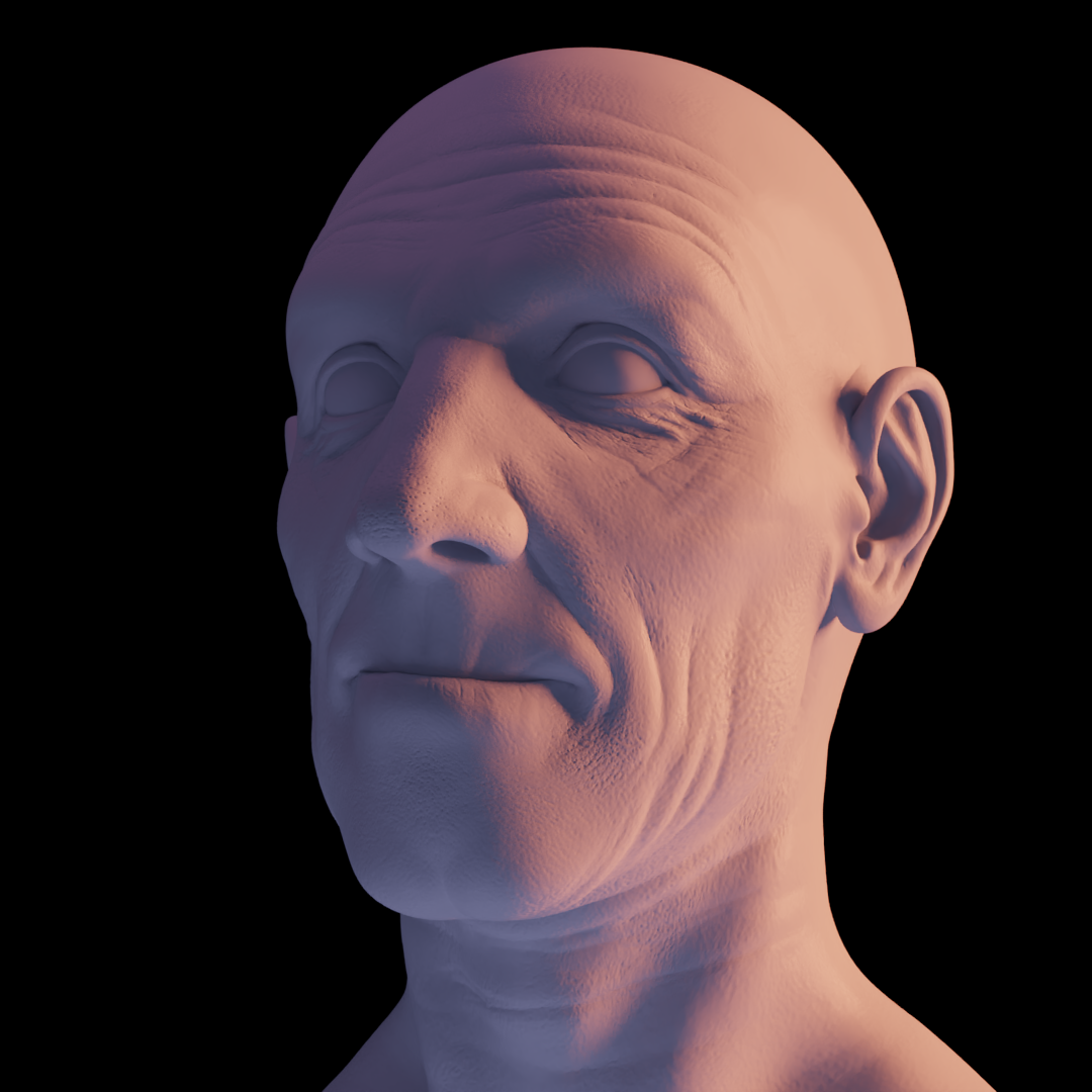
So I wanted to capture the beautiful color variation from a warm light to a cool light.
As always, I started with a background color, I wanted to use an HDRi but I couldn't find one that satisfied me and I have to understand how can I put different background colors (I tried with the noise, wave texture and voronoi but nope).
Used a sunlamp as main, with a strong orange color to complement the purplish ambient light.
Looking at the reference from Monet, he put a strong blue underlight coming form the water, so I proceeded to do so and in the and, since the pink color was still missing in my opinion, a put a small fill light and the end!
The overall result is moodier, as if the beautiful lights couldn't make the 'situation' better, looking sad and a bit sinister.
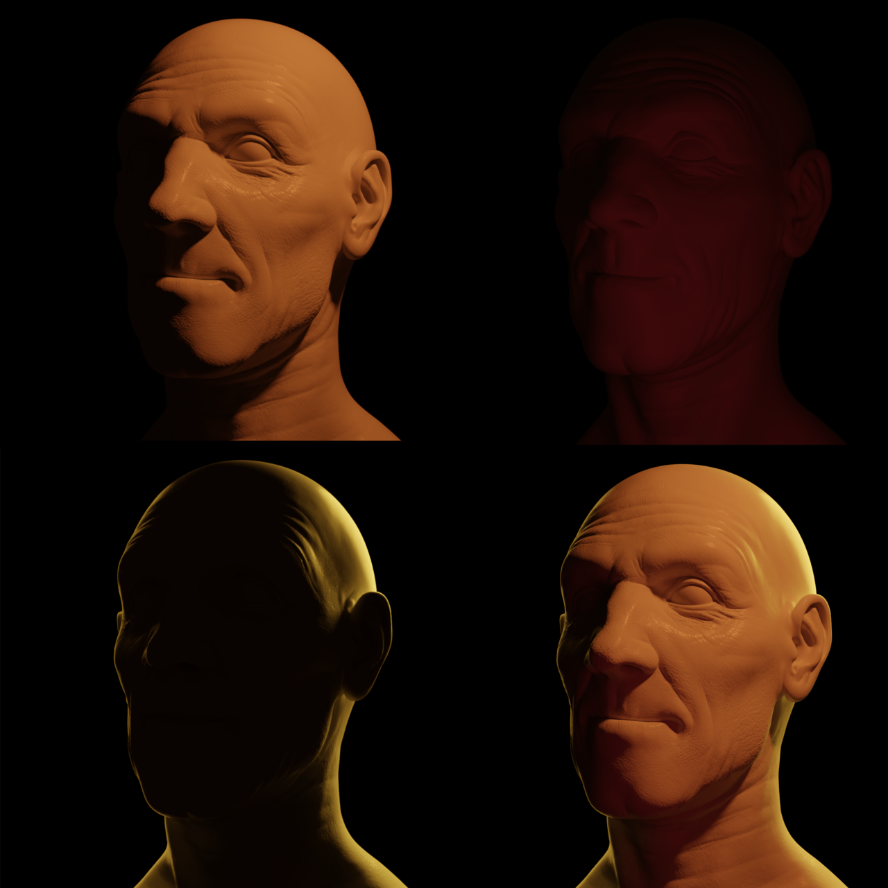
Final reference!
This one was the hardes one to nail in my opinion because of the head turn, but I'm happy that it looks a fiery image of a proud man (I know Oppenheimer wasn't proud of the outcome of everything, but at least he accomplished something ahah)
I didn't include the background/ambient light step because you couldn't almost see it, but if you're curious the color is a very dark brown.
The main light was hard to set up, because of the half/half situation, but in the end I decided to make the right side of the face totally in the shadow, then to come with some weak fill red light, to give the impression of the light passing through its skin.
For the rim lights I used an area (long rectangle) for the right side and a spot light for the left side.
So this is my journey in trying to match up the lighting setups from different references!
Thank you everyone who followed along with me! (because I had a lot of fun)