Hello dear CGCookie Community,
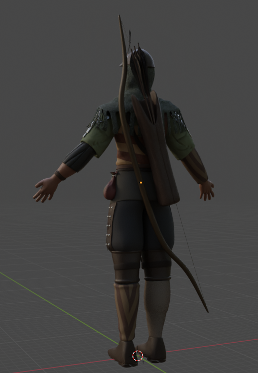
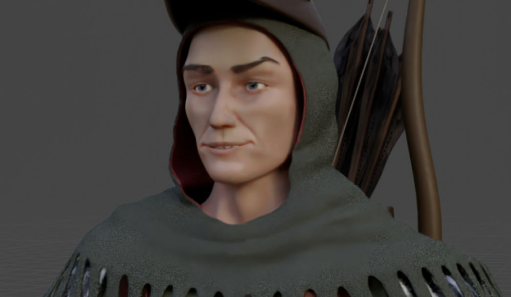
Recently I've been working on a 3D character from the Witcher Series. The name of this character is 'Gascon Brossard'.
Link: [DELETED]
Reference:
https://static.wikia.nocookie.net/witcher/images/0/0a/TB_gascon.png
There are very few reference pictures like front, side and back view of this character.
Not a perfect result but I tried my best.
I'd like to create my personal 3D portfolio. Could you give me a constructive feedback?
PS: This is still work in progress - The sword and other small details are missing
Thank you!
Sorry guys. Screenshots added!
As I already mentioned I've been basically working with one reference picture. There isn't much any other information about this character like a view from a different angle etc.
Reference picture:

My work:


That is looking good man. That is at least PS3 to PS4 graphics, which is good. To aim for hyper realism is a lot of practice, that's the holy grail and it's super hard to achieve. You can build up to what you have, try to get more detail in and that way slowly get from PS4 to PS5.
Thank you for your reply. Really appreciate it.
Can I add this work to my 3D portfolio once I'm done with all the details and fine polishing? I mean is it really good enough? I'm asking because I have absolutely zero experience and I'm getting kinda desperate.
Anything I should be aware of?
Oh dang, that is really nice! It would be interesting to know what your goal is/was for the overall look of your piece in order to give more detailed feedback. Realism? Game-ready? Something else?
Hi Artur,
I agree with Omar, that this looks really good! And from only that one reference image, that is amazing!
There are two things that I noticed, the mouth corners on your model look weird. In the reference, the left mouth corner is stretched out, as you can see from the muscles there, but your model's mouth looks strangely wide in a relaxed pose and also makes a weird exaggerated bend/hook:

Also, his thumb looks too short and stumpy. (Actually, all his fingers remind me of sausages 😉)
But again, overall it's a great piece of work👍🏻
I am super impressed!
Someone like Kent can give you better feedback on whether it is portfolio material or not. I don't know much about characters, I don't know if the competition out there is too fierce or not, because you see some amazing hyper-realistic stuff, but that might be a tiny percent and what you normally see in portfolios is more on the normal range. Let me try and rope Kent in, perhaps he has time to comment.
![]() coyohti My goal is to create a game-ready video game character. (:
coyohti My goal is to create a game-ready video game character. (:
No rigging and animating though because it's just too much and kinda overwhelming.
I noticed the bat signal out my mansion window....![]() AutopsyGuy - Congrats on your character! It's clear that you've put a lot of work into it and evident that you're developing your skills effectively.
AutopsyGuy - Congrats on your character! It's clear that you've put a lot of work into it and evident that you're developing your skills effectively.
Some general feedback I'd like to offer:
@theluthier: Thank you for your feedback
Hope you like my new shoes :)

Added some details like stitches, soles etc.
Well I guess I have a long road ahead before I reach the goal where my characters look really interesting. Right now I have absolutely zero experience with rigging, lighting and camera setup because all this sculpting, modelling, texturing, adding details and so on gets really (I mean really) overwhelming :/
But nevertheless I'm always open to learn some new skills