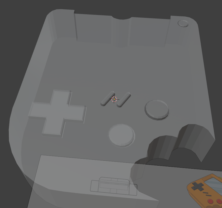
Some of my buttons are lighter and some are darker, does someone know why is that? It does not affect the work (maybe for now) but I wonder why it looks different

Could be flipped normals or just the default studio lighting setup.
HI Oskar ![]() OC01 ,
OC01 ,
My bet goes to double (overlapping) Faces, where the buttons are lighter...
Maybe M > Merge by Distance (in Edit Mode, with everything Selected) will solve that, but if it doesn't:
go to Solid Shading Mode (disable the X-Ray) and (in Edit Mode) with Face Selection Mode, select a Face of the button and X > Delete it...see if there is still a Face left...