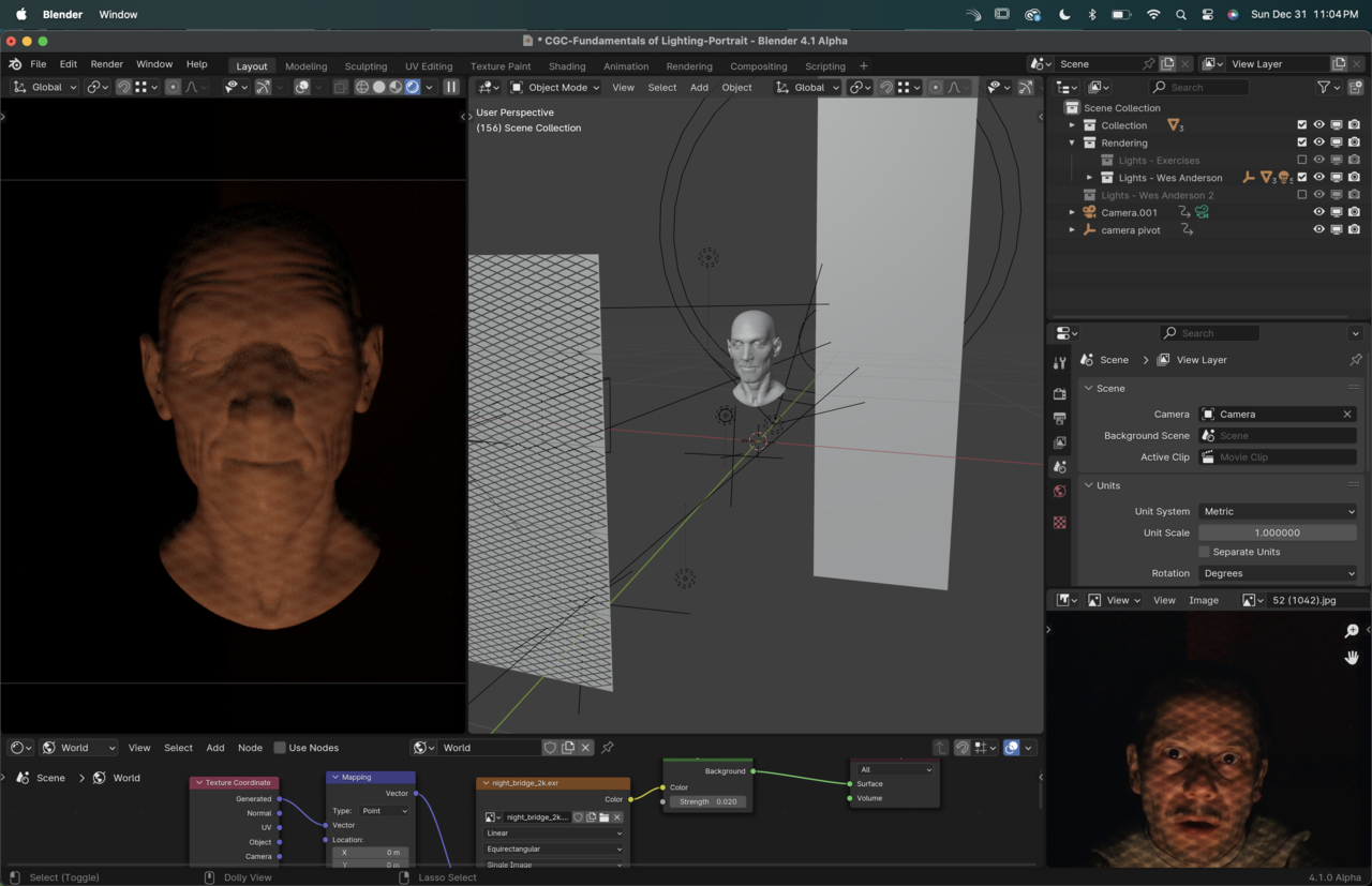
Here's one of the images I chose to try for this lighting exercise and while I thought it'd be easy, the brightness of the light through the cookie is stumping me. I can't get it to be bright enough without over exposing the head, or leaking to the back wall.
To achieve that effect do I have to create a whole room? Still, I can't imagine how to make it shine brighter in parts of the diamonds.
Any insight on how to achieve the effect?
Thanks!
Hi Nathalia,
I think you'll have to make the light brighter (maybe also increase the Saturation of the red). You might also need to move the light (and cookie) closer to the subject and play with the spread of the cone, all to get a stronger falloff.
One thing you can do with the back Plane is, to give it a Diffuse Shader and set the Color to pure black...You can also make it larger and move it back more...And of course, there is Light Linking now...
That's right! I totally forgot about the light linking. Thanks Martin! Moving the lights did help! I also realized I had to invert my grid to make the light brighter in the intersections.
Thanks again!
You can also use light textures Nathalia, linking you up:
https://cgcookie.com/lessons/using-light-textures-cookies-and-gobos
Also for reducing the blowouts you can tone it with the color management options, link also:
Thanks Omar! I'll rewatch those! This course was so packed with info I have a feeling I'll have to revisit it more than once.