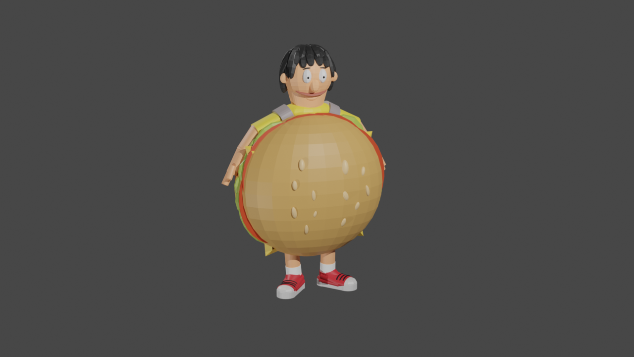
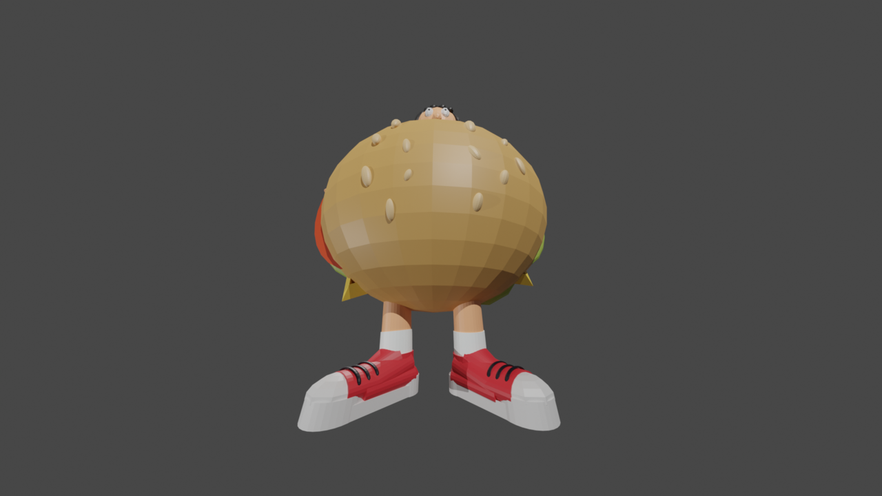
Followed Jonothan's primitive snowman tutorial in the Fundamentals of 3D Mesh Modeling... He then said to do whatever I want... Sooo here's a wildly absurd and a tad bonkers Gene Belcher that I definitely didn't spend an unnecessary amount time working on. (Now to get back to following the rest of the course)

Here's a crack at the Digital Lighting task where @jlampel suggested I try create a sunset or a sunrise. I went with a "Golden Hour" sunset - and did my best to create it without an HDRI (Mostly being because I couldn't achieve the look I was hoping for)
I'd been writing notes down throughout the course so this is an attempt to do it all from the notes, and from my memory. Ie without going back to follow anything from the videos.
If you've any thoughts or pointers I'm all ears (If there's one thing a fine arts degree taught me, it's how to positively and construcively take critisism).
By doing it without an HDRI I figured it would make more sense for a sunset to lower the sun lamp and angle it nearly horizontal to get the drawn out light on the back wall. I also had a go at using nodes to change the sky texture to make it a bit more sunset-ish, and changed the warmth - However I could only get it so far before I couldn't think of anything else. I played with the histogram and curves too, althought I wasn't able to get the Luma info to be more centered. Additonally I viewed it through the raw colours and everything looked somewhat cold - so I'm not sure how it'll look on your screens... but maybe I'm reading the data wrong? I'm adding a screenshot of that for reference.
I think if anything, Golden Hours, at least here in Melbourne are usually pretty blinding. So perhaps I could have the light brighter?
Anywho, still having a blast and I really appreciate the feedback I've recieved on everything else so far!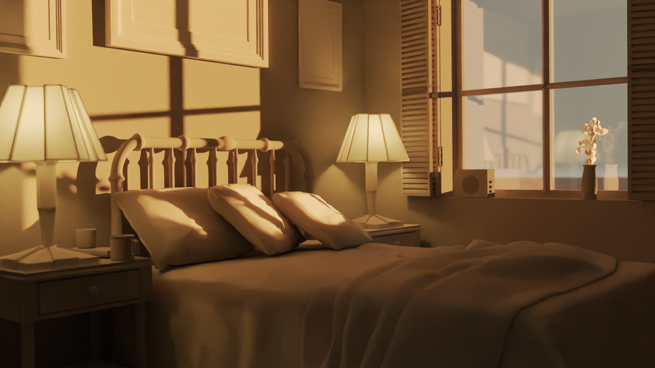

It's looking good. We try to make an effort at the beginning to understand all the technical, but the technical is so much it's a whole different world and profession. I try to stick to the result, if it artistically looks how I want, then I'm good, even if I hacked my way around it all. Maybe some day I will have time to go deep into the technical aspects, but the point is you're not wrong if you just want to focus on the outcome.
Cheers Martin and Omar!
I played with the sky texture using Hosek/wilkie. I momentarily used Nishita but panicked when the brightness skyrocketed and went in a different direction - I'll have an actual look this evening after work to see what it actually does!
Something else that's based purely on assumption as I'm not by any means a physicist, but the lighting on the pillows is much brighter than that on the wall or really anywhere else aside from the flowers. Considering the sun is the source of light then I figure the brightness should realistically be shared further if we're talking about how big the sun is and how far the light has traveled to get here and the distance between objects etc.
Soooo, in the false colour image, should I be seeing a bit more orange throughout if I wanted to go for a more realistic render?
No, the hot spots are most likely just where the sun is hitting directly, everything else is the light bouncing around. You can set your light bounces to 1 to see where they hit directly and stop. The thing with realism is that it's not just the lighting, but a bunch of other things that have to interact just right. Realism is that thing that everyone tries to achieve but is crazy hard, all the Hollywood VFX companies can vouch for that.
Also, how much the light is bouncing around, depends on the materials. A lot of non-metals absorb quite a lot of the light that hits them (depending on the material, the color and the angle the light hits the surface, 'dead on' reflects only about 4% of the light, with non-metals) so after a few bounces, there is relatively little light contribution left.
So, if you cover your walls with shiny paint and your bed and pillow sheets out of silk and the bed frame out of chrome, you'd get a lot more light bouncing through the scene. But even then, where the sunlight first hits a surface 'dead on', will be the brightest.
Here's a new version using Nishita. There are qualities from Nishita and Hosek that I like over eachother. Eg the Nishita render's sky texture and soft blues on the bed. But there's a touch more of a golden hour sunset feeling to me in the window frame in the Hosek render. Cheers for the suggestion Martin! And I completely understand what you mean in regards to realism, Omar. Thanks again

Last note on this. I'm looking out my window at home now worked out how to get the sky to look even more like the current sunset here in Melbourne by lowering the world strength, and adjusting the air, dust, and ozone settings. There's probably more that I could do but i'm happy with this.
Thanks again, I'm off to make dinner!
Here's my final excercises for the Digital Lighting course using film stills.
Some of them were really challenging. I'm happy with most, not completely with one or two but I thought it is still worthwhile posting them here anyway to get some constructive thoughts. I got to a point with all of them where I knew I could keep going, but I also needed to just leave it otherwise I'll be here forever making more adjustments. My aim for these was to capture where the shadows land and replicate the level of the lights as best as possible. I'm posting them here in order of producing them too.
I'll make a decision later upon which to submit via the link in the course.
Cheers!
After Blue: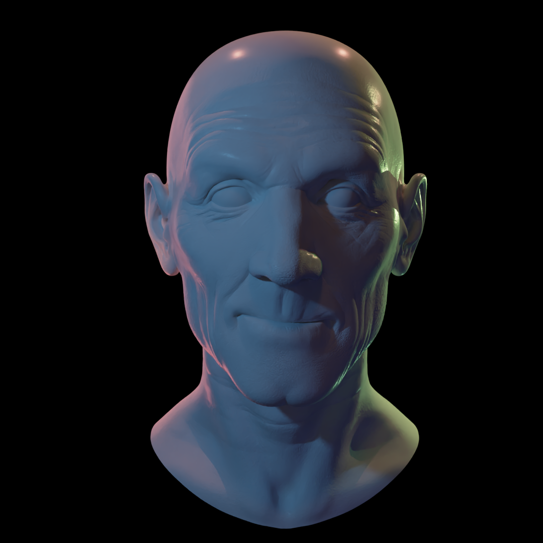

Battle Royale: There was a bit of tricky-ness when it came to adding the hot white of the light to the tip of the nose and middle of the brow. Tried a few things but couldn't quite find a good solution - I'll have another gander another time however.

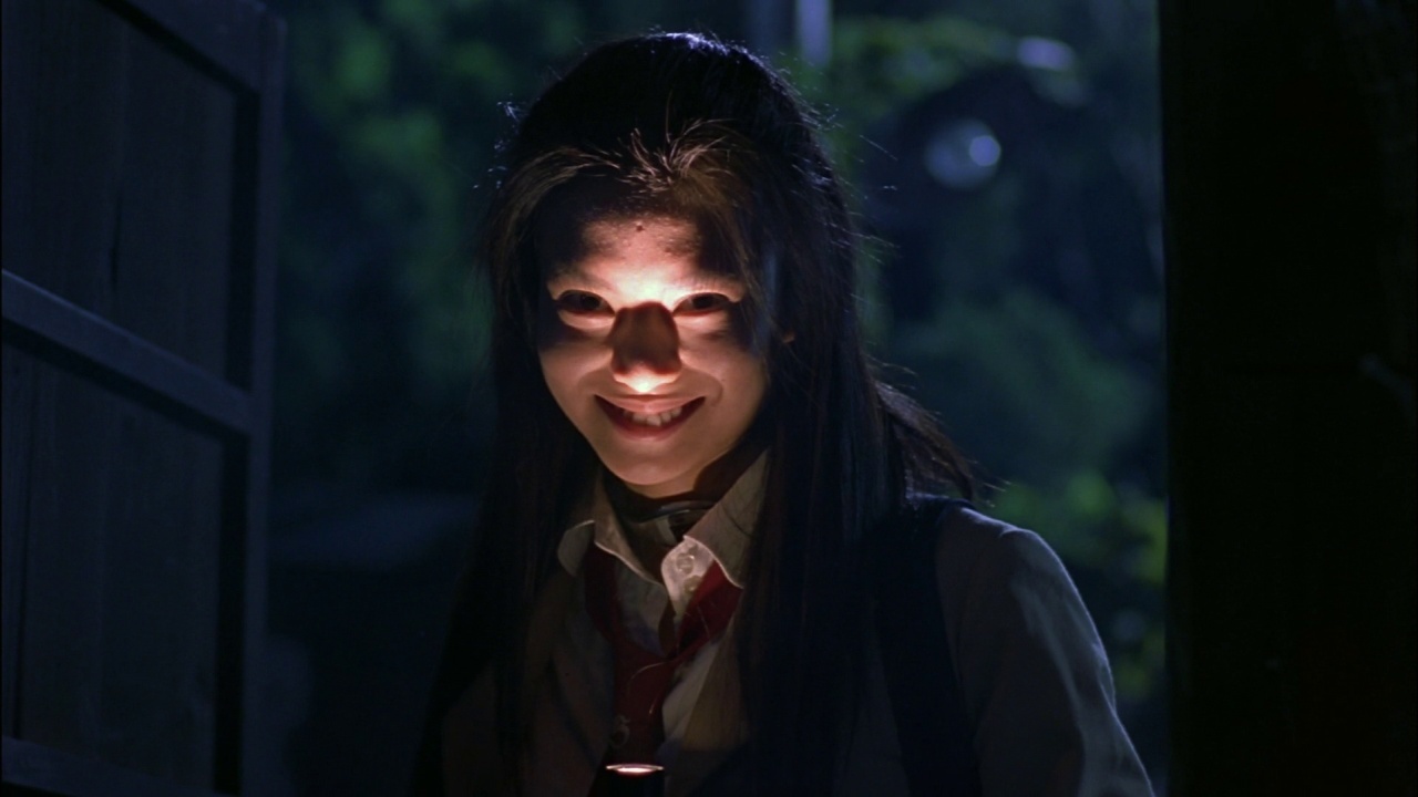
Stalker:
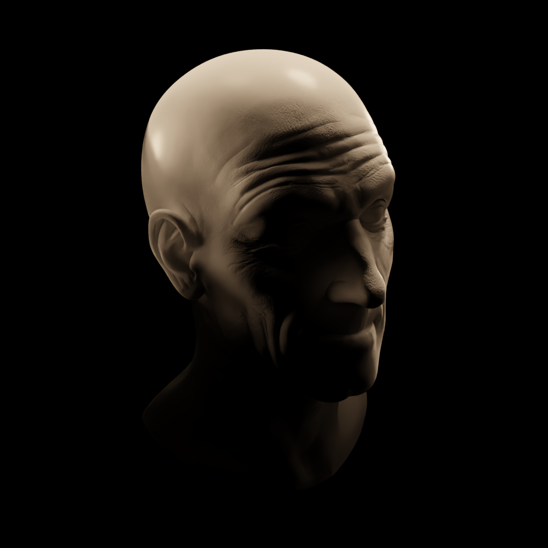
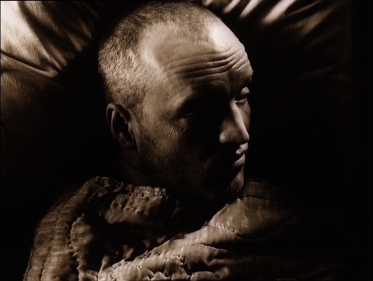
Blade Runner: It took me far too long to realise that Roy is sticking his neck and jaw out in the still. His eyes also appear to be set deeper than the model's too. Which explains why I couldn't hit some shadows in the areas i was aiming for.

La Haine: I'm not completely stoked on this one. Primarily with the amount of difficulty I had with lighting his left eye. I couldn't find an angle to illuminate it without blowing up the nose so I made a mesh object and gave it an emmission property to fake it but it wasn't quiiite what I was hoping for. I think it made it look too washed out.
