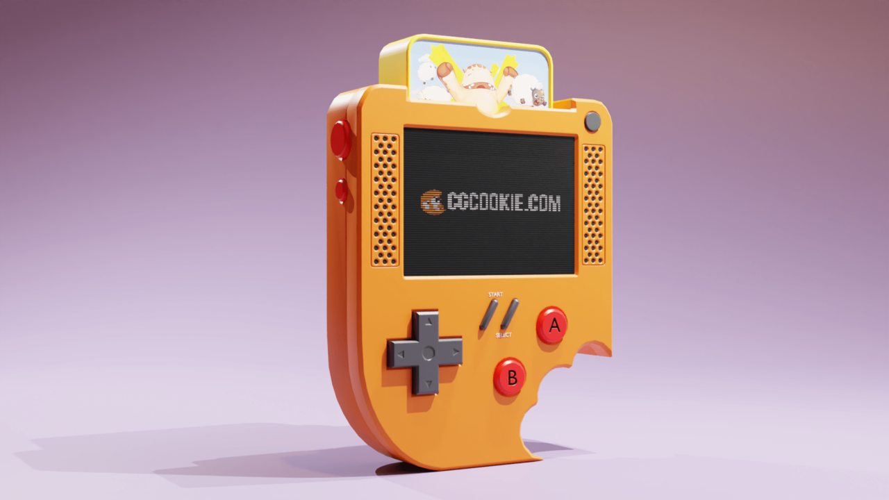
What a great project. Proud of this one... and the wife is too! The CGCOOKIE podcast has inspired me to start posing my work in the forums to get input from the community. At this point I'm only focusing on modeling. Obviously texturing/rending is huge but my brain can't take all that lol. All and any feedback is welcome :) Let me know what you think. Thank you. Also, to upload here are y'all compressing image...? How does that effect the reviews? Or should I provide links if so what's a popular place to upload OG file?
Great Press Start result Kale, that's you, the wife and me now that are proud. Great lighting as well. I don't know why the cartridge tends to be overblown or super de-saturated, but that's nitpicking. You can upload files normally here, no image compression, links or things that affect any review to worry about.
Thank you for the encouragement and feed back. The upload size appears to be limited to 5MB so I had to compress this one as it was 7MB. Either way I can't really see the difference between the two, but my eyes are untrained.
Nice. The Start and Select buttons look a bit too thin for my money. The red A and B buttons don't look like they're inset into the console quite right. It feels like there should be a darker, blacker shadow around them when you compare with the + button. Have you applied the red material to the inset part of the console I wonder?
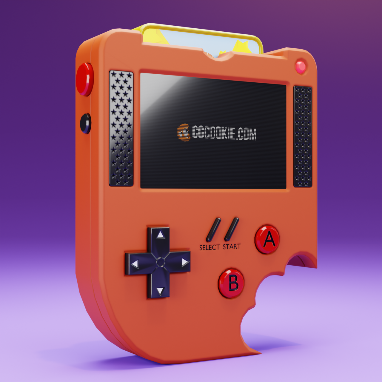
Just finished up the course! I'm very proud of what I've done with your help. This is my first model ever! I think my favorite change I made was the d-pad. I love the way the light bounces off the edges. I'd love to read what you think.

Great work Chris. Everything looks crisp and the lighting is wonderful to my eye. I've always enjoyed David Bowie Space Oddity though some intergalactic star speakers. The area between the screen in the speakers looks a bit odd to my eye? Keep on working it's paying off!