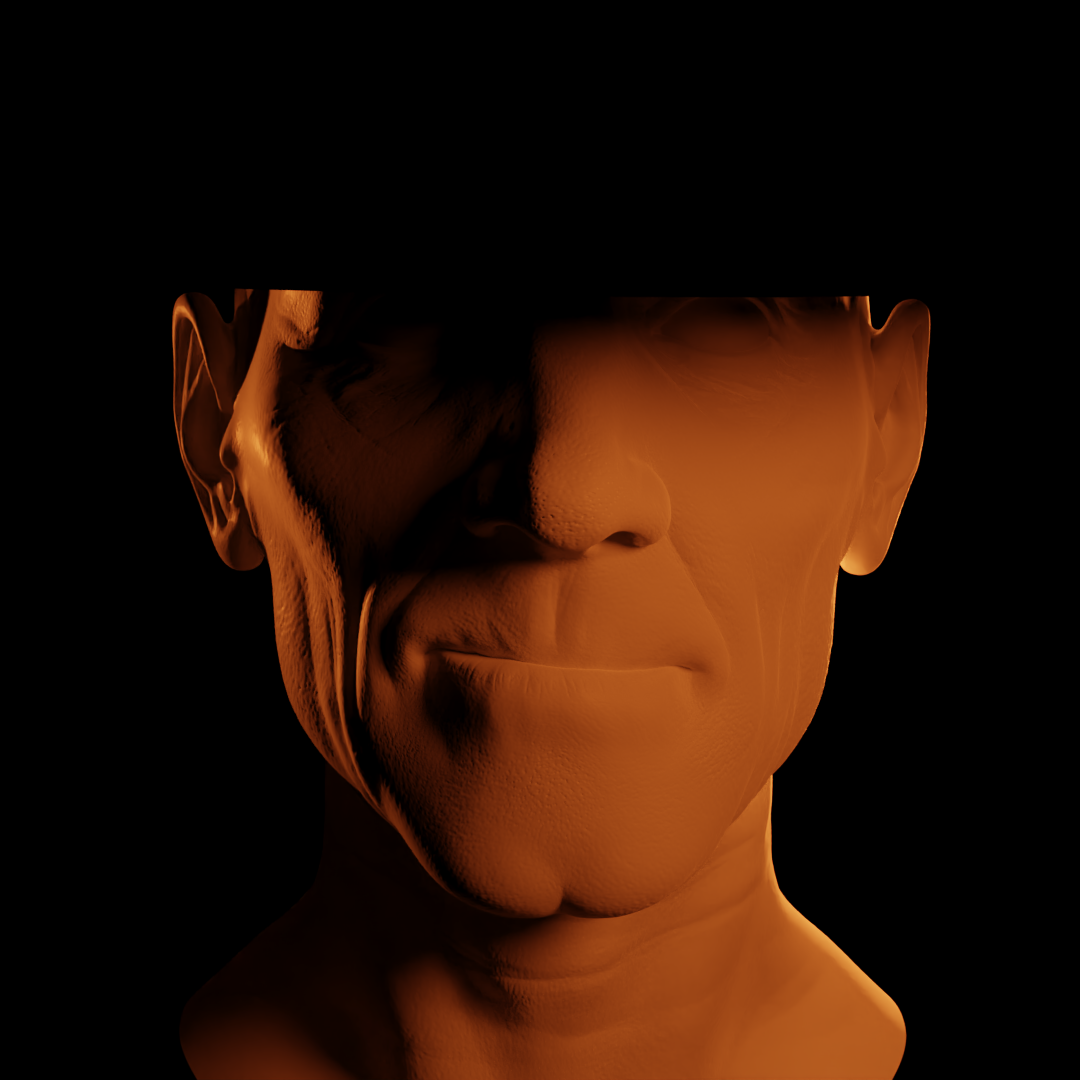
Working on the fundamentals again, will be posting progress here.
Fundamental's of lighting assignment results:
Image 1: Lincoln Movie Poster

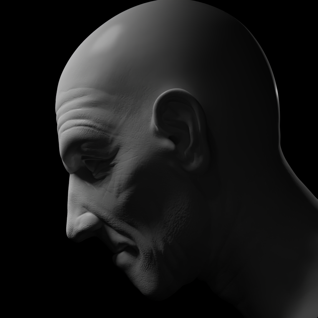
Image 2: Stock Portrait Photos

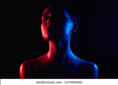
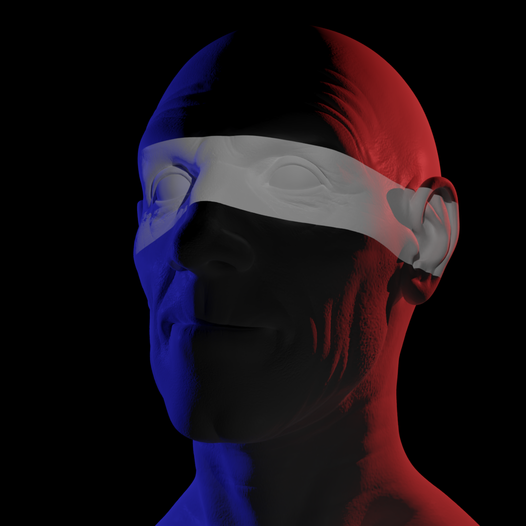
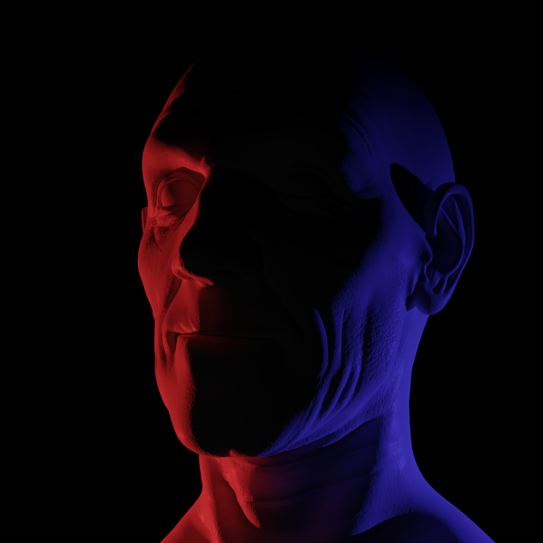
Image 3: Oppenheimer Poster

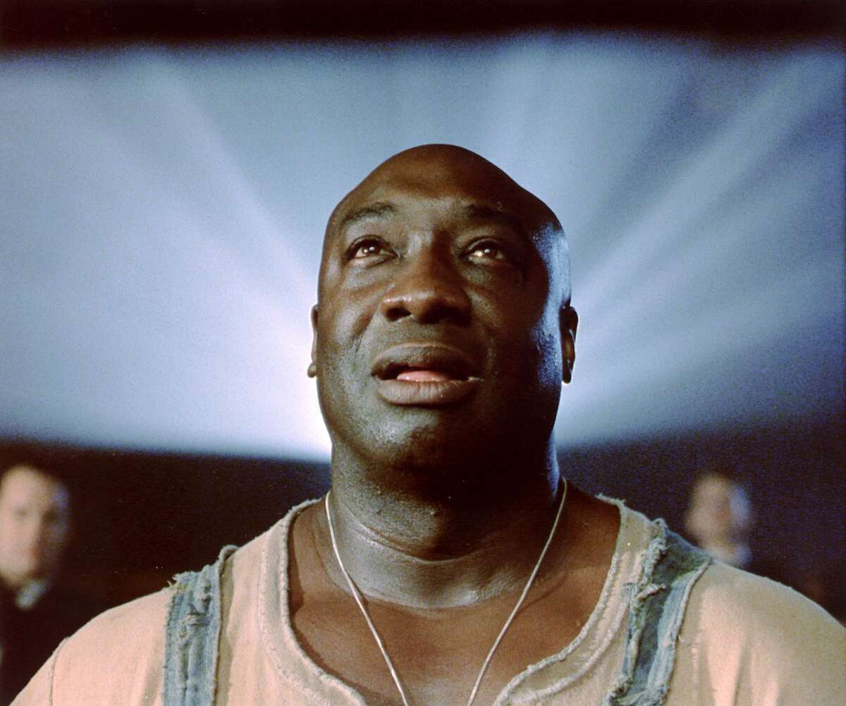
Reference
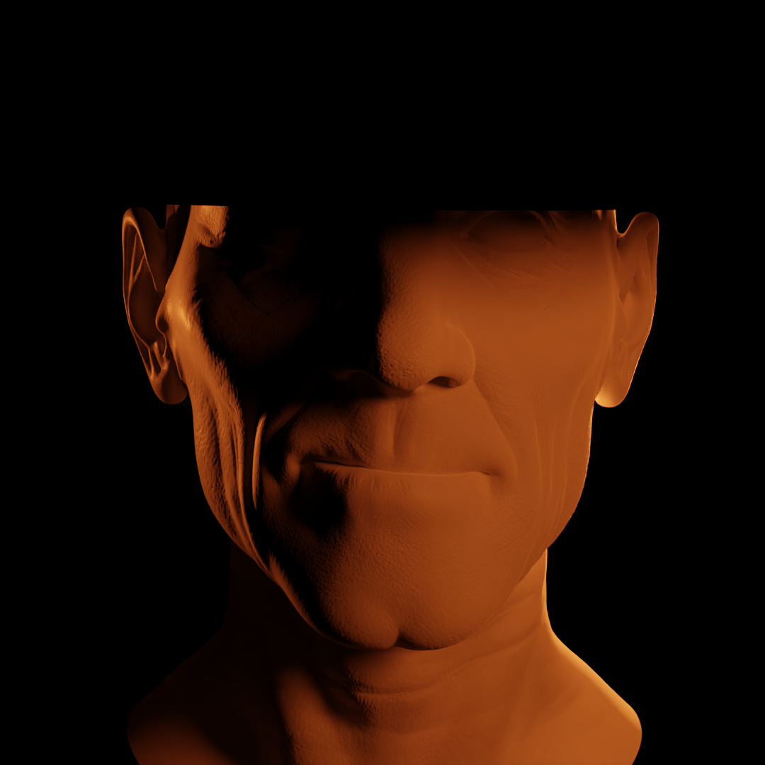
Image 4: Green Mile
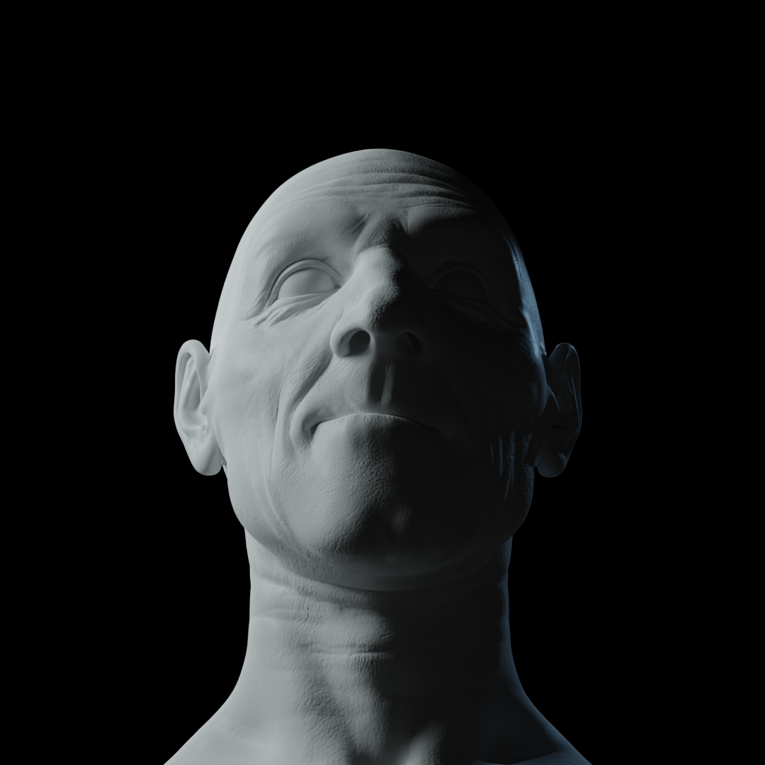
I think I struggled with this assignment the most out of any so far, so I'd like any feedback the community can give!
Thanks Martin. My key light was producing that, but you're right, once I added the rest of the lights, I think it became almost imperceptible. I struggled with light placement that would give the Rembrandt light, but would also create that hard shadow line that goes almost vertically through the middle of Oppenheimer's face. In the end, I think the two face shapes are pretty different, with the model being a little flatter. Here's a second attempt that improves it a little bit I think.
