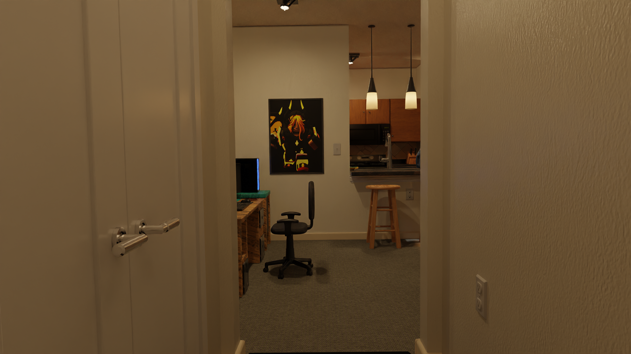
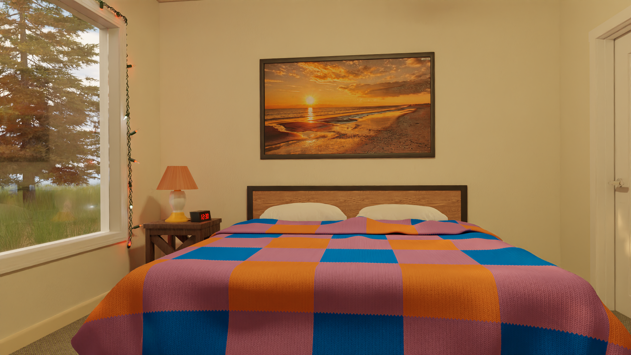
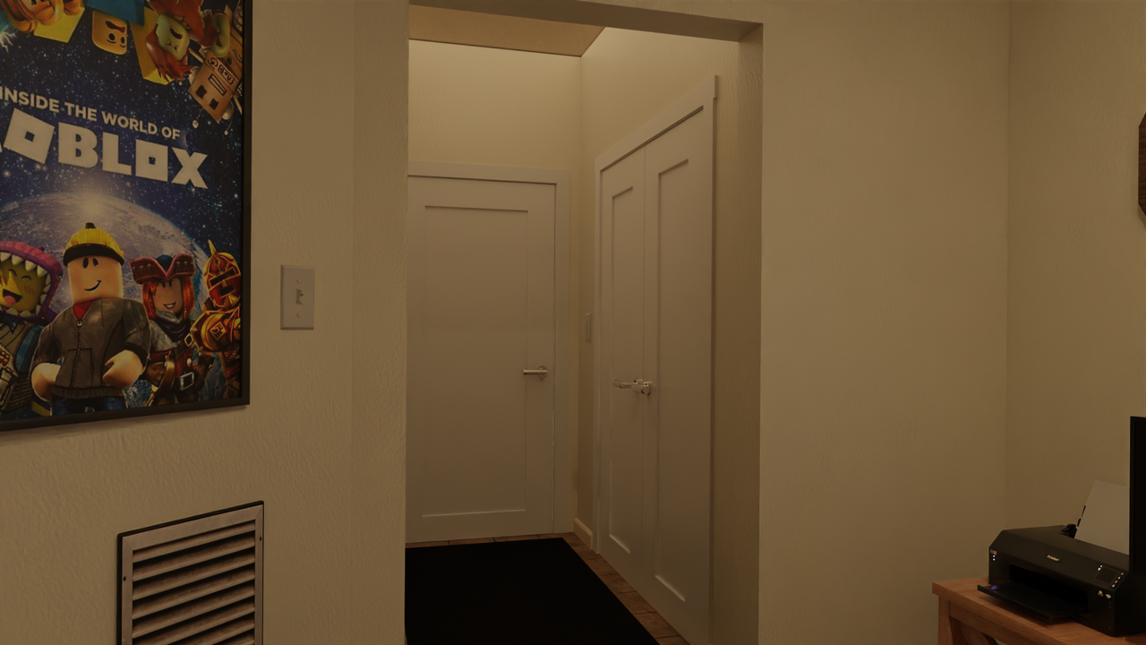
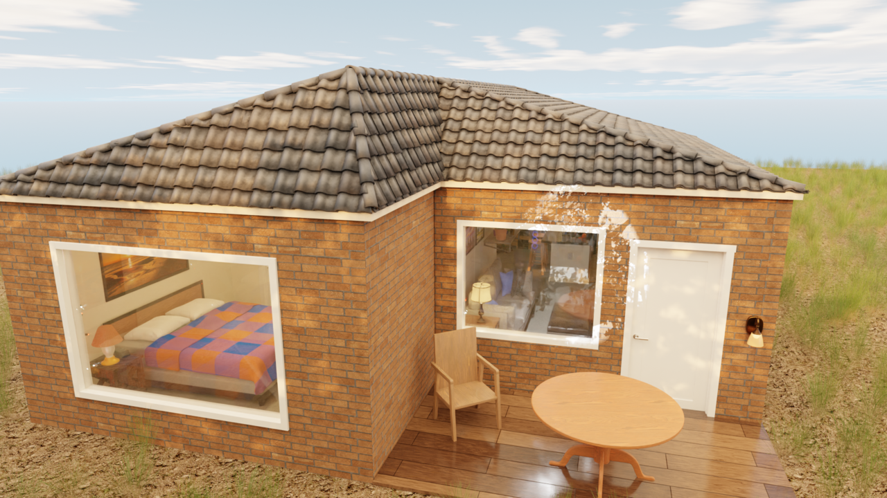
Here's a couple more pics of the house project I have been working on for a while now. I think I am ready to starting animating official shots for it now I know what to look out for when animating something like this. I can get these renders done pretty quick with the turbo tools addon I have been testing out as well. As stated before I did not make everything myself and used addons but for just me working on it I think it turned out pretty good. I think I started it about July this year on and off. I used my apartment as a reference but only the layout is similar. Colors are pretty yellow in real life too. Any thoughts or opinions?


