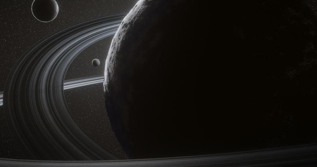
I just started Jonathan's Fundamentals course and this is my primitives exercise. Definitely not my first scene in Blender but I had some fun with it. I figured I'd post it and start this thread. I'm excited to watch my progress as I continue here at CG Cookie!
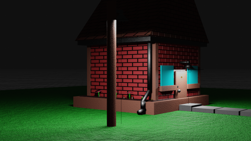
I've also completed Kent's course on 3D Industrial Environments. Here's my version:
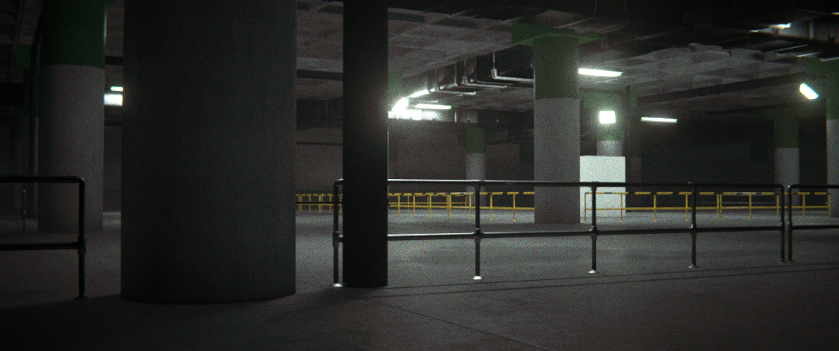
I followed pretty close to him through the whole thing and I feel like this image represents the quality limits of my current hardware (I'm on an older machine running 2.93). I can get a little better but not enough to really make it worth waiting for. This isn't too bad though! I loved this course :)
Here's my take on the sci-fi crate from the fundamentals course. I know it doesn't have to be textured. It really sells the presentation better though and that's something I'm working on.

Thanks for the critique Martin :) My real name is Josh but I usually go by Jay online. My gamer tags are all variations of "jaydawg" lol
I'm not sure what you mean by "low-frequency detail". Could you give an example?
Hi Jay,
So, probably the great Gleb Alexandrov can explain this better than I can: https://www.youtube.com/watch?v=qMH_J_vcoqE
(low frequency might not even be the official term, but it's simply about the size of the details; large, medium and small)
Thanks that video made a lot of sense. I tried to keep some of that in mind as I made this submission for the low-poly room exercise.

Thanks guys! I guess I did kind of break with the theme didn't I? I think I was just trying to fill up space. I think this fixes it some though.

Here's my submission for the Fundamentals of Texturing course procedural lava project. This is a smaller version of the actual submission to save on space. This is also my first project on my new computer. It's certainly not ideal, but I managed to get through this project. And I look forward to doing more.
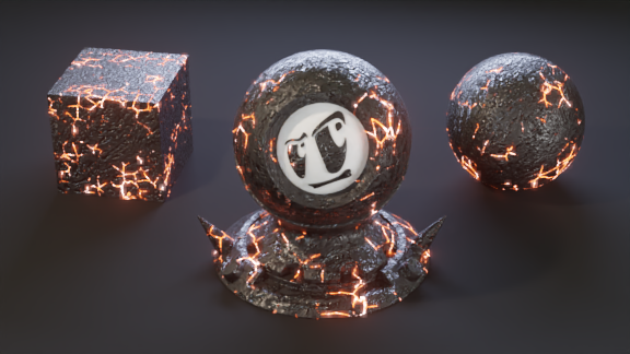
I made this a single group node that controls the color, glow, width and spread of the lava/cracks.
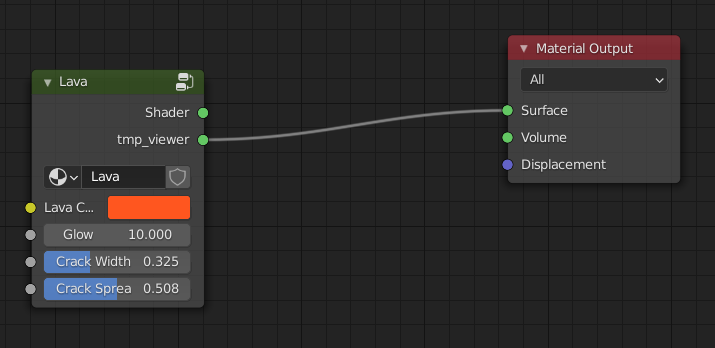
It has a base layer for the rock, another for the cracks, one for the flecks, and then an emission shader that gets mixed in with the crack layer's output as the factor.

I had to start this over a number of times, sometimes because what I was trying just wasn't working and a few times because Blender crashed and I realized I hadn't saved in... two hours? But every time, I understood what I was doing a little better, and I think it came out better for it. I learned a lot from this project, so I'm really happy with it.
Thanks :) I tried your suggestion, Martin, but plugging the noise in there really just thinned everything out. I managed to figure it out, though. I just needed to adjust what was going into the randomness of the Voronoi texture that controls the cracks.

The top noise texture here adds some curve to the lines and the bottom one breaks them up a little. It took me a minute to figure out where exactly to plug these in, but once I found it, it made sense. I ended up with this:
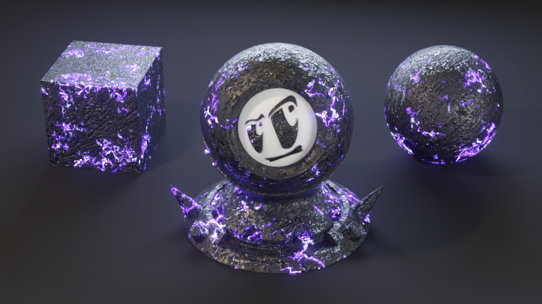
I really like the hard rock feel, too, Omar. And it looks really cool animated, too - it looks like it's getting ready to explode. :D
My first Sessions exercise is meant to give the impression that you are looking at the back side of the planet as it turns to face its star, hidden on the other side. There are lights on the surface, meant to imply the planet is inhabited. It took a little over the two-hour time limit because I spent too much time fiddling with those lights. This was fun. I'm a fan of minimalism. :)
