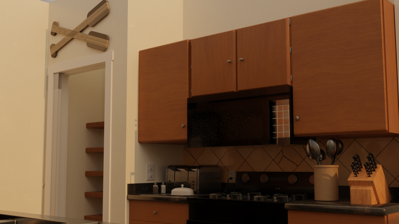
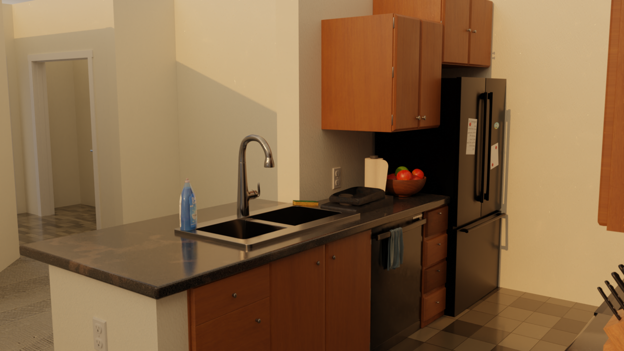
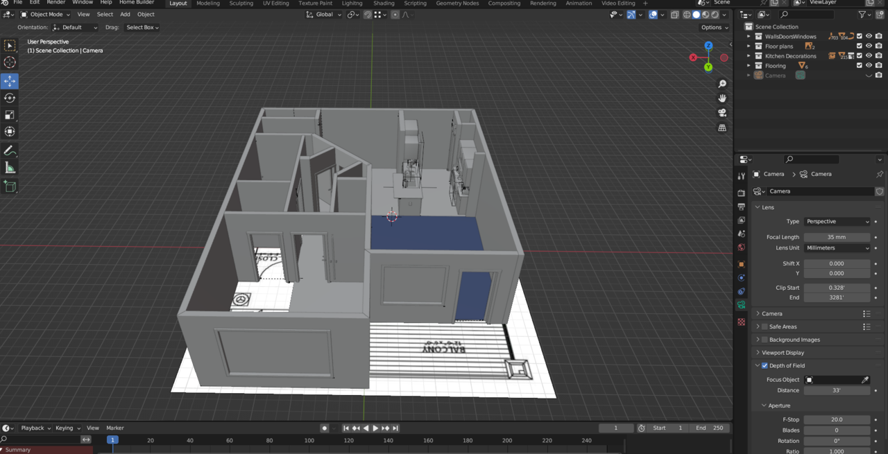
This is what I have been up to lately. Even though I did not model everything it still takes a while on just one room! I am making my apartment and just finished the kitchen the other night. I plan to add the lights and crown molding when the other rooms are done, over 800 sq ft of a place. I bought a furniture and home asset pack and some pbr textures. The objects I made fully was the countertops, more cabinet variations as I only had 2, the dish rack, ores, paper towels, and microwave! The rest I placed from the asset pack. Any feedback is appreciated as this is my first home build! It's not exact and some things might look wrong but it is close. Also using the home builder and pro atmo sky addon! The doors and windows are bugged but that is a easy fix.


Looking good! Brandon👍🏻 That's a huge project!
I noticed two things:
- The cooking spoons asset seems disproportionately large.
- Is there a slight UV problem with the carpet (especially visible in the second image)? Maybe that's how it's supposed to be, but it looks weirdly 'warped'.
In larger projects, things like this tend to fly under the radar (or you think, "I'll do that later" and then forget...luckily, both these things are super easy to fix.
Looking forard to seeing the rest of the apartment 😊
Yea I scaled the spoons down some to fix that, as for the carpet I may need to change that up before it’s fully done I downloaded the texture from ambient cg as none of the 2 materials packs had carpet. I also wasn’t sure the best way to create the flooring with how the apartment is angled and for the carpet texture to transition seemlessly. There is a option to cover the whole apartment with a plane as a floor in the home builder addon but I would then need to separate the plane as it is not all the same material.
That is looking very very good Brandon. It's a work in progress, but for things to look realistic when doing interiors, I guess the main things are lighting and color grading. I always like to do this experiment when I'm at the point of doing renders, I turn the whole render black and white, get rid of all the color and immediately almost always the renders looks very realistic, and that tells me my colors are off, maybe too saturated of cartoon like. White balance I think is super important to get that nice good ambient light. Of course doing the render in Cycles helps a lot, you get all that extra realistic fidelity that Eevee lacks. Right now your renders are very filled with yellow or orange tones, I think if you take those out it'll help with the realism.
i plan to work on lighting when the apartment is done! Thanks for the tips on how it looks now!