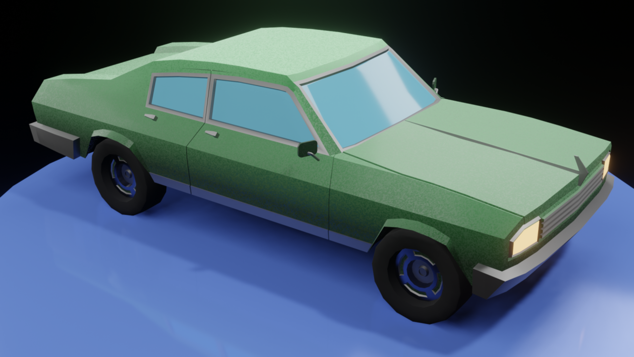
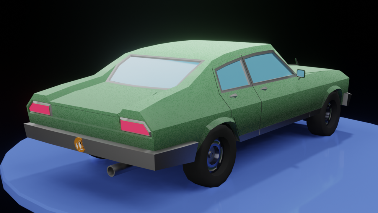
A great mini course, REV: Model a Low Poly Muscle Car.
I did a little embellishment, experimentation, nothing noteworthy. I still have to figure out how to get the materials to show properly with SketchFab. I just let it go for now and move on with other things. I find a lot of times the answers come if I keep moving forward and not go around in circles till I go cross-eyed trying to figure it out, lol.
I tried some various techniques to show the doors, hood and trunk. I felt with he renders and 3D viewing I could get away with exaggerating them by giving them an exaggerated thickness and leaving them on top of the car body. The hood I did make a crease in the mesh, trying out different techniques and leaving the ones that seem to work. If I was to do it properly it would be redoing a lot of the mesh, which is good and all but decided to take the easy way for now. Not something I want to get into the habit of doing though. I may end up redoing a lot of this car.
I didn't do the windshield wipers 8^]
Nothing much to examine, it was good exercise in various areas and fun to do. Another course I really liked.
Here is the SketchFab and a coupe of renders.
https://sketchfab.com/3d-models/low-poly-muscle-car-ce2a1fd791d341bf95f6d0c2c3db8bea


Hi Omar,
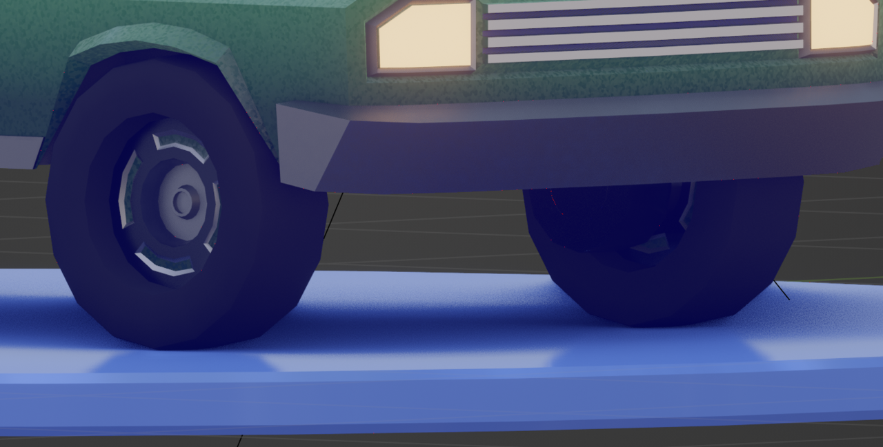
I see what you mean, I didn't notice that b4, good point. It must the the glossy surface and lighting that gives it that look.
I took a pic from the model and the tires are on the surface. Something to be mindful of is the roughness I put on surfaces and how it interacts with the model. Good that you pointed that out, I didn't notice it.
Thanks

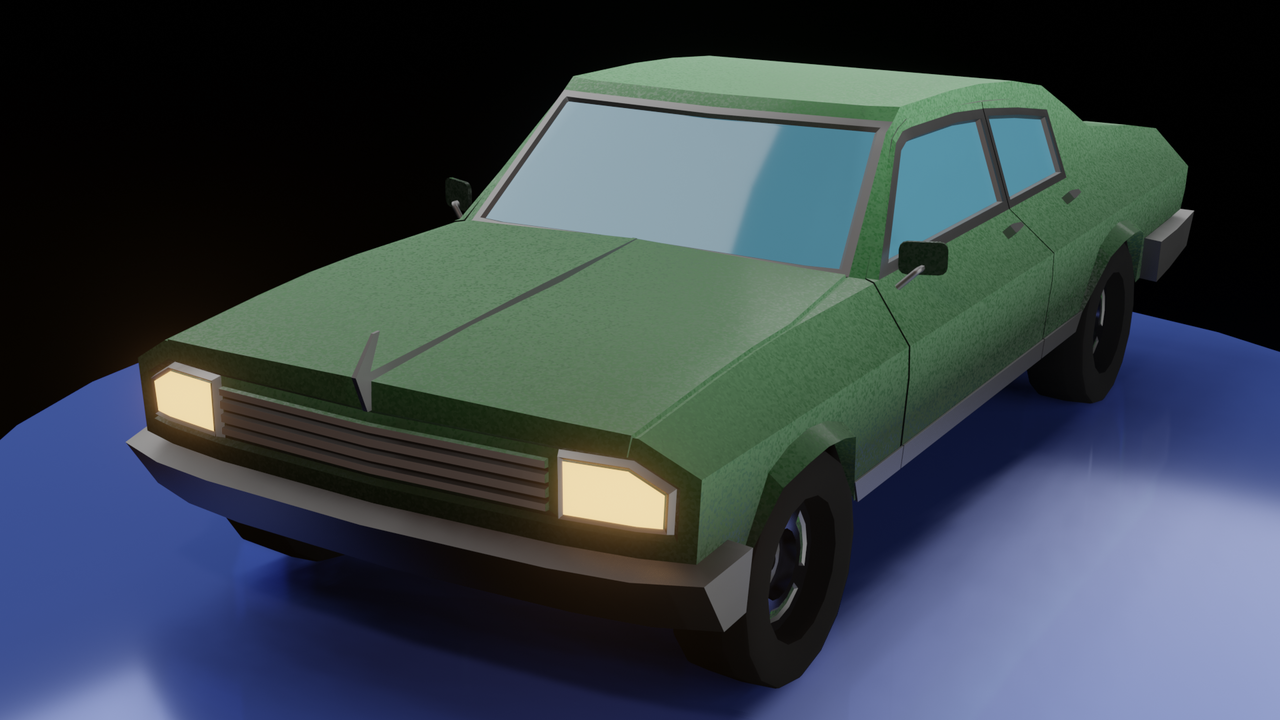
You guys brought up an excellent point. I re-arranged the lighting and that seems to have corrected it. I think it's a little better overall. So many things to consider and put together. I know the lighting and materials are going to be a challenge for me. I really don't have a good eye for lighting so any critiques, pointers, tips are more than welcome.
I had to post pic on another post, no option for images. on Last post. I'm getting more of the paint speckles now. The lights were too bright.
