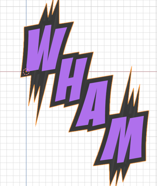
I'm trying to create some SFX text using the first approach in the video: converting the text to curves, but I'm running into a couple road blocks. First of all, if I want the text to overlap at all, it causes an issue because points from both letters occupy overlapping 2D space. The overlapping area doesn't show textures at all. Is there any work around for this, or will this just not work with curves?

A second issue: I run into the same problem that you have at around 19:00 in the recording, where the border is having some overlap issues, but I've already converted to curves, is there anyway to fix this? Obviously, we can't access the text properties anymore to adjust the size.

I think I can sort of solve these problems by applying the border while its still text, then converting to mesh (instead of curves), and then staggering the letters a bit in 3d space, but this is a bit cumbersome, and the result doesn't quite look as nice for some reason. Any ideas?
Thanks ![]() jammingammon - yes I agree, text can be finicky, especially at the scales I've set - it's almost certainly a scale issue. I'll work on a simple solution and post here ASAP.
jammingammon - yes I agree, text can be finicky, especially at the scales I've set - it's almost certainly a scale issue. I'll work on a simple solution and post here ASAP.
Ok - I think this is a good question to tackle in more depth when I do my Office Hours this week. If you're available at the assigned time (US CST 2PM) I will be recording it and will upload the relevant segment here for you. Each object type has its own pros and cons, and some settings can help you adjust problem areas, but ultimately, it is a toss-up between non-destructive and destructive editing. There's always more than one way to do things, so here are a few options you might want to try.
Text will allow you to overlap characters with spacing, but you can't really effect the text too much beyond that. Using the Solidify settings as shown will give a good outline and scale isn't really an issue.
Curve will not allow good overlap, since it tries to calculate a boolean operation when 2D curves overlap. Setting to 3D curve does not help, as it then becomes a curve which is more like a path or an outline and no fill. Scaling is also problematic, as you have seen. If the object is sufficiently large, you will not see the problem areas (as you have already shown in your original post) but scale it too small, you will begin to see where the curve angles overlap for bevels or solidifying.
Grease Pencil will allow overlap, but creating an outline requires you to duplicate the shapes onto a second layer and assign all those shapes an Outline material. Each shape will be outlines, but if you change your Grease Pencil object's Stroke Depth Order to 3D Location, then transform the location of the layers individually (eg: attached image show the Solid layer adjusted in the Z direction), you can set the solid shapes above the outlines and mask out the overlapping segments. You can then adjust the stroke thickness of the Lines layer to get a better outline.
Hey Paul,
Thanks for the explanation. That would be cool to see a bit more about it, if you're able to upload the content later, like you said. Unfortunately, I'm not going to be available at that time, but I'll definitely watch it later.
I'm really having fun with the course, by the way. The text section is particularly interesting. Looking forward to whatever you do next.
Hey ![]() jammingammon - here's some of the stuff I covered on this week's Office Hours
jammingammon - here's some of the stuff I covered on this week's Office Hours
Thanks Paul! Interesting segment. It was good to see a bit more in-depth explanation of the lettering stuff from panels. It's a little finicky, but the results are really cool, when you get it to work!