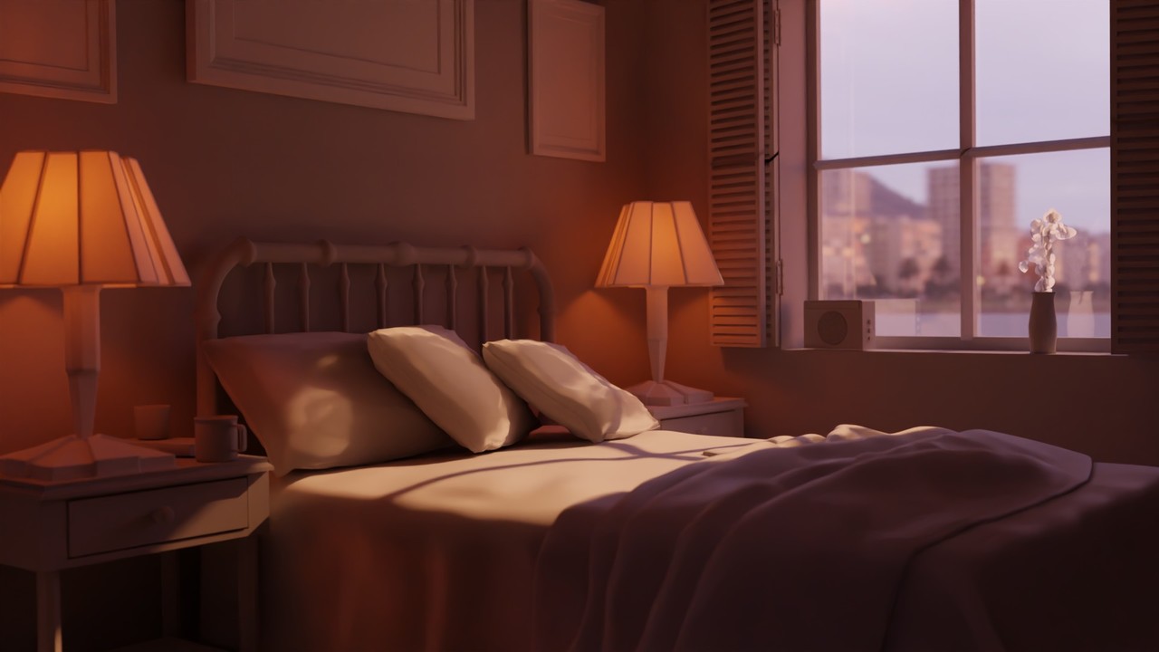
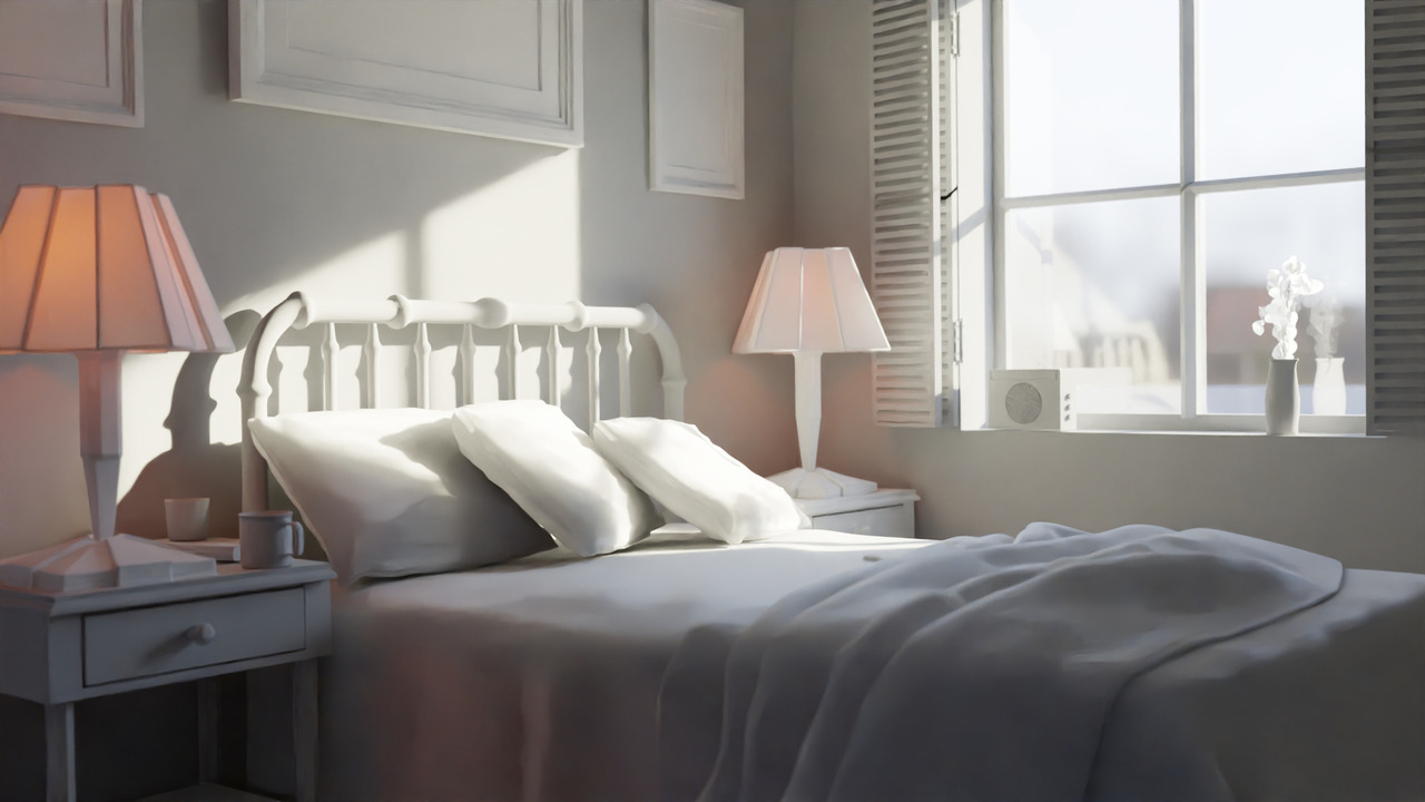
Hi if anyone's reading this! This is my proof of progress for myself and a place for me to come back and reflect on how things can be improved in the future! I just got done with the lighting a bedroom in cycles and wanted to get over my nervousness to post so here I am.
Other notes, I noticed that some of blenders renders seem to have more vibrant colors in the preview then what my images are. I've tried different formats with no discernible results. usually I like PNG files as they are lossless and at this point storage is pretty cheap but same duller colors then my preview window. I even tested putting the render right next to the preview window and taking a screenshot of both, the resulting image was more washed out on both snips on the output. maybe its a color space thing I don't understand yet but I should keep it in mind. It could be a strange only on Linux bug, wouldn't be the first time something like that happens.
Edit: I might be misunderstanding how to attach images, I attached 3 but i cant see them in the post... Need to look later, they seem to have uploaded alright.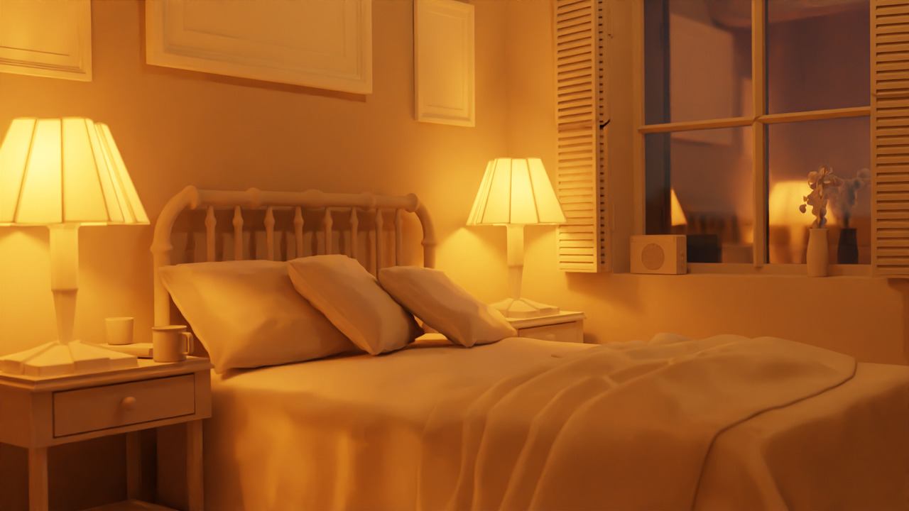
For the image is that icon there:
Then browse your computer for your image.
It will appear as part of your images there and then just hit the plus sign.
For the color management and getting dull images, Filmic is on by default in the color managements which creates dull images. You can watch more about it here:
https://cgcookie.com/lessons/scopes-and-color-management
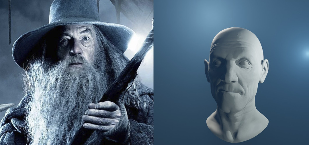
Just got done with the assignment for "Fundamentals of Digital Lighting in Blender"
Posting a collage and sources for images!
Weird Al - Weird the movie - https://encrypted-tbn0.gstatic.com/images?q=tbn:ANd9GcSyOKo9wrSwHbDs8F3W1sbpMu0F4PIxBkANNy3d8pF43XH_HerG
Gandalf - Lord of the rings - https://assets-prd.ignimgs.com/2022/02/24/ringsofpower-gandalf-blogroll-1645743567179.jpg
Cliford Unger - Death Stranding - https://www.gamespot.com/a/uploads/scale_super/172/1720905/3605892-ds-episode11-00001.jpg
Anakin Skywalker - Starwars 3 - https://d2ycltig8jwwee.cloudfront.net/features/1035/fullwidth.599a02f1.jpg
Paul Atreides - Dune 2020 - https://pbs.twimg.com/media/E6rDI4IUUAQ-Yx7?format=jpg&name=4096x4096
If there's some weird line ups on these, originally they were one huge image but found out this website doesn't really like tall tall images. Not to great at the photo editing yet.



just got done with the exercise for intro to materials, great practice and shaders are no longer "magic". Got excited and looked some stuff up, figured out how to make a marble texture so I hydro dipped the lamp. may not be the best color choices but this is probably the best representation of what I have on my desk right now. Great practice and glad I've stuck with it.
just finished the concept art to scene course, astray... actually finished it about 2 weeks ago. trouble rendering a small animation so I've decided to get a better PC.
Here's the animation but there are defiantly things i want to change and don't understand why there are issues happening... but currently takes about a week to render https://www.youtube.com/watch?v=AJ7IT5bqk-w
Astray was definitely worth the time invested and I hope to use what I've learned in animations (i need practice) and set extensions in the future
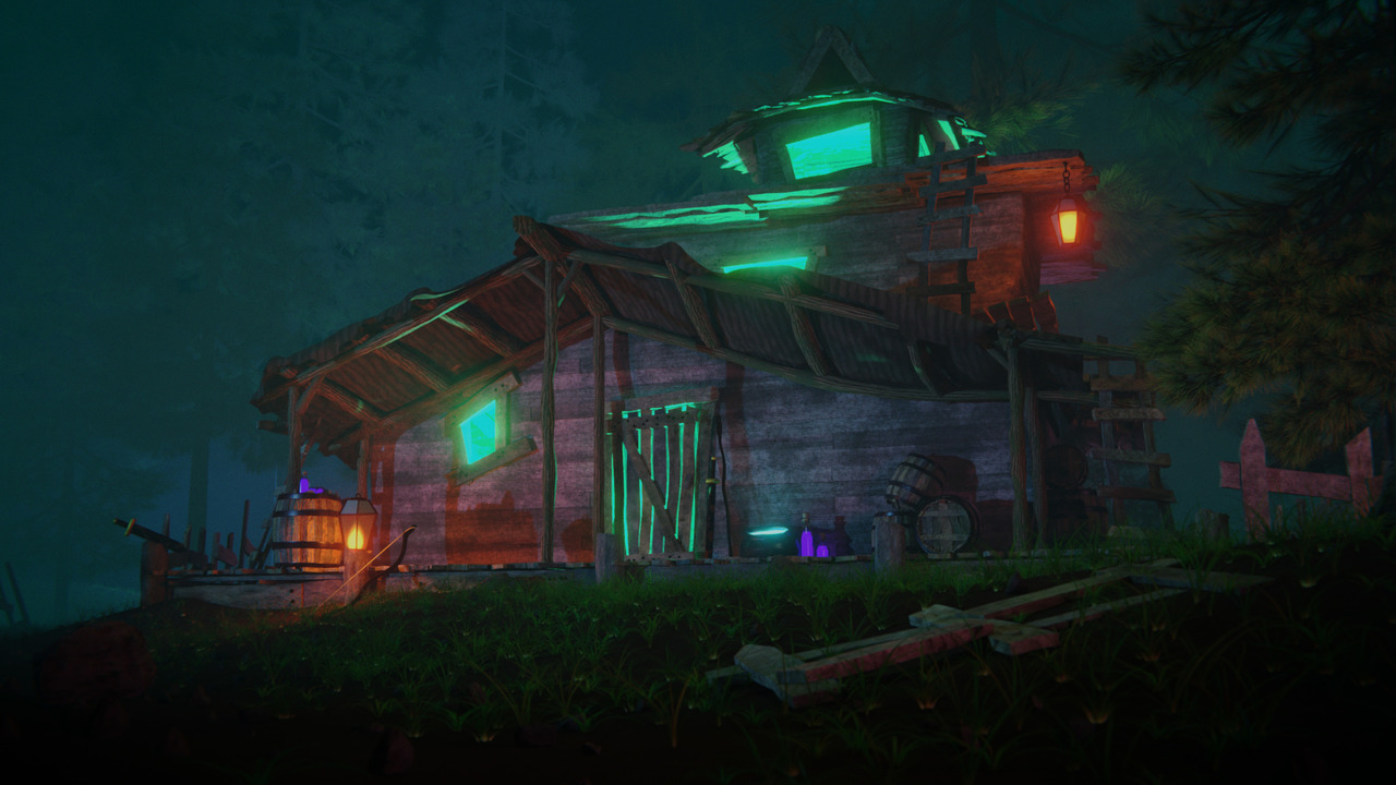
Posting an update as I'm about to submit the final for Fundamentals in Texturing
Most of this is procedural textures but i did find an image texture of carbon fiber i ended up using from textures.com and I painted some dirt on the wheels using a brush texture I made with an image of cracking paint I took while i walked around the town I live near. For anyone interested, here's that image. feel free to use I'll say its public domain. 
I spent a lot of time on procedural textures on this one, a lot of metals and paints because car stuff, here are the ones i'm most happy with.
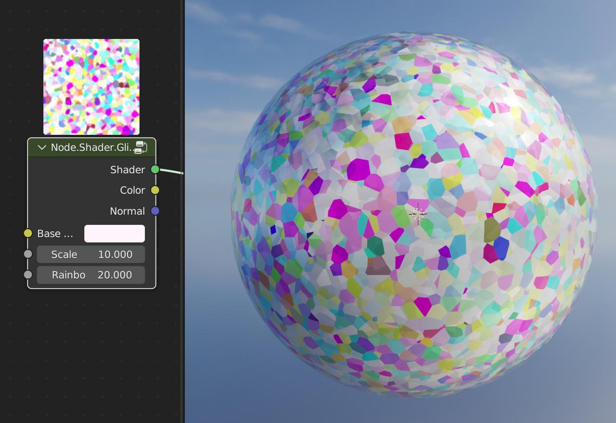
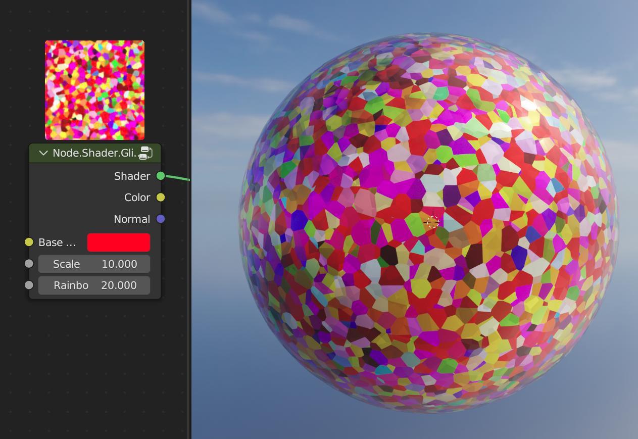
A glitter coat with customizable scale and rainbow amount, the rainbow even works with dark colors giving it kind of a crow feather result! real happy with this one and how small it turned out to be. (most of the others ended up being nightmare in size and I need to work on being efficient...)
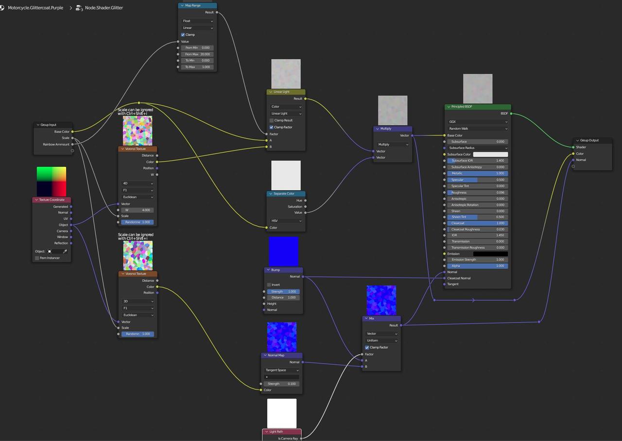 Here's some examples of its range

 I also made an customizable anodized metal with the ability to shift the hue of the color range, decrease how much rainbow encroaches on the center and decrease the size of the rainbow effect range. this node group is a bit bigger but again still super happy with this one.
here's an example of some of its extreme ranges it can do. 
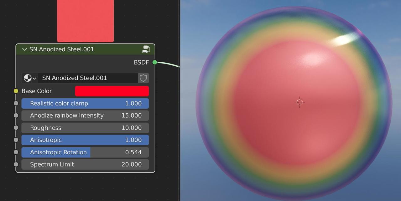

Preview on next one bugged but shader still works.
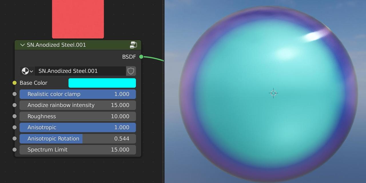
I made plastic and a few others I ended up using like leather, I could keep going on this but at this point i think I'm nitpicking and should finish up this project. Really enjoy procedural materials and definitely plan on looking more into the class specifically for that. might take a break and try the new animation course next though.