Hey TTj,
It's great to see your eagerness to receive feedback on your exercise submission.
I have just checked for your submission; it says you submitted it for grading 1 hour ago.
Please give the instructor a day or two to grade your exercise and write any notes for you.
The instructors in general grade exercises Monday to Thursday, in between all the other duties they have, like creating new awesome courses for consumption!
Take a look at what they are working on, coming-soon-to-cg-cookie
Thanks for your patience!
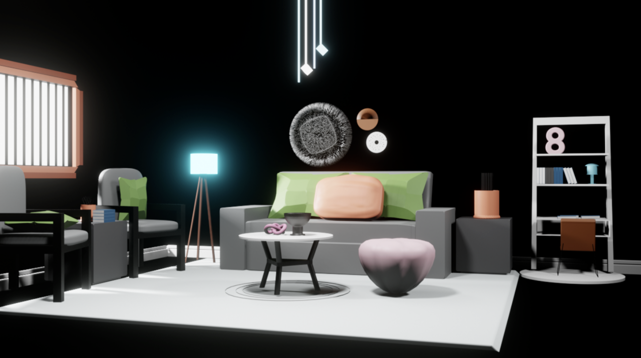
I went on ahead and search for it. Is this it?

If this is not yours, then we find the author and tell him he got some unexpected feedback.
The thing that strikes me is how black it is. I see on the description that it was supposed to be pink. Maybe it was due to the world settings, that would have to be troubleshooted. But yes, mainly the problem is lighting and shading, right now it's as if it exists on a vacuum and we don't get non of the volume of the room, with the lights and shadows bouncing of the room. Try troubleshooting your settings to get your walls back, it'll liven things up. Try using that windows as your main focus of light, let it flood the room.
All the other elements are great, they work as a low poly assets to fill the room. Post it again when you get it working and things are lit up. All in all good job on getting the room together.
But yes, mainly the problem is lighting and shading
As a general render, you're spot on, but also this is very specifically a modeling exercise and I said to not spend too much time on lighting and shading 😅 I think I need to be clearer about that on the exercise page since so many of the comments on the older site were beside the point. Even clay viewport renders would be ok! In these we're looking just at the shapes.
I'll leave some feedback on the exercise as soon as I get to it. I'm a little behind but I'm going through those today and will do that shortly. I love the initiative and I can tell you're excited to dive in more! That's the best :)