Earlier this week, we pushed new code to the site that addressed a few bugs on the site, and improved the Cookie. 🍪
In the efforts to remove duplicate exercise submissions, we realized that the website had been allowing members to submit multiple exercise submissions to a single exercise. While not as original designed, it makes sense to retake exercises to apply what you've learned from feedback.
Appreciate the patience while we're working on how to best re-enable this on exercises. The current work-around is to delete the submission and re-submit.
As always, thanks for being a part of the Cookie and for being awesome.
Happy Learning!
Wes Burke
CEO, CG Cookie
hi,
1. how do you delete an exercise? I really want to resubmit something.
2. I greatly appreciate being able to retake an exercise. I have learned way more by being able to do this, then I can try to fix what was wrong, Wayne has been great with this in the animation, and looked at numerous exercises numerous times, which has taught me a lot. For my own curiosity did you change this due to your point system (which I don't personally care about) or some other reason.
Thanks.
ttanya53 Sure thing - to delete an exercise, view them from your profile while logged in. There is a trash-can icon that will appear over the thumbnails - https://cl.ly/2T3D0T2y1V0w
Wayne is awesome! 🍪
Re: Why did we change it: Nah, we feel it great to be able to re-submit exercise submissions for the very reasons you mentioned. Unfortunately as we fixed the duplicity bug, it temporarily removed this functionality, something we're working on restoring in future releases. 👍
[copy] [paste] how to write a congratulation note
Dear Wes
Congratulations on doing such a great job on developing a new project plan for your group. The extra time you've been putting in on this has really paid off, and I believed that you have presented and ambitious and attainable set of goals for your team and the company. Bravo for a job well done Toby, Sincerely Mick.
Now this humble cookie crumb has some respectful requirement. It's in the My profile - projects section.
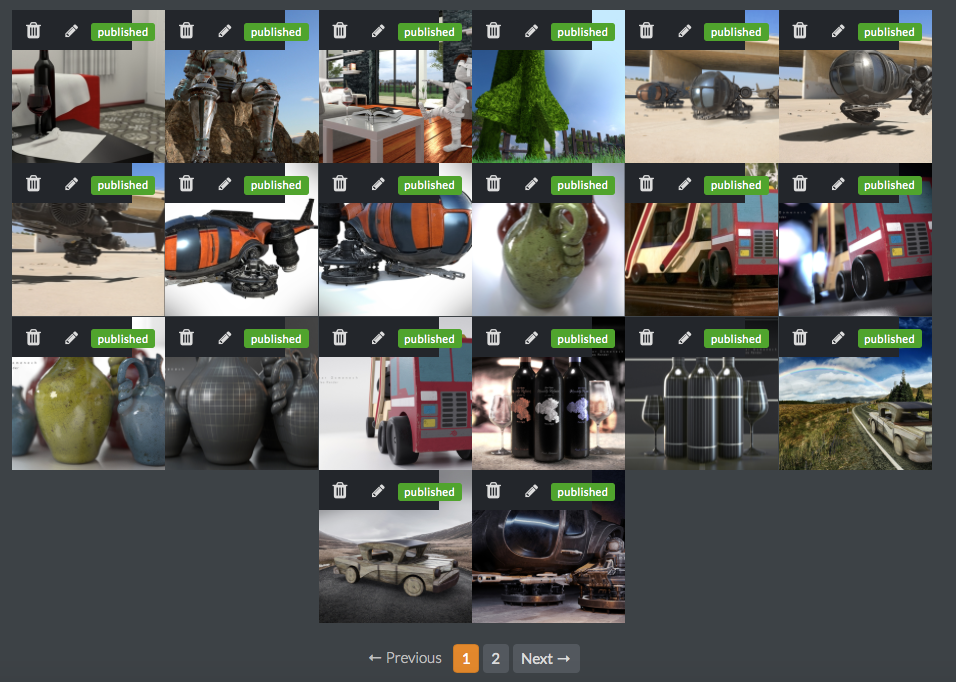
I can never see how people see my projects. When I go to my projects there is always the small thumbnails with the green "published" mark but I can't access my full project. I always think that when I click on one it's going to take me to the full page display, with the comments and all, but it doesn't. I have hack it, I log out and search for myself and then I can see my full projects, which takes me to the second part...
I think right now it organizes your work by oldest to newest? maybe? It orders it in a random fashion. Some of my newest work is at the bottom or at the second page, so people see your old and worst stuff first. Could there be a menu that lets you organize the layout or order of the projects? You know, from new to old, from old to new, alphabetical order, most loved to least loved, etc.
Could there also be a title for the front images? When all your projects are displayed, when you hoover the mouse over one, it looses a bit of opacity, it would be great if the title also gets displayed there. Perhaps also an indication that the project has multiple images inside? Only seeing the front display picture gets you no clue as if there is other images
Thank you for reading.
Hey Omar! Sure thing, let me see if I can help out.
Re: Viewing your projects: It sounds like your browser size may be pushing the Published tag over your edit, and view options. You should see these icons when viewing your projects from your profile - https://cl.ly/1m391m2Z153w If not, a trick is to resize the browser.
Love the idea of being able to organize your projects on your profile. Will write this up and present it to Nick and crew to see what we can do.
Herm - in early iterations of this version of the site we had icons that would overlay on the gallery thumbnails indicating if there was a video, multiple images, etc.. Similar to ArtStation. I believe it was removed due to the complexity, but will take another look at it.
🍪
Oh so that's what's been happening. This is the best I can get it to. I had never seen the eye icon, that publish green thingy has always been like a blindfold for my projects. I feel like Neo "my eyes hurt" Morpheus "it's because you've never used them"
Cookie on.

My thumbnails also show up like Omar's using Chrome on Windows. Maybe the published can be moved to the bottom or make the thumbnail itself clickable?
![]() gothicbunny Ah, sorry to hear as well. Working with Dennis to find a solution to go out. 👍
gothicbunny Ah, sorry to hear as well. Working with Dennis to find a solution to go out. 👍