
2/13
Finished overall shapes. Used Quad Remesher first time, best add-on I've ever used.
I love Psyduck! And thank you so much regarding the quad remesher add-on tip. I just started remeshing and decided to give this add on a shot too. It worked beyond my expectation! 🙏
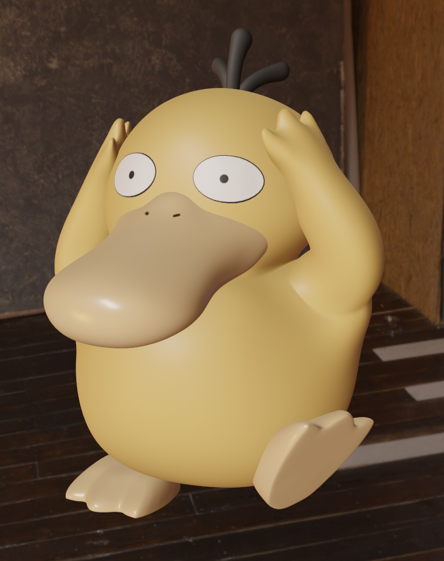
2/15
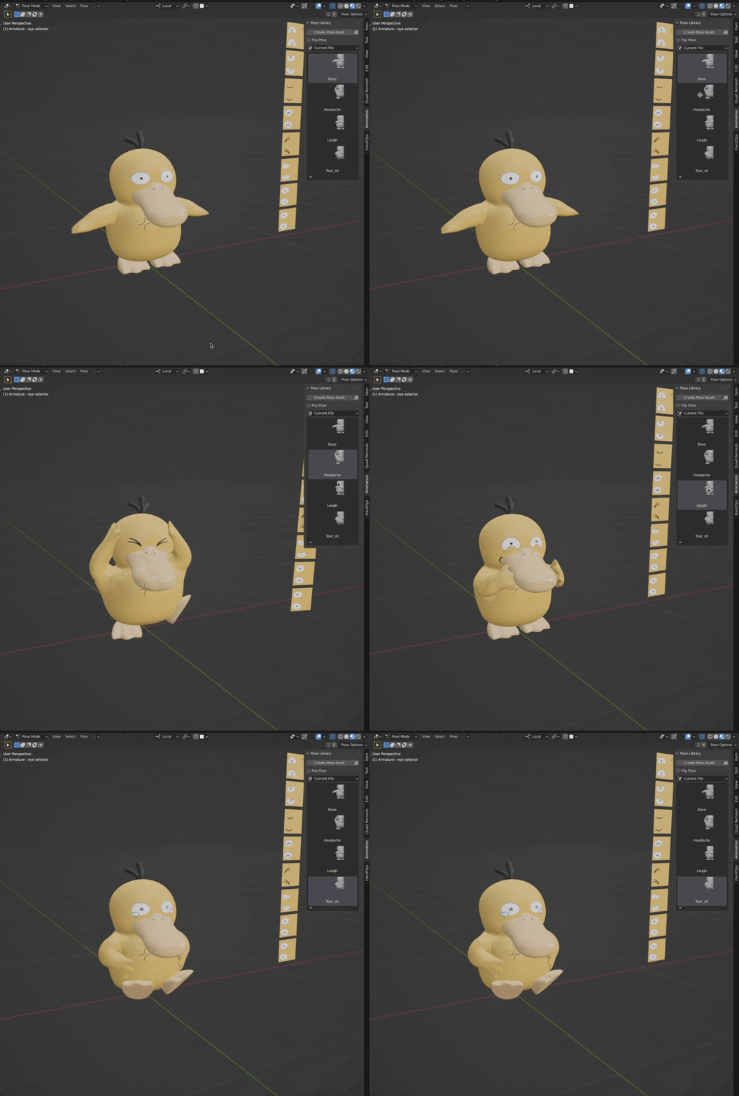
Spend a lot of time to rig the character and made a pose with a lot of tutorial videos.
Pose library feature made the process easier. Now I'm planning to model several more facial expressions and nice background to give my character a story.
 2/16
2/16
Tried texture animation. If you wonder how I did it, check this great tutorial.
https://www.youtube.com/watch?v=nmzAbeUDPUQ&t=166s
This challenge makes me explore unexperienced features of Blender. Now I hope to complete a more complex project than when I first started.
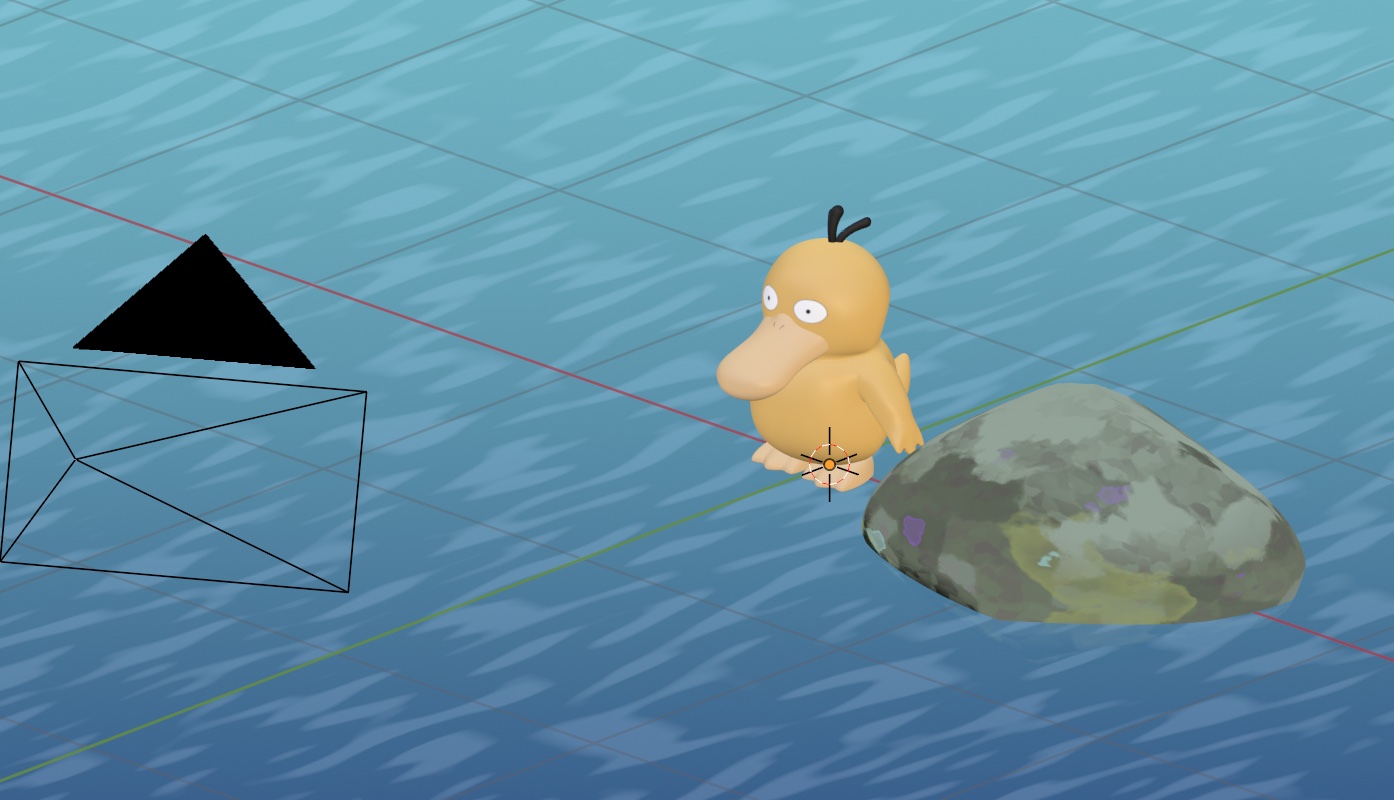
12/18
Preparing stylized background with a help of Kristof Dedene's Youtube tutorials. https://www.youtube.com/channel/UCAcXkKCYidxGU-VIA5z-ZzQ
After making bunch of poses and facial expressions, I made a collage of psyduck.
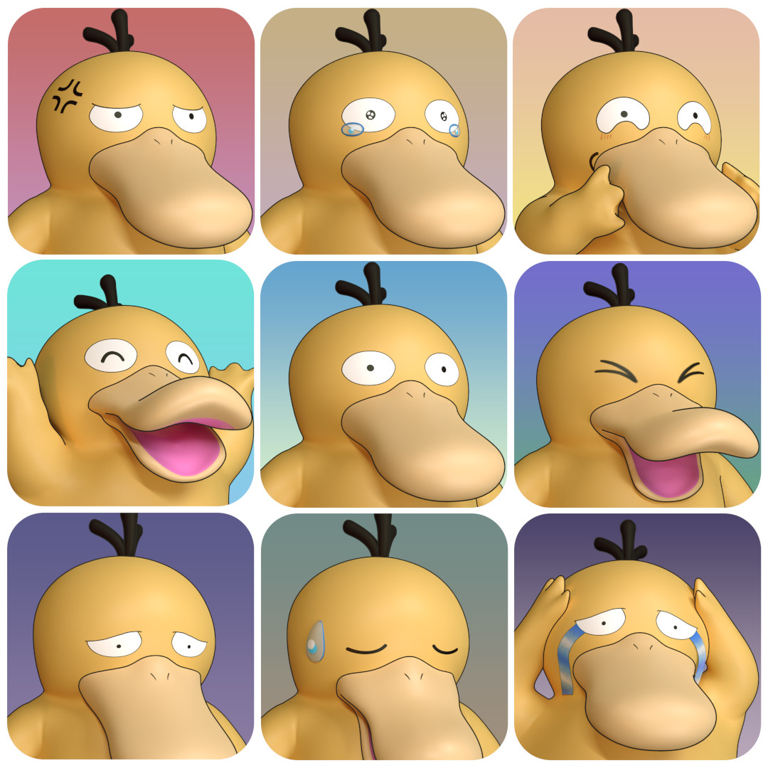
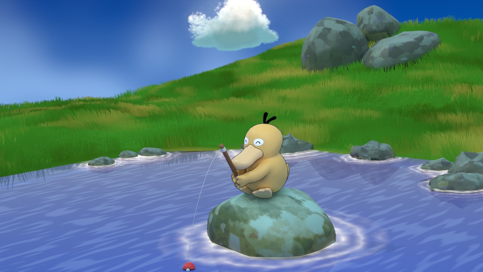
Grease pencil outlining technic made my render much more cartoonish and I am very happy with the result.
2/20
I completed overall composition and feeling good about it.
Still, this render feels too empty. I'm planning to put some kind of tree or house on the left side, but not quite sure about the other areas.
What do you guys think? should I put more things or shoud I leave it simple to draw focus on my psyduck?
I think it looks great. I might move the cloud over so your eye has something to focus on in that corner but other than that it looks really good. Not to busy. And Psyduck really stands out against the blue and green.
This is great! Really neat artistic style. I don't see blender used this way very often, but I love it when I do.
Love the concept so much. Remind me of a "Wish you were here" holiday postcard 🥰
Agree with Wendy re the cloud. Perhaps move it to the left and add more clouds so a single cloud does not stand out too much. And perhaps crop the image a bit to follow rule of third.
2/21
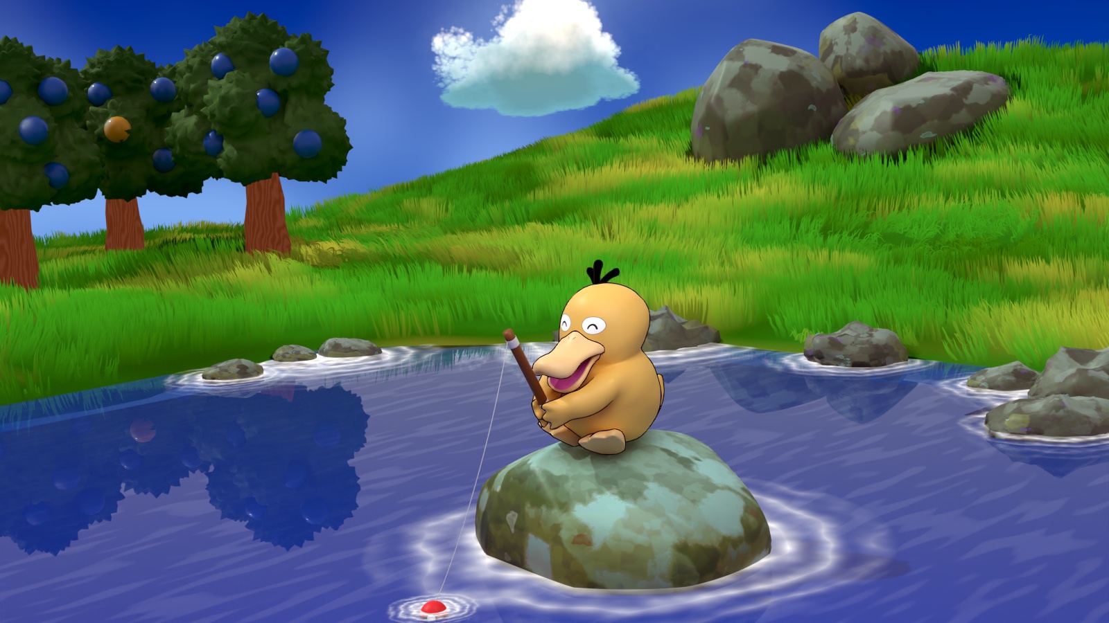
Still image was rendered in Cycles and animation was rendered in Eevee.
I'm done. Hooray! Thanks to all members who read my thread. your comments and hearts were energy that kept me moving forward. Doing a challenge was a nice reviewing process for what I've learned so far.