Yeah! another polybook.
Thanks for taking the time to share your work,
the community will be happy to offer any guidance, and feedback you need to support your learning journey.
You made an awesome start with the sci fi crate, it looks great.
Keep it up,
Happy Blending.
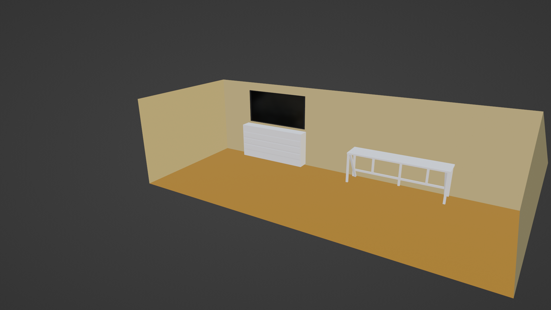
WIP of my low poly room. Got a pretty good start.
I know its probably in a further lesson, but if anyone can give me a quick way to use a noise texture or something to model the floor to make it look like a rug. Also, the top of the desk is wood-like and not sure how to mkae it blend 2 colors into the swirly wood varnish like a desk.

...not sure how to mkae it blend 2 colors into the swirly wood
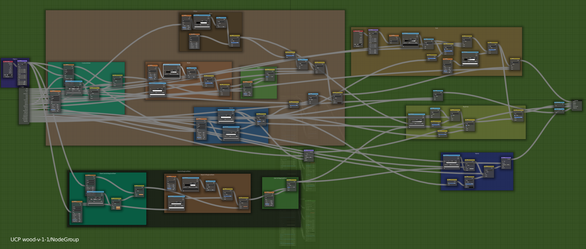
that is rather advanced! There is the Shader Forge series:
https://cgcookie.com/course/shader-forge
that has a wood chapter...but to give you an idea, this is what you might be looking at when making wood:
 More or less the same story with the rug...a simple Noise Texture will not make it look anywhere near a rug...just keep it simple for now, I'd suggest.
Keep doing what you're doing; you're on the right track!
That's one big room. Enough space to do backflips and cartwheels across the room. And play DDR on PlayStation in front of large screen tv.
I think the rules of the exercise stated 50 or less approximately 10 items.
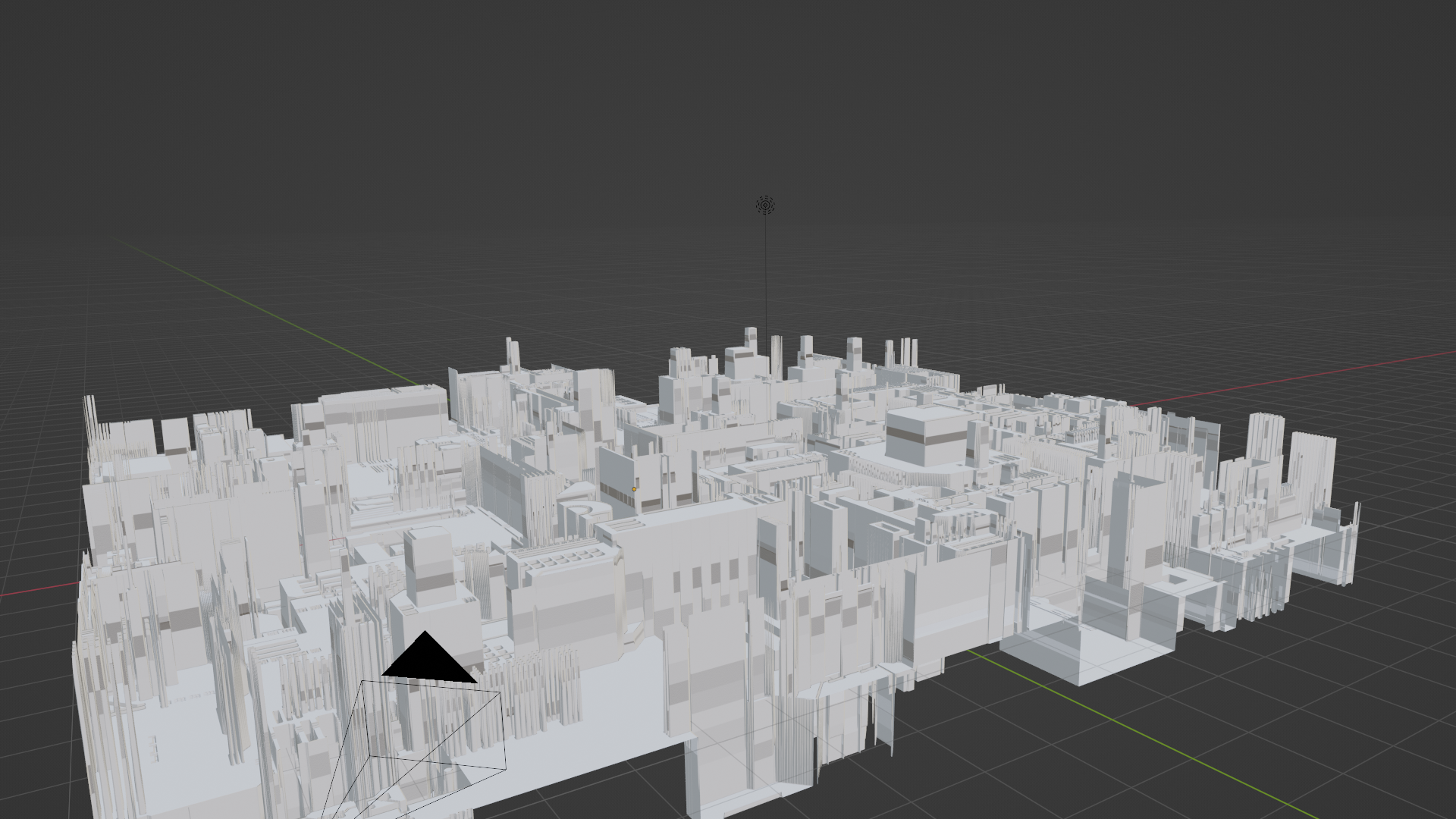
New WIP - Used JSPlacement to make the plane look like a city. Thinking about putting a very large building in the middle as a focal point. Maybe with a light sphere coming from it, almost as if that building gives all the light for the city. There are still somethings Im not sure of. Trying to find the right position. should I put the camera at building level and look up, or at structure level looking over the city. Would also like to somehow find a way to procedurally generate small lights around the city, so its not completely dark. Ive got a concept, but there are still things Im not sure of how to accomplish.