Maybe something like this:
In Level 2, the two-faced Janus must collect enough (22) bottles of champagne before the time runs out...so, for instance, with 20 seconds left, the bottle counter can jump from 21 to 22...I'll see if I can add some fireworks upon his succeeding....
It will at least be a more complex maze, with perhaps some dangerously slippery frozen parts...
Very simple and crude first test, because I was curious to see if pixelated fireworks could be made to look anywhere near acceptable...I am happily surprised:
 No motion blur used, that effect is just a happy coincidence, which I don't really understand to be honest...
Also a first draft of Janus and a bottle...does not look good yet:
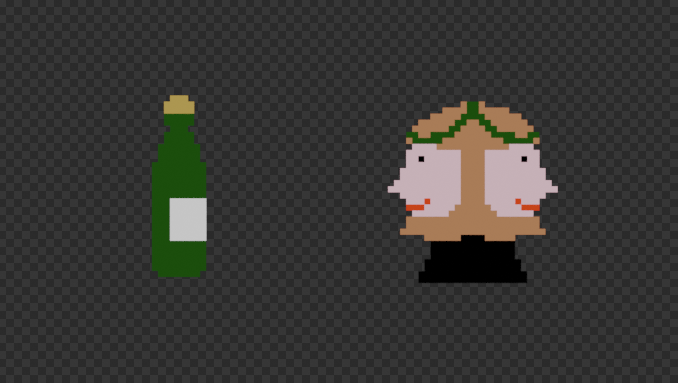 but now I will start working on the maze, so that I can block out some 'animation' with these models; I will not be able to use Blender around Christmas, so I will have to get most work done before friday...
Just looked at the individual frames and no frame has that motion blur effect; it's the so-called positive after image effect, caused by a short exposure to a very bright light (against the black background).
Like the idea. You did a good job coming up with an idea for the two challenges so they build off each other.
Thanks ttanya53 , glad you like it.
Another lucky coincidence; when I started the first one, I wasn't thinking about part 2...in fact I wasn't even expecting to be able to participate in the second GIF Challenge. Only when I made the Level 1 text (which was originally supposed to be Level 0), I thought there might be a Level 2...
Testing:
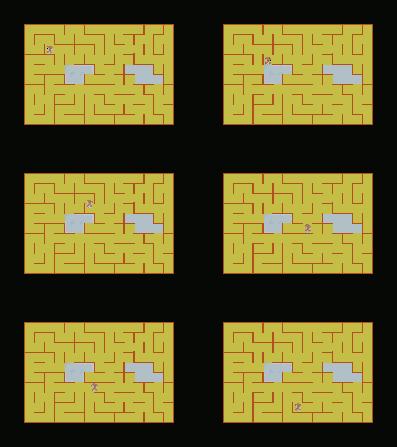 Having a more complex maze, means I have less pixels for the main character (here I used 28 x 28), and I haven't been able to fit legs in (at least not yet):
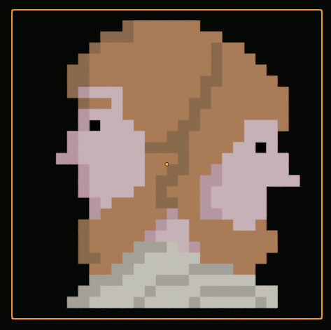 When I had it moving 1 unit per frame it looked too much like the head was sliding, so I tried moving it 2 units per frame and that looks a lot better, I think.
I will probably change the route, with Janus coming from the left horizontally, so that he is longer on the ice and that it will hopefully be clearer that he slips and dies there...
This will have to do, time's up:
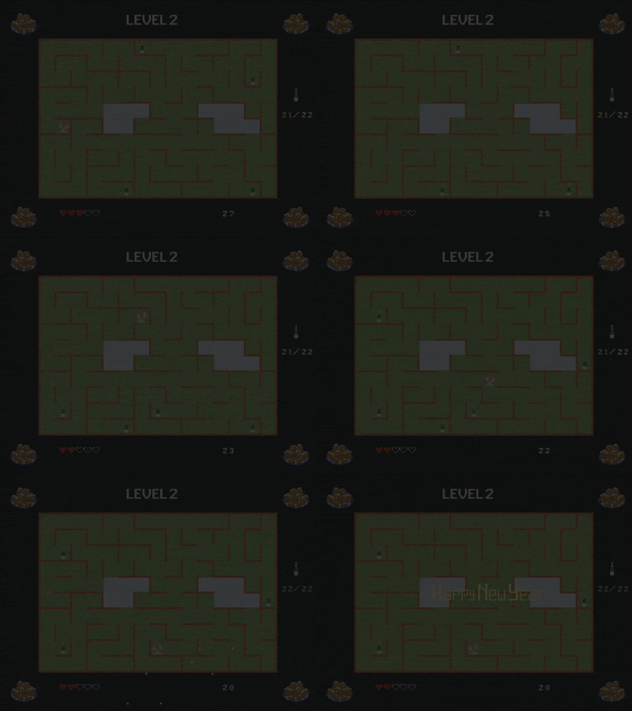
There is a lot that could be improved, but the message is clear, I hope :)
The corner images are a dutch new year specialty, called 'oliebollen'.
And here's a 'fixed' version:
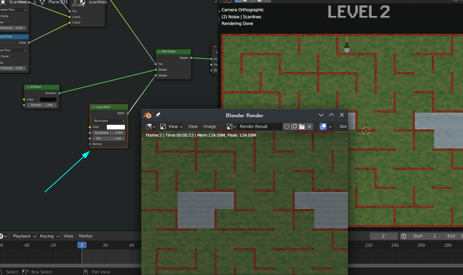
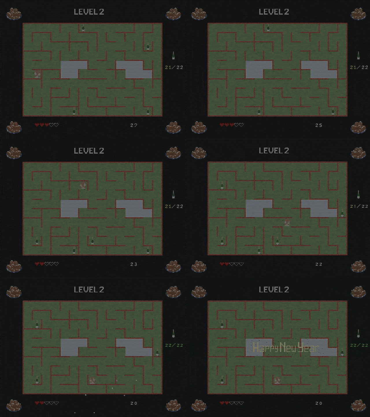 Still don't understand what was causing it, but I got some weird noise in the Renders, something to do with transparency:
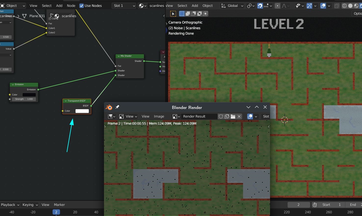 rendering the Scanlines seperately made everything darker (I don't remember how I solved it with the Christmas GIF)...
But switching the Transparent Shader for a Glass Shader with IOR = 1, did the trick:
