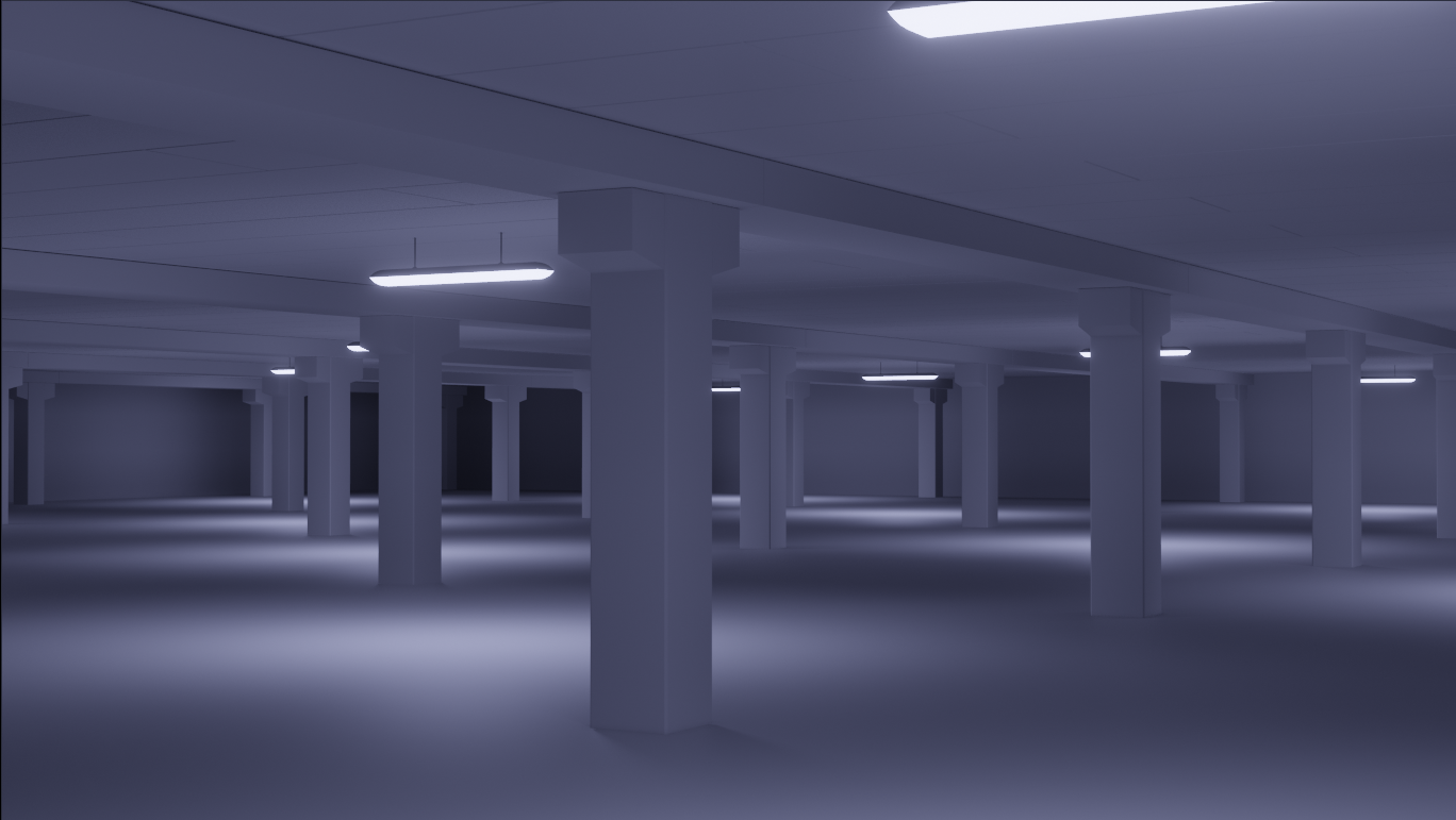
Have started with the Industrial Environment:
And also began the, already legendary, Human course:
I haven't done a lot of sculpting yet in my years using Blender (or before...), but this is so much fun and under the fantastic guidance of @theluthier I am able to overcome my fears and sure rise above myself.
The ears are terrible, but I always have had trouble using the Snake Hook Brush. Maybe they will be good enough as a blockout and if not, I will simply start again from scratch (I can use the practice...).
I am SO GLAD to read this ![]() spikeyxxx! I hope you don't mind me saying I suspected organics / sculpting maybe wasn't your thing. And I'm absolutely thrilled to see you attempting it anyway AND making excellent progress already! Please keep updating through your progress 🙏
spikeyxxx! I hope you don't mind me saying I suspected organics / sculpting maybe wasn't your thing. And I'm absolutely thrilled to see you attempting it anyway AND making excellent progress already! Please keep updating through your progress 🙏
Tanks @theluthier !
I suspected organics / sculpting maybe wasn't your thing.
It is one of my dreams to be able to make something like this, but I always though that I was not ready, technically capable yet...
With this course you give me the confidence to get out of my comfort zone and I have already amazed myself as to what I can acchieve with (so far) very little effort !
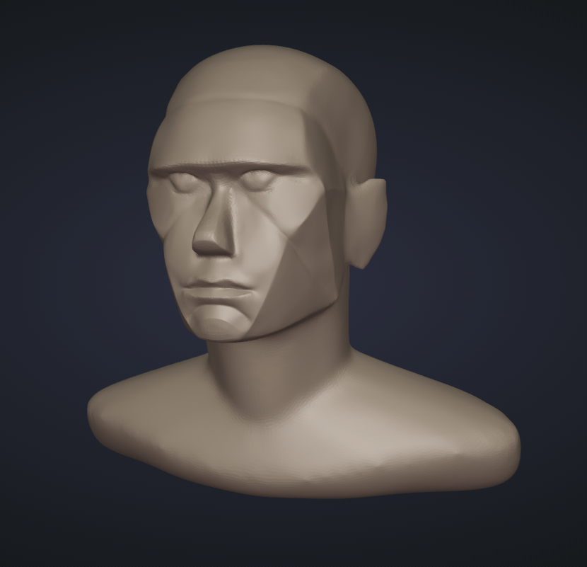
@theluthier some time has passed and after starting over quite a few times I finally finished my first sculpt:

Far from perfect, but I think I can work with this and continue the course to make my first portrait. For me this was the hardest part of the course, but thanks to you I managed to do something I didn't think I could. You transformed me from someone who wanted to sculpt,
but was afraid to do so, into feeling much more confident to plug in my tablet and start sculpting away.
Facial features swap:

A more feminine version:

A toddler:

And a weight comparison:

(This was originally several posts, but I messed up and deleted the images in this sites image browser, but that also deleted them from the posts (stupid me!) and editing the answer does't let you add images, so I had to delete them and make a new one.)
@theluthier (just in case the copy/paste version doesn't work)
![]() spikeyxxx You're really doing well with these faces! Remind me: Is this your first human head sculpting experience?? I wouldn't guess it was if so..
spikeyxxx You're really doing well with these faces! Remind me: Is this your first human head sculpting experience?? I wouldn't guess it was if so..
The number 1 thing that stands out to me is a case of "flat face": 
There's a definitive planar quality to all the facial features that makes the face feel less integrated into the head as a whole. I've seen this happen enough times with HUMAN student results that I'm starting to wonder if there's something in the videos leading people this way.
But it can be fixed fairly easily by pulling the "corners" of the face plane (outside brow, cheekbone, corner of the mouth) backward to give the face a subtle curvature from a top angle:

I would do this with a large grab brush + smooth falloff but you could also do this with a lattice as well. In fact, could you supply me your .blend file? I'm strongly considering adding a clip about this into one of the chapter 1 videos.
@theluthier Thanks a lot! This is my first head sculpting apart from my 'long hair' model, which was mainly for grooming long hair from your course (and the head looked terrible, see my Gallery).
You are so right about the flatness; I especially noticed getting into problems when making the child version. It easily became too flat.
Anyway, here is my file: https://drive.google.com/file/d/13CTYTHG86asYfXwN2sKSQxkJVAqC18Py/view?usp=sharing
@theluthier
Actually this is a better version (used the wrong head in the other file, so that the eyes didn't match...):
https://drive.google.com/file/d/1mIqNpyKiJka3bSra7ICFmszeTRwfWV2R/view?usp=sharing
When in side ortho view (I moved the whole head slightly forward to match the Annotations) it actually looks pretty close to the original lines:

![]() spikeyxxx Thanks for the .blend file! Here's a gif of what I mean by rounding the front of the face more, done easily with a lattice:
spikeyxxx Thanks for the .blend file! Here's a gif of what I mean by rounding the front of the face more, done easily with a lattice:

I really don't think it's anything you did "wrong" but rather an imperfect aspect of the head planes formula. The formula does a lot for getting a head blockout close - let's say 90%. It's an amazing tool especially for newer head sculptors. But my experience says that inevitably the final 10% of shaping is refined after the formula in perspective view by thoroughly analyzing the head from every angle, comparing it to photographic reference.
This is never a popular bit of advice but feel is a very reliable tool. I think everyone, regardless of skill, can feel when a head is slightly unnatrual/off - as you said you noticed especially during the child sculpt. Only after sculpting many heads and developing a familiarity does it become easier to know exactly why a head feels off. Flat face is very common and immediately noticeable to me.
Aside from the formula, I see flat face commonly result from an over-dependence on front and side photos. This is how I started modeling heads. I would always end up flat faced despite my model matching my photos perfectly. It's very frustrating thinking "it matches. It should be perfect. But it looks bad in perspective which is the only view that actually matters in the end". So I learned that, like the formula, front and side photos is good for getting started but it's unwise to rely on it too much.
@theluthier excellent! Thank you so much!
That is a super easy fix with the Lattice. With my next versions I will be more aware of this flatness problem, but for now I can just use this fix and carry on with the retopology (which I like) and work my way through to the end.
Feel is definitely a reliable tool, the thing is, you know/feel something's off, but to pin point what it is exactly can be difficult (especially for a beginner like me), but luckily we have you 👍🏻
If you have a hard surface model, you can (and this is done in real life) use front, side and top orthographic drawings to construct something, but with organic forms that doesn't work at all 😒
@theluthier first render test for pore depth (too late, I know), much room for improvement, but it'll have to do for now (had a lot of trouble with the eyelids after that Lattice trick, lol):

Started with the eyeball, trying to make my own procedural texture, the iris is getting there I think. Still a bit of a messy Nodetree, but I'll clean that up later:

First skin material test:

Made a comparison between Random Walk with and without "fixed radius' and I think I like the fixed radius more.
And with different lighting:

I'll do some more renders with different lighting and camera angles and then move on. Can revisit the skin later, when I have more context.
![]() spikeyxxx You're continuing to make great progress. The skin tone difference is substantial between your latest two renders. Is lighting really the only difference?
spikeyxxx You're continuing to make great progress. The skin tone difference is substantial between your latest two renders. Is lighting really the only difference?
Your iris procedural looks good aside from this highlighted pattern which looks unintegrated into the broader pattern: 
Blend that in a bit more and I think it's 👍
Your eyes have an awkward look right now. Like they're kinda wired and looking at something on the ground. Here's what I suggest:

In the course I left my eyes too wide for a long time (giving it a "wired" look) but eventually fixed it.
Thanks @theluthier!
Indeed only the lighting is changed.
I already improved the iris material and it looks better (I first added it on top of the main pattern, but now I take the maximum, which makes it look more incorporated..I will probably tweak it later, but for now I'm okay with it).
The eyes have been buging me from the beginning, but now I put a damped track constraint on them, pointing at an Empty, so I can easily adjust there focus (and they are indeed looking down in those two renders). I havent even adjusted the eyelids for the bulge in the eyes yet, as I'm not happy yet with their rotation. But you gave me a good idea, to not only rotate the eyes, but also raise the lower eyelid!
There is so much to improve, but my main focus is to get an acceptable portrait now and then make another one (or two, or....) with everything I've learned in this process.
It is defifnitely an excellent course, when you see what even I can make :)
Spend all day on the eyes (including meniscus and eyelashes):

Might still need some work (surely the caruncle!), but I want to move on.
@theluthier while working on my hoodie fuzz, I got extreme bald patches across the whole cloth. Not a triangulation problem! But I found what caused it; my hoodie has thickness and when simplifying the situation:

All hairs have the same length, but when using Interpolated Children, they are interpolating between opposite hairs and they not only interpolate the position, but also their direction, resulting in:

To further demonstrate:

So I made a Vertex Group from visible Verts, something like this:

Which solved the patchiness (although hard to see here):

But you had also problems in the 'double surface' area on the rim of the hood, that might have a similar cause.
![]() spikeyxxx Your troubleshooting with the hoodie fuzz patchiness is amazing! The children interpolating their length between opposite-surface-facing parent hairs...never would have guessed. Brilliant work 👏
spikeyxxx Your troubleshooting with the hoodie fuzz patchiness is amazing! The children interpolating their length between opposite-surface-facing parent hairs...never would have guessed. Brilliant work 👏
Your eye looks a lot better looking forward instead of down. The iris texture looks really nice too. Only notes I have would be to:

Sorry to focus in on the eyes so much. They have a lot of control over the effectiveness of a portrait. I'll give them a break though 😅 Hoodie looks amazing so far btw
Okay, far from finished, but already becoming 'presentable' (apart from the abominations where the eyebrows are supposed to be):

