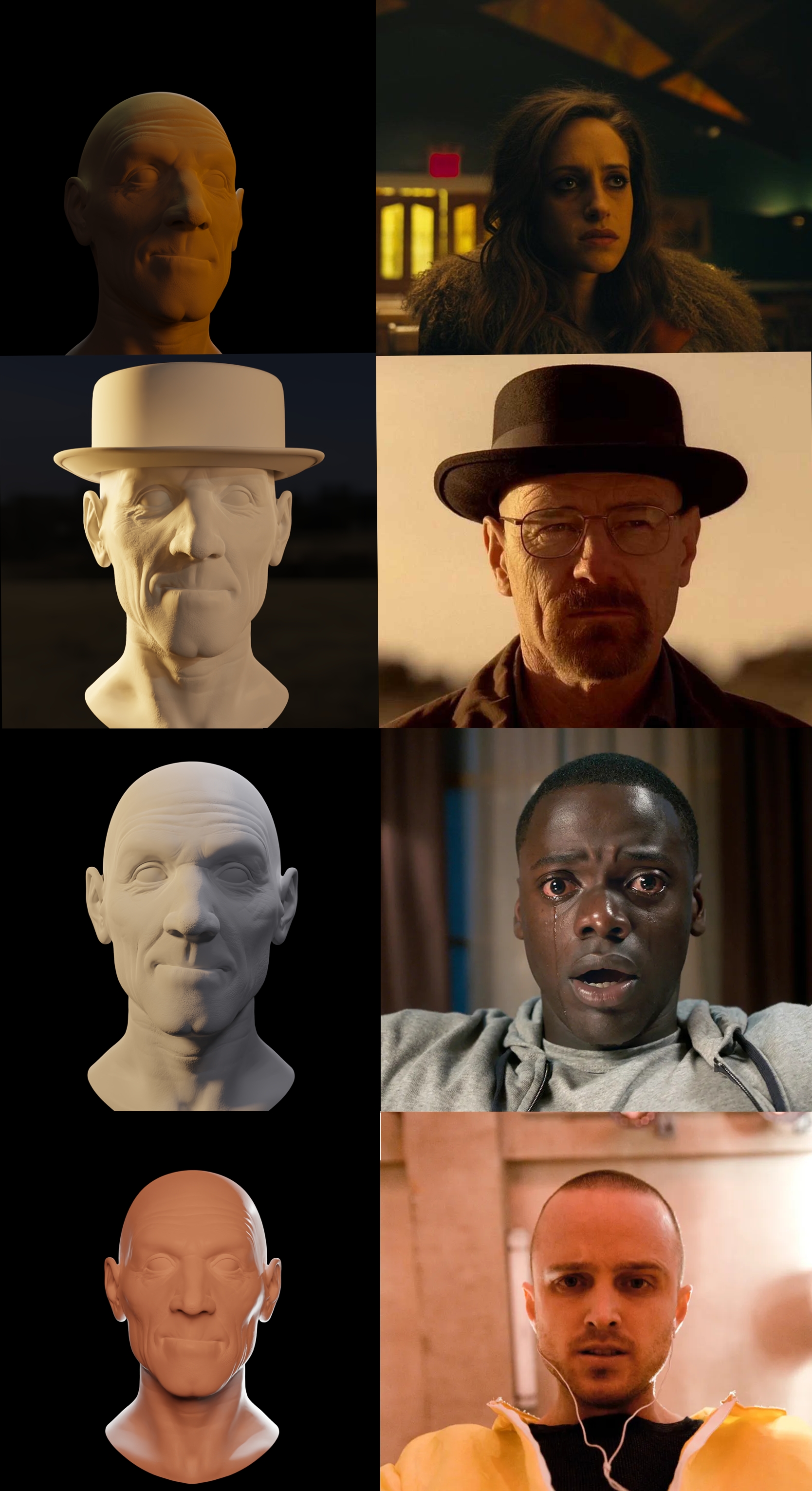
This is the result of the final exercise in the Fundamentals of Digital Lighting course, I will try from now to post here my personal progress. It was a little bit complicate to achieve this result, and I still not completely happy with it, but I appreciate any advice.

Nice work, personally i find those really accurate! Maybe on the last one, the eyes are missing a shadow.
Yeah, I fill that something is missing in the last one, I wasn't sure to upload it, but I did it to get feedback, I will try your advice, thanks.
Really good work ![]() ericyec ,
ericyec ,
The last one, the light screen right, maybe should be moved more behind the character, see how the light just catches the edge of the silhouette without casting light on the cheek and neck. The light on the other side should be a softer fill light just to remove harsh shadows. The darkening around the eyes is probably more makeup than shadow, the depth of the eye from the brow will also make a difference.
The second one, the fill light screen right, could be a little softer, there is still shadow across the face, yours is a little too bright.
Well done.
Thank you for all the advices, @adrian2301 those were the exercises that takes me more time, in the last one i couldn't figured out how to fix those errors. I will prove what you have mention on your comment. Thank you so much.