I've always had an interest in vfx and video games, and to have access to the tools to create these things is amazing! Like many people, I started my Blender journey with the Donut Tutorial from Blender Guru. That was a great start, but I wanted more, CGCookie is the place for all the learning I could ask for. So now it's time to keep a record of all the things I create along the way, to measure my progress and push my inspiration forward. Lets GOOO!
This course has been amazing so far, I’ve never really payed attention to just how important lighting is for a scene. Cycles was always my go to render engine, but now I can do so much more with Eevee and that’s exciting! Thank you so much CGCookie and @jlampel for this experience.
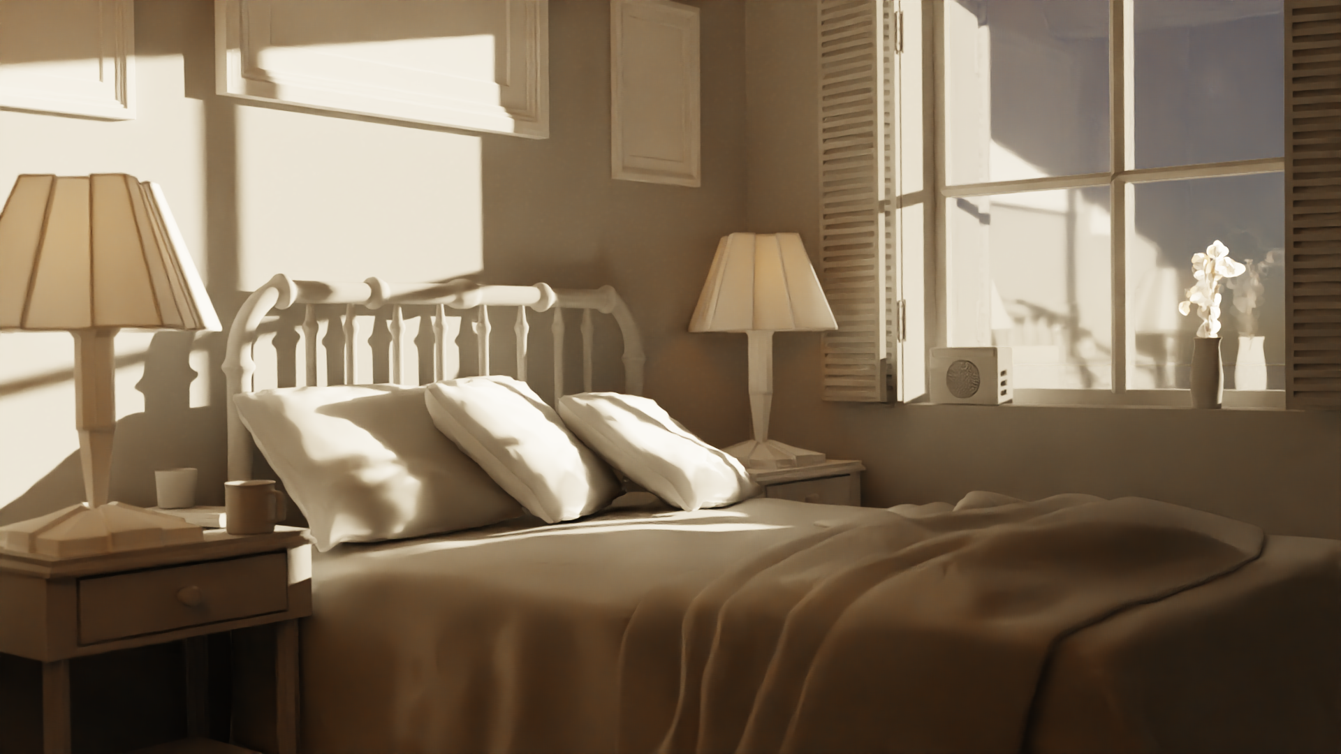 Cycles Sunrise
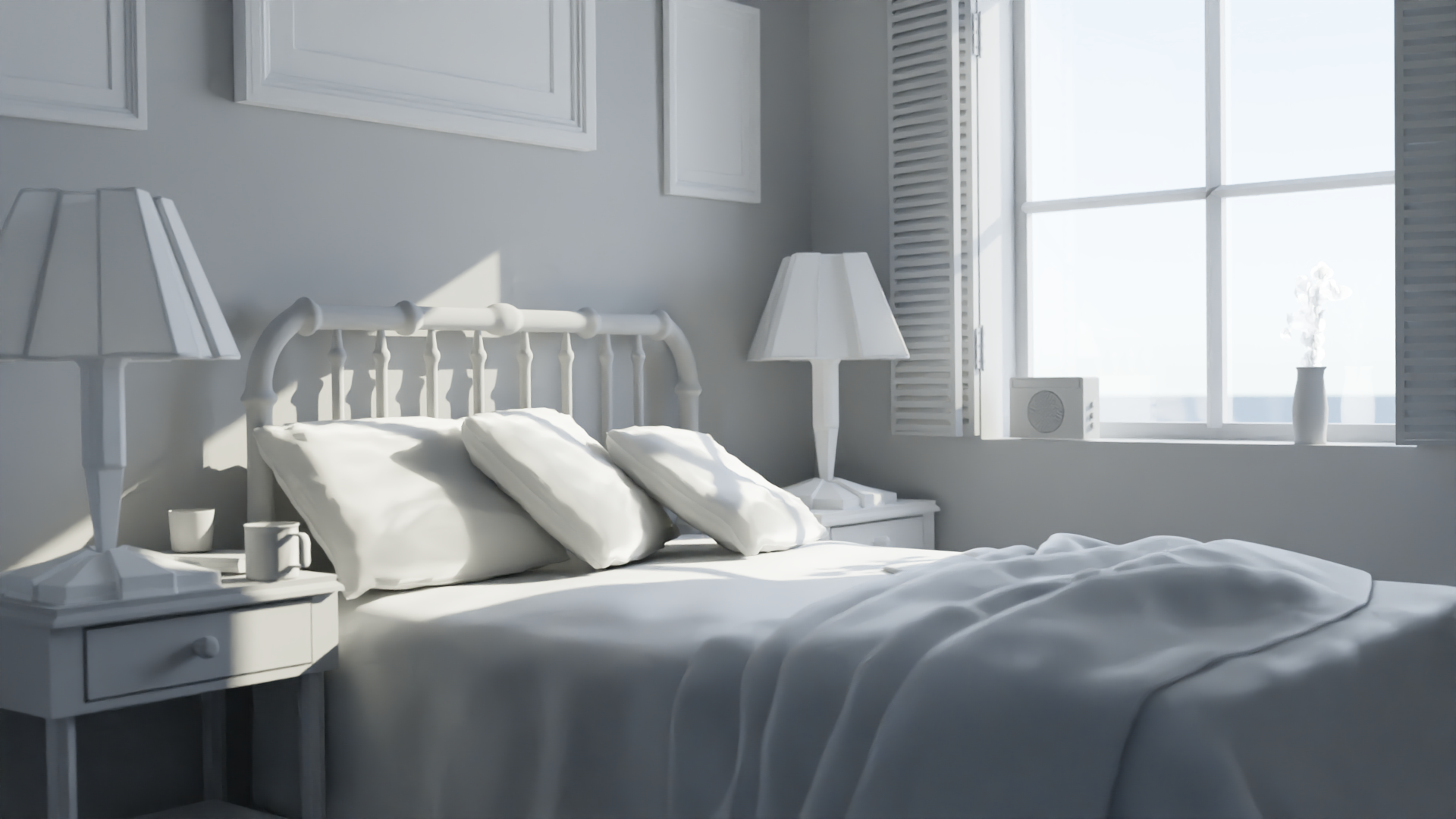 Cycles Day
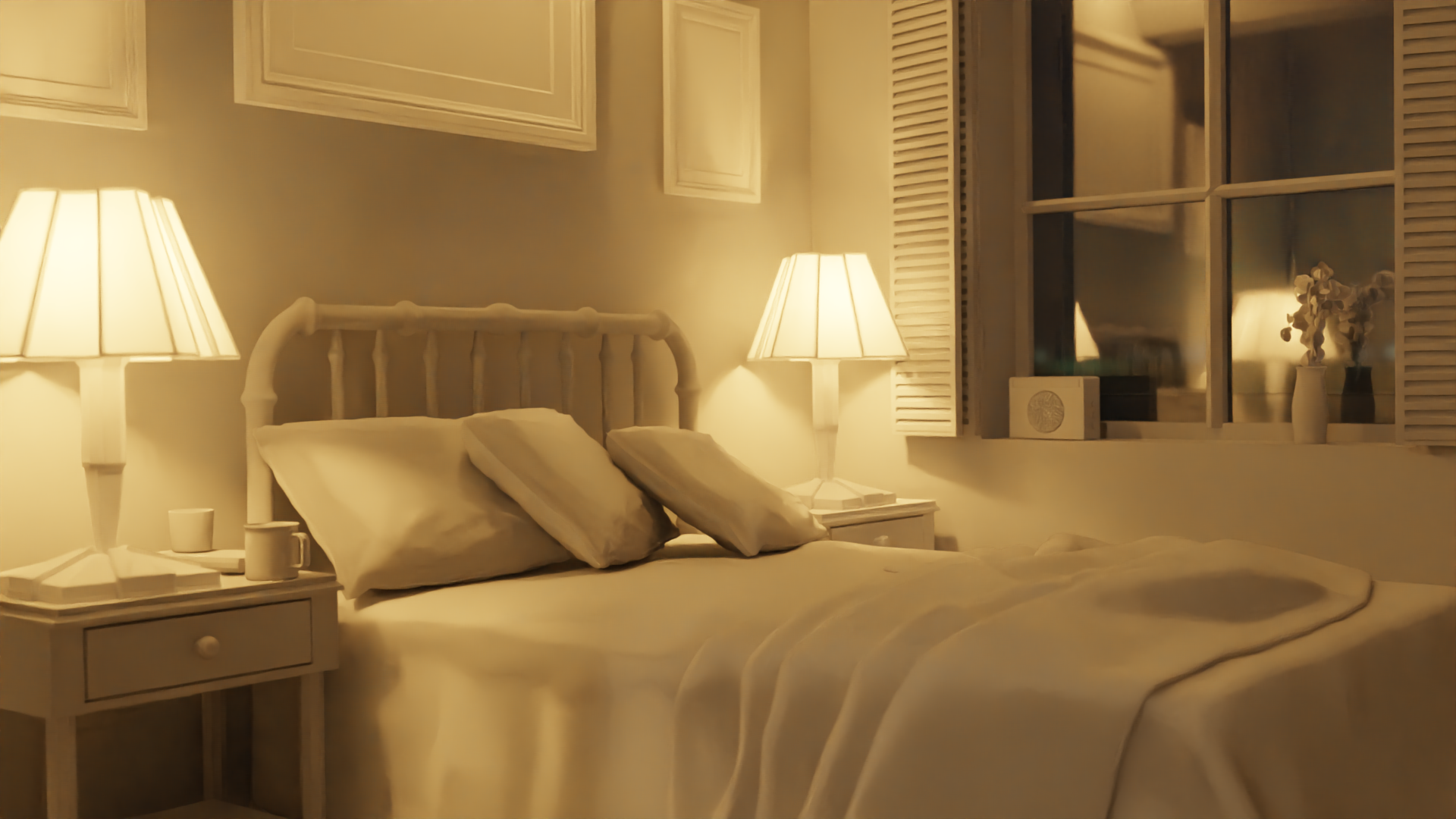 Cycles Night
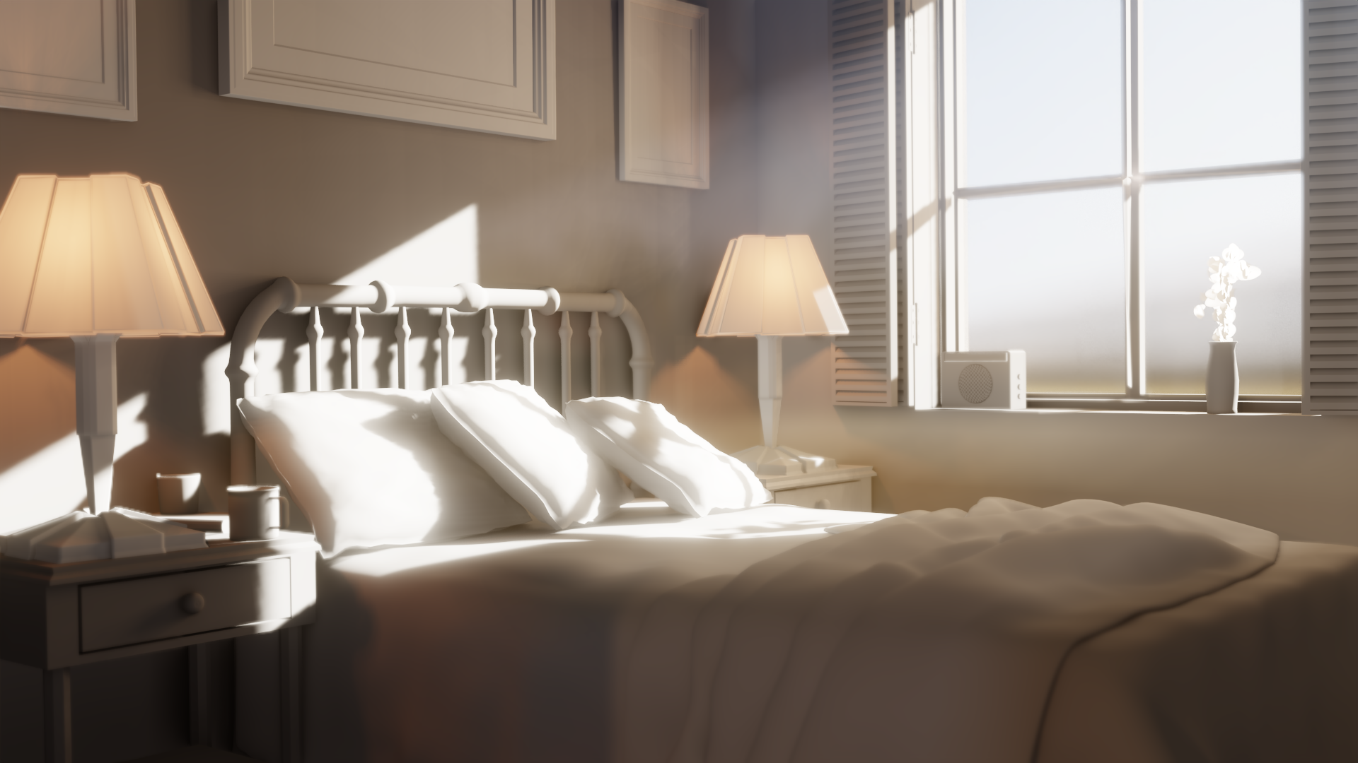 Eevee Day
Nice results for the lighting course. If you want to see more of what Eevee can do check out Create Realistic Industrial Environment with Blender and Eevee , you will love the lessons on lighting.
CGCookie is the place for all the learning I could ask for.
Your not alone, it really is so great.
Glad to see you start this thread to help keep you motivated and document your progress. Its good to look back over your work and see what you could do better after every course. Getting feedback will also help the learning process.
Keep it up, I look forward to see what else you create.
This project was fun primarily in its simplicity, no need to worry about your materials looking realistic, just pure modeling and fun. Like playing with lego bricks you built.
 Low Poly Bedroom
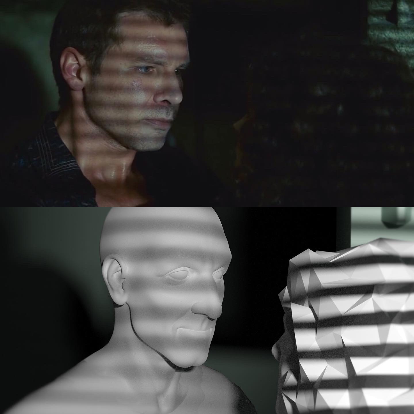
This is for the Fundamentals of Lighting Course, @jlampel asked us to create at least 5 different examples of matching lighting from reference photos. This was lots of fun and it has really opened my eyes to just how powerful lighting can be, it can make or break a scene.
Let me know how I did, or if I should improve in any area. Thank you
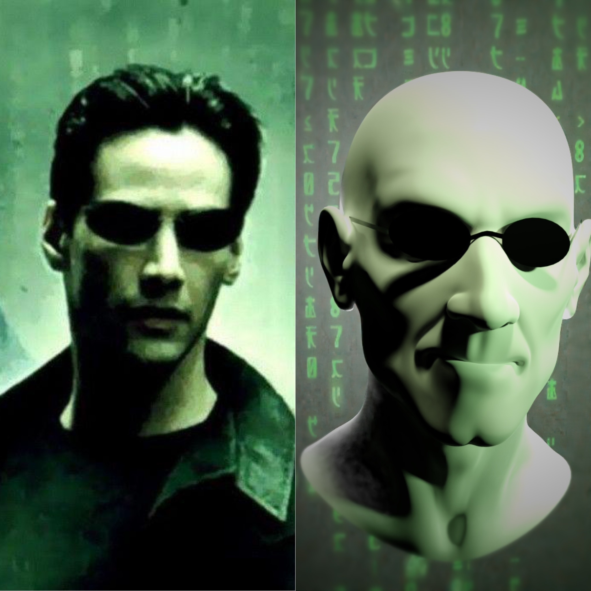
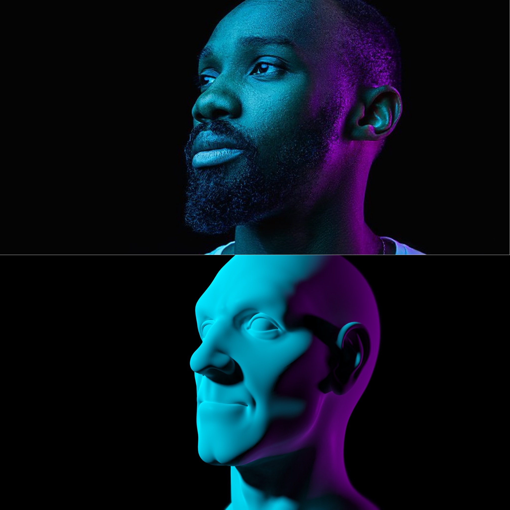
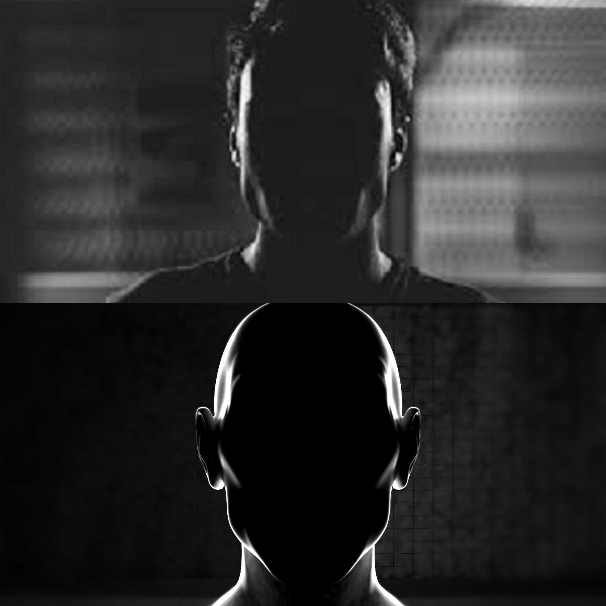
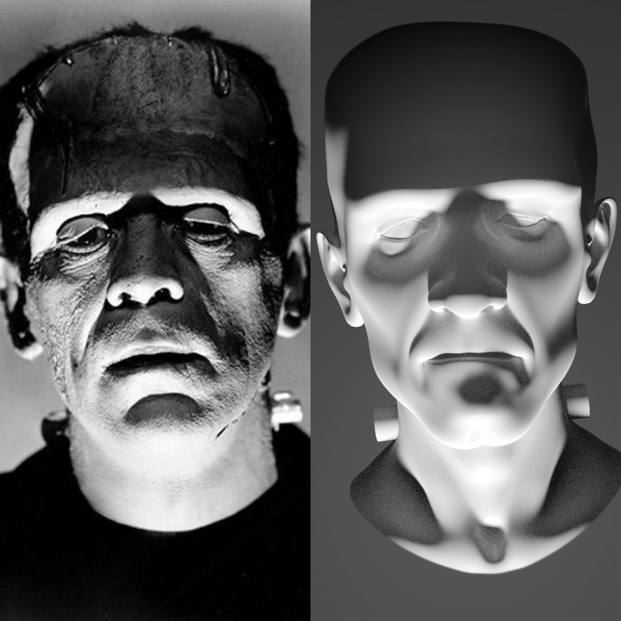
Really nice work ![]() flyntot
flyntot
You have a good lighting match on all these.
I would say though the angle of the light is a little off, take Neo from the Matrix for example, the shadow on the neck of the original is more to the front whereas yours is to the side, suggesting the light should be more from above.
Quite often I see one main light, when there should be perhaps two or even three lights in total. The second image is obvious there is more than one light, look at Neo again, his right ear and cheek receive more light than your image, perhaps a fill light on screen left slightly behind the subject.
The third image, I can just about make out the features in the face and its grey whereas yours is I can't see any features and is darker. Probably because of bounce light. Too match this, a very dim light in front but far from the face just to lift the shadow slightly.
Frankenstein's Monster, difficult to match the shadows because there is an obvious difference in the shapes. See around the eyes, you have shadow under the eyes and no shadow above, whereas the original is opposite. Also a fill light above the forehead perhaps.
Finally, the angle of the main light, you have from right of the camera position, almost behind the woman, going by the shadow line on her nose. Maybe the light should be left of the camera and not quite as bright. See his far eye, cheek and the top lip, generally the far side of the face, it should be a little more in shadow.
I am impressed with the effort you put in to recreate not just the lighting but also the models. Well done.
Nice work Chris, these are looking good! I agree with @adrian2301 's notes above. The only think I'll add is that on #2 the transition between the different colors of light is very soft in the reference but pretty harsh in the render.
Hope this exercise got you experimenting a bit and congrats on finishing the course!