@jlampel
1.Ben Stiller
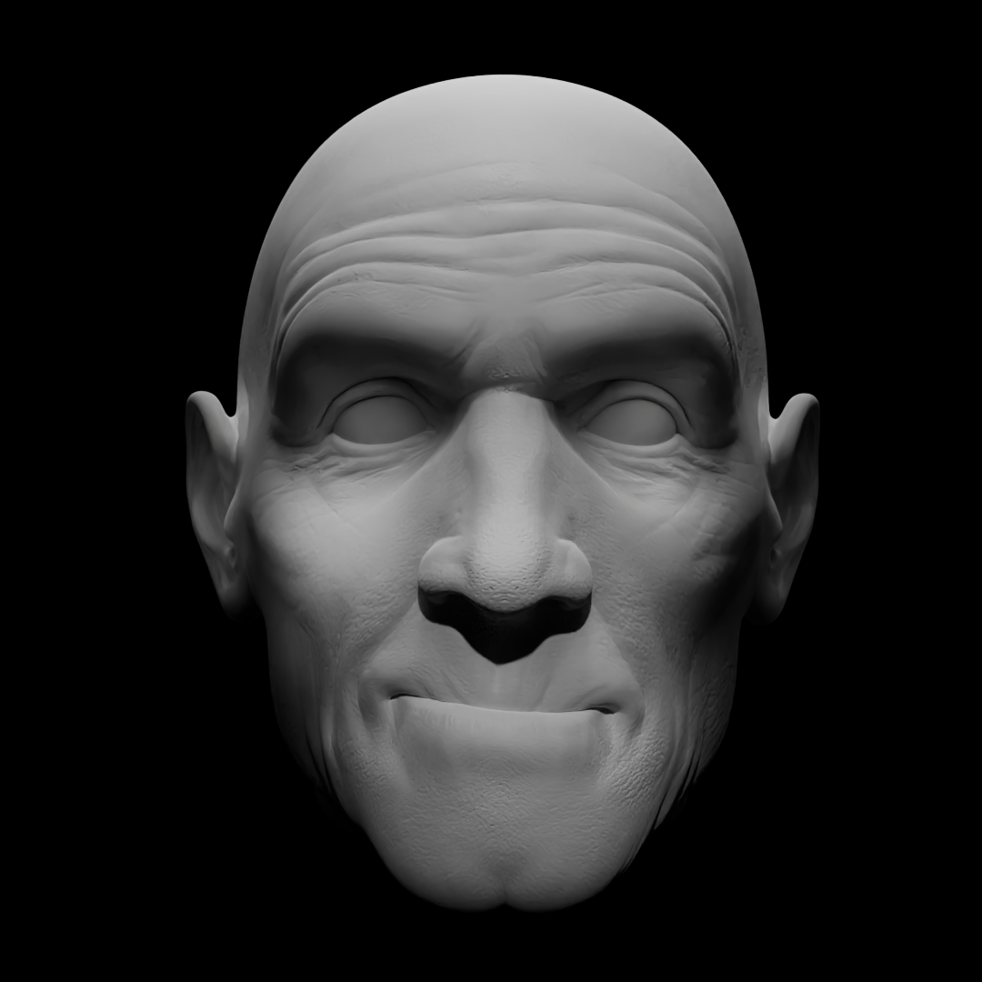
I started with a monochrome picture of Ben Stiller's face. I put a lot of effort into meeting the contrast. I used four different spotlights to light his face and two small point light for his ears. But it was hard to co-exist between the really dark and the really bright. So I ended with a pretty dull result.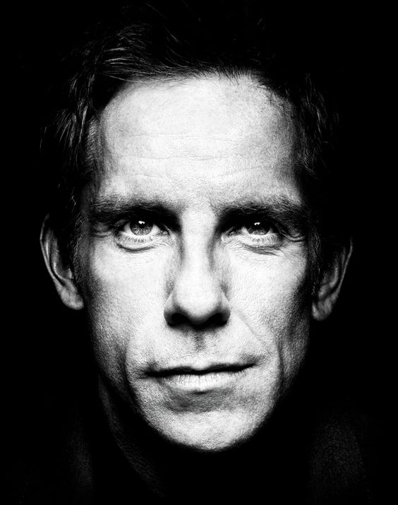
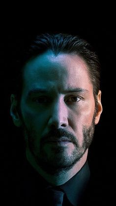
2. Christoph Waltz
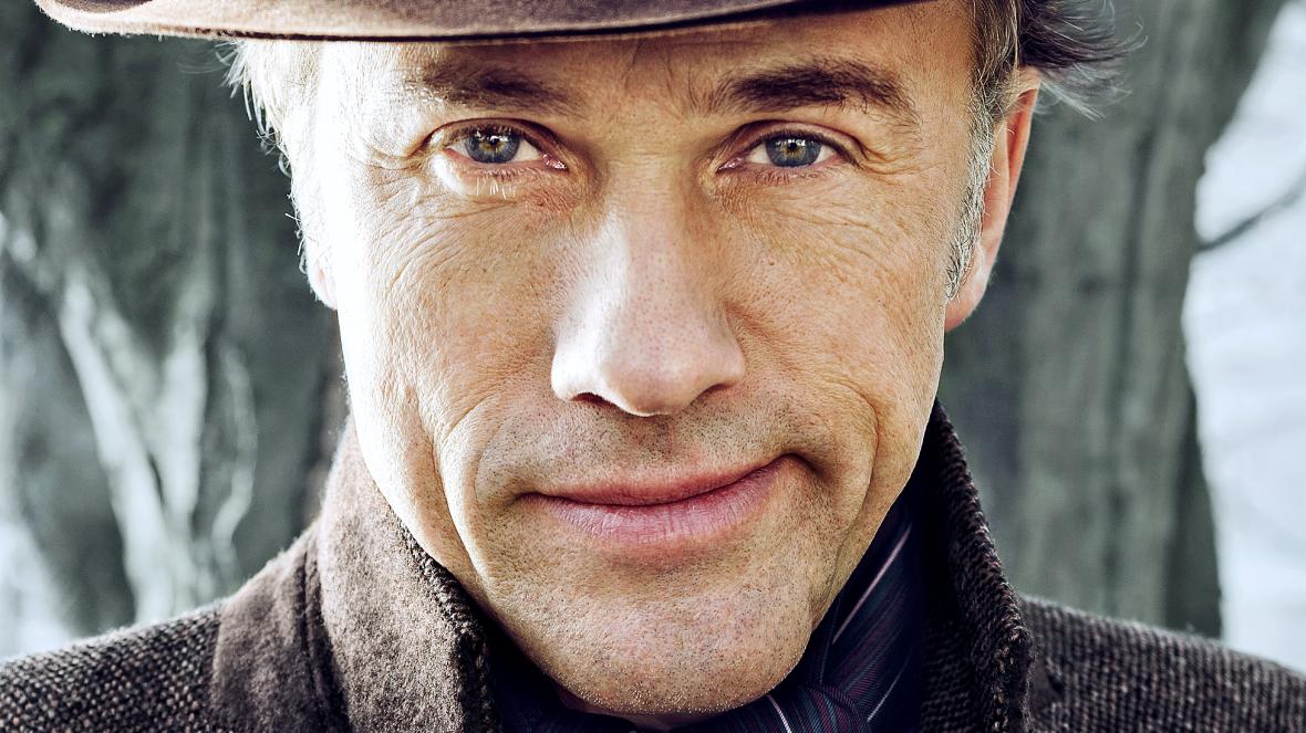
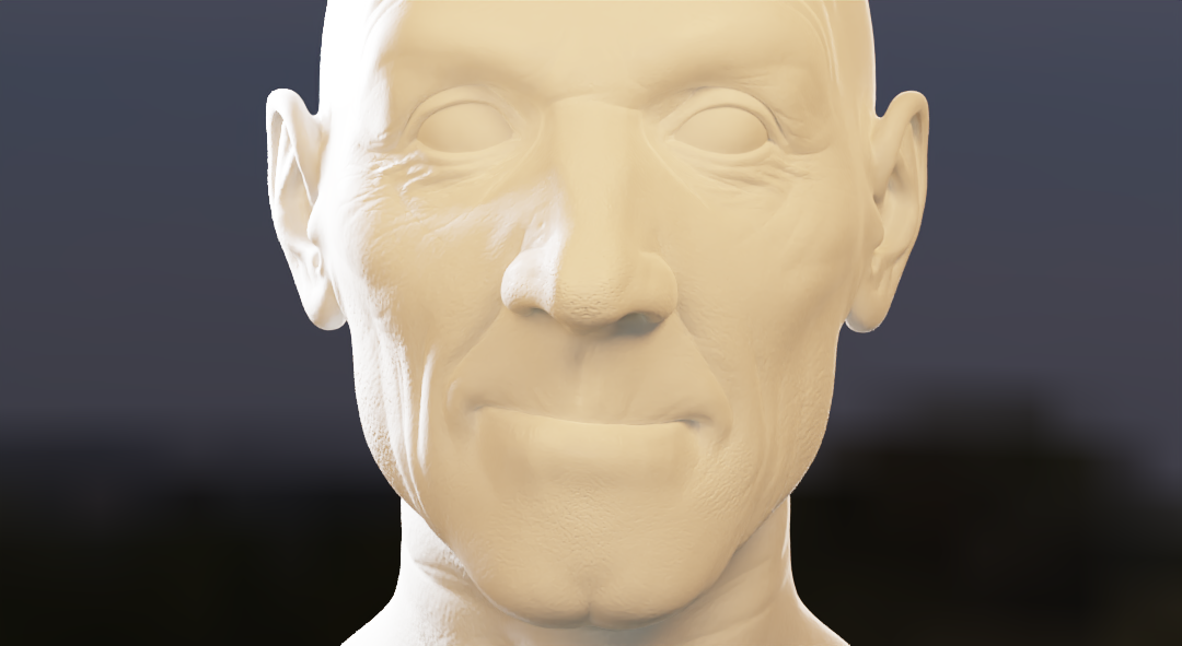
Next, I tried Christoph Waltz with a bright background. This time I used HDRI. This was a relatively easy task. I don't know whether the white part of the original picture is made of sunlight or artificial lighting, I used the point light because, it was impossible to bleach out his left face without bleaching out his whole face.
3. John Wick
This one was tough. In the reference photo, John Wick has a very shiny face, so I could contour his face with reflected light , but I couldn't reproduce that. Also, the blue part of his face is bigger at his neck and forehead but not on his nose. By the way, I don't know why the strange boundary line on the eye was drawn.

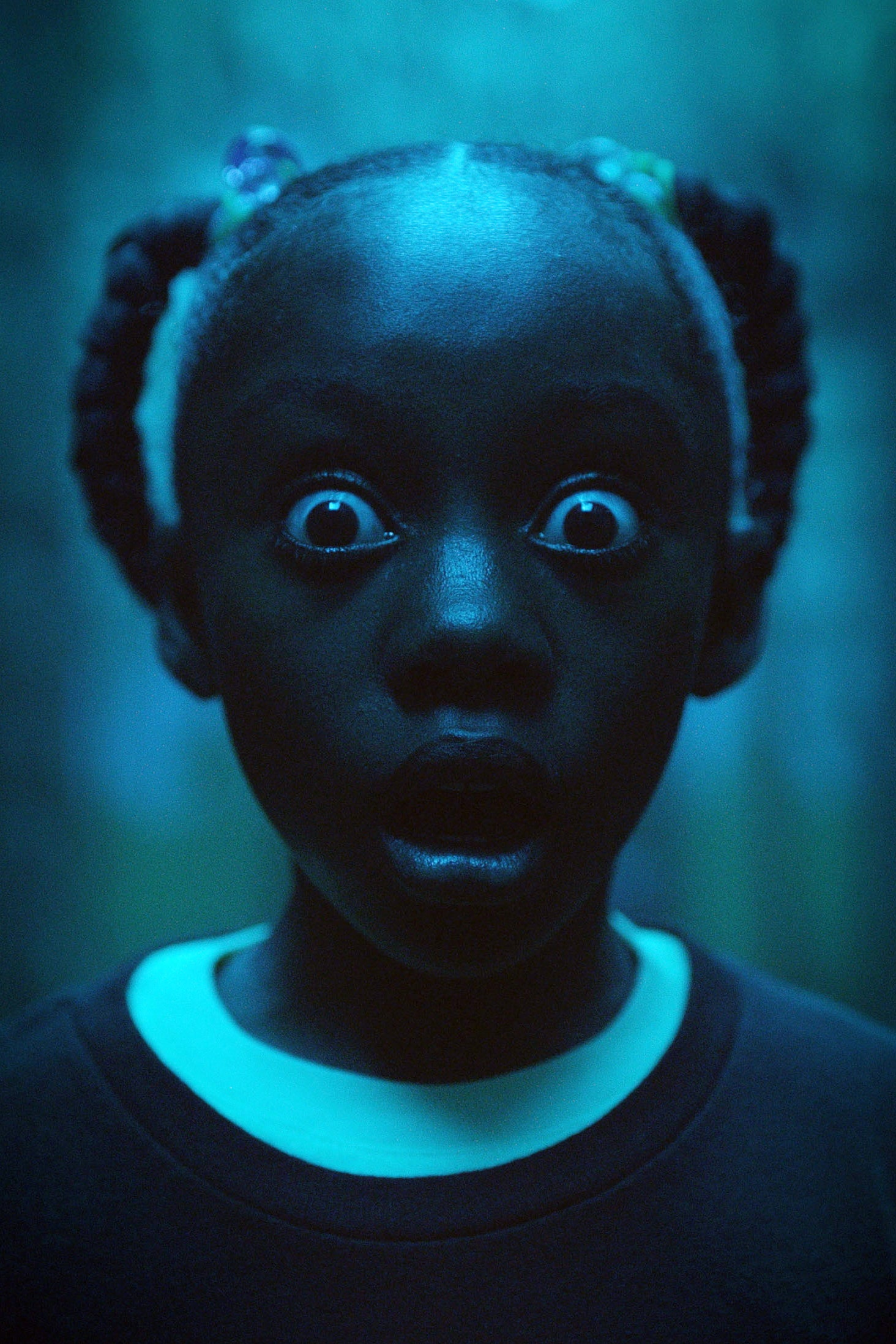
4. Us
Although I don't know much about this movie, I found this picture is very good for my practice and I think It's the best lighting I've done.
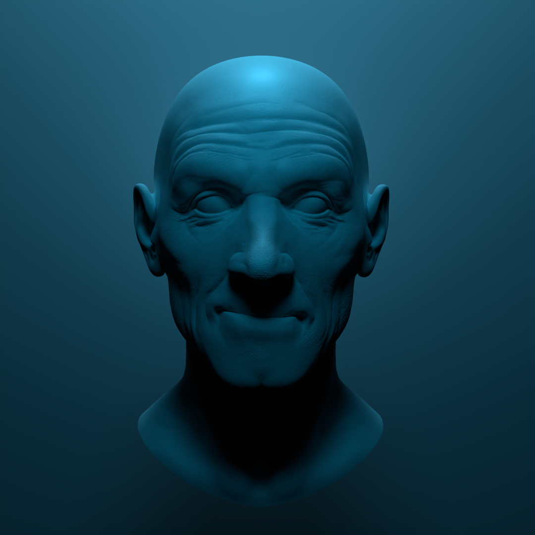
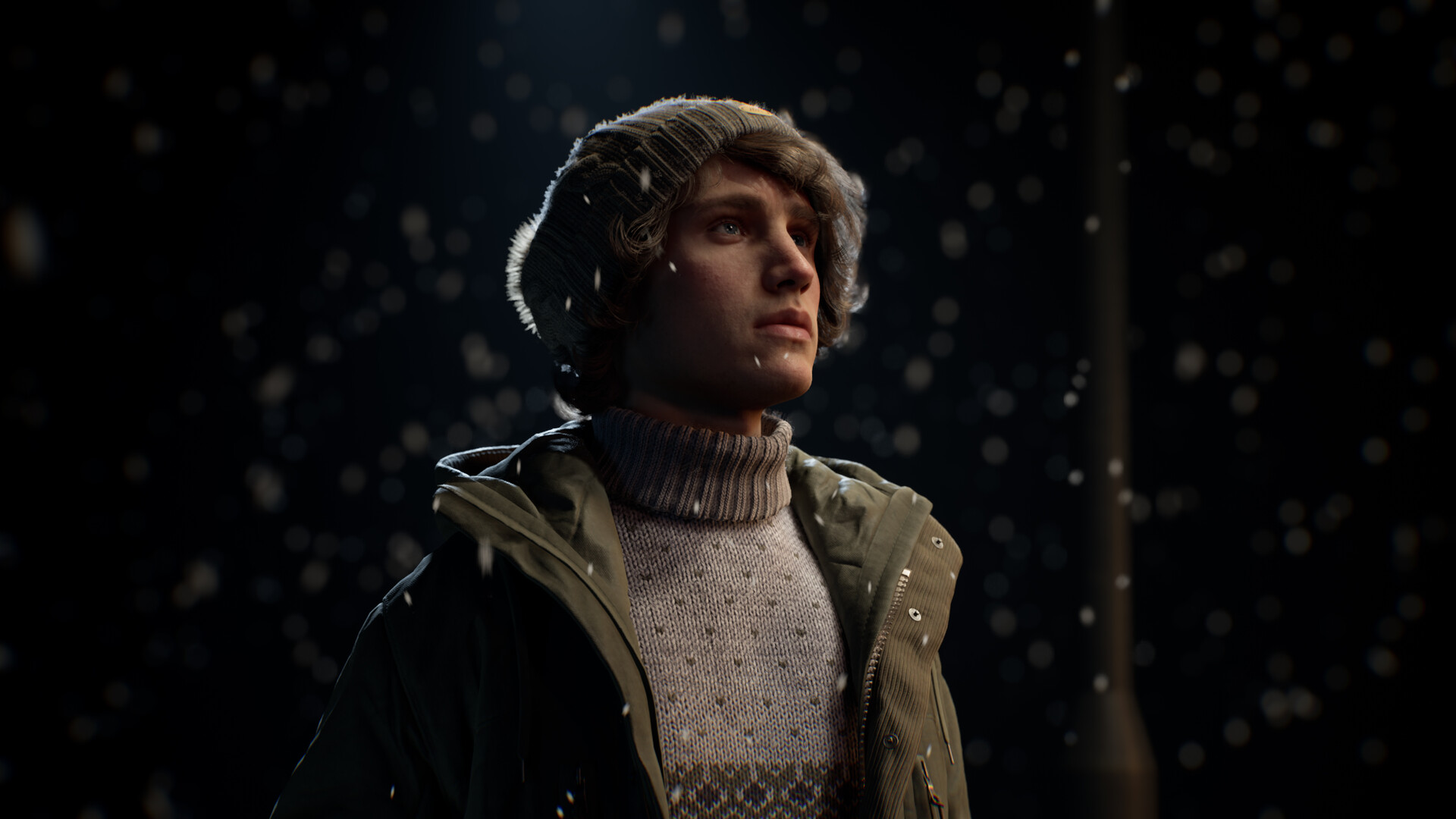
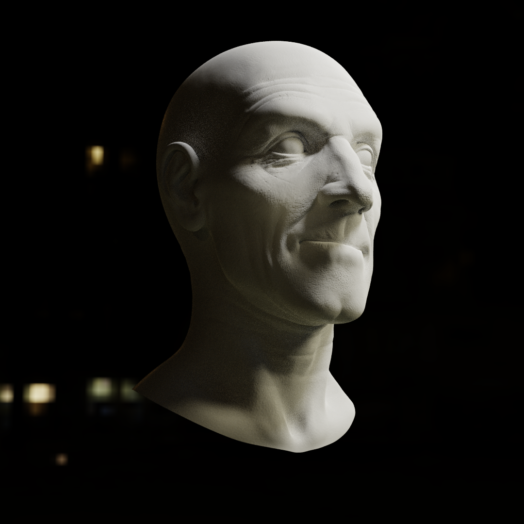
5. Modelling from Moa Alfredsson
I tried different angle this time. By looking this image I thought one big spotlight would be enough. But there were so many shadows on his face so I put several fill lights. Again, matching the contrast was a tough part.
Nice work with these ![]() jeewon ,
jeewon ,
With Ben Stiller the trick is to bring the light close to the face to brighten the face without brightening the whole scene.
Nice job with Christoph Waltz. Its difficult with this type of outdoor shot , a lot of the light will come from reflective sheets or cards out of shot rather than lights, making it hard to replicate the soft light with lights. Notice the blending of the shadow line compared to your image the shadow line is hardly visible.
John Wick looks pretty good, the exercise is about the lighting, so don't worry too much about the shiny face. I would suggest the blue light is slightly in front and to the side while the other reddish light is slightly behind and to the opposite side.
Us, yeah good likeness, maybe bring the light forward a touch so the shadow from the nose doesn't reach the mouth, but then the nose is bigger than the reference.
Modelling from Moa Alfredsson, I think for this one the main light is more to the far side of the head further away, not so bright, a fill light on the nearside to the front of the face, and your missing a bright rim light behind the subject from the camera angle.
Hope this helps, Good job overall.
Looking great! These are all very close.
1. Similar to what Adrian mentioned, the lighting should be a little brighter. I'm not sure it needs to be closer though as you can see how his forehead is a similar brightness as his chin, and the light is coming from slightly above to shadow his eyes, indicating that the source is farther away - there's not much decay between the two points.
2. Same comment as Adrian, it just needs to be softer overall but still retain the darker shadows in the corners of his mouth and such. In yours those are all chased away. Try setting this up manually rather than using an HDRI to see what difference it makes.
3. This is a tricky one but it looks good! The blue light definitely needs to be more prominent though, and notice how the inner corners of his eyes are in shadow in the reference.
4. Nice job! I'd agree the light could be moved a little closer - notice the size of the highlight in the reference and how it fills up a good portion of the forehead.
5. This is a really good match. My only comments were also about the key light being a bit too bright and it needing a sliver of rim light.
Congrats on finishing the course and keep up the good work!