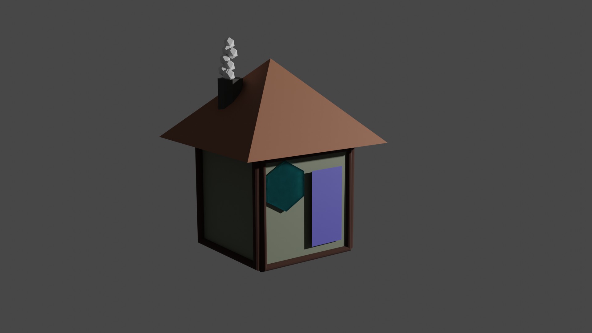
 hey guys here is my first exercise i make this post so i can track my progress more easily and i think that will kinda motivate me :)
@adrian2301 yes you are right but i do not know why this happened i think because i adjusted manually the hundles in graph editor .
What's your opinion? why do you think it's happening?
Probably in the graph editor the handles are not aligned correctly.
Instead of this
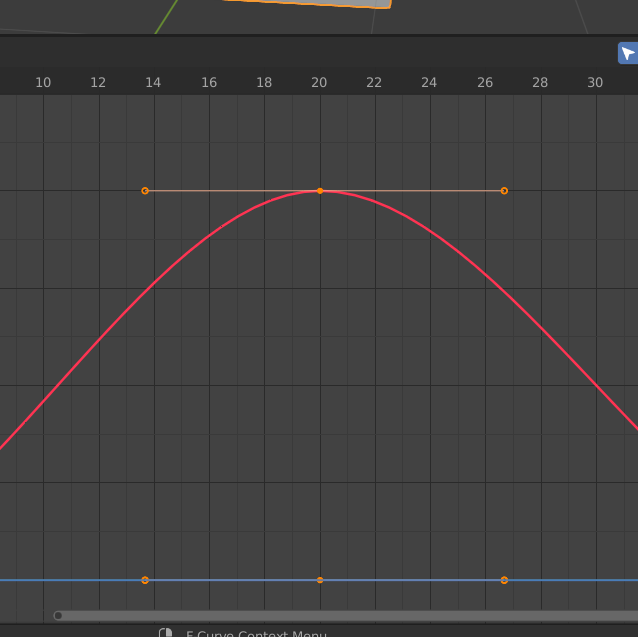
It's probably more like this
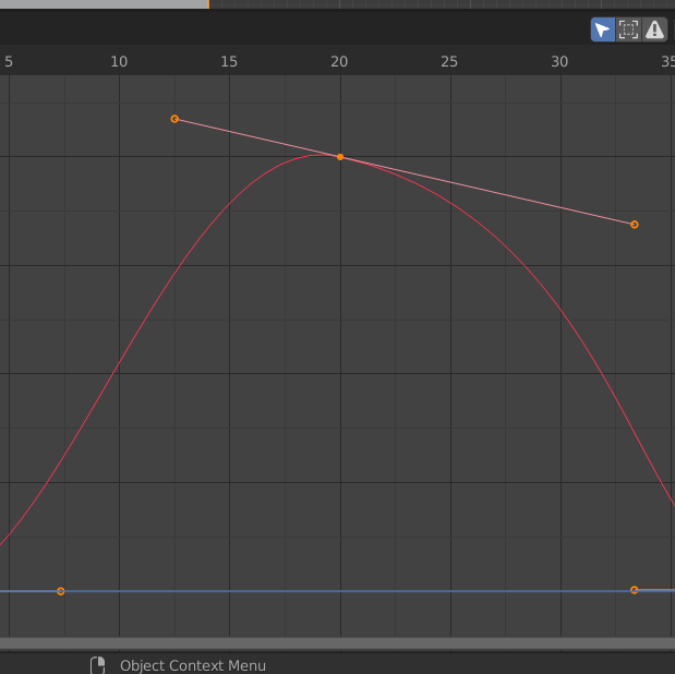
Yes same thing, the curve handles.
I just showed the top one, best thing to do is adjust them, move them around and see what happens. You can always CTRL + Z to undo and try another one.
@adrian2301 yeah i see but i just put them by hand because i didnt think it would be a problem
See in this image the handles on either side of the arc (the green circles) need to be the same angle and length
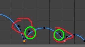
and the same goes for each arc
@adrian2301 i understand what u saying i just thought that it doesnt matter for this specific exercise
from @jlampel course Fundamentals of Digital Lighting in Blender and chapter Lighting a Bedroom with Cycles...!
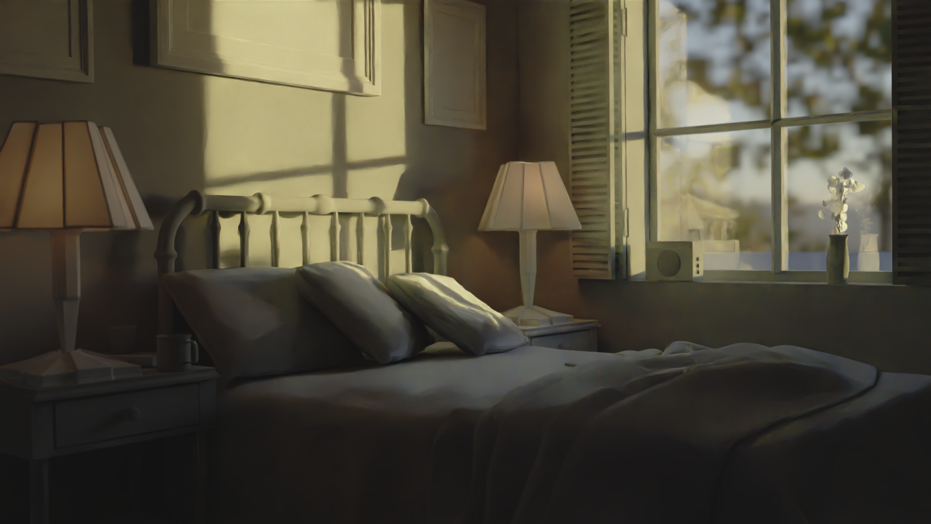
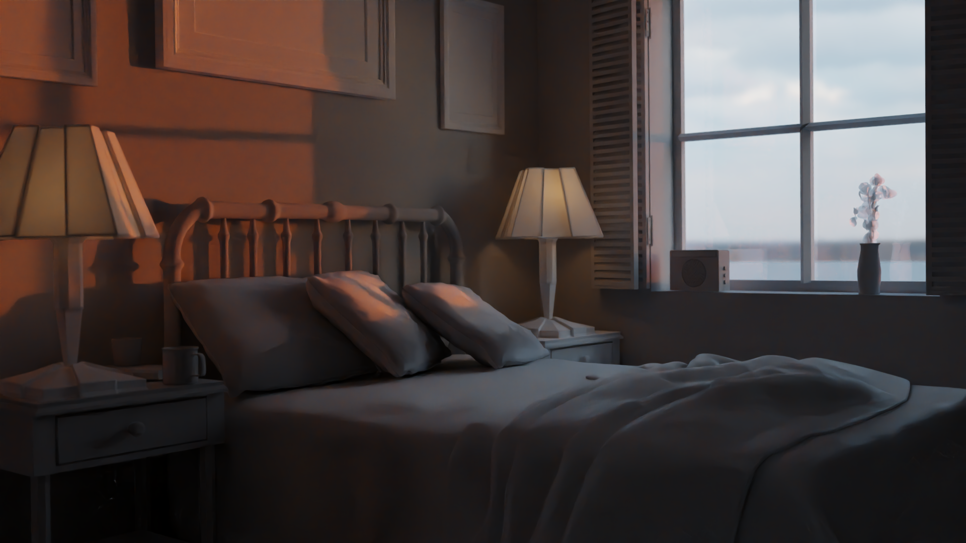
Nice ![]() tasosn !
tasosn !
Haven't done this myself yet, but I notice some things...
The highlight (along the nose) on your Joker seems a bit too strong (needs to be more diffused) and along his left side of his face there is a (almost) back-light emphasizing the contour.
In Mr Robot and also in the first photo, there is a slight triangle of light below the shadow eye (if I'm not mistaken this is called Rembrandt lighting), which is missing in your interpretation...(in Mr. Robot even his right eye itself is lit...).
The third image has a strong contour highlight from brow to chin, but in your version, the nose and lips and chin shapes are not well-defined.
Anyway, well done!
Well done ![]() tasosn nice work, I agree with
tasosn nice work, I agree with ![]() spikeyxxx .
spikeyxxx .
Adding a low strength fill light on Mr. Robot's right side will help.
With the third image move the light slightly more forward of the face, but not too far that it brightens the opposite side.
Your joker has a steak of light down his face, I think you have a light above to give that light on the top of the head, but the should be achieved with a bright rim light placed behind the head.
The first image the rim light should be more behind the head roughly directly opposite the camera. Then add a dim fill light to his left side.
Excellent job 👍