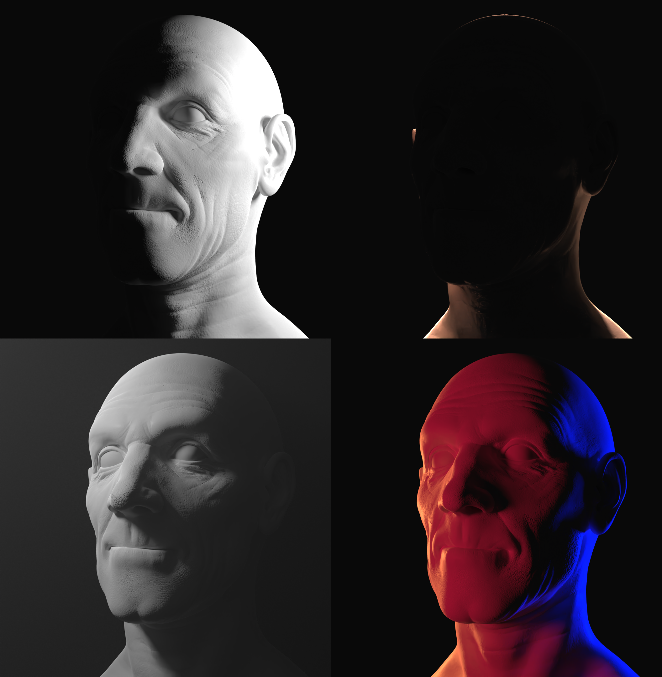
Just some training for the Digital Lighting course! :) 
Your right you submitted the best one for grading.
Top Left - way to dark on the left side - add a low strength light and reduce the strength of the current light a touch, it's a bit blown out on the side of the head.
Top Right - ?? - Some low level light to make out the face - move the light back further or increase the size or add another light.
Bottom Left - Not too bad - maybe add another light off screen right and behind with a low strength, just enough to distinguish the head from the background.
Bottom Right - very nice.
As with the last, you can add more than one light to get the desired effect.