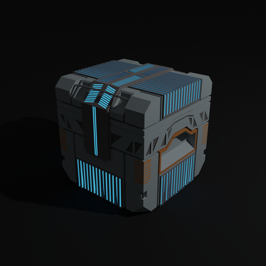
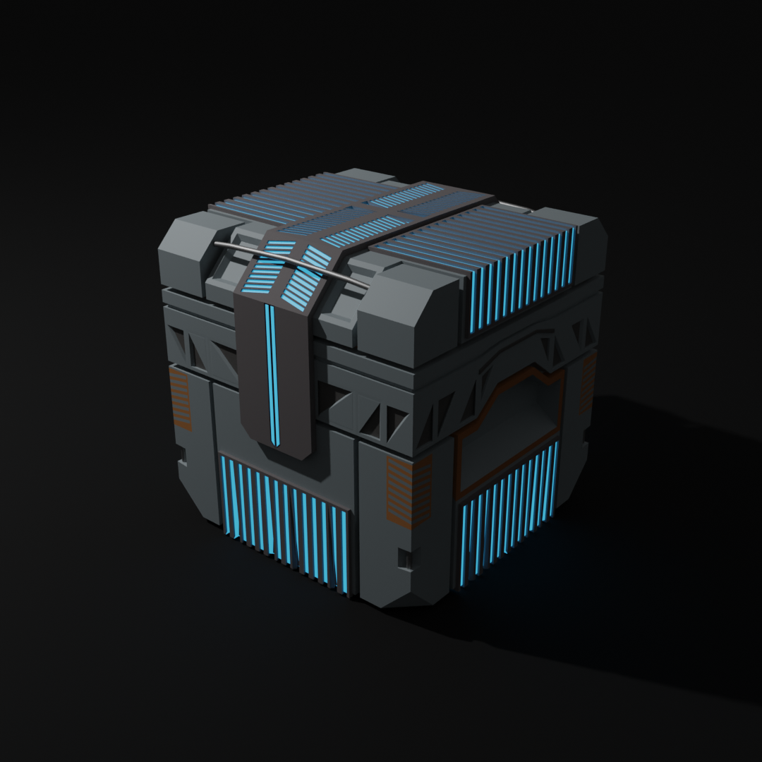
Made a few extra changes to the crate, as well as added some colors. Could have made more additions but I also wanted to go on to the next tutorial :)

This is looking really nice, some really clean modelling. I would suggest adding more variations to the textures to break up the uniformity, as well variation between objects with the same materials/textures. Also, in terms of composition, try finding a story to the image to be the main focal point. Look forward to seeing more!
Thank you! This was actually made as part of the "Fundamentals of 3D Mesh Modelling in Blender"-course, so I focused mainly on the modelling and only played a little with the materials. But yeah, I do agree with you and I really appreciate the feedback!