Hi,
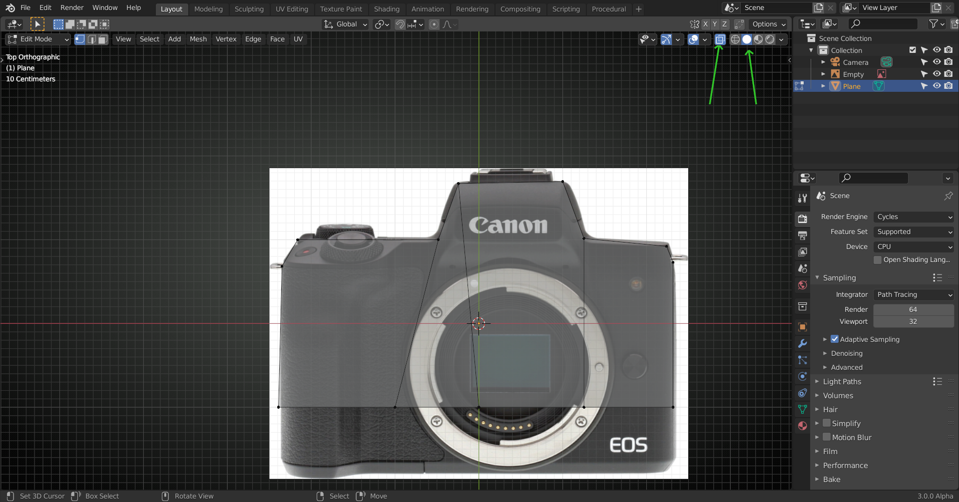
Trying to familiar a bit more with blender 2.9 and I was wondering how to have a improved view of the wire-frame like in the image from_tuto.png. I have noticed that it's not as much as transparent than mine see my_setup.png (For the object selected in edit mode).
I prefer the from_tuto visualisation since we see more the object we are currently working on (It's a bit grey).
Thank you for your help!
You may want to use these settings:
and
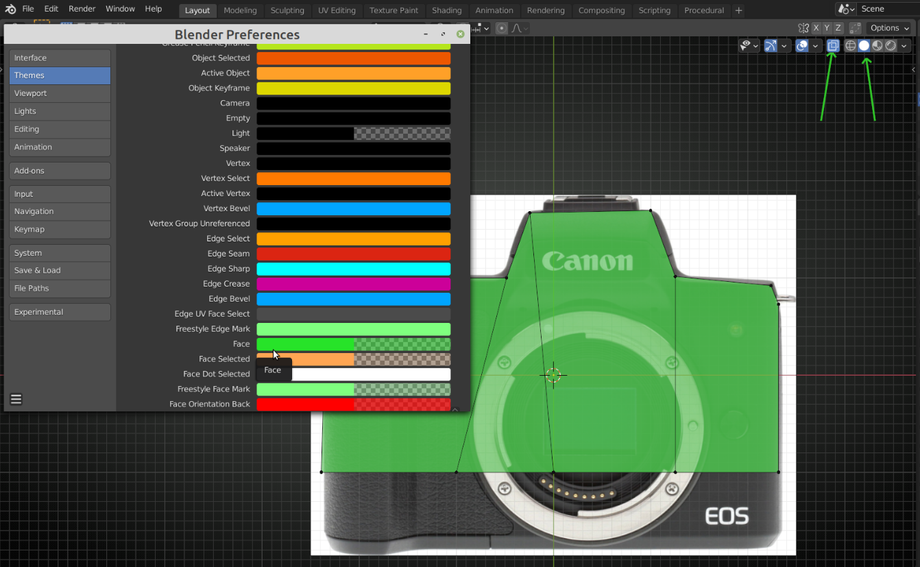
 and furthermore, you can adjust the color and transparancy (Alpha) in your Preferences > Themes > 3D Viewport:
