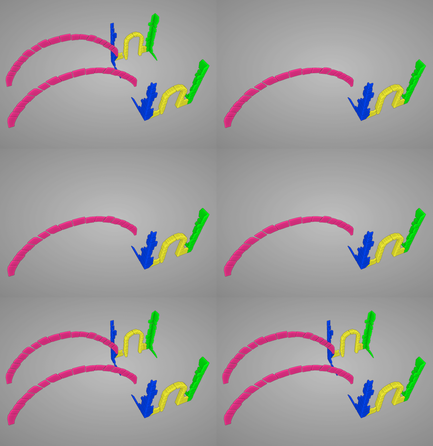
This is an on-going thread documenting my progress through creating the Masonry Accents in the 2021 Collab Project
Looks good. I have been giving feedback about the keystone (top center piece) needing a little more geometry to actually support the loading on the arch but you are welcome to keep things the way they are.
The height differences are good. It may help sell the effect if the depths coming out from the building differ a little more (not so perfect).
rrobcampbell26 This really gives the Vladim Homestead a wonderful medieval look. I like it.
Perfect blockout for week 1 rrobcampbell26! I really don't have any constructive criticism to add. You've earned full points from me week 1 👍
You're on track for gorgeous sculpted accents in week 2. I'll give you the same recommendation I'm giving the others: I recommend you treat each accent "area" as a separate model that can be mirrored for easy population on the rear of the house:

Each color represents a separate model that can be mirrored to the backside. This way you won't have to model + sculpt + texture the rear side individually. And I think all 4 of these models can share a texture map if their UVs are laid out in the same texture space. But more on that for week 3.
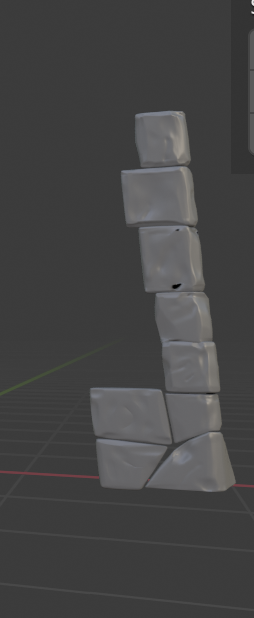
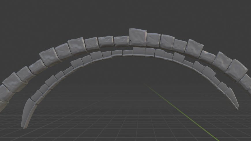
Good job this week rrobcampbell26! I'm seeing some inconsistency in the level of detail between each rock. Some are more developed than others. Maybe this is your current progress rather than final? If this is final, I'd recommend spending a bit more time making details consistent.
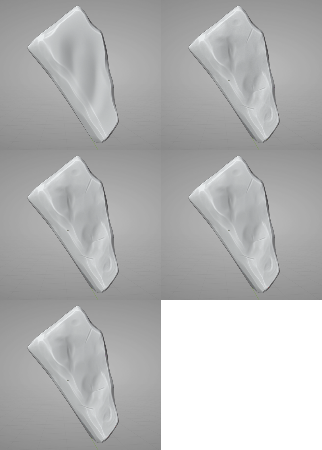
In general your rocks have fairly deep divots next to perfectly flat sides of the rocks. I'd like to see less emphasis on the divots while also un-perfecting the flat sides. Too flat feels unnatural. Here's a before-and-after GIF of what I mean:

Mostly it's the scrape brush all over. There's also a little crease brush for the "tool marks" and pinch brush to tighten those marks.
I also noticed your arch is mirrored at the base level. Which means your sculpture is using twice the amount of geo that's needed. I recommend deleting the back half of rocks and use a mirror modifier to get those more efficiently.
I definitely know what you mean. I was just getting used to sculpting stoney material as I progressed I started to get the hang of more subtle detail. I am definately going to give it another pass before I UV unwrap. Thanks for feedback @theluthier !
Week 3 - Masonry Accents.
I am playing a little bit of catch up but here's how it looks with normal map detail. I'm In the process of adding cavity map detail.

