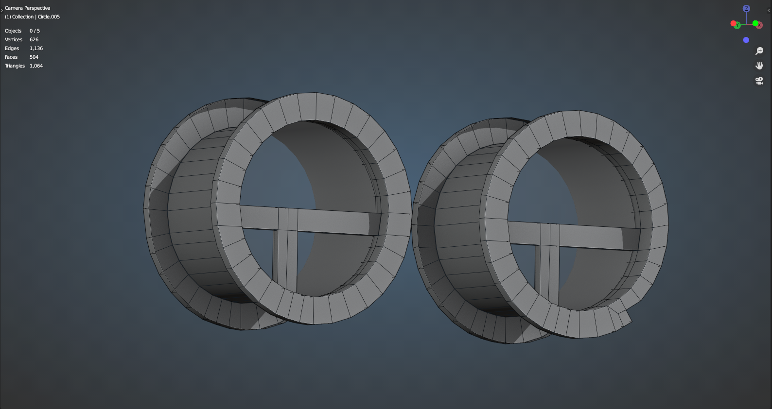
Here is a screengrab of my modeling for the WindowB asset on the house exterior. I made two versions because in the concept I could not tell if the notch in the frame was intentional or if it was just an artifact of brushwork. Also, it appeared to me that the vertical divider stops at the horizontal one and does not continue upward, but this may be again a misread of the concept. That, and it appears to me that the middle divider is offset from center. I personally prefer the slight deviations from perfection, as they give more character to the house, but I don't want to do this incorrectly. Feedback? PLEASE and THANK YOU VERY MUCH!
PS The frames are 276 verts on the left one and 286 on the right each with a separate 32 vert circle filled in for a stand-in glass panel. Is this a good polycount or should I shoot to make it lower? The image has wireframe turned on for better scrutiny.

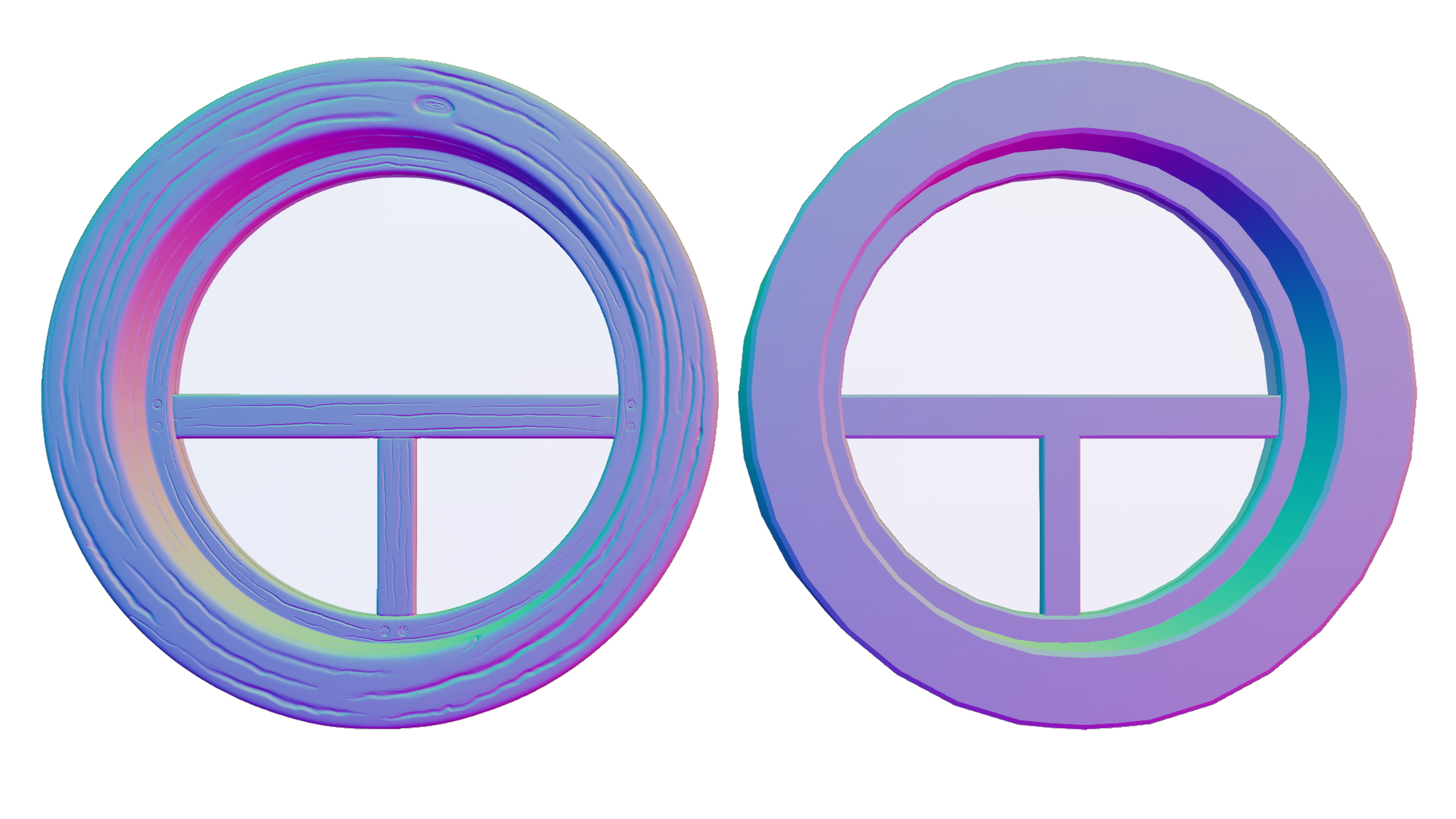
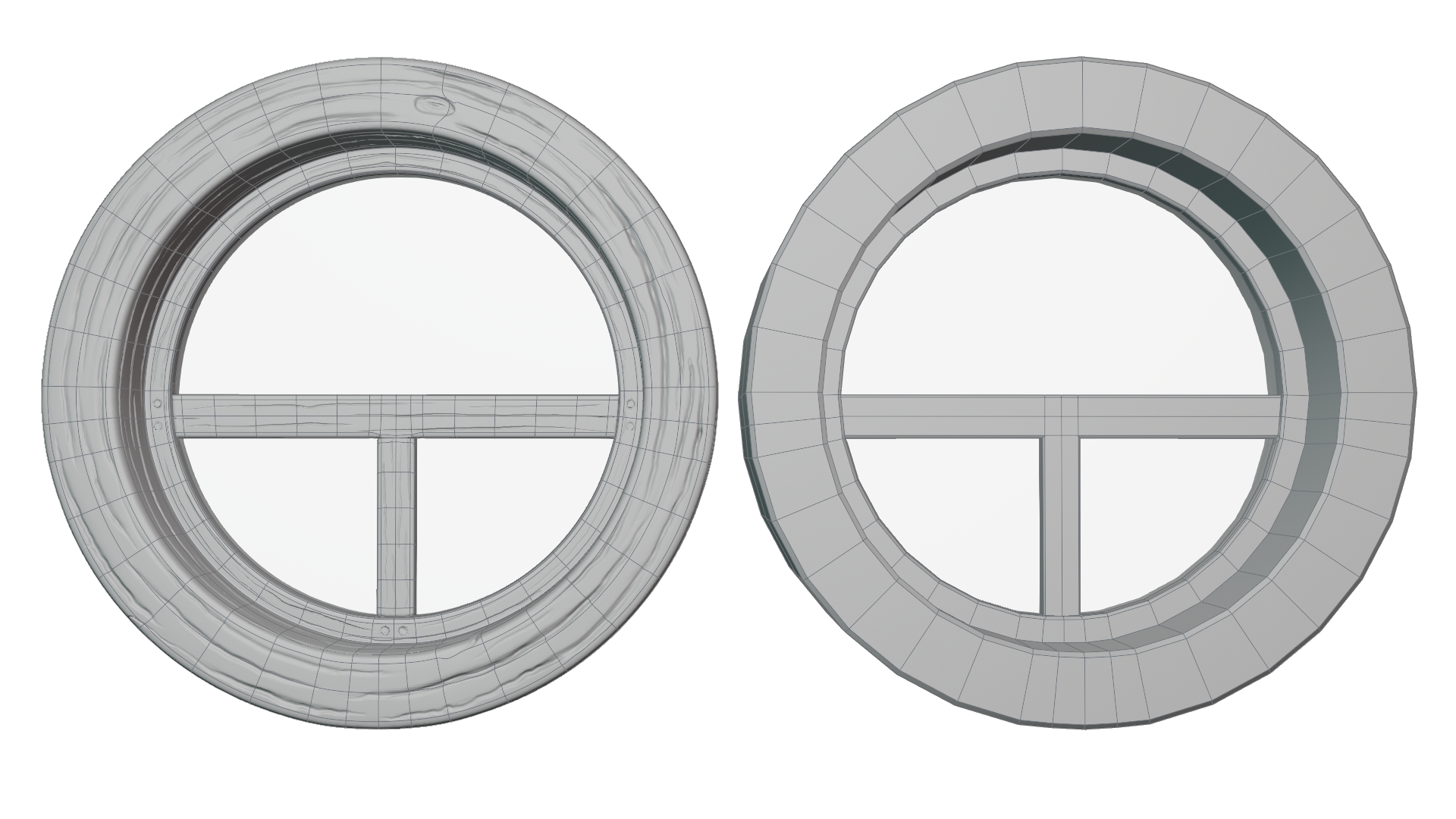
 Per Vadim's feedback in the livestream, I revised my work on Window B. I also have done some sculpting on the version with edge supports. The low-res version is 712 verts total. The sculpt. . . somewhere around 11 million. . . But that should all bake just fine, yeah? Let me know if you think this is going in the right direction. Thanks and cheers.
sstclark I'm sorry to say I'm just now seeing this, but WOW! You've done excellent work for week 1 - beyond my expectations seeing HI and LO res versions side by side. Very nice work 👍
My only suggestion would be to add a pane of glass with some wavy glass detail. This could be sculpted but also added procedurally in the material. Either way I'm giving the wavy glass suggestion to all artists with glass in their asset.