What I would do is clean up your creek first, so that you can use UV Coordinates for the effects (and this ain't perfect yet, just a test):
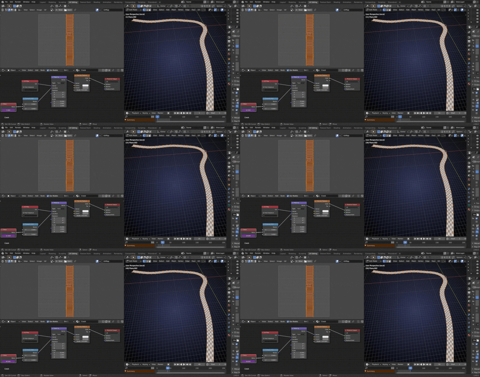
This is looking great! Easily full points for week 2.
I talked to Kent and he mentioned the 'please don't use procedural' thing was for all the little assets, with the creek and clouds being specific exceptions, so you're good to go!
I agree with ![]() spikeyxxx about using UVs to animate your texture - that should help it to flow around corners and such.
spikeyxxx about using UVs to animate your texture - that should help it to flow around corners and such.
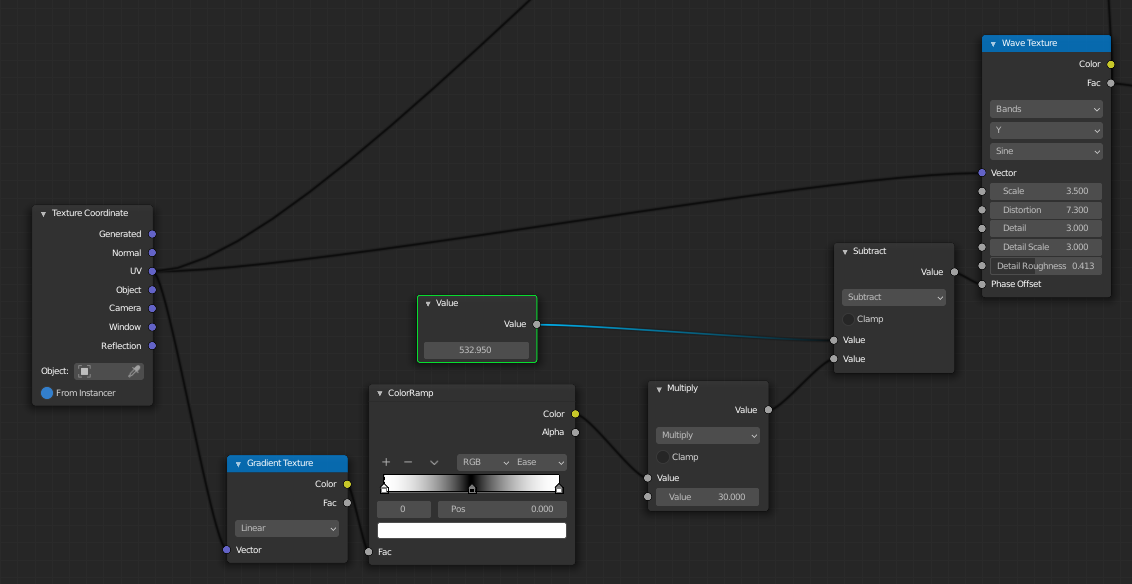
You could also then take a gradient from the left to the right side of the creek and make the sides lag behind a bit:
Backing up a bit though, there's one key problem I see - we can't use an emission shader! If we did, it would ignore all the shadows from the house and look like it's glowing:
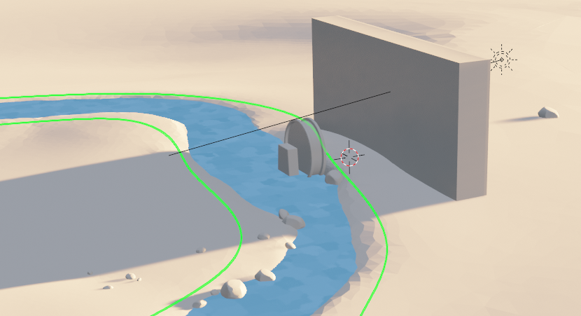
So, while we still want it to look stylized, we've got to start with something that at least reacts to light believably.
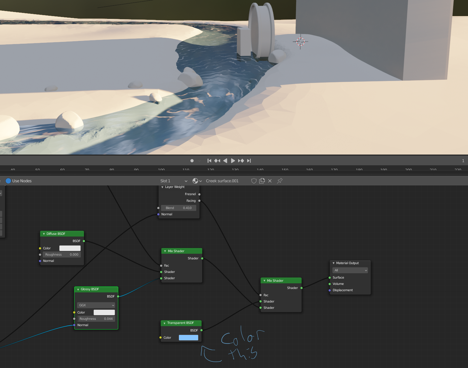
Eevee can't cast colored shadows, so I've turned shadows off, but we still need the water to have some sort of absorption so I duplicated the river, moved it ever so slightly down, and gave it an array and a super basic material with alpha hashed transparency and also no shadows.
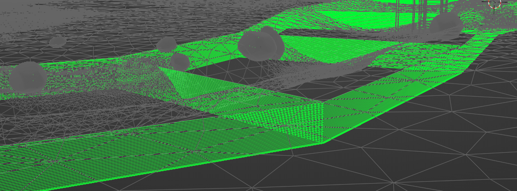
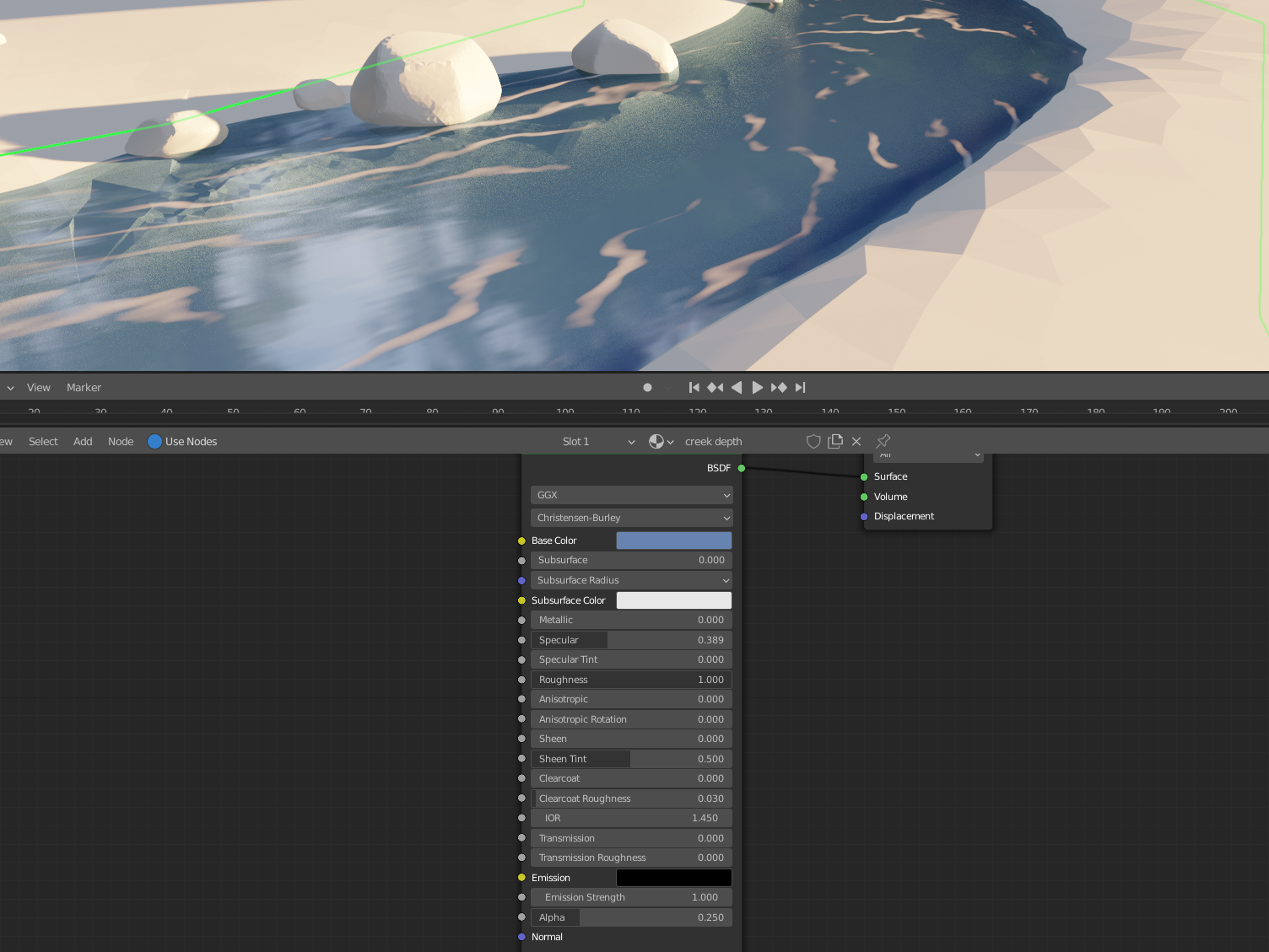
Now it's not super stylized, but that just comes down to what texture you plug into the color for the transparent shader and into the normal for the glossy shader to smear those reflections nicely.
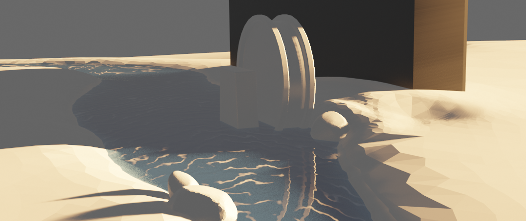
It's not a perfect example because the shape of the reflections and foam would need a lot more work (which it looks like you've already done well), but hopefully it points you in the right direction! It's in the WIP folder as WIP_nature_creek-tests_lampel_00 if you want to dig through.
Hey @jlampel . I appreciate your feedback and the set up you put together. And ultimately you are the spice lord who makes such decisions, but I am going to push back a little. You said”...need to start with something that at least reactbelievably to light” and I disagree. This is a stylized scene and emission shaders like this one are common in this kind of style. I’m looking at the concept and, while it has the same harsh morning light as our blender scene, I can’t distinguish any shadows on the creek. While I’m sure your setup would look great in the final scene, I don’t think my emission setup is untenable or unfaithful to the concept. I also feel like it compromises my contribution if I submit in the 9th hour a shader set up that is almost entirely your creation. Again, you’re the spice lord who is responsible for the final vision and if you don’t want to bend on this, I’ll work within your parameters, but I’d be frustrated that those parameters weren’t established much earlier in the project.
Also I understand you yourself were brought in kind of in the middle of things. And I fully understand the helpful spirit in which your post was made, just to be clear. I just disagree that the shadows are that important and feel like the shift toward realism that they necessitate fundamentally unravels the idea I’ve been working toward.
Let me know what you think and I’ll spend some time this weekend diving in and exploring options. Thanks.
Homework Submission Week 3:
@jlampel @theluthier
Hopefully it's not weird or annoying that I keep submitting these in video. I feel like it helps you see the animation and keeps me from having to type up a novel :)
I expected that you'd get problems with the AO bake, but you could use the existing AO with their UV Map and make a new (straightened ) UV Map for the river flow. Yes, you can use more than one UV Map in your shader.
Maybe I should have told you that right away, but I thought I'd let you struggle for a bit first and see if you came up with that yourself...(sorry)
Haven't though about how I would deal with the reflections to be honest.
![]() spikeyxxx You coyote’d me. Haha. I guess I knew multiple UVs was a thing, but it never would have occurred to me to do that.
spikeyxxx You coyote’d me. Haha. I guess I knew multiple UVs was a thing, but it never would have occurred to me to do that.
To be honest, I have so far never used more than one UV Map myself, so it's not something you think of immediately :)
Here's something really cool that I just discovered:
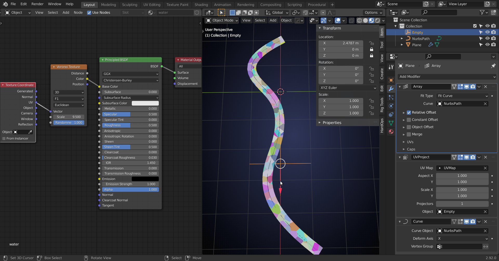
Simply move the Empty.
No difficult straightening UV's, because you are just using a Plane.
The Radius of the Curve (Path) points controls the width of the creek at those points.
The AO bake has to be reconsidered, but I think that if you Apply the Array Modifier you could make a separate UV Map for that.
Nice work exploring more solutions this week! First, to answer one of your technical questions:
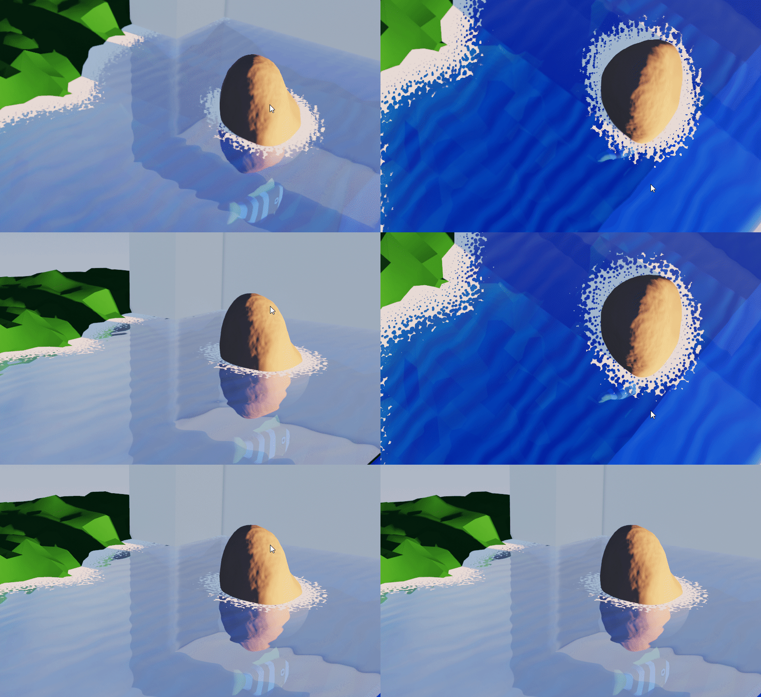
The reason the rock appears to be in the wrong place is because of what's being plugged into the normal of the glossy node. The normal helps the renderer know at which angle to bounce light, and so according to Eevee with that texture plugged in, the whole creek is angled down and away from the rocks, so the reflection of the objects appears to be further away.
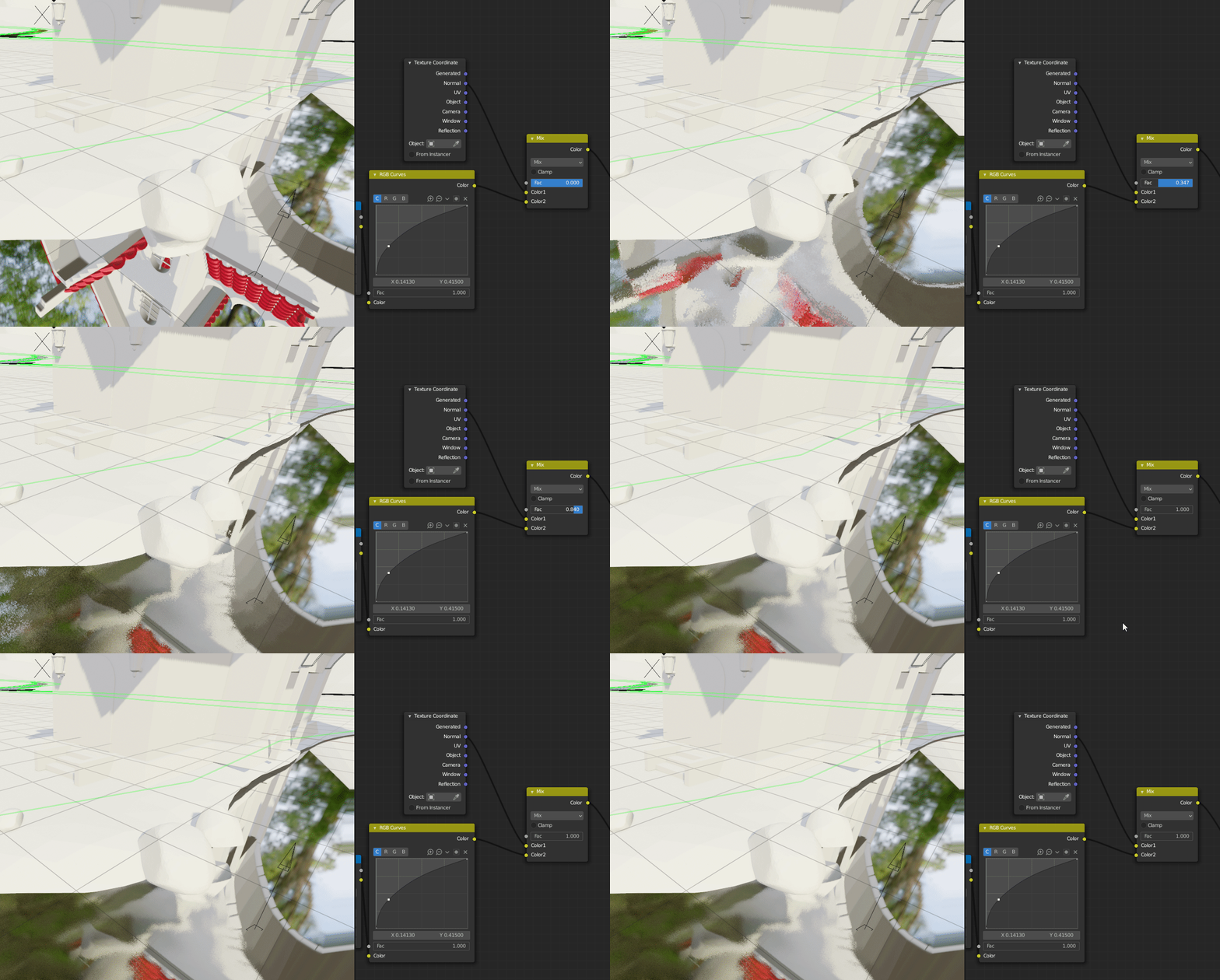
What you'll want to do instead is create a texture that can be plugged into a bump node. To make it work with your texture you'll need to adjust the values in the displacement section of your graph, specifically the add node.
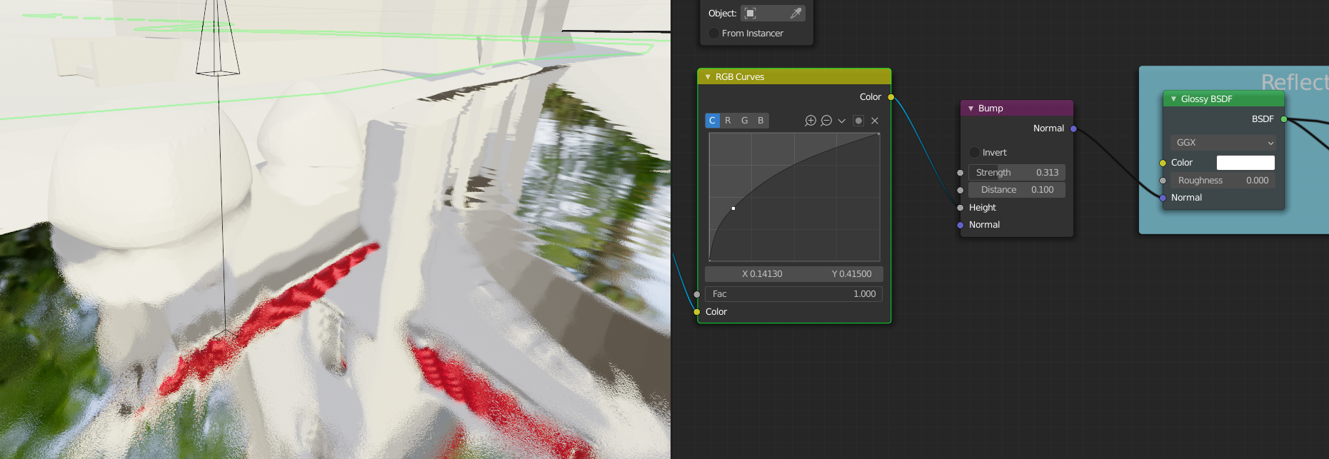
It sounds like you and Spikey got the river flow direction sorted out with multiple UVs, so that will be cool to see!
For the emission shader discussion, I was pretty surprised by how strongly you felt about using it. I didn't expect that changing which shader nodes you plug your textures into would minimize any of the hard work you've done on those textures, the foam setup, the animation, and so on. I also don't believe that it's necessary to use emission shaders to achieve a stylized result. Obviously though, this is your asset and you are free to create it with whatever method you choose as long as it fits with the rest of the objects in the scene and looks good for the final render. If it works so well in context that it convinces myself and Kent to use it in the final render, anything goes.
I think I hammered on the shadows a bit too much - you're right that the surface of the water does not have shadows in the concept nor would it in real life unless it was very dense with particles. My intention was to show how that setup behaved properly both in shadow and out of it by not glowing in the dark. When turning a stylized concept to 3d, some decisions need to be made as to how certain qualities get interpreted. As a general rule of thumb, flexibility is king. If we were to change the lighting from day to early morning or night, no further adjustments to the previously posted setup would be needed. I did not want to go through and adjust every asset's colors if we need to change to a golden hour shot or something, so for all other nature assets in the scene I've said no emission shaders
However, for this project, I'm fine with assuming the final animation will be shot with the same lighting that is in the concept, and the creek is unique enough in it's properties to potentially warrant it.
One thing that I do request though is that the reflections more faithfully show the colors of the reflected objects. Compare the reflection of the water wheel to the concept art:
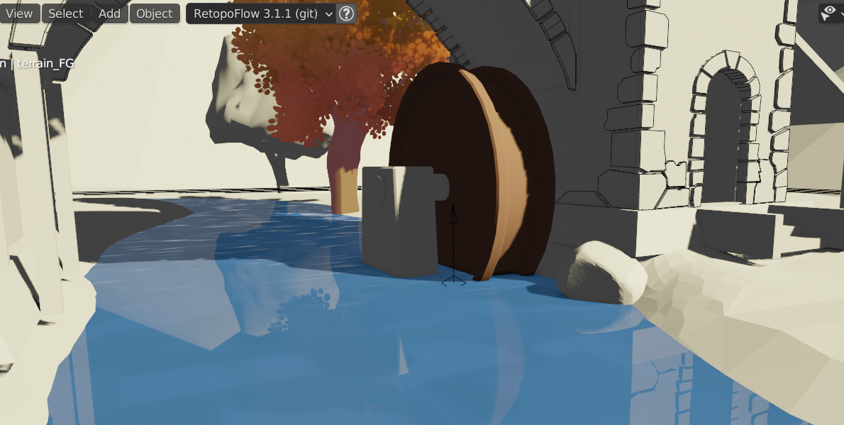
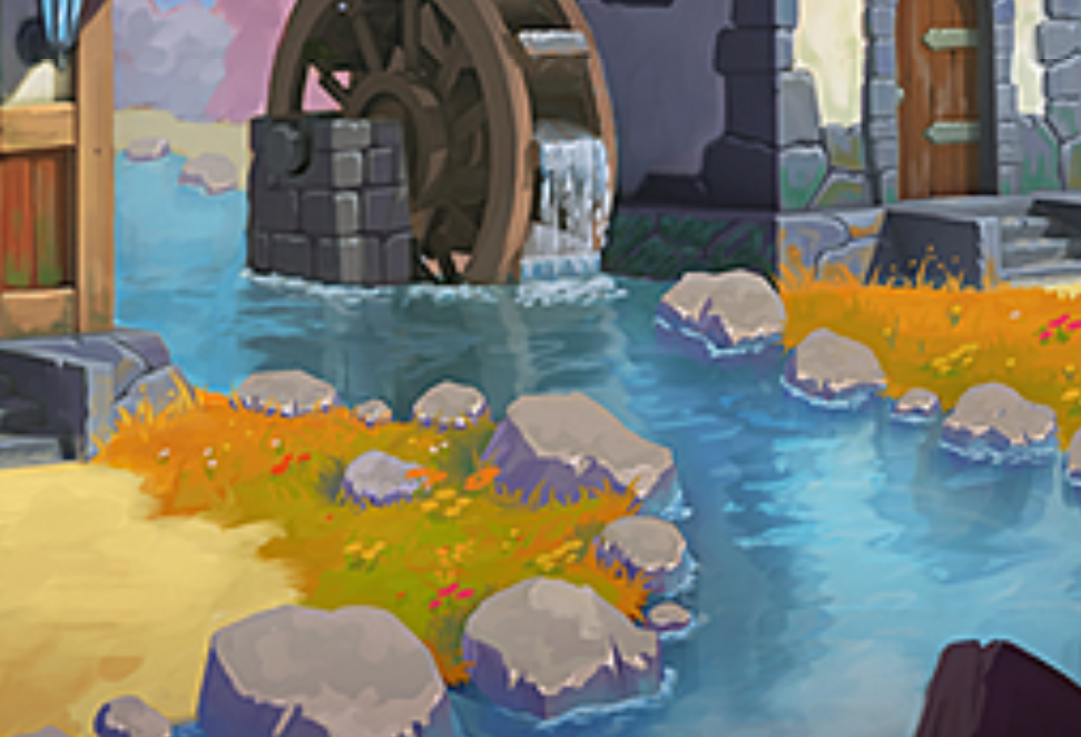
While both are tinted blue, the reflection in the concept, at least when close to the object, is much closer to the original color. Since we're going to have such fun vibrant colors all around, it would be incredible to see those reflected in the creek in a painterly way.
Using Fresnel seems to be one way of having our cake and eating it too when it comes to stylized colors and nice reflections, but I'm open to all solutions.
Apologies for coming in late and giving feedback after you were well on your way - I can see how that would be frustrating. Keep plugging away at this and I'll be looking forward to the final week's submission.
Creek week 4: ![]() spikeyxxx @jlampel
spikeyxxx @jlampel ![]() elcangrejo
elcangrejo
@theluthier I think I may have saved over your 10b file. Soooo sorry! I just punched save without even thinking. I shouldn't have messed with much other than my asset though.
pprocyonlotor, it looks like you are finishing up with your project. And, your creek looks great. I'd love to post your artwork in the TSMF Blog. Please let me know if you create a money shot.
Thanks ![]() splat21 ! I don't know how much sense a shot of the creek in isolation would make. This render showcases it, although it has a lot of other people's work in it too. But if you feel ok using it for your blog, then go for it.
splat21 ! I don't know how much sense a shot of the creek in isolation would make. This render showcases it, although it has a lot of other people's work in it too. But if you feel ok using it for your blog, then go for it.

pprocyonlotor, I agree with your assessment has to the best way to present the creek. I think it looks great, especially with the reflections. I will specifically call out "creek" in the blog posting so viewers will know what is being showcased. Thanks for providing a money shot!
Week 4 Homework Submission:
@jlampel
Here it is (animated in the above video):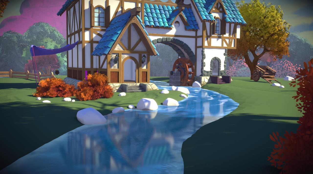
Nice job pprocyonlotor , I think this turned out well! Full points for week 4!
pprocyonlotor I agree with Lampel - Your creek turned out very well! Check it out in the final assembly:
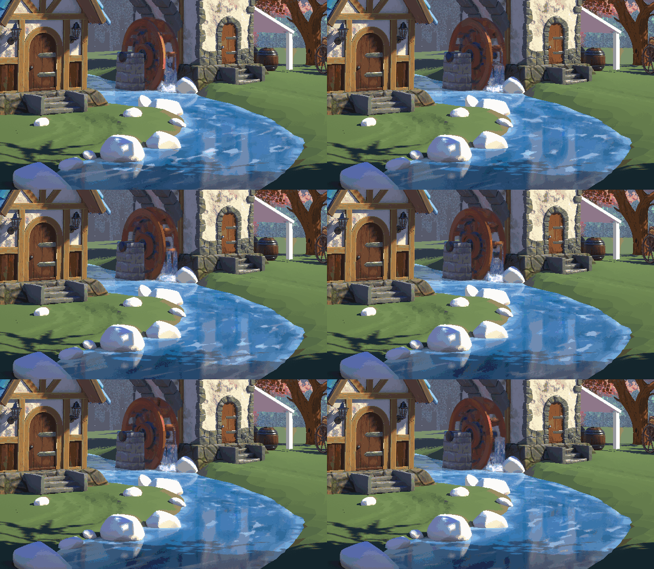
Just beautiful. Very well done 👋👏
Thanks for contributing to this collab. It's been a pleasure working with you!
Thanks guys! And a special thanks to ![]() spikeyxxx for helping me at every turn and just generally earning his baronship.
spikeyxxx for helping me at every turn and just generally earning his baronship.