This is my blockout of masonry accents. I did both sides, front and back.
looking really great, love how its not perfectly even :) especially those around the house looks so cool :D
Excellent blockout for week 1 ![]() hadiczech! I really don't have any constructive criticism to add. You've earned full points from me week 1 👍
hadiczech! I really don't have any constructive criticism to add. You've earned full points from me week 1 👍
You're on track for gorgeous sculpted accents in week 2. I'll give you the same recommendation I'm giving the others even though it looks like you're already doing it: I recommend you treat each accent "area" as a separate model that can be mirrored for easy population on the rear of the house:
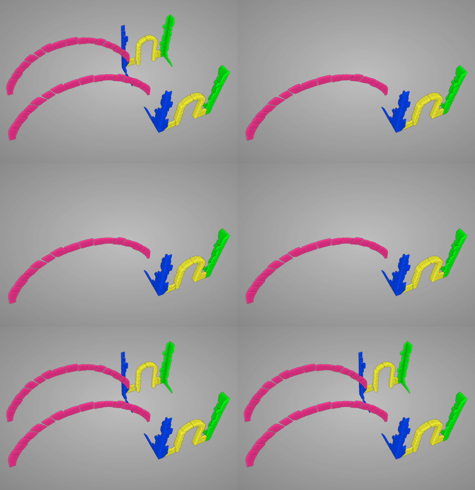
Each color represents a separate model that can be mirrored to the backside. This way you won't have to model + sculpt + texture the rear side individually. And I think all 4 of these models can share a texture map if their UVs are laid out in the same texture space. But more on that for week 3.
@theluthier thank You very much for Your feedback, i will do, as You recomended.
This is week 2 homework - sculpting details. Objects are not mirrored.
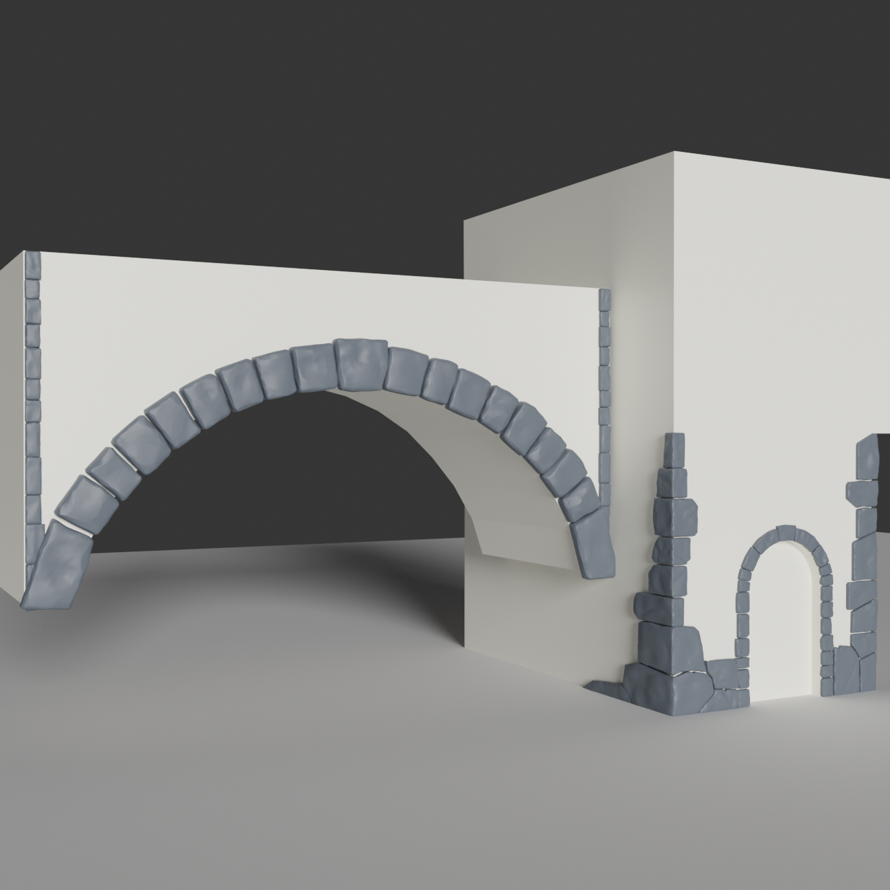
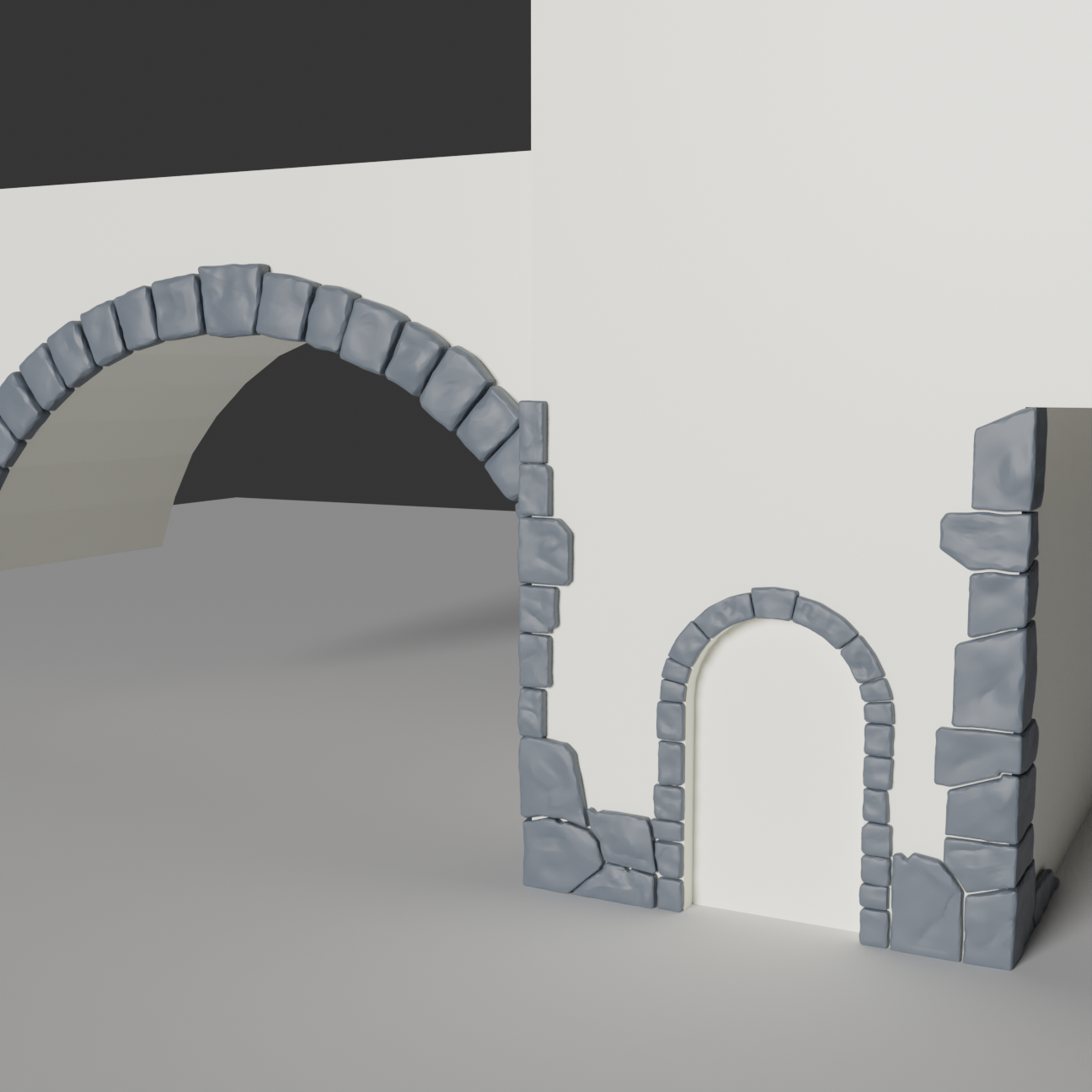
That is looking great ![]() hadiczech. Some cavity texture will hopefully make those stones pop a ton especially on their crags and crevices.
hadiczech. Some cavity texture will hopefully make those stones pop a ton especially on their crags and crevices.
Fantastic rock sculpting ![]() hadiczech! I've only got a couple minor notes:
hadiczech! I've only got a couple minor notes:
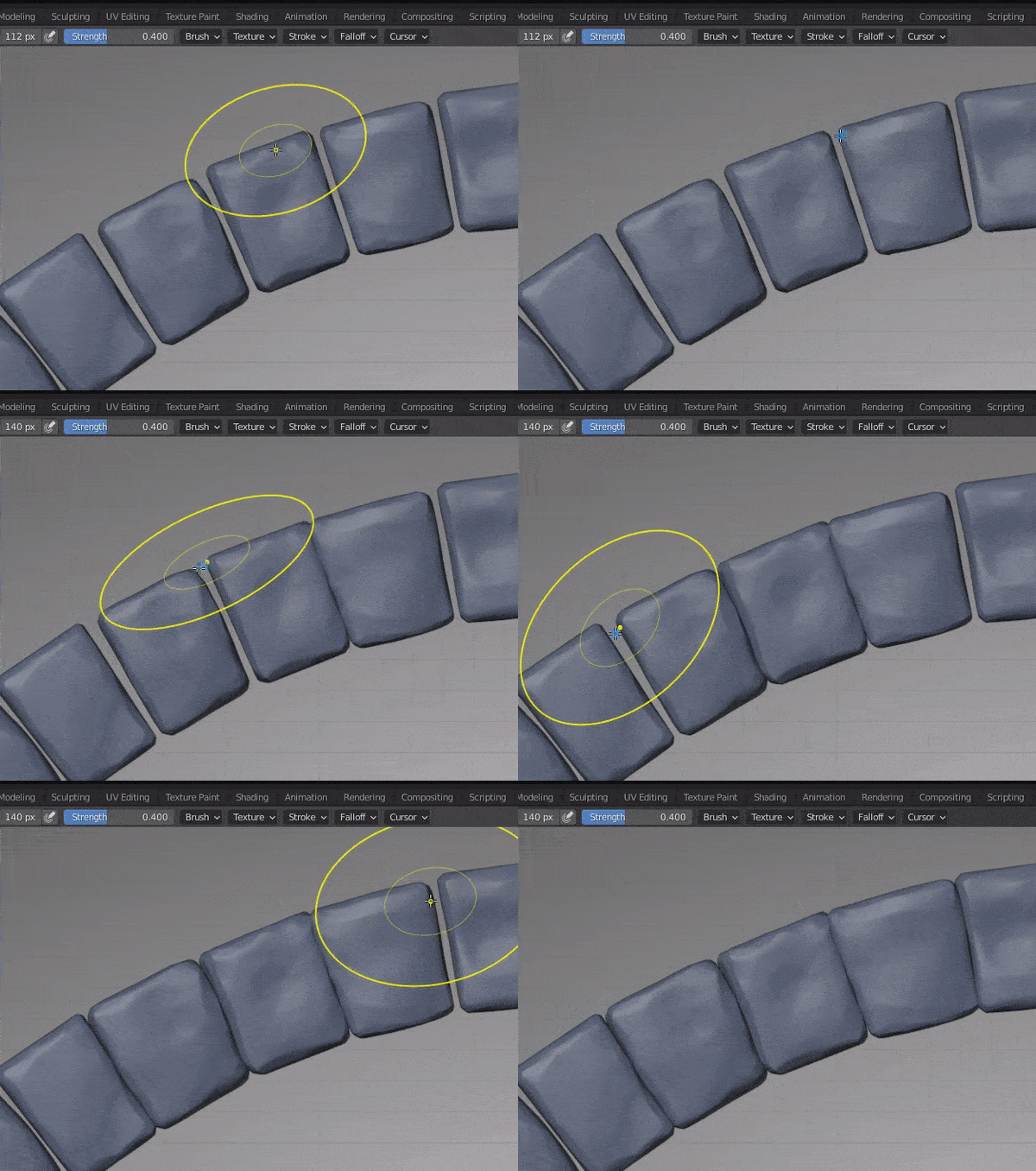
I know, this is a complete disaster, but i upload it anyway, so you don't think I didn't do anything. At least i tried. But it is not my first texturing disaster, so one failure less or more does not stop me from blending. But i think i learned a lot, while making it.
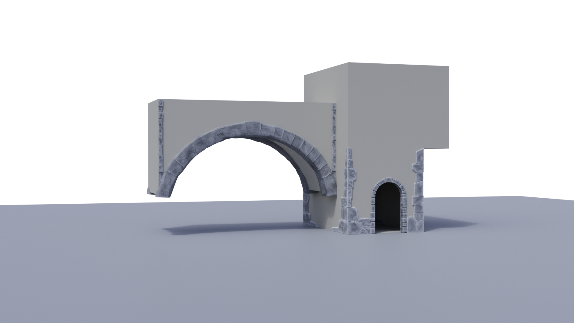
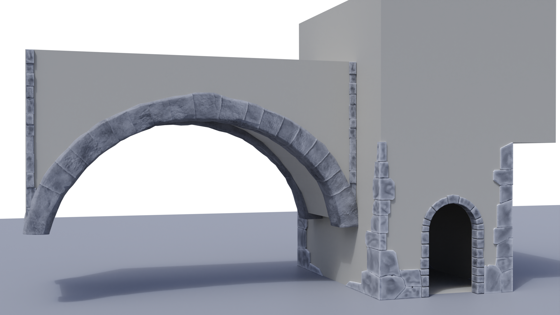
![]() hadiczech We have different definitions of "complete disaster" 😅
hadiczech We have different definitions of "complete disaster" 😅
I don't think this looks back at all! I'd like to take a closer look at your .blend. But the latest version I see is from 5 days ago. Can you make sure your latest WIP is up to date and add your textures to the TEXTURES directory?
@theluthier Hi Kent, thank You for Your kind comment, i just uploaded it to WIP section, i´m not sure, if it was done right, mainly with textures (if they are properly named)
I've got your .blend and textures and It looks good! Some food for thought: The corner masonry is a little too flat / straight in the lo-poly. It will work out OK but a better option would be to go with the more irregular shapes like your arch stones. These kinds of old-world stones are hand-carved and look better when imperfect.
With regards to the arch stones they're a bit hi-poly. I think the decimate modifier will take care of that well enough.
Lastly it would be more optimal for all the masonry objects to share a single texture, even a larger one like 2048 px. More numerous smaller textures is less optimal than fewer large textures. I will plan to combine UVs into a single 2048 texture at some point in the future.
You don't need to make these changes but like I said, more food for thought in case you run into this kind of project in the future. Thanks for contributing to Collab2021! You've been a pleasure to work with 🤝