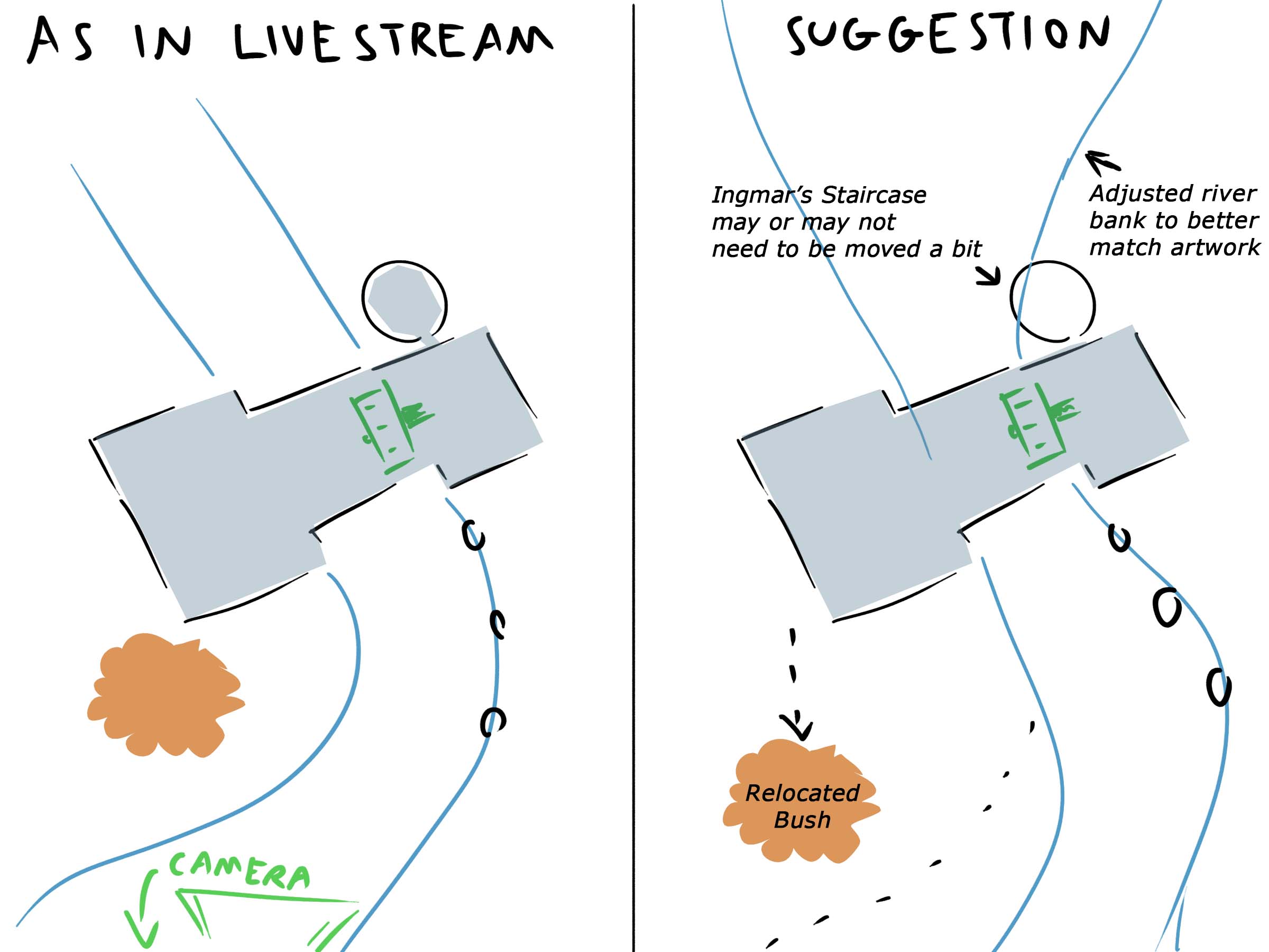
@theluthier I think at least the main problem with the ground plane is that currently it is being based on an assumption that the ground in the artwork is flat, but (to my eyes at least) the ground in the artwork is composed more of small hills/hillocks/mounds and dips and so on.
Case in point: when I had a closer look at the cart in the artwork, my understanding was that the cart is parked on top of a small hill such that while someone might think that the wheels and bars are both lying perfectly on the ground, they are in fact at different heights. ![]() duerer
duerer

And about the front bushes, after lowering the ground plane I, personally, might have moved them closer towards the camera and scaled them on the Z-axis to better match the artwork. So that you could then have a reference point in the 3D scene to know how far to also bring the curvature of the river bank towards the camera as well and additionally re-sculpt the current flow of the river.

Of course this is all dependent on whether or not we continue trying to Xerox the concept or use it as a jumping off point instead.
To my eye in the concept art, the foundation of the water wheel house is built into the ground rather than resting on it (as it was in this Casual Stream). Like the foundations of a castle surrounded by a moat.
Below is how I see/interpret the representation of the water wheel in the concept art. ![]() harbinger_ua
harbinger_ua

Hopefully some of this may be of use to the Collab.
Thank you, ![]() vincav81 , for your excellent illustrations 👍! I agree with you about the unevenness of the foreground terrain. We now have a view of the backside of the spice vendor's house here (you may have to scroll down until you see the post in an orange frame) and Vadim
vincav81 , for your excellent illustrations 👍! I agree with you about the unevenness of the foreground terrain. We now have a view of the backside of the spice vendor's house here (you may have to scroll down until you see the post in an orange frame) and Vadim ![]() harbinger_ua has answered in the same thread some questions which I had asked him about the house and its environment. There won't be a staircase tower or a veranda but an oriel where the spice vendor grows a few spice plants!
harbinger_ua has answered in the same thread some questions which I had asked him about the house and its environment. There won't be a staircase tower or a veranda but an oriel where the spice vendor grows a few spice plants!
Thanks ![]() duerer , I've already been catching up on your WIP thread, very meticulous. Thank you.
duerer , I've already been catching up on your WIP thread, very meticulous. Thank you.
Ooh I love this so much! Great illustrations Vincent! Simple yet very informative. Your understanding of my mill tower foundation idea is perfectly on point. That's exactly what I was thinking while making it. The only thing I'd change is to leave the bush where it is right now as it is intended to be right beside the house.
Super informative ![]() vincav81. 100% clarifies what the foundation should look like. That was a mystery till your drawing 👍
vincav81. 100% clarifies what the foundation should look like. That was a mystery till your drawing 👍
PS: I've seen several clarifying drawings from you so far. They're always on point and even a recognizable style. Thanks for putting in such effort!