I've only been using Blender for about a week, so there's that.
Some background of my problem if you care. I have a pattern that I'm trying to extrude; just a silly curvy line doodle. I used Inkscape to turn the png of the image to an svg, imported that into Blender as a curve, converted it to a mesh, extruded it and subdivided it. I like the shape that came out in the nice part but when Blender converted the curve to a mesh it made some really messy face geometry that, when extruded and subdivided, left a lot of ridges everywhere. So, I added a reference image and started merging and moving verts to match the reference. greatly simplify the face geometry and made most of the model look how I want, but I still have a few trouble spots.
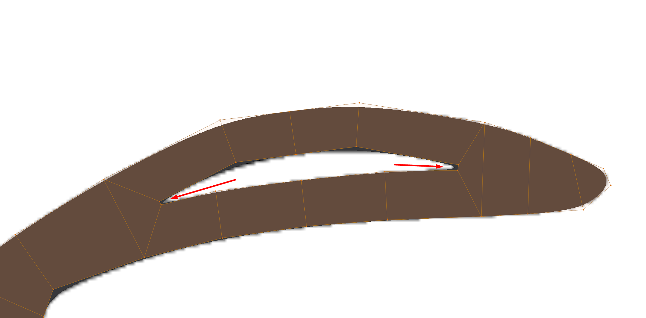
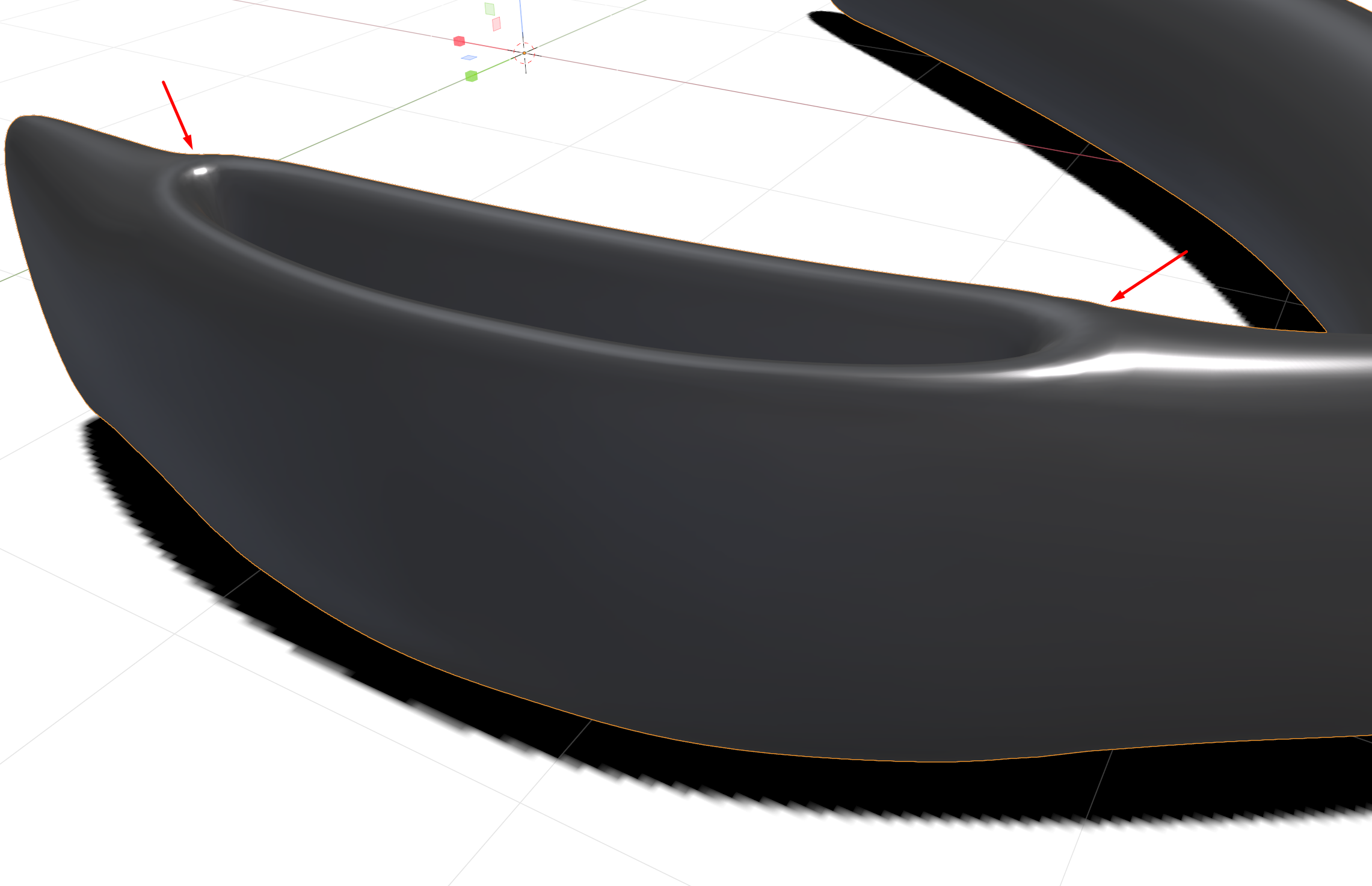
So, here are some examples of my issue. Arrows pointing out the trouble spots. Subdivide modifier is already applied (before the extrude) so I can see where to move verts in order to match the shape to my reference image
Unextruded mesh
As you can (hopefully) see, there is a ridge that forms at the corners.
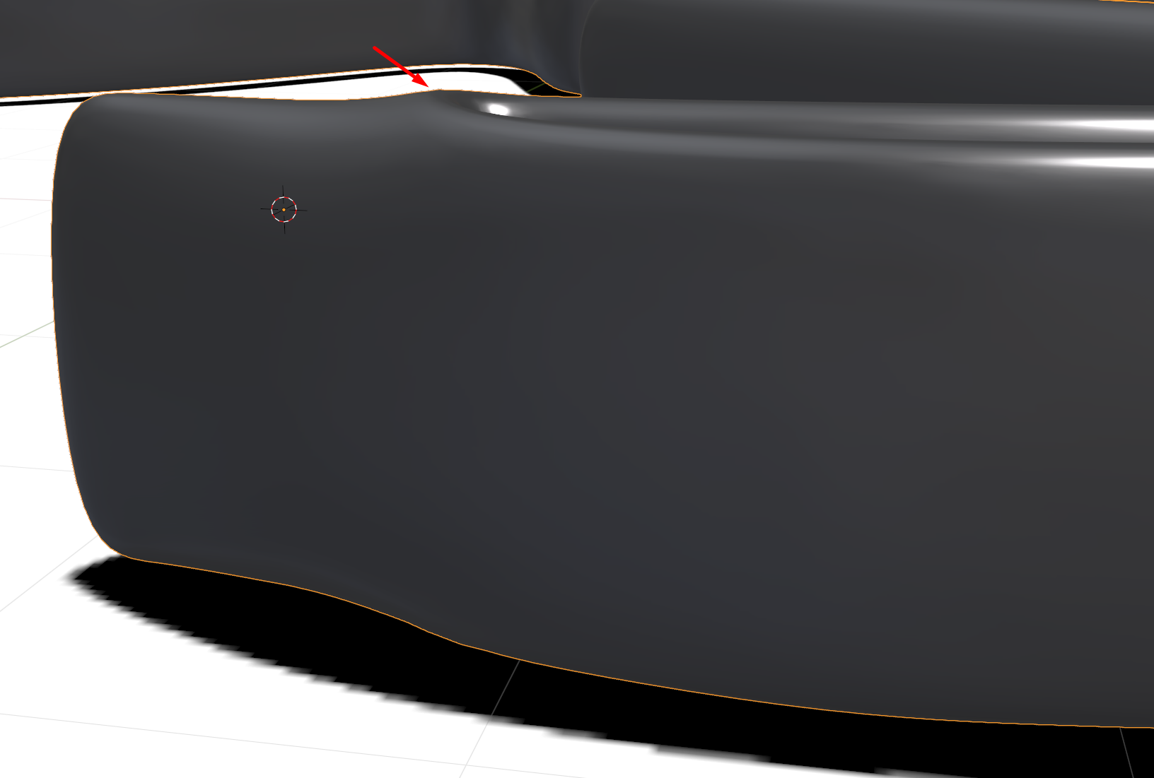
Is there a "better" way to go about making this? I tried piping a profile along a spline, but it didn't look good because I had to loop the spline back on itself, and I couldn't find a way to make a "Y" with splines.
I've been playing with this for about 10 hours, trying different geometries and vert positions, and this is the best result that I can get. I would like the corners to be flush with the top of the rest of the model. Is this something that I can do by modifying the geometry? Am I going to have to edit the mesh somehow after the extrude? I tried playing with some of the sculpting tools, but couldn't get any of that to work. Advice or examples would be greatly appreciated.
yyukinoh1989 Not much else to see but here are a few shots of different viewport shadings from 2 angles. Hope one of these is what you want to see.
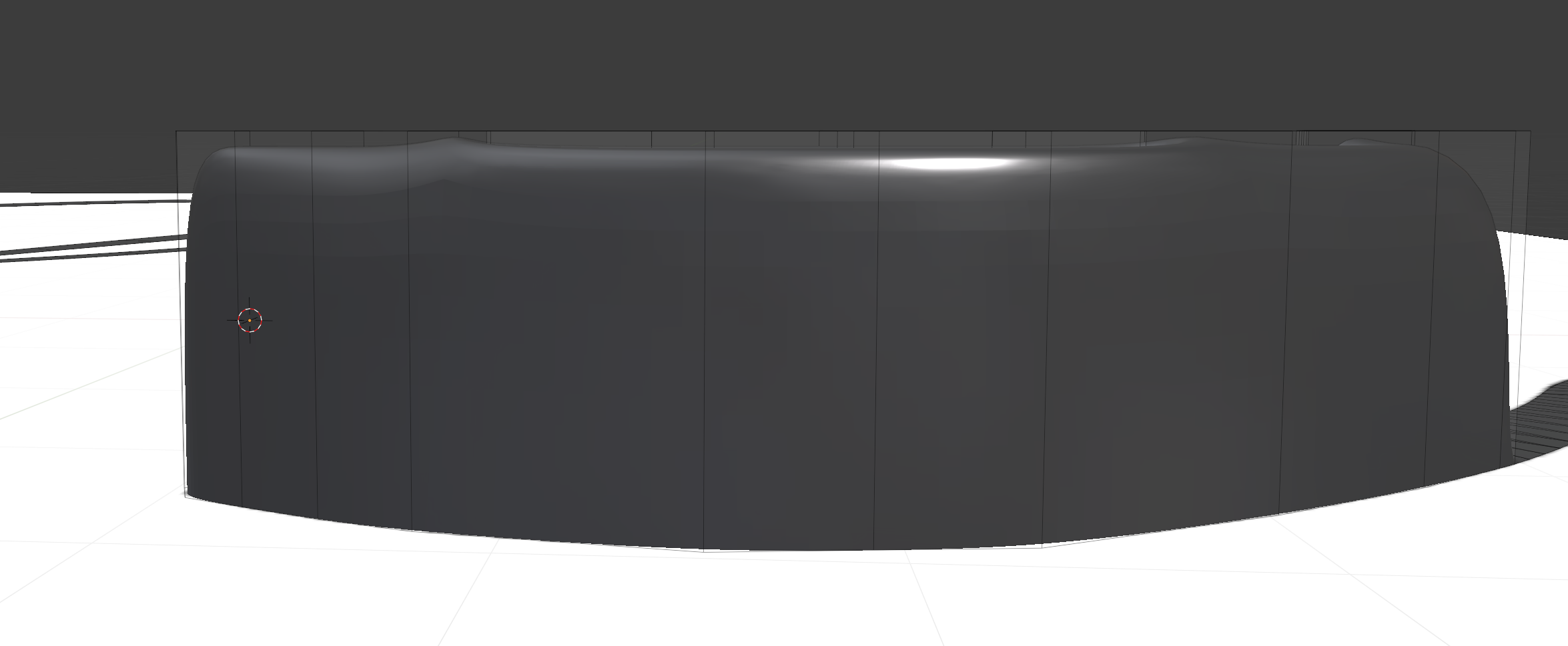
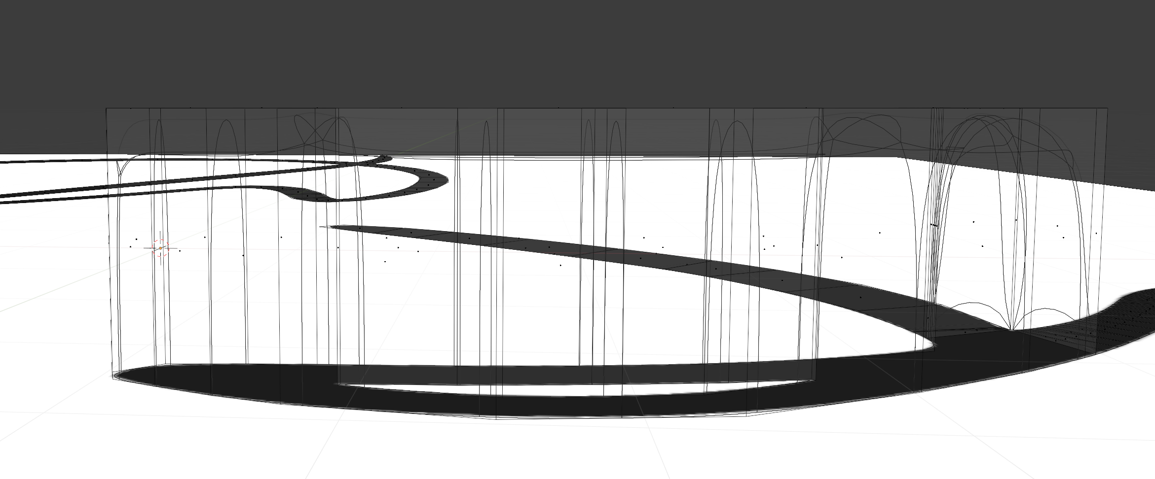
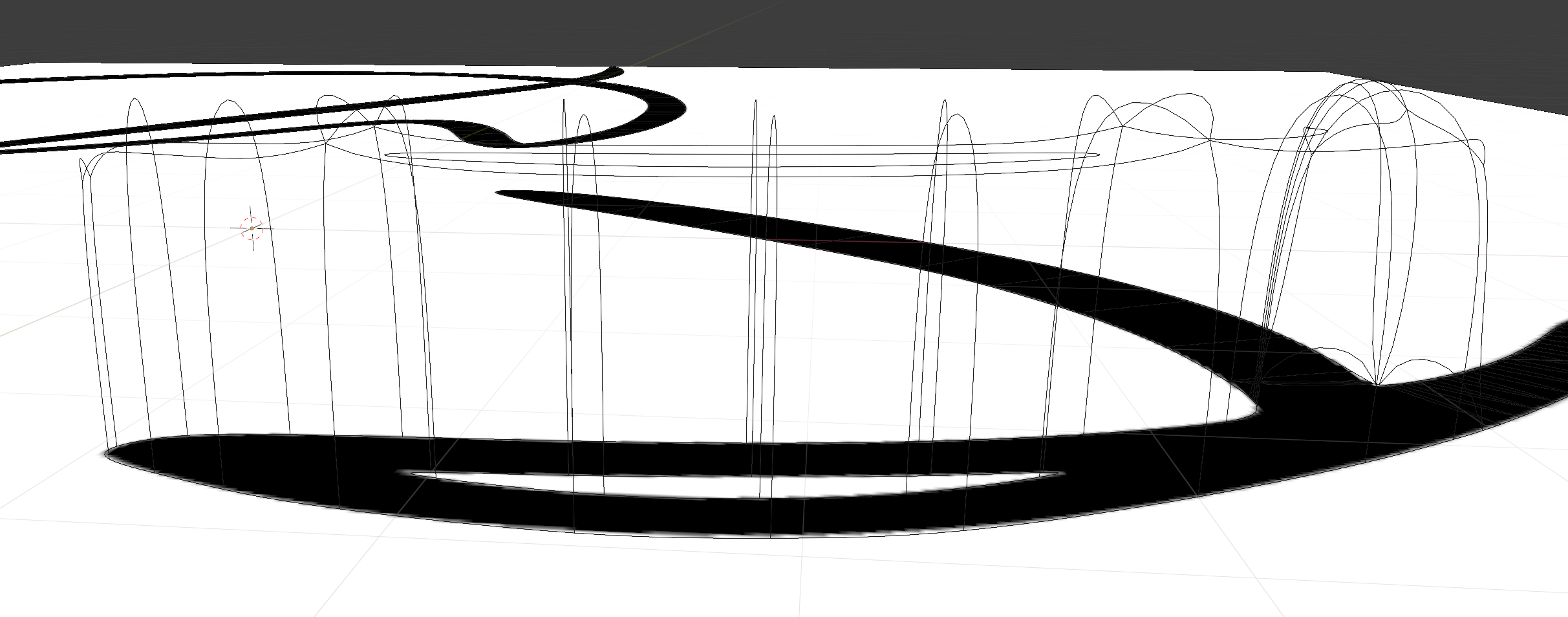
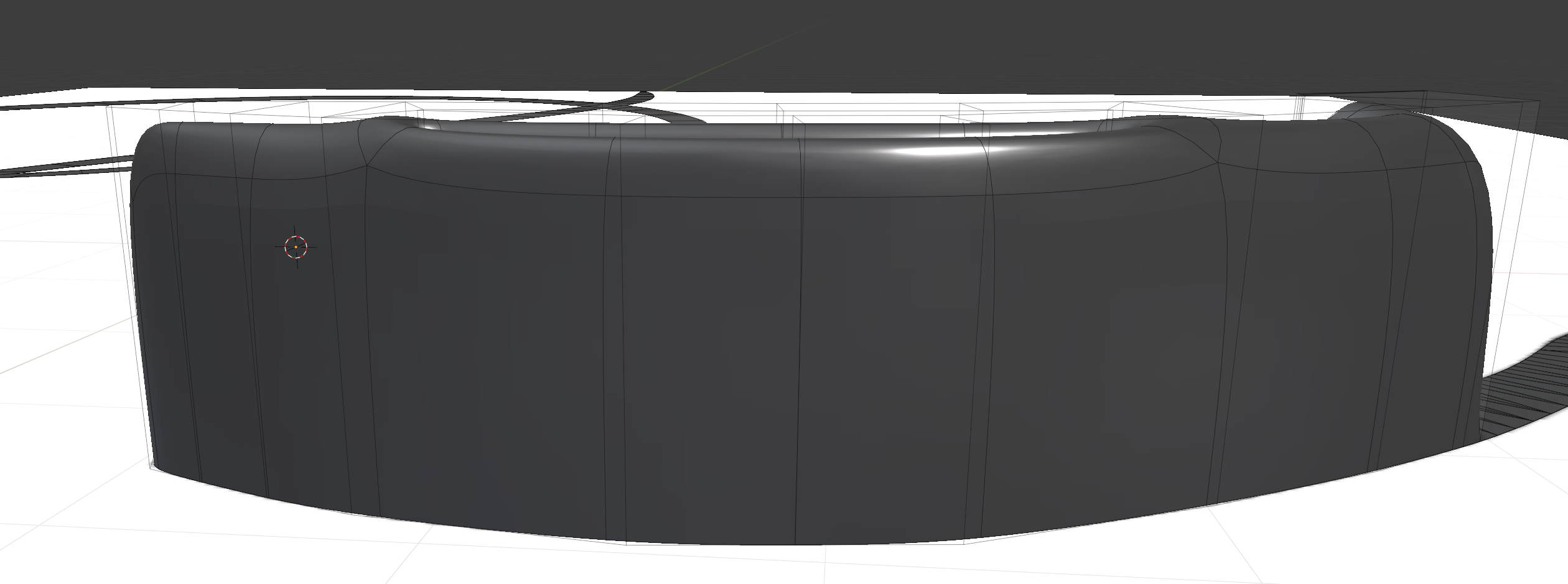
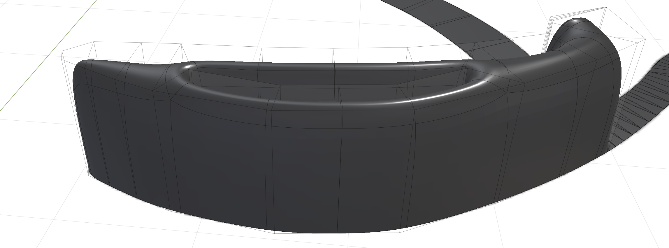
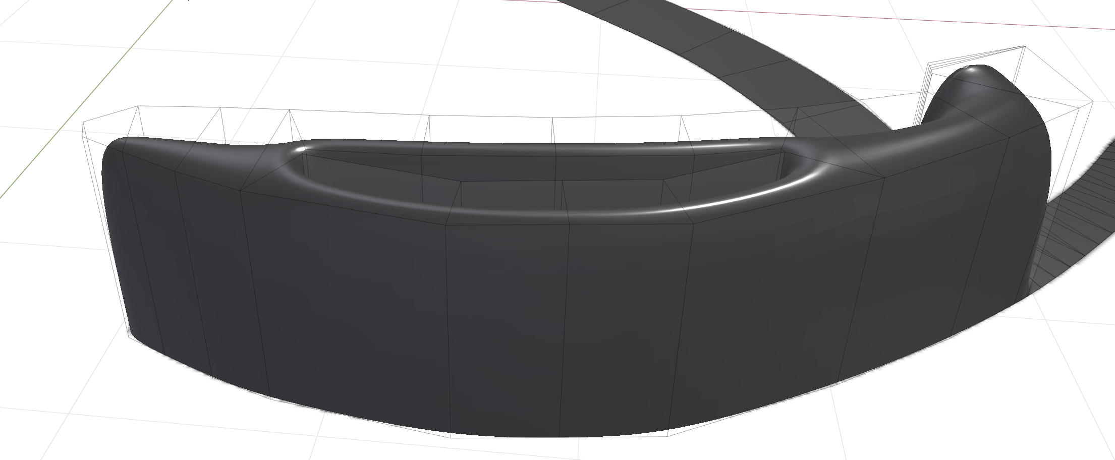
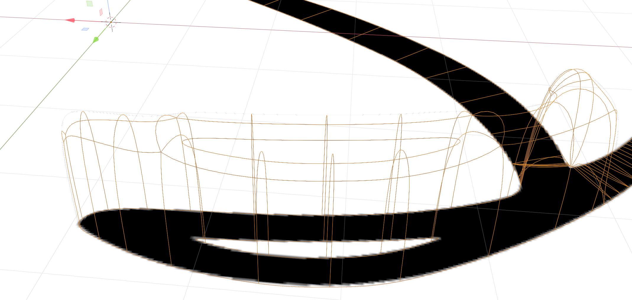
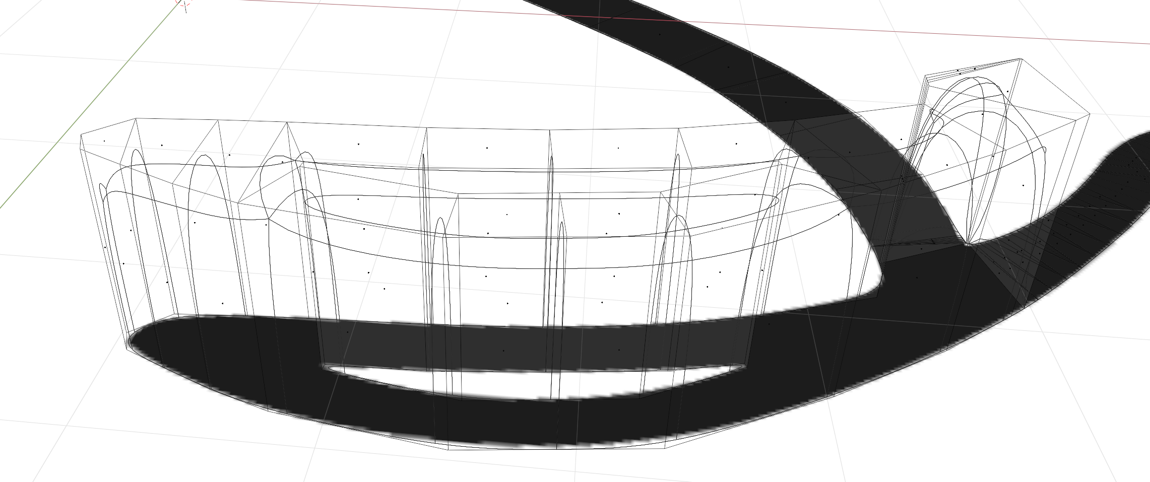
Hey, thanks for the screens. Sadly i dont see the problem right away. I supppose you use the subsurf modifier? If you disable that, how does it looks then?
It looks like its coming from the subsurf modifier, perhaps you can try 2 suporting edges to flaten it out. Or increase mean crease value, if you cant get it to work i could take a look in youre file to help solve it and post the steps i did to fix it.
yyukinoh1989 I had tried adding supported edges before; forgot to mention that was one of the things I tried. All I managed to do was created a bigger flat raised area. I just spent 30 min giving it another go, but with the same results. As far as the mean crease value; I'm not sure what that is. I really appreciate you looking at this.
I couldn't see any way to attach a file, so here is a google drive link: v2_mesh_wip2.blend
That is because of the way that the Catmull-Clark Subdivision algorithm works.
Look closer at for instance your triangle: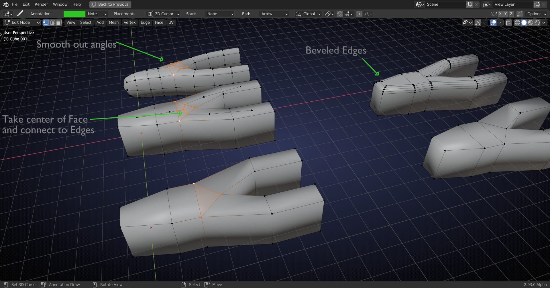
Subsurf takes the center of each Face and connects it to the surrounding Edges. Then it smoothes everything out.
Now the other (not in the triangle) points get 'pulled down' more, hence the 'bump'.
The principle, seen in 2D, is this:
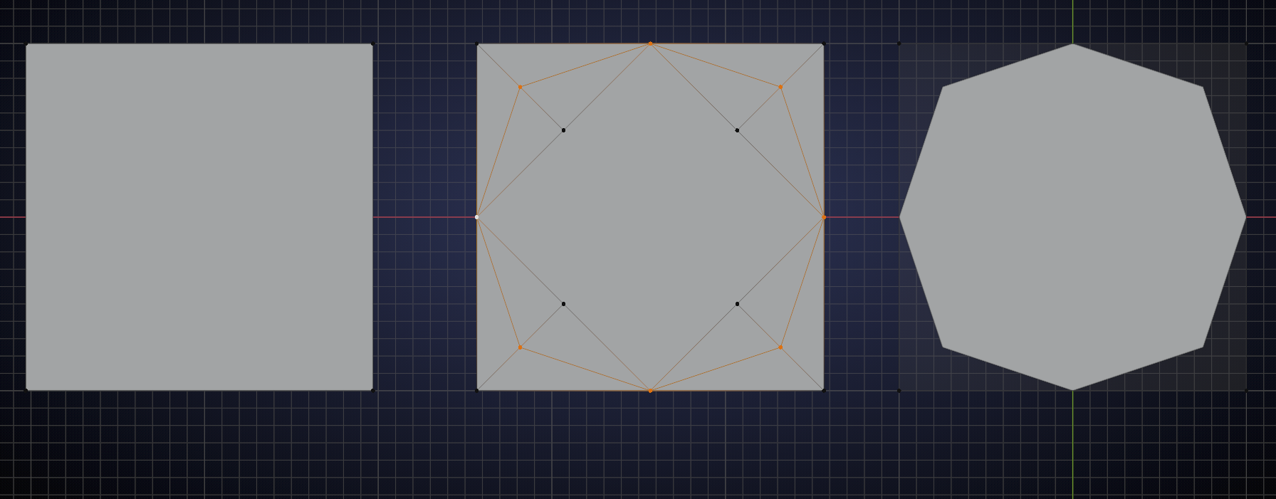
(It is slightly more complicated, because Blender, by default, smoothes out more, as if there were infinitely many subdivisions, but forget about that...).
Avoid triangles when using the Subdivision Surface whenever possible and when you must have a triangle, place it there where it 'can't do any harm'.
I'd get rid of the triangles in your example and Bevel the Edges, instead of using the Subsurf.
Probably not the answer you'd like to hear...
so here are the steps to get it better (just adding a bit more geometry will fix it (if anyone know a better fix feel free to jump in )
ctrl + r to place a loop cut there in the middel (we also do this the other side )
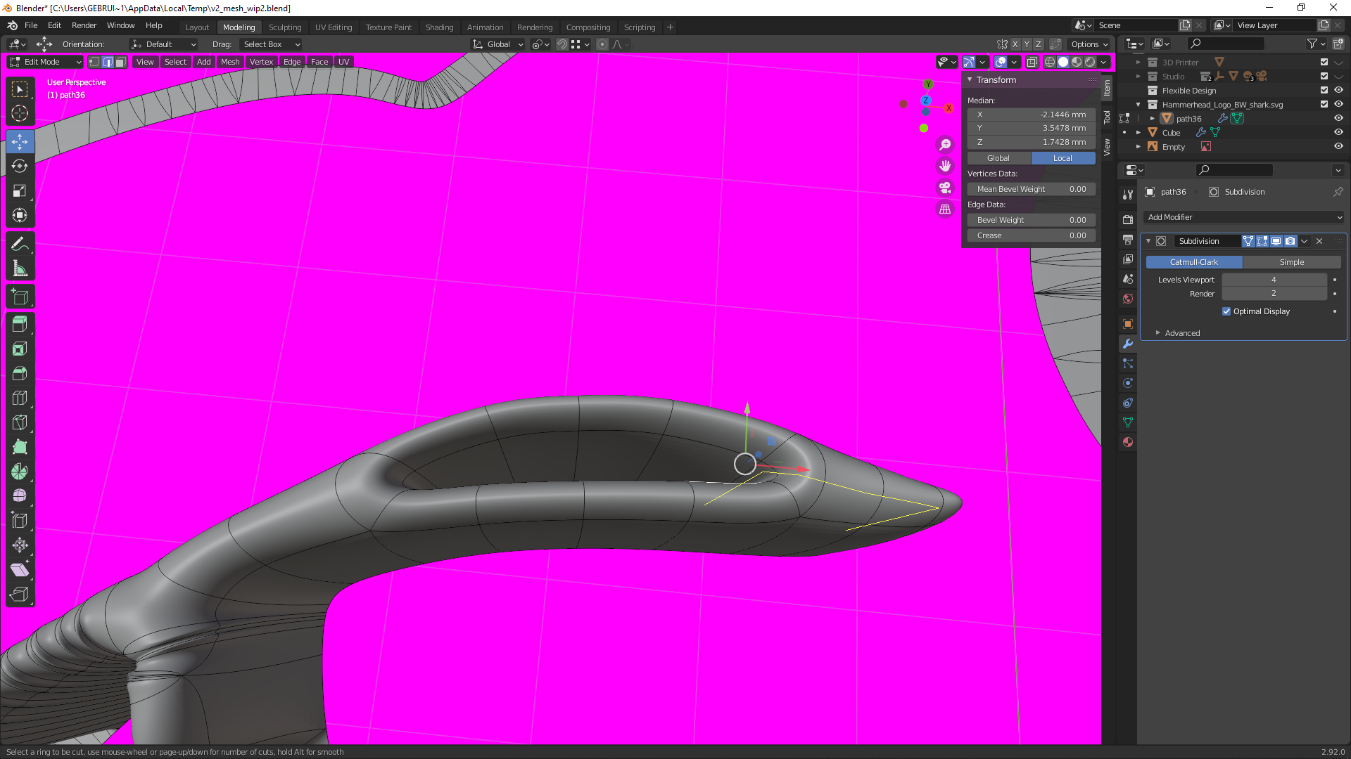
once that is placed it still has this bump but this will be fixed soon
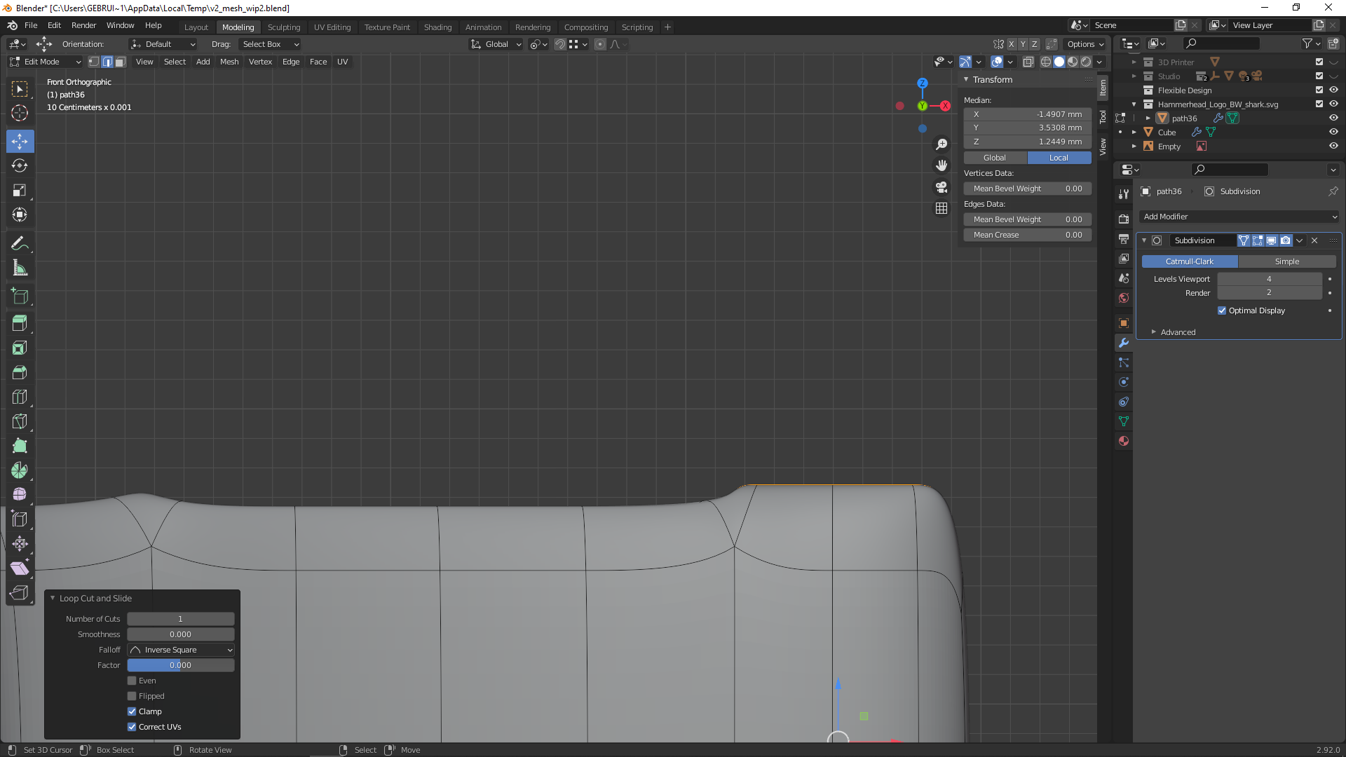
now we add a loop cut in here
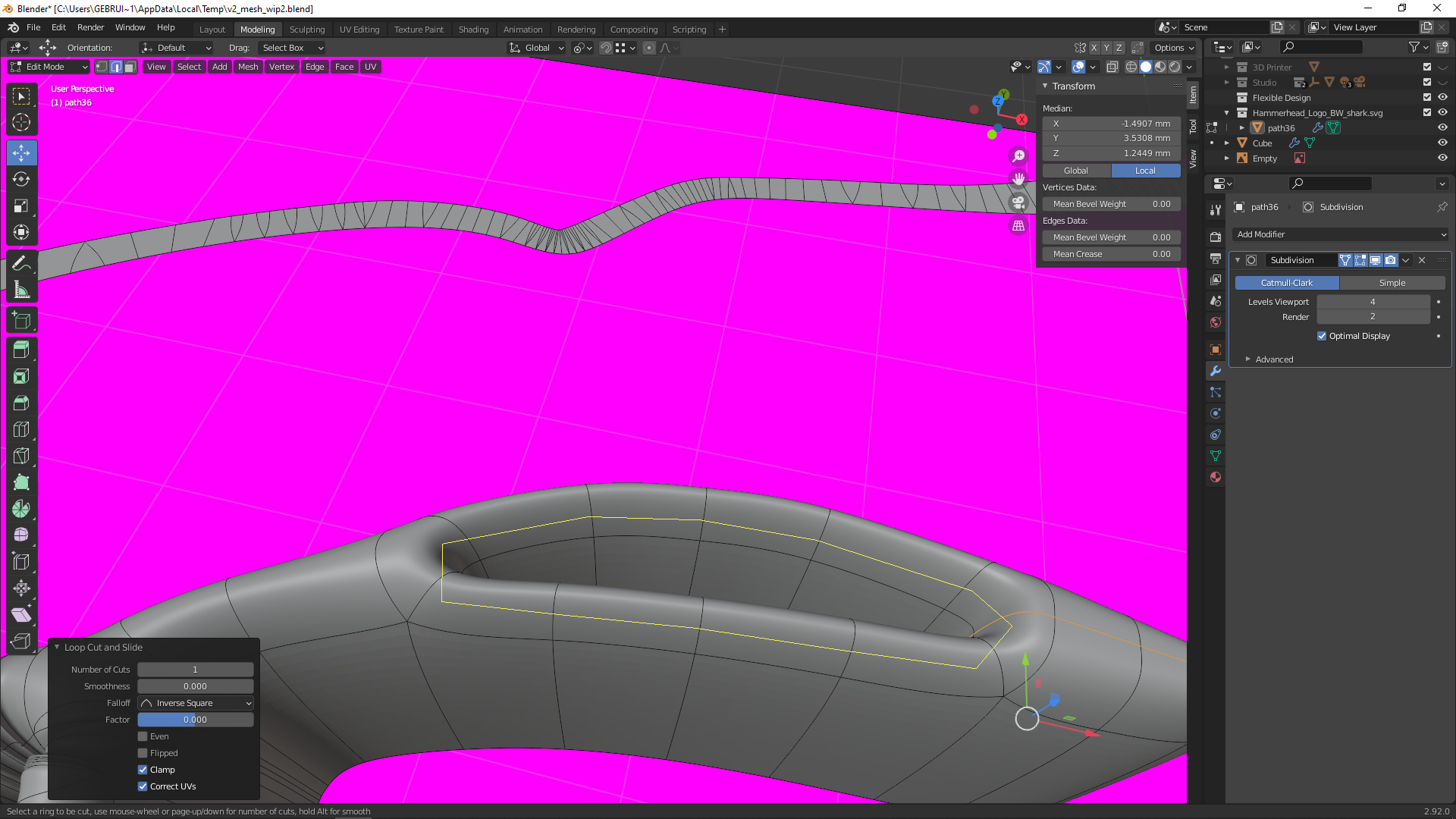
when we check now from the side you will notice the bump is gone
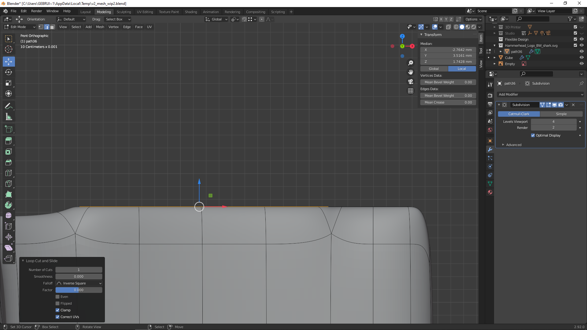
so repeat step one on the left side and it will be flatten out completly :)
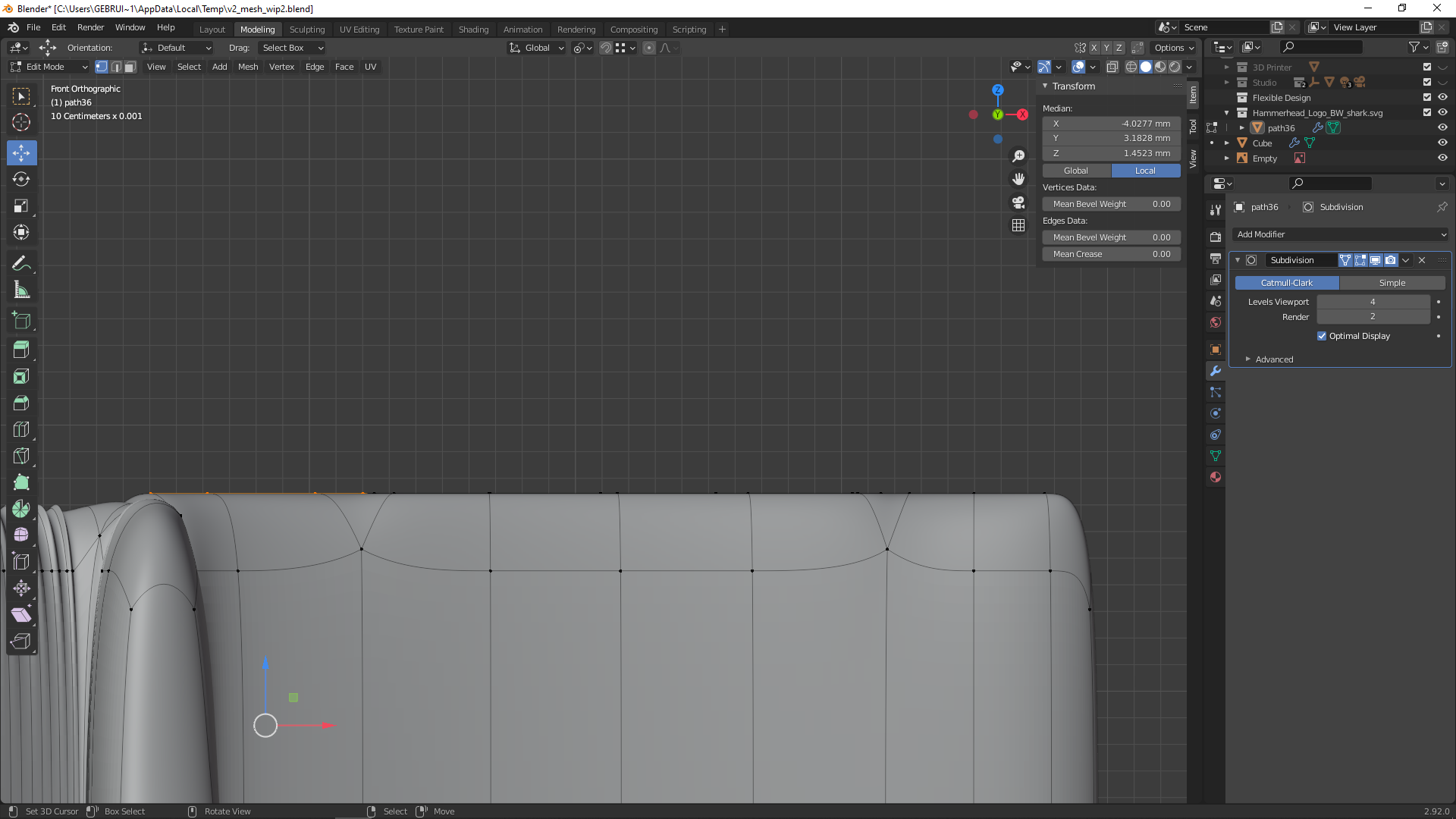
hope this will clear it out :)
sometimes supporting loops or a bevel will get you the needed result
![]() spikeyxxx I see the point you are making with the triangle. However, mine is not actually a triangle, it's a quad with 2 vers fairly close together. I thought the ridge was forming because the verts were so close together that it was having the same effect as a tri, by the ridge is still there even if I move those two verts far apart. The problem with beveling is that, while the ridge is gone, so is the cross-section shape I'm going for. I tried the bevel and sliding the edges down the z-axis to recreate the cross-section shape I want, but couldn't get it just right. Thank you for the input.
spikeyxxx I see the point you are making with the triangle. However, mine is not actually a triangle, it's a quad with 2 vers fairly close together. I thought the ridge was forming because the verts were so close together that it was having the same effect as a tri, by the ridge is still there even if I move those two verts far apart. The problem with beveling is that, while the ridge is gone, so is the cross-section shape I'm going for. I tried the bevel and sliding the edges down the z-axis to recreate the cross-section shape I want, but couldn't get it just right. Thank you for the input.
yyukinoh1989 Thank you for your work. I did what you showed in your reply, and while it gets rid of the ridge, it also seems to flatten out the top curvature of the cross-section (I hope that made sense). With your and ![]() spikeyxxx's reply, I am much more informed on how things work. I think it's just something that my lack of experience is blinding me to. Hopefully, as I gain experience, something will just click and I'll see how to put it all together to get what I want. I might just have to let this one go until I am more skilled with Blender; unless a different solution shows up.
spikeyxxx's reply, I am much more informed on how things work. I think it's just something that my lack of experience is blinding me to. Hopefully, as I gain experience, something will just click and I'll see how to put it all together to get what I want. I might just have to let this one go until I am more skilled with Blender; unless a different solution shows up.
np if you follow the mesh modeling bootcamp here you will learn a lot of nice tricks that might help, not sure how it should look but from there you could adjust the model further to youre liking :)