Signed up for the foreground tree A. I've never attemted to make a stylized tree, so it should be a lot of fun.
Instead of using tree generating addons, I decided make a sculpt first, then do retopo, I feel like it gives me much more artistic freedom.

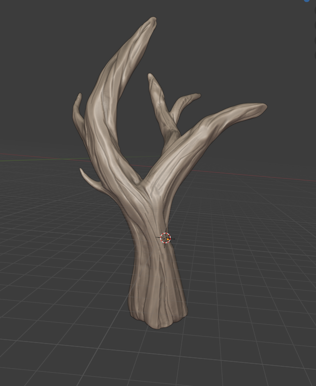
So this is the sculpt of the base of the tree, I'll add more branches later in the process. I used a very handy brush - multi-plane scrape. I don't know if it's been just recently added to Blender, but this was the first time I used it and it works beatifully for this type of surfaces.
FYI Multiplane scrape was added in 2.82.
It is indeed a great brush for this!
Love your tree so far!
Homework Submission - Week 1 - FG Tree A
@theluthier
I'm doing the sculpt to retopology workflow.
The leaves are kind of there, but still it's still very, very experimental.

With textures:


Brilliant first week ![]() brzostek! I'm so impressed by your result. You went way beyond my expectations for week 1, so you get full points + some extra 👍
brzostek! I'm so impressed by your result. You went way beyond my expectations for week 1, so you get full points + some extra 👍
I mentioned during the stream yesterday that blending your method with the ghibli method might be the ideal result stylistically. I really like the leafyness of your tree, which is the key missing aspect of the ghibli examples I've seen. So mixing your leafiness with the ghilbli blobiness could be perfect.
As for the trunk: I'm thrilled to see you've sculpted such lovely bark detail! My only concern is the lack of smaller branches. I think some smaller branches would present a more believable transition from trunk to leaves. Also please make sure the base of your trunk reaches further into the ground. We don't want to see evidence that the trunk stops at the ground.
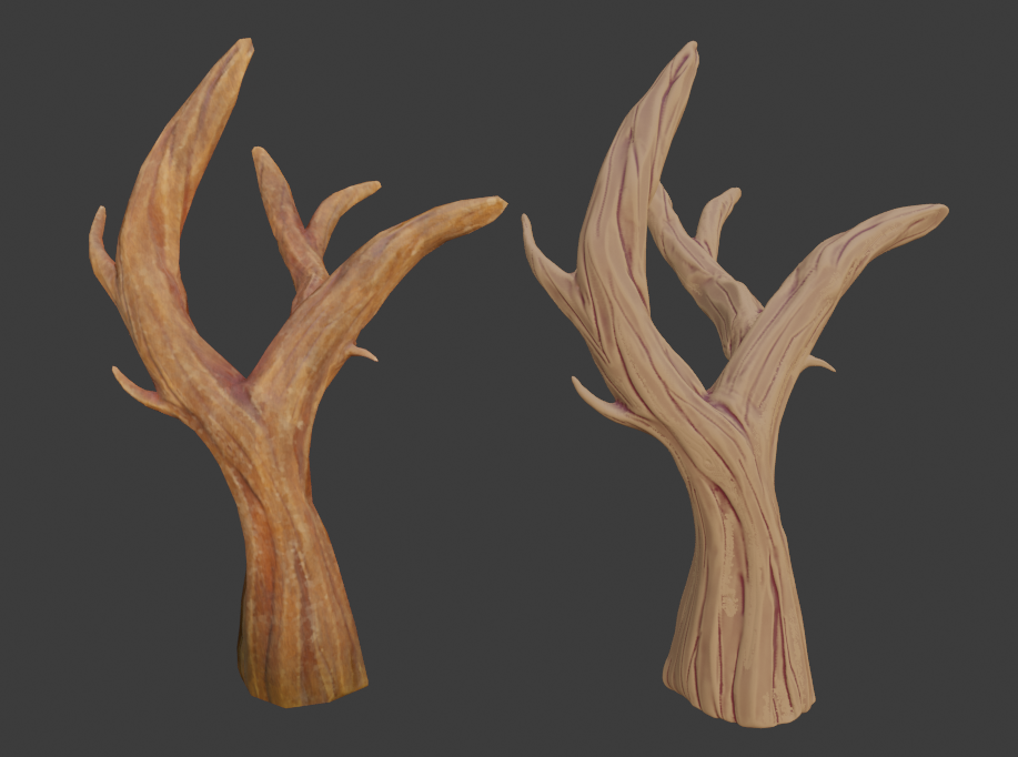
My tree so far. The trunk is retopologized (662 verts), the leaves however are about 300k, so I need to work on optimizing it a bit, lol. As for adding more branches, I think I'll add them separately to fill in some gaps and maybe it'll work just fine.

Baked and textured retopo on the left, sculpt on the right.


@theluthier
@jlampel
Homework submission - Week 2
I changed the colors and the amount of leaves, but it still seems a bit heavy (37k verts), so 10 times less than in the post above, but still too much.
I posted above the mesh after retopology, which is also part of the homework.

I added some branches, which use the same texture as tree to save some space, I might add some more, because they're fairly low poly.

This is looking really great! I'm loving that trunk a lot. I wasn't able to check out the file since I don't think it's in the drive (lmk if it is and I just missed it) but from the images it looks like you're nailing it. Full points for this week!
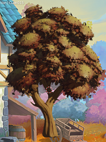
Edit: Looking through the rest of the thread, I really really like the shape of the bunches of leaves in this WIP:

If you have any way of taking your current result and making it more defined in shape like this, I think you're golden. I also like how the leaves appear to be slightly smaller. While we can't quite go with a size that's totally realistic, I'd like to err on the side of believability for this. If you need to, think of each leaf as a group of leaves rather than one single leaf to get the best of both worlds.
@jlampel ![]() spikeyxxx
spikeyxxx
I just uploaded it to the drive. Sorry for the late reply, but I had serious problems with my PC. I tried to stay closer to the first WIP (the one you mentioned) and tweaked the leaves.
Homework submission - Week 3
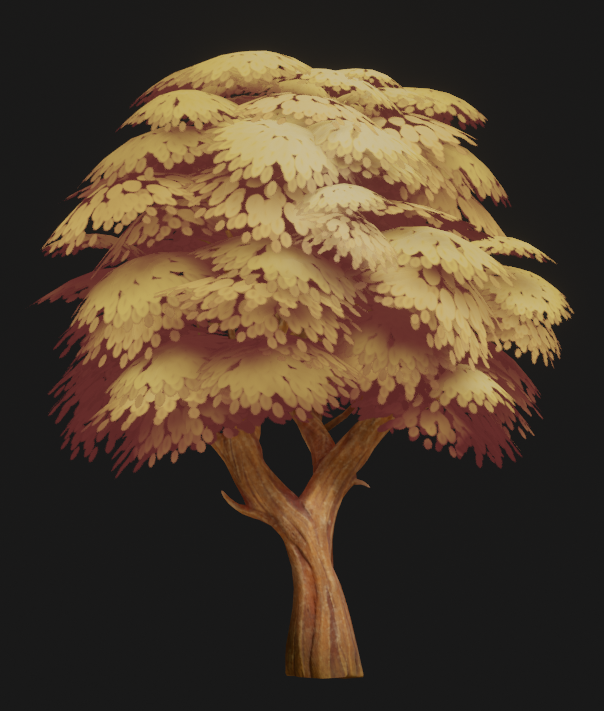
Does this style of leaves look appealing? I've been staring at them for too long now and I can't tell if I like them or not. Also, since I'm trying to learn Substance Painter (I have a student license), I've done all the baking and texturing there. Trunk textures are 2K, leaves are 512x512. However, I baked the textures into more maps than just normal and cavity, is that okay?


I love the trunk!
The leaves bunches are too 'flat-parachute'-like for my taste... like stacked palm-tree leaves.....also dulls out the color variation....maybe you took Jonathan's suggestion for the shape a bit too far in the wrong direction...but that's just my opinion, let's hear what @jlampel has to say.
Does this style of leaves look appealing?
Yes! Yes it does! With most of the trees being the same shape, I like how this one takes a different approach to the shape while keeping in the same style. I do think ![]() spikeyxxx 's critique is a good one though and I agree - they're slightly too flat overall. Perhaps just a couple sets of leaves sticking out at odd angles would be enough to make it look just a little bit fluffy.
spikeyxxx 's critique is a good one though and I agree - they're slightly too flat overall. Perhaps just a couple sets of leaves sticking out at odd angles would be enough to make it look just a little bit fluffy.
For the shading, everything looks quite good but I would really prefer to stay away from emission shaders unless it's critical. Try using translucency or SSS instead so that the lighting will always match all the other objects in the scene. If we need to tint the shadows a certain color like that (to change the time of day, for example), it would be way easier to change the environment light then dig through all the shaders for all the objects in the scene.
On the optimization side, please put the alpha for the leaves into the alpha channel of the color texture - the fewer textures to load the better. If you can find some other way to add variation than multiple leaf shaders (like vertex colors), that would be preferred. Similarly for the bark, try baking all of this to just one final texture:

The bark texture itself looks stellar.
Amazing work here, and full points for week 3 and then some!
@jlampel ![]() spikeyxxx
spikeyxxx
Homework submission - Week 4
I changed the material of the leaves, so now it uses only the alpha texture and I combined the principled BSDF with translucent shader. I modified the overall look of the leaves, so now it's both the previous convex meshes and flat planes.
I also changed the trunk's texture to make its colors more vibrant and stylized and now it uses only 3 textures - color, roughness and normal.
I have to admit, those 4 weeks flew by so fast, but I had a lot of fun. I think I'll need to tackle on creating stylized assets more in the future.
Wow, your tree turned out amazingly well!
A few minor notes if you happen to have the time - we're using Alpha Clip for all transparent planes since it's a little more efficient than Alpha Hashed. Lastly, one thing I really liked about your previous leaves was the subtle hint of texture on each leaf and the slight variation given to each one. The current result feels just a bit too flat in comparison.

Either way, definitely a result to be proud of! Full points for week 4 and I'm looking forward to seeing this in the final scene.
![]() brzostek You did great work for the Collab! I want to say that your week 3 homework looks fantastic. It's a certain style of tree that I really like. Unfortunately it's very definitive and if we were to go that route it would have required a global style shift. Ultimately I don't think it fit the art close enough, but I just want you to know that I commend you going that route initially.
brzostek You did great work for the Collab! I want to say that your week 3 homework looks fantastic. It's a certain style of tree that I really like. Unfortunately it's very definitive and if we were to go that route it would have required a global style shift. Ultimately I don't think it fit the art close enough, but I just want you to know that I commend you going that route initially.
I applied some material tweaks including a leaf hue randomizer. It looks great in the assembly!

Thanks for joining the project. It's been a pleasure working with you 🤝