This is an on-going thread documenting my progress through the 2021 Collab Project.
Homework Submission - Week 1 -Window A + Shutters
@theluthier
Final Outcome
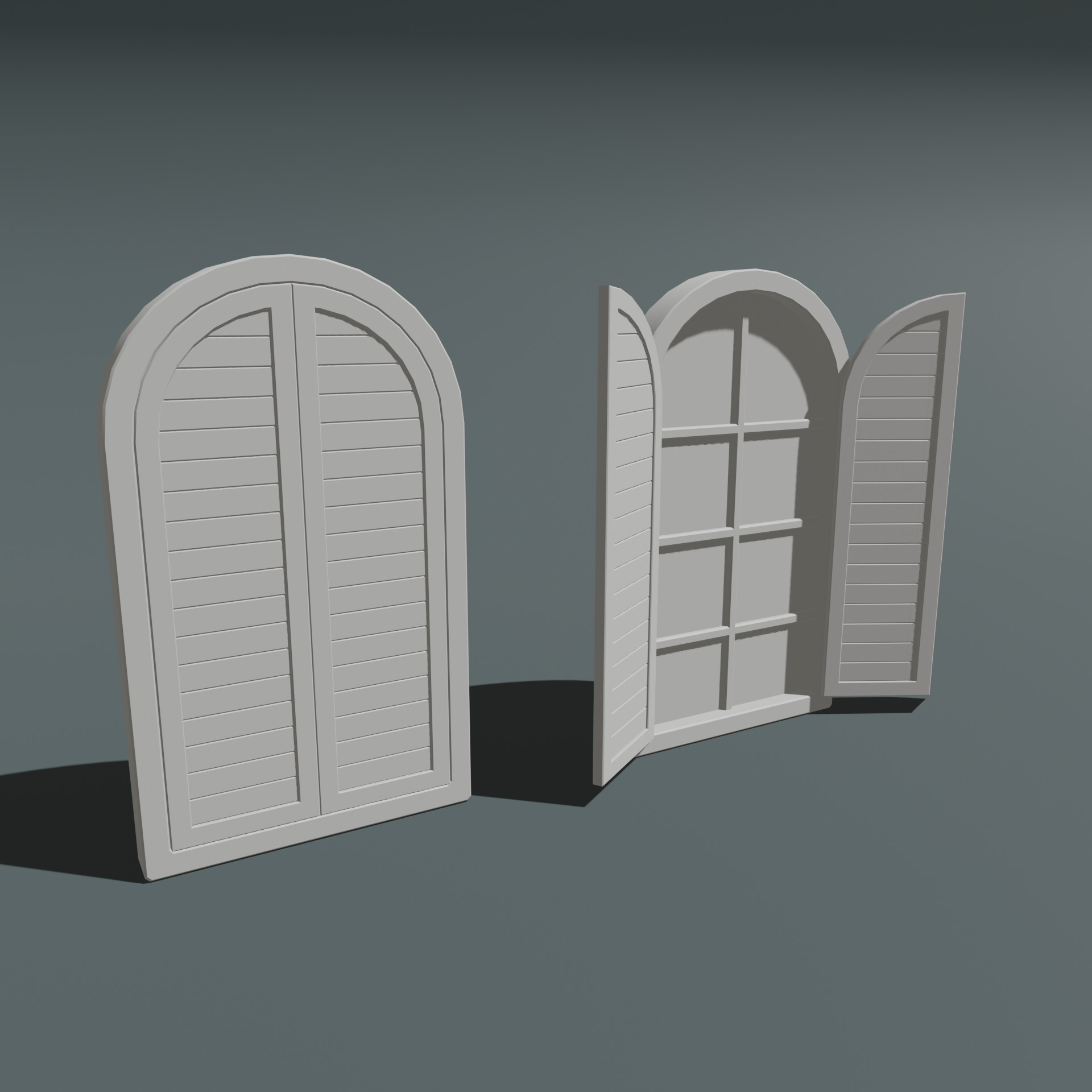
Week one workthrough below
----------------------------------------------------------------------------------------------------------------------------
Using empties to help control the pivot on the shutters. Hopefully it isn't too low poly!
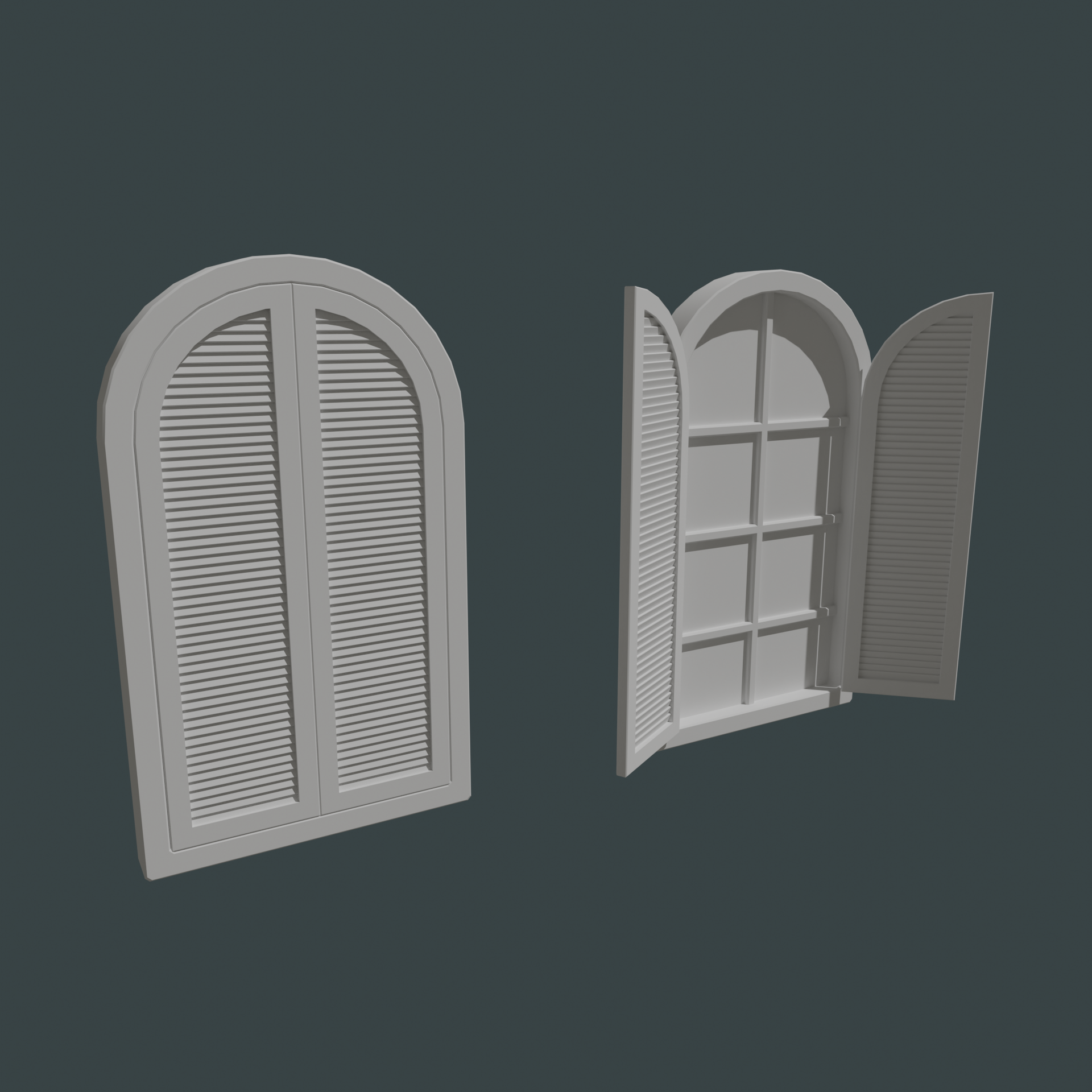
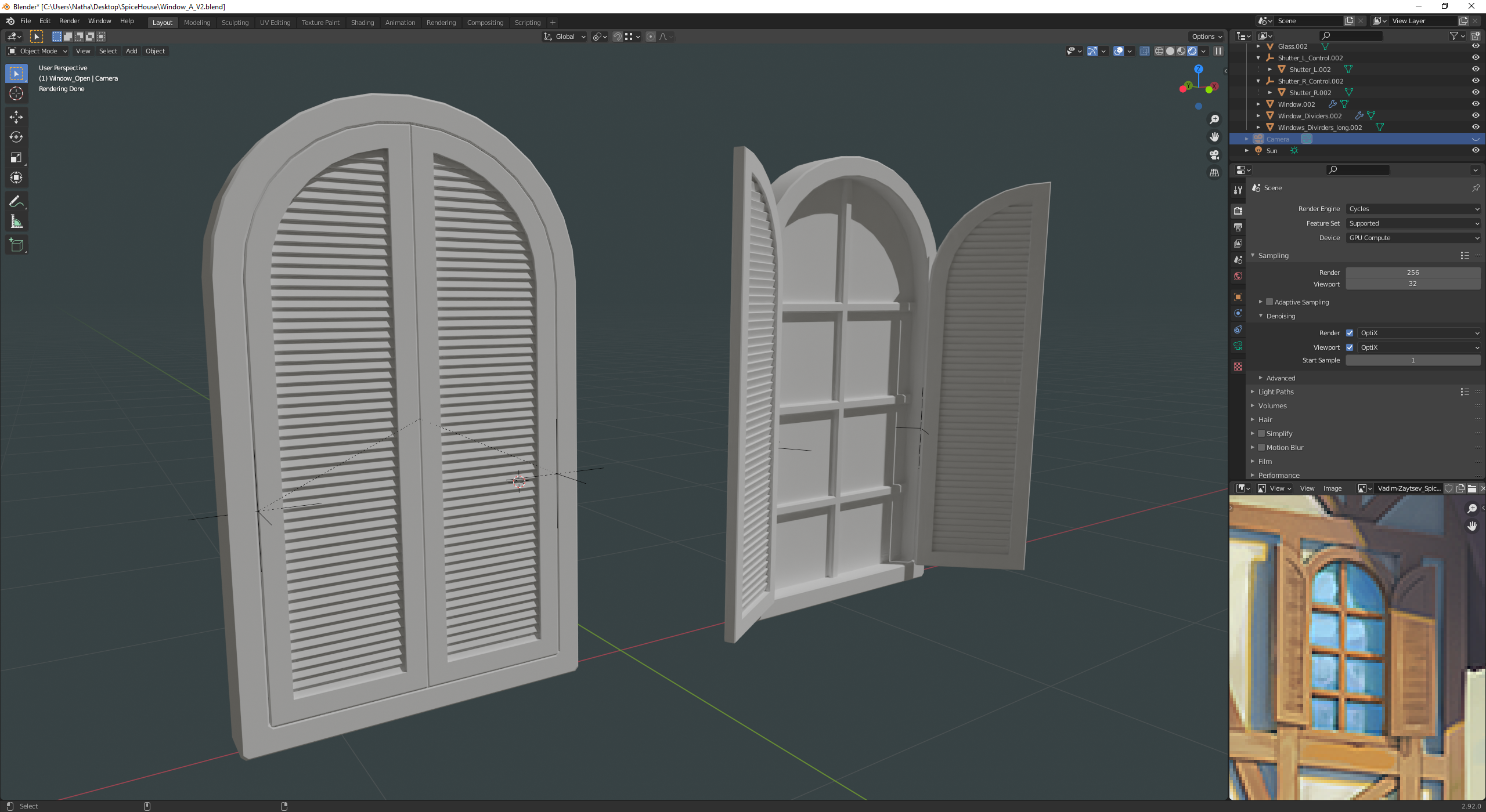
The pole timbers appear to be larger in the early art. This would also reduce the polygons
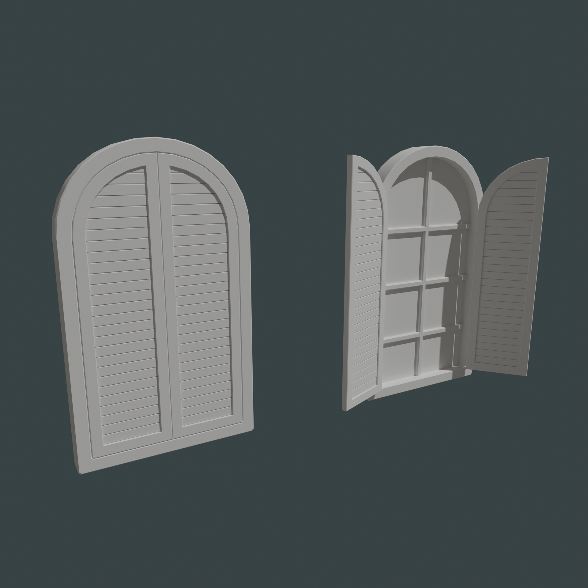
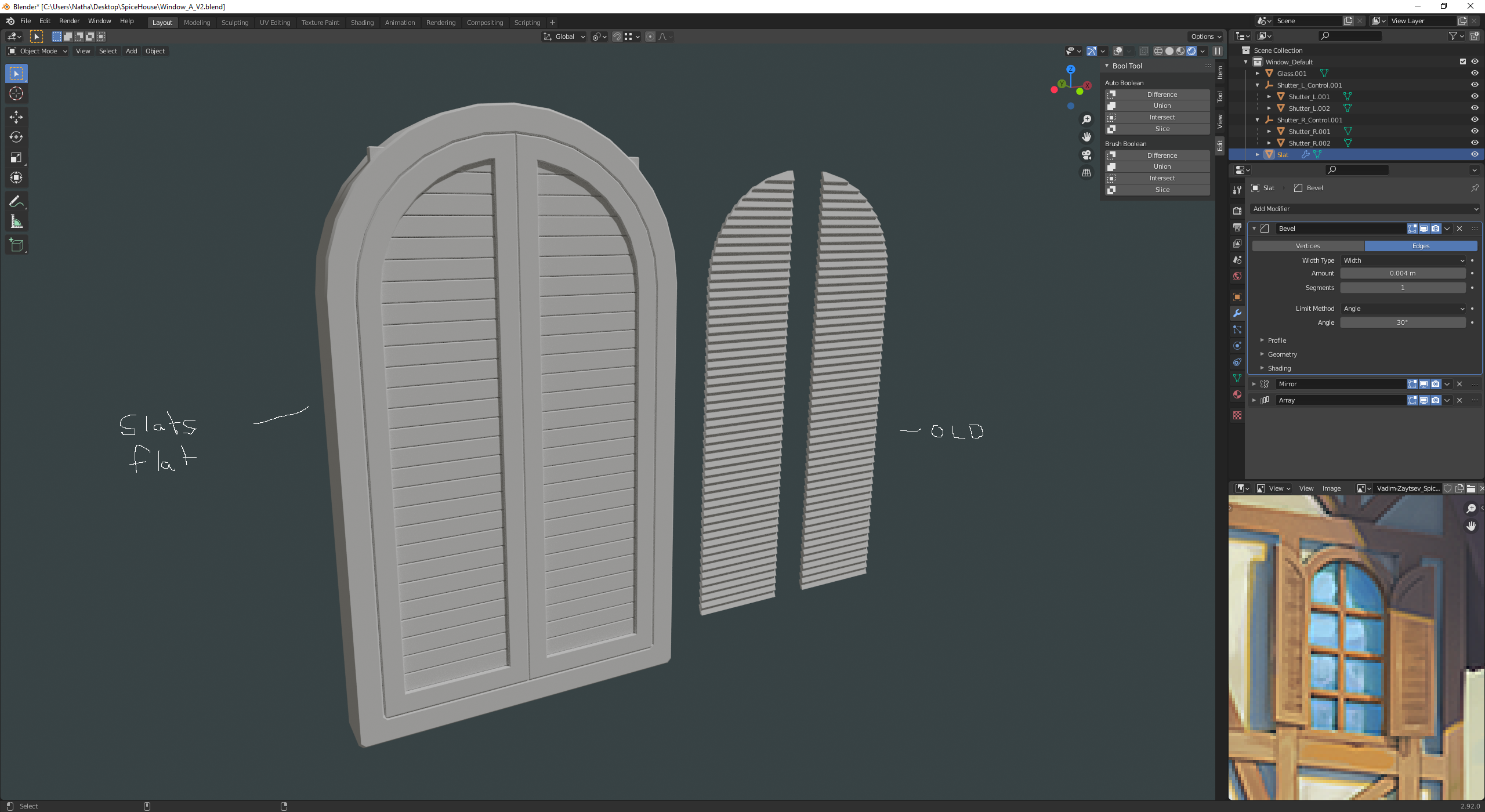
Agreed! Also looking back at the original art, it looks like the slats might also be flat, versus the style I have no where they are slanted like blinds/shades. I went ahead and did a version 2
I think the blades should be at an angle. Otherwise the functionality would be wrong.
I roughly count 18-20 blades on the window shades, so yours are a litte bit to small.
Hope I could help you.
Yeah thanks for the reference! I am not too sure on that use case here. These shutters seem almost like a "close shop" use and it feels like in the reference image the slats are flat and not angled to completely block light. I was going back and forth on this as well. Trying to consider the use case for them in the context of this fantasy building versus references from real life.
Alrighty final outcome for the week. Sticking with the flat styled slats, but increased the width of them.

![]() nathangarduno as I said in the Discord, this is looking great so far.
nathangarduno as I said in the Discord, this is looking great so far.
Finally getting around to your homework ![]() nathangarduno - You've done excellent work for week 1! Easily deserving of full points. I also concur with the suggestion of broader shutter slats than the thinner ones 👍
nathangarduno - You've done excellent work for week 1! Easily deserving of full points. I also concur with the suggestion of broader shutter slats than the thinner ones 👍
And I know you've already been exploring sculpted accents. Can't wait to see the results from week 2.
Homework Submission - Week 2 Sculpt -Window A + Shutters
@theluthier
Not huge about sculpting but was cool to learn and I love the accent it gives the piece.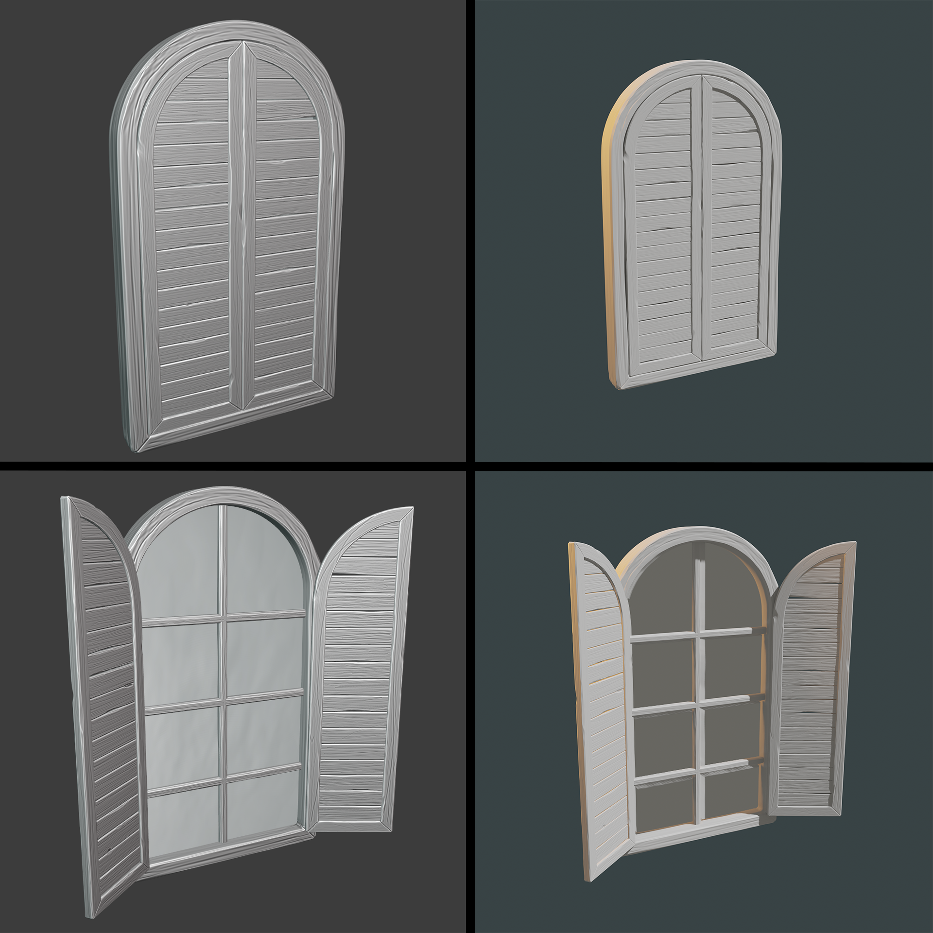
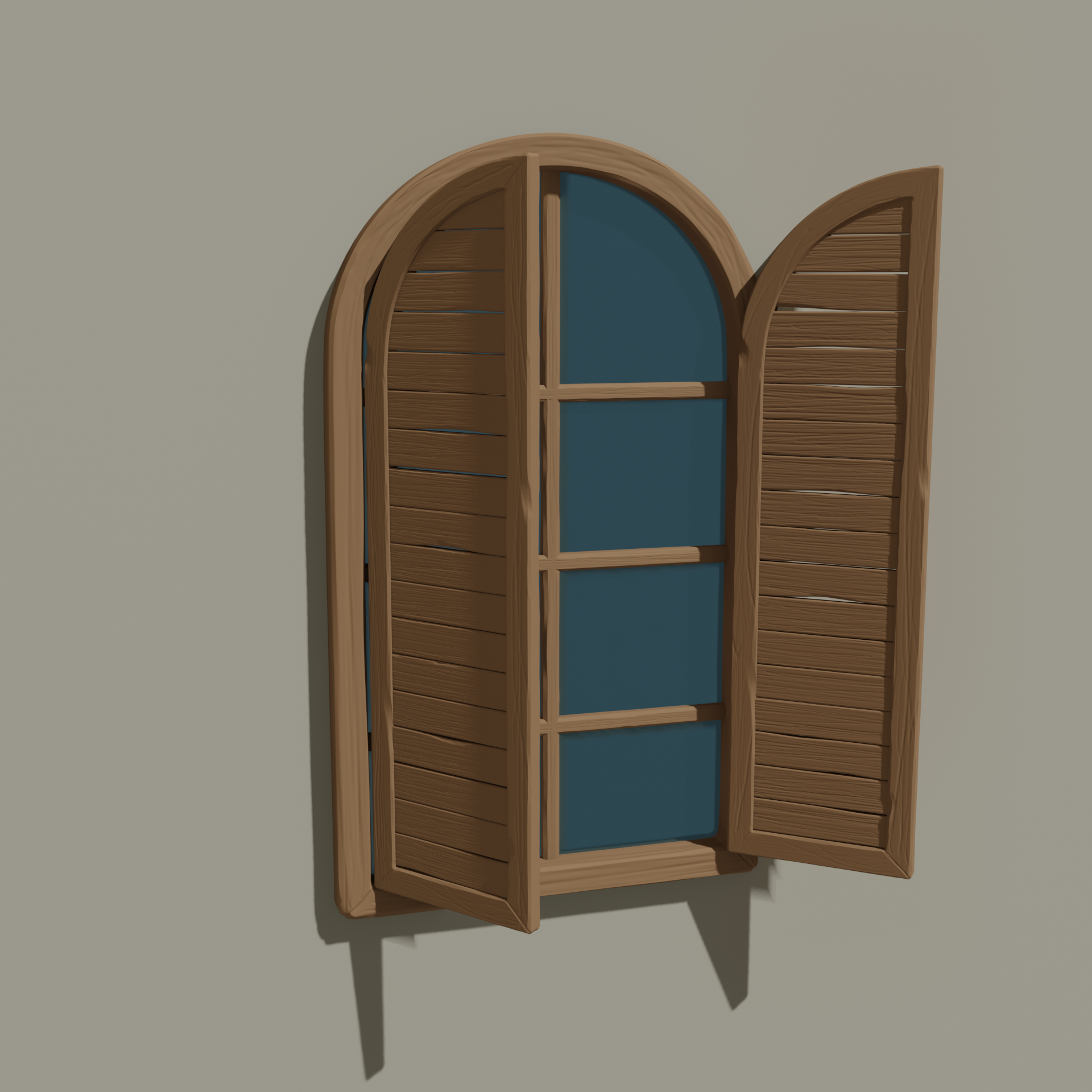
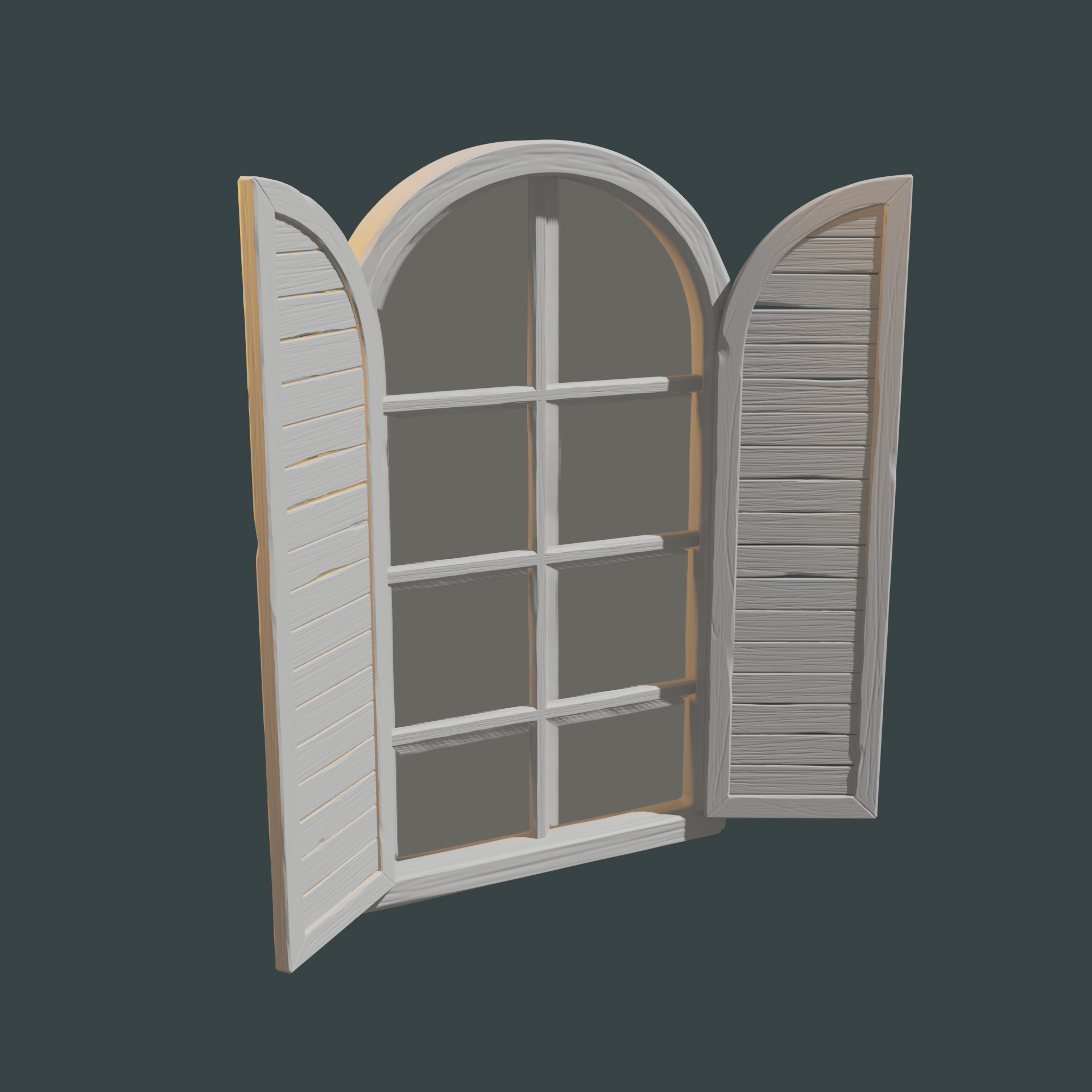
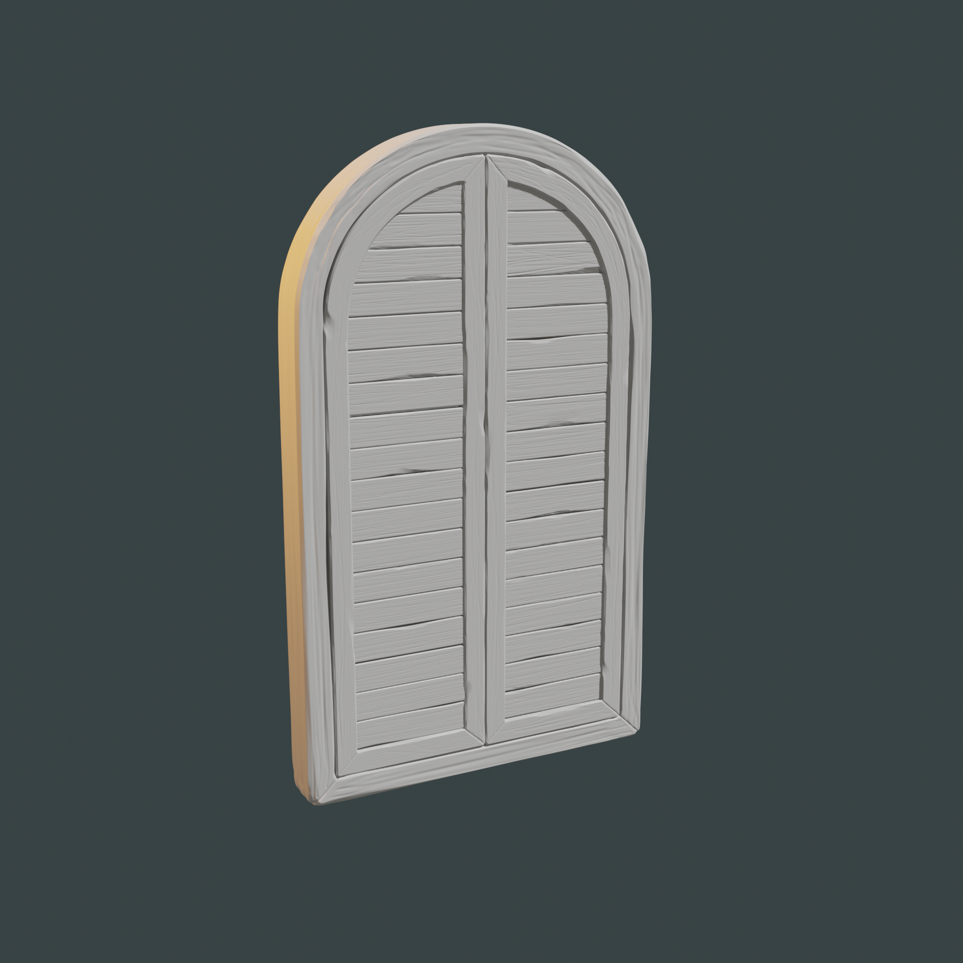
You nailed it ![]() nathangarduno. Exquisitely sculpted accents. The right balance of wood grain and beaten edges👌
nathangarduno. Exquisitely sculpted accents. The right balance of wood grain and beaten edges👌
No constructive criticism from me at all. Going into texture painting, your asset is one I would recommend simplifying the base geo for the shutters. The slats can easily be baked on to a flat face; no need for individual mesh islands for the slats.
I recommend you simplifying the geo to look like this:
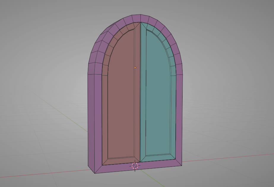
They can all be separate objects too (though they will all share the same texture space.