I love the amount of testing that you've done here! It looks like you've settled on the image plane method, which is shaping up to be the preferred method for all the vegetation in the scene.
Are any of your files in the drive? I'd love to see how things look in 3D.
Even though your objects are in the background, we're still going to see things from multiple angles, so the method of placing several cards together in a clump and setting the normals to be that of a sphere (or other blobby shape) will be the best bet. If you have any questions about that just let me know.
Definitely full points for week 2 and I'm looking forward to seeing what you end up with for next week!
Thanks!
My file should be in /SCENES/MODELS/TEMP if you want to take a look.
I guess I'm thinking a half-sphere at most, because even if the user can take the camera anywhere... at some point they will see a void right? The illusion will be broken at some point, so I was just planning to make it look good from roughly around the house.
With a half-sphere, we could easily double it up if needed from all angles anyway, so I'll do that for now.
Hey ppfbourassa , haven't heard from you in a while.
Any progress on your bushes??
Hope you are keeping well.
No updates this week, I've been busy with paid work. But I'm not quitting on this project!
I'll put together something usable this week.
Still not sure exactly how to deliver. Maybe like 5-10 collections with different colors and shapes?
Good to hear.
Did you see Kent's casual stream on Thursday, he covered mostly nature assets, a good example of the bushes.
Trying to get my placements correct. I copy-pasted some geometry from the scene file, and I'm placing bushes around the seams where different objects meet, and I'll put some at the bottom of trees to hide the trunks.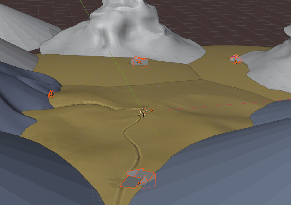
Here's what each bush looks like up close.
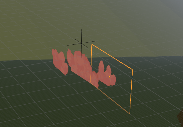
And from the main camera.
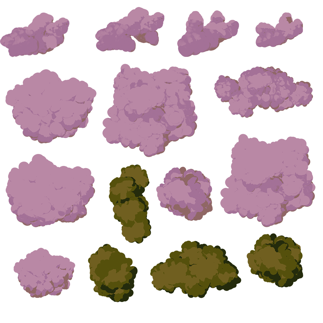
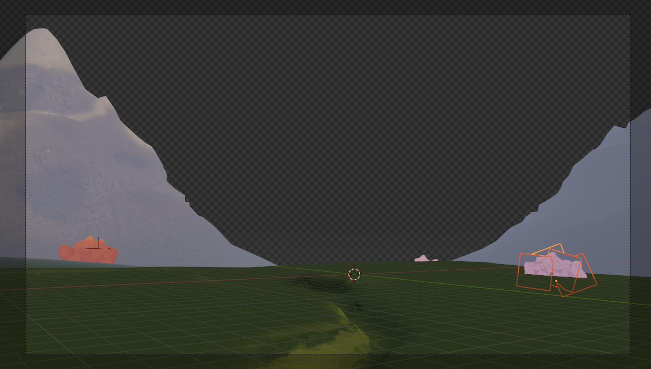 Still working on the colors. I'll need to consolidate my PNGs into one big image I think.
This is great! The textures weren't in the drive (as far as I could find) but the screenshots show enough. If you happen to have extra time, you could experiment with giving the bushes a soft and blobby bump map to see if that helps give it some depth from farther away. You could also try giving a simple curve like below to test if it picks up more of the direction of the lighting. I haven't tried it myself with the textures so it's just a theory.
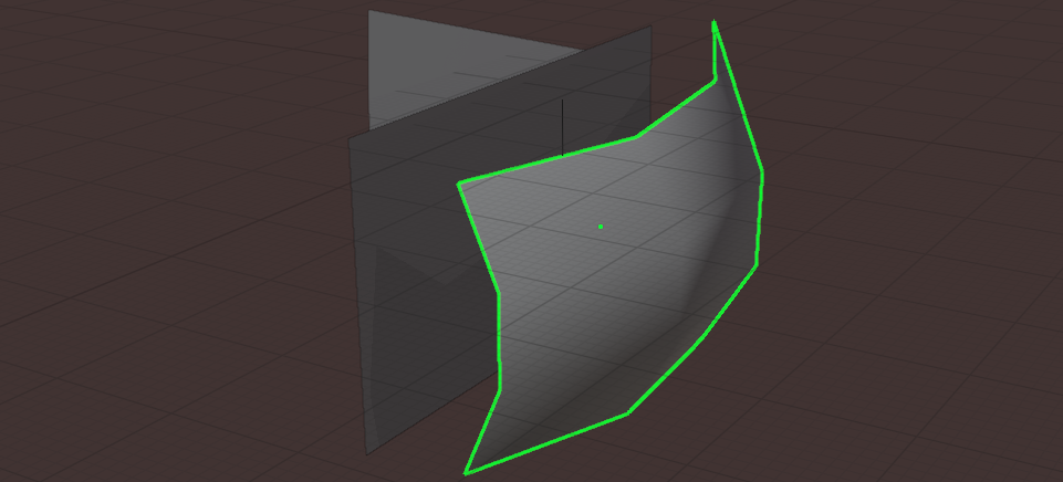
Beyond that, I don't really have any critiques. Keep doing what you're doing and it'll look great!
ppfbourassa Glad to see you're keeping with this project! I see your latest WIP .blend but textures aren't loading. I'm keen to see your card-based bushes which should work well with @tijnkroons card-based trees for the BG 🤝
Homework Week 4 - BG Bushes
@theluthier I think I've uploading everything correctly, and I think I'm done?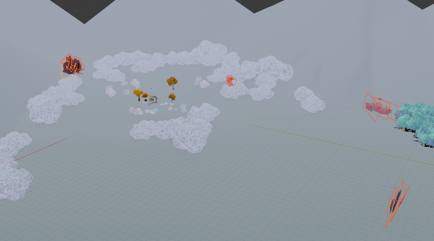 I put all the "clump" textures into one 1024x1024 PNG :
 And I placed a few unique bush shapes around the scene. If you want to duplicate the collections, feel free. I linked in enough reference geometry from the scene to help with placement.
And the material is set up to easily change the color if needed.
Just duplicate the material, and change the color ramp.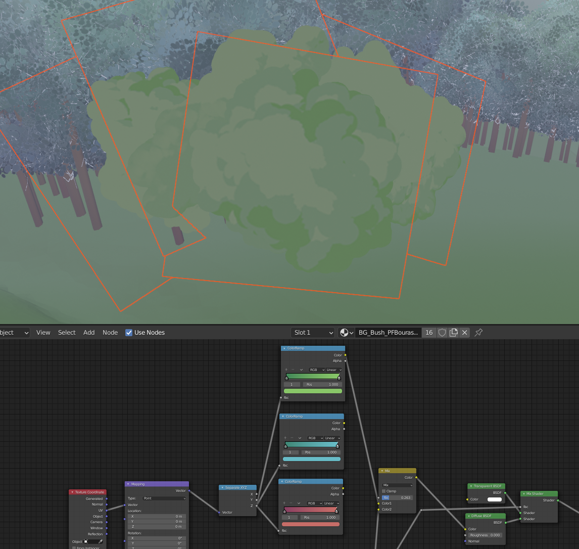 Again, I'm not super clear on what's needed, but I tried to make it easy!
ppfbourassa, it looks like you are finishing up with your project. I'd love to post your artwork in the TSMF Blog. Please let me know if you create a money shot.
These bushes don't really have a money shot as they play such a background role. They kind of look bad close up. And I don't have access to the final lighting setup (or do I? Honestly not sure)
But feel free to use any image in this thread for the blog if you want.
ppfbourassa, I am sorry, but I don't see a "money shot" within the images you posted. Even if they looked bad up close, they would demonstrate a low poly model that was designed for the background. If you get access to the final lighting setup and create an image that you want me to post in the blog, just comment me in your WIP and I'd be happy to do so.
Also, congratulations in completing the project! I bet it feels good.
You synced everything correctly ppfbourassa 👌 Nice work on the bushes! Here's how they look in the assembly:
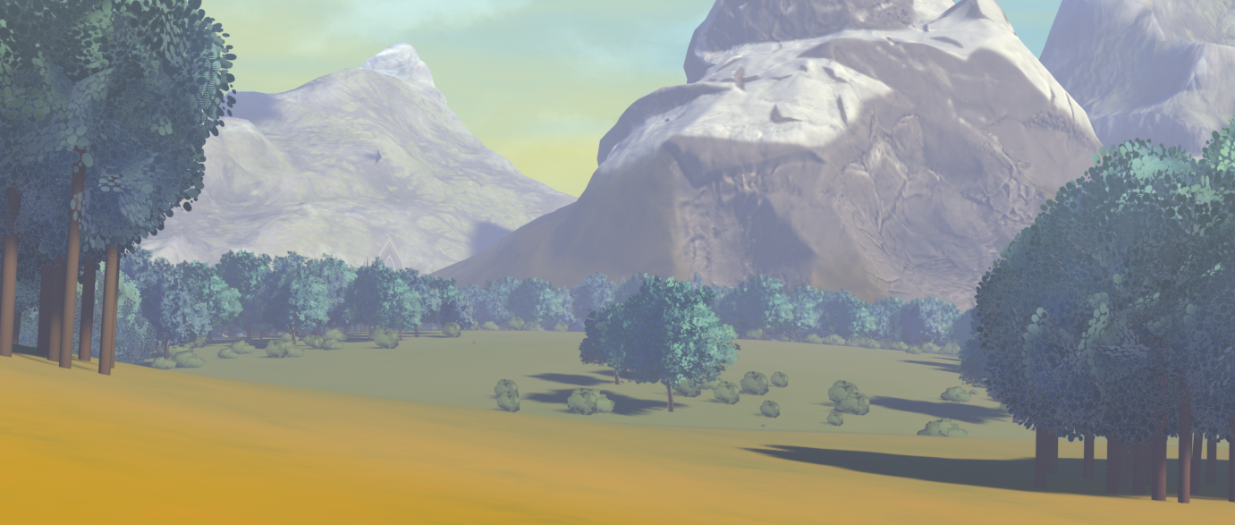
I'm on the fence about them...Even though they were structured the same as tijn's trees (perpendicular cards) the bushes feel noticeably more flat and billboard-y. I added some curvature to the flat planes but it still doesn't solve it for me.
Perhaps the gibli method results in a much less leafy feel than the rest of our foliage. I'll think it through some more. Still it may be fine for the background.
I'm really glad you joined the Collab! As always it's been a pleasure working with you 🤝