This will show my work in progress on the ivy on the corners of the house.
Wow. This was my first attempt at the ivy. I started with a particle system. But after I while I realized this would never bring the silhoutte and desired leaf orientations. Both the ivy plugin and the particle system remain too random, more apt for photorealistic styles at high numbers.
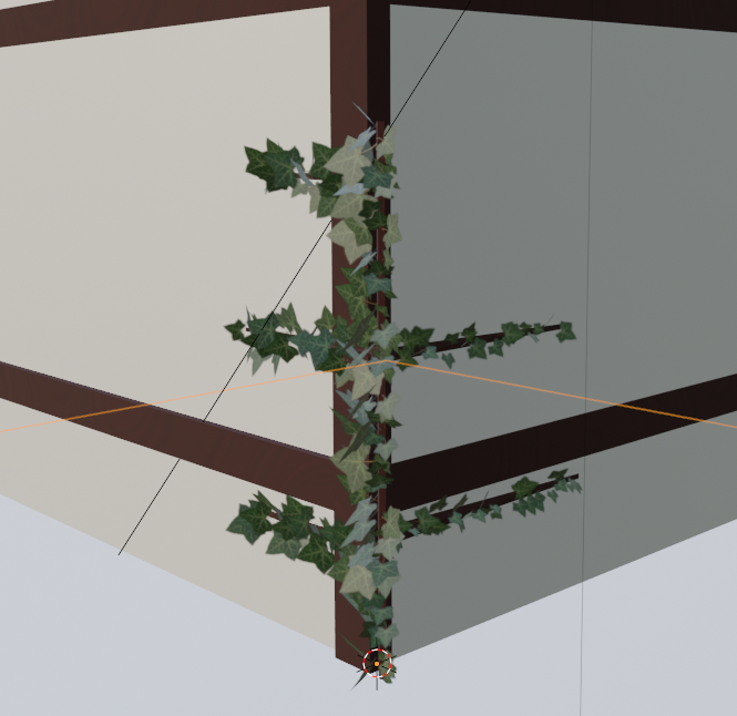
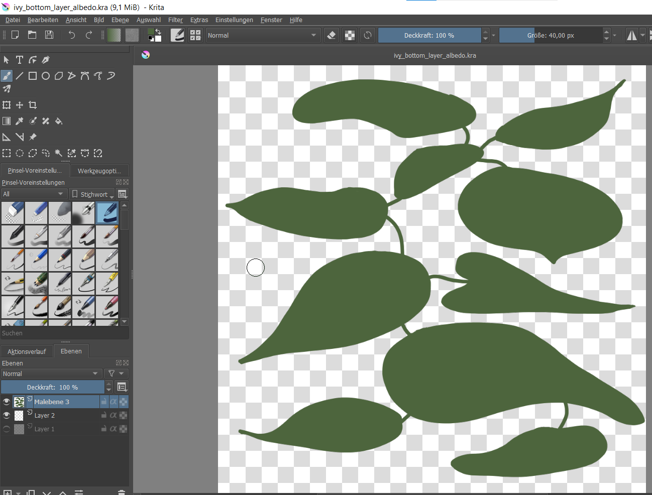
So, I took another direction. I'm going for foliage cards, trying to emulate the leaf shape from Vadim's work. This will be the bottom layer leaves. Further foliage cards will feature the full palette employed by Vadim. Subsequent shapes will be smaller, more random. I decided to forgo a central brown stem and rather evoke the impression of thinner green stems integrated in the foliage cards.
Homework Submission - Week 1 - Nature:FG Ivy
@theluthier
I think I might be on the right track. I'll add additional foliage cards for the brighter layers. If the result is acceptable I will add detail to the cards. The orientations of the individual leaves might need some work. As soon as I'm happy with the cards I will add roughness maps based on the albedo.
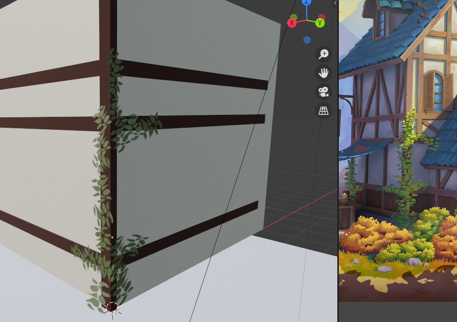
Fantastic work for week 1 rraisonhomme! What you've done is very promising so far. You've earned full points from me 👍
My only note right now is that it's lacking dimension. Feels like a flat decal where I'd like it to have some "fluff"; a little depth.
Have you looked into the IvyGen addon?
Thank you so much for your support! Yes, I've looked into the IvyGen addon - it is a great tool for photorealistic renders. I went through Jonathan's course on plants an even used it inthe background of my stylized forest tutorial (hidden by depth of field). I finally decided against it as for reasons I will I explain in my forthcoming WIP report.
I'm late to the blender crowd - I started in 2019 with blenderguru's donut. During the last chapters of the donut tutorial Andrew was going kind of nuts. I wondered - why does he obsess so much about the details? Now that I'm on the first project "in freefall" I find myself obsessing about small details, although most of the time not in front of a computer. Here's my story of the obsession.
1. Taking things to literally
My first failed attempt at the top is due to the name of the task: It was called ivy, thus I looked up reference images on ivy and even took photos of ivy outside.
Then it dawned on me: This looks nothing like Vadim's artwork! There's tons of geometry in the real world! It's all over the place! There's sharp and pointy edges everywhere! The leaves have bright veins! None of this is in Vadim's artwork. I could not get satisfactory results trying to emulate something that is not in the original. So we're in some kind of fantasy world, thus I figured I can create a fantasy plant that looks more like Vadim's artwork. The plant he chose is closer to the leaf of a sea rose, roundish and oval shapes abound.
2. Emulating Line of Balance in 3D
But there's more to consider. I could not get a decent silhouette with randomized particle systems. The silhouette follows a rule that ink artist Alphonso Dunn calls "the secret line of balance".
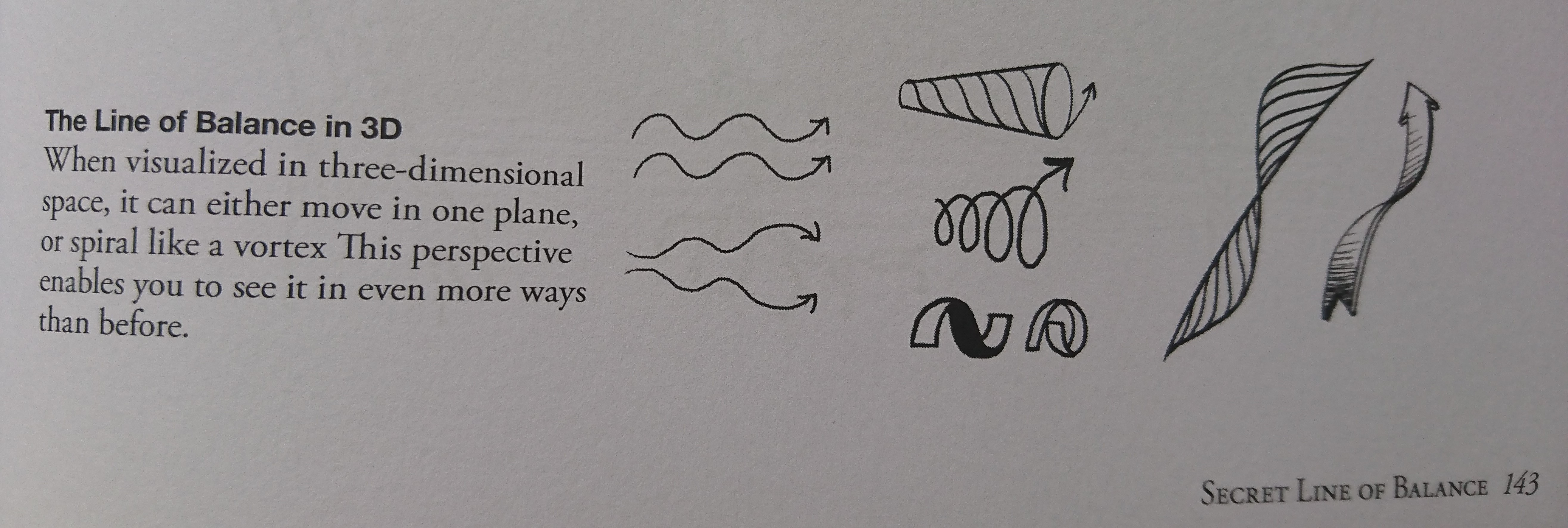
It is about lines and shapes which always follow one direction and then gently push to the opposite side. This what the secret line of balance looks like in Vadim's artwork:

I realized that I wouldn't be able to recreate this wonderful silhouette without manual labour. Particle systems wouldn't do. Furthermore, individual leaves should be visible and layered. Although many plants in the scene are rather "mushy" individual leaves heighten the appeal of the house. A green cloudy thing wouldn't to the job.
So I decided to go for hand-painted alpha cards. Alle leaves will be one material on which I push the UVs around.

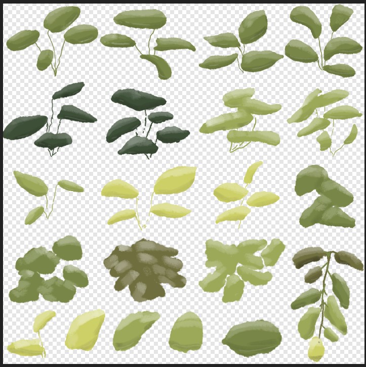
I took a fuzzy brush in affinity and created clusters of leaves (just like Vadim did - you can see the repetition of his smart brush. There are clusters for the background. I picked most of the colors from the lit parts in the foreground.
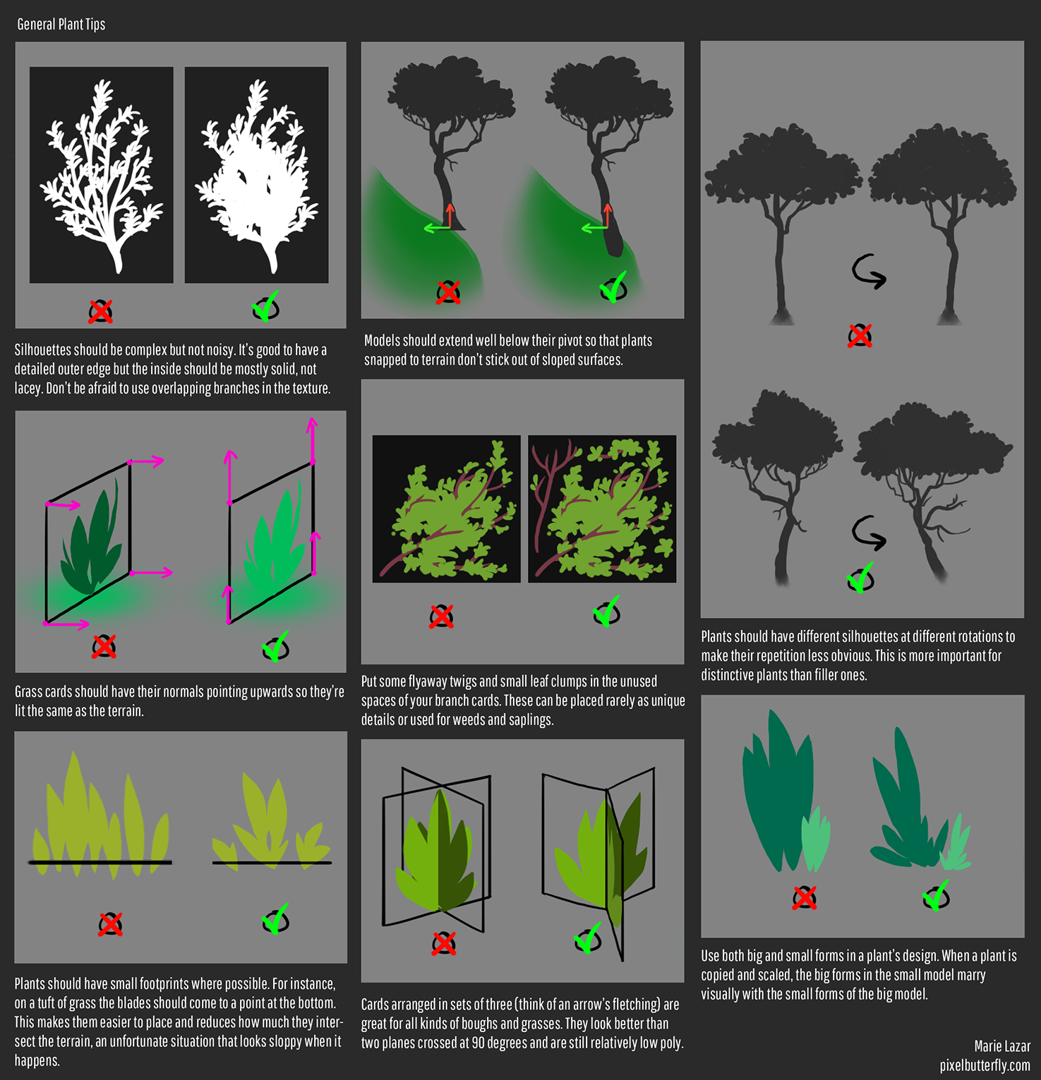
I took advice from Marie Lazar's excellent blog entry on creating stylized plants and used some spare space for individual leaves that help for emulating the same "line-of-balance-silhouette" of Vadim's artwork.
3. Let's paint
Not quite happy with the blandness of the texture, I inserted some highlights on a different layer. If these highlights turn out to be clashing with the rest of the artwork I can return to the bland versions.
The goal for our project is to have a painterly style and yet - the leaves should have physical properties. I went about this Ian Hubert style and did a slapdash roughness map. The idea is that the roughness is lowest in the middle of the leaf where many plants feature a shiny stem.
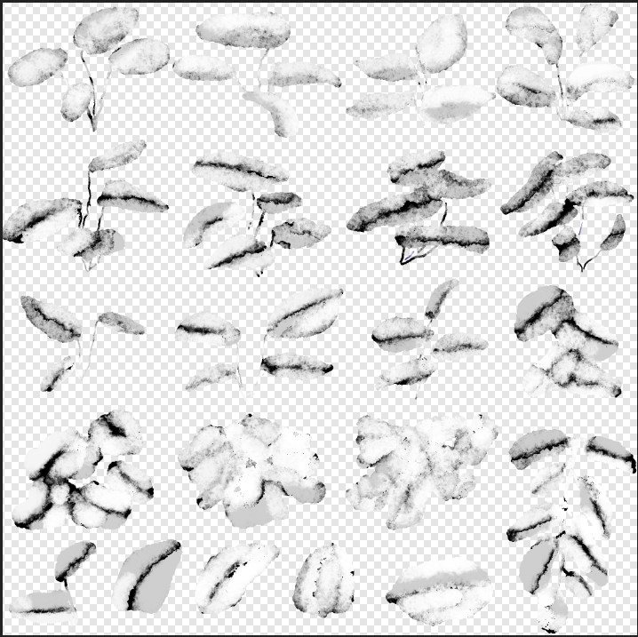
I keep the effect subtle on the dials.
4. Going Unreal
The entirety of the first ivyish plant consists of roughly 40 cards, which makes it very low poly! I joined the project, because I want to become an environment designer for game engines. When I saw the project outline I thought right away of those games where the environment is the star, such as Firewatch or The Long Dark. I wanted to do the vines because I realized that the details of the environment can be harder to do than the landmarks. When Vadim asked in our chat if we could take this to Unreal I went - YES! - that's what I had in mind. Exploring such a dreamy world personally is great. My competitor is a far more proficient blenderer than I, so I decided that I focus on an asset that would go well with a game engine. His work will certainly be better for a render but this could be useful if we extend this into an Unreal project. (What is CGCookie doing with that Epic Megagrant anyhow?) ;-)
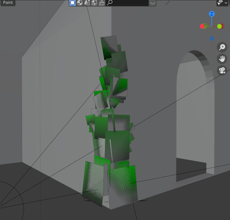
In order to have some random movement in Unreal I randomly painted some vertices on the green channel (chosen randomly) whilst favoring the upper parts of the vine cards.

Coming from blender node-fun is to be had in Unreal. The green vertex channel drives the displacement animation. So only green vertices are being "shoved around" more in the wind. And there it is shaking gently in the wind! Vines don't move like that? So what?! - They don't grow on wooden beams only either!
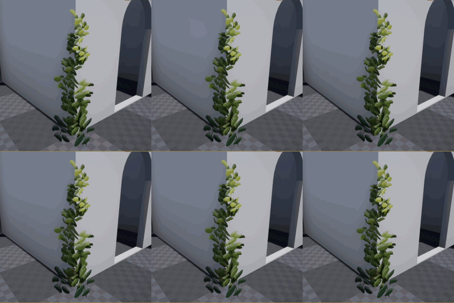
This project is fun!
Homework Submission - Week 2 - Nature:FG Ivy
@theluthier
Texture-painting and finishing the first corner was my goal for the weekend.
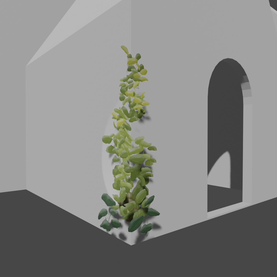
I documented how I got here in the post above. See you on Monday!

AMAZING process breakdown and final result! This is soooo cool. Fantastic work. I can't hold back the extra points 👏
Now can you get this (including animation) back to Blender or recreate it in Blender??
Thank you so much for your support, Kent and Spikey! This collab is so inspirational!
On taking the animation to blender
![]() spikeyxxx - you sure do know your way around them nodes! Some of those I have never seen before! Is that a "random integer pacemaker" on the far left? Would you mind sending me a high-rez version on the discord so I can replicate it for creating some wafting in blender?
spikeyxxx - you sure do know your way around them nodes! Some of those I have never seen before! Is that a "random integer pacemaker" on the far left? Would you mind sending me a high-rez version on the discord so I can replicate it for creating some wafting in blender?
This might be a good question for tomorrow: If everyone in the scene is working on a looping animation (wafting leaves, water, the tarp) should we agree on a frame number to make it looping? Off the top of my head I'd say 100 frames to have at least one different iteration of movement and counter-movement? In that case all looping animations need to end on frame 101? (I've never tried a looping animation before.)
Apart from Spikey's node setup I can thing of several ways to do the leaf animation in blender:
- a lattice deform, maybe two lattices because one part of the vines are facing the y and the other one the x axis.
- a gentle f-curve modifier with noise on the location and maybe the scale of the alpha-cards.
Could you think of other ways I could approach this?
Is that a "random integer pacemaker" on the far left
No, that is an Input > Value Node. In the value field I typed in: #frame
that way, the value is the same as the frame number.
This was not intended as an animation demo, but to show the you can make rotated looking leaves from 'alpha planes', without rotating the planes themselves ;)
There are other ways to do leaf animations, for instance use a Particle Hair System with Hair Dynamics and no Gravity.
Then add a Particle Instance Modifier on the leaves and check Create Along Paths.
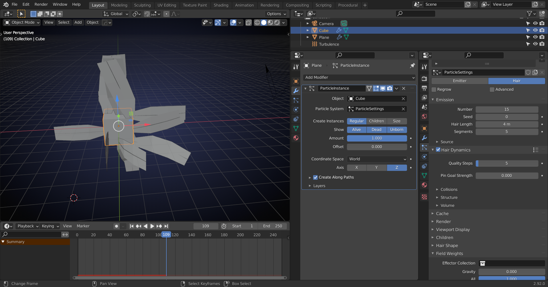
Here's a better picture than the GIF:
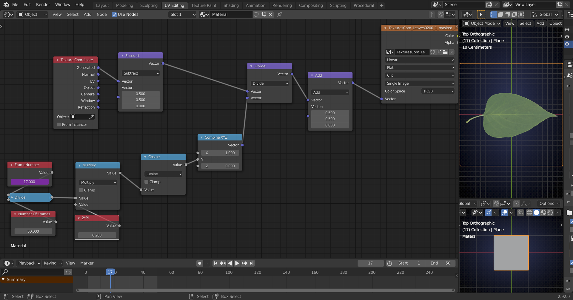
I'll have to leave for a bit now, but after that I will visit discord again (been a while...).
Homework submission - Week 3 - Nature:FG Ivy
@theluthier
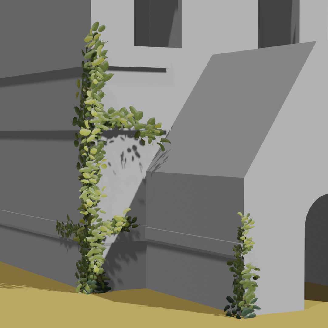
I finished the tallest of the three vines using a numer of leaf variations. I wonder how it'll look on the final model of the house. I'll finish the other corner in the course of the week.
Hey rraisonhomme , I love seeing where you started, what you've tried so far, and where you're ending up! This is great progress!
Here are my suggestions for improvement:
Even though the ivy is fairly rounded in the artwork, it still has a pretty distinct shape and still has a point on the end. I would love to see the textures be a little more crisp and pointy than bean-shaped. I can tell you're going for the paint brushed look, and it *almost* works, but it needs to be dialed back just a bit to hit the sweet spot.
I wasn't able to test out the file since the textures weren't in the drive. Please add those in when you get the chance.
I'd encourage you to experiment with adding a loop cut or a couple to play with some of the shapes so that they're not all perfectly flat planes. Giving some a slight curve or bulge may help it to look less flat at many angles.
Along those same lines, try adding more leaves sticking out at odd angles so that we can't tell as easily that it's just flat textures.
Lastly, I would like to see some leaf vein lines in the texture as well as some super subtle spots and a gradient from the center or from the end. The current painted stepped gradient makes it look like a rounded 3D shape which I think is what's contributing to the bean-like appearance.
I know that's a lot all at once but I can definitely see that you're up to the task! Amazing job here, full points for week 2, and keep up the good work!
Thanks @jlampel for coming into the project.
Your input is very valuable. I sensed that there is something off about the painterly style. The beaniness clearly was an issue.
I reworked the texture entirely going for crisp edges this time, adding small veins but leaving the spots for the moment. Since I'm going to play with scales for leaf variation, I want to have consistent spots as in film grain. I have uploaded the texture in 2k and will shrink it to the agreed 1k once they are finally adjusted.
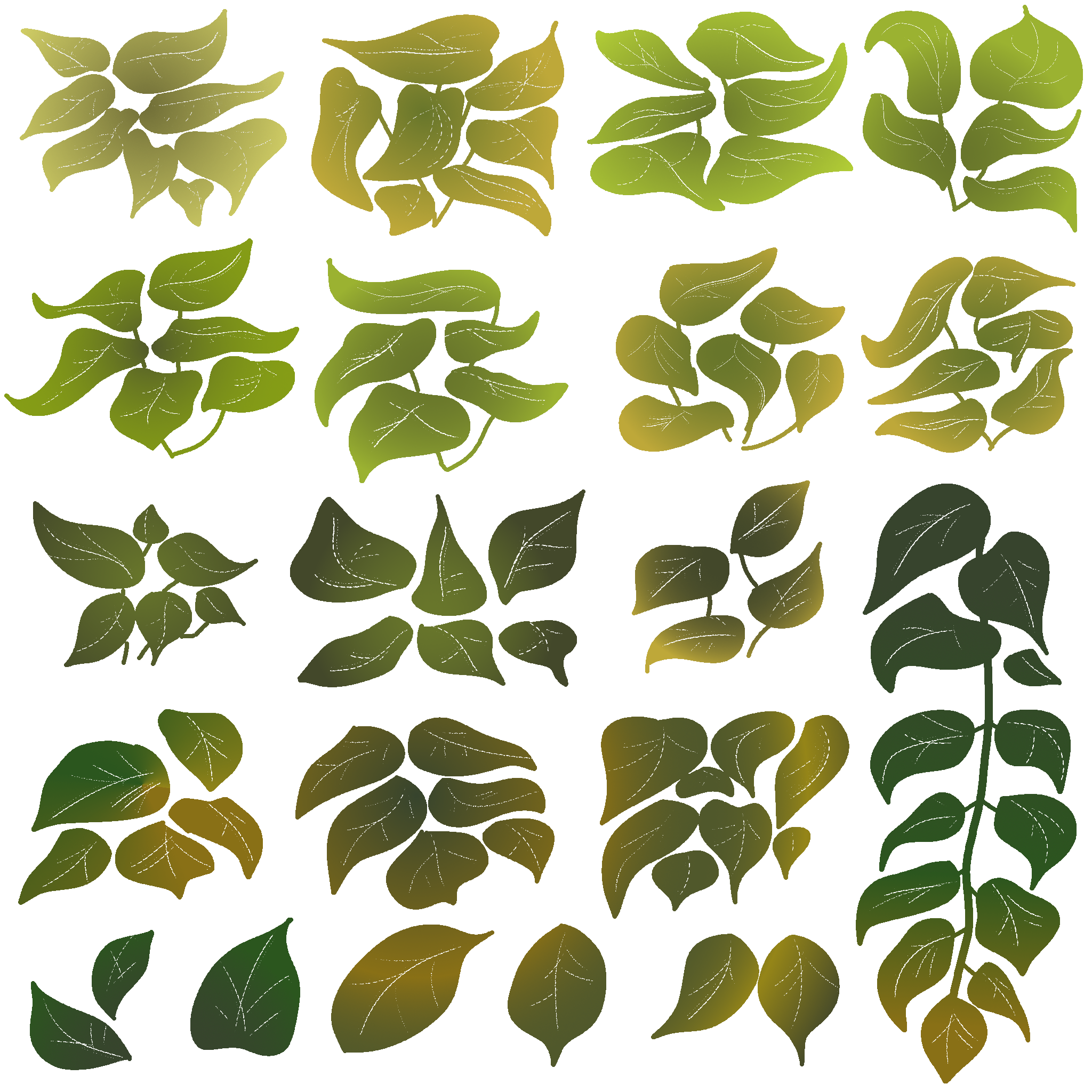
While painting, it turns out that I may have gone a little crazy with the gradients, which need to be toned down in the node setup.


The node setup tones down the heavy gradients of the original texture and provides some spots on the leaves.
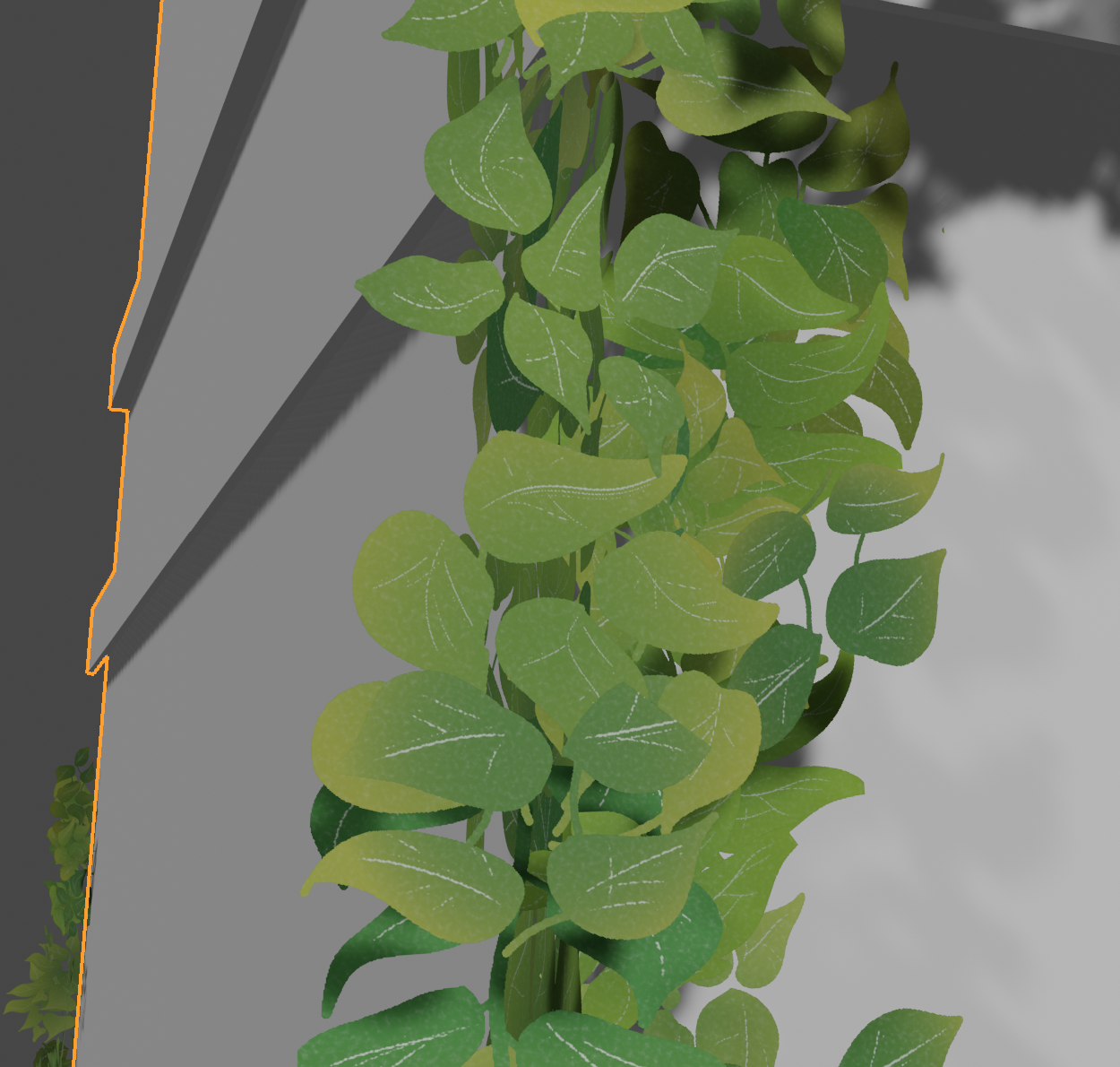
I'll fix the broken UVs over the course of the next days. I'll also add the twigs that go every which way and add some loop cuts to bend some of the alpha planes. Your input has already been very valuable! Thanks a lot!
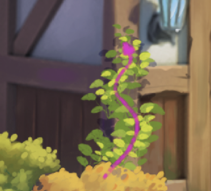
Wow, great work, this is looking much better! The spots are a nice touch. Looking forward to seeing this week's submission! The only critique I have is that the overall distribution does feel pretty flat and boxy. If we could get more of this wave and more of the image planes curved a bit, I think you'd be golden:
Homework submission - Week 4 - Nature:FG Ivy
@jlampel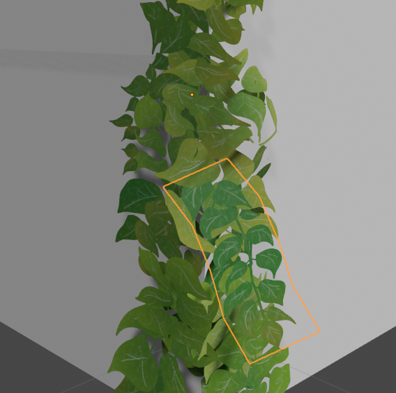
I've added quite a few more subdivided planes as branches that are sticking out.

Some planes are gently curved in order to create a nicer overlap.
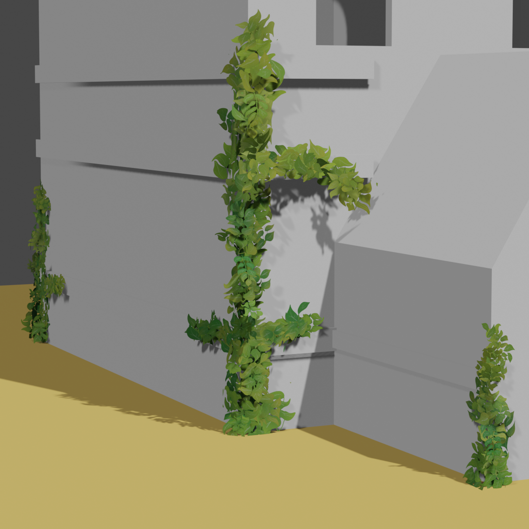
On the corner of the entrance I made sure that the silhouette matches the line of balance, using my separate leaves on my alpha card generally pointing upwards on the corners and the very tip.
Furthermore, I replaced the texture in the folder with a 1k texture as specified in the project outline.
Awesome job, I'm loving how this has turned out! When viewed from the side this looks much less flat and much more interesting.
I do still think the overall structure is a bit boxy:
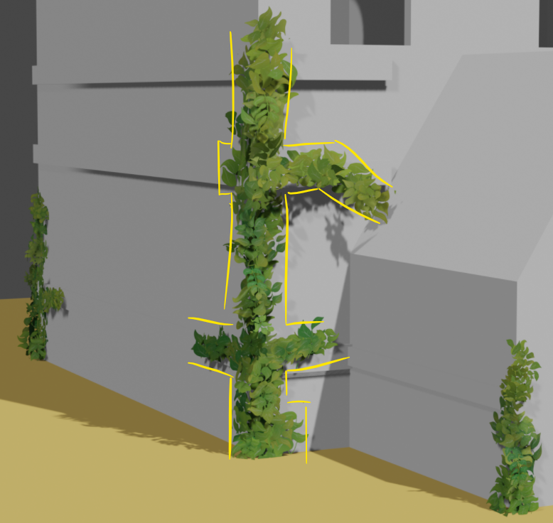
It's a hard problem to solve, because I can see that you're following the lines of the house which are inherently straight. The concept art is following those same lines, but I think the difference is that it's less dense, which makes the boundary of the ivy appear less uniform.
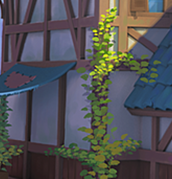
My theory is that actually removing some of the cards to reduce the density could help the distribution to look more natural, but I could be wrong.
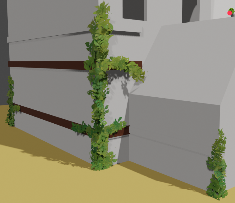
Full foliage - prior version
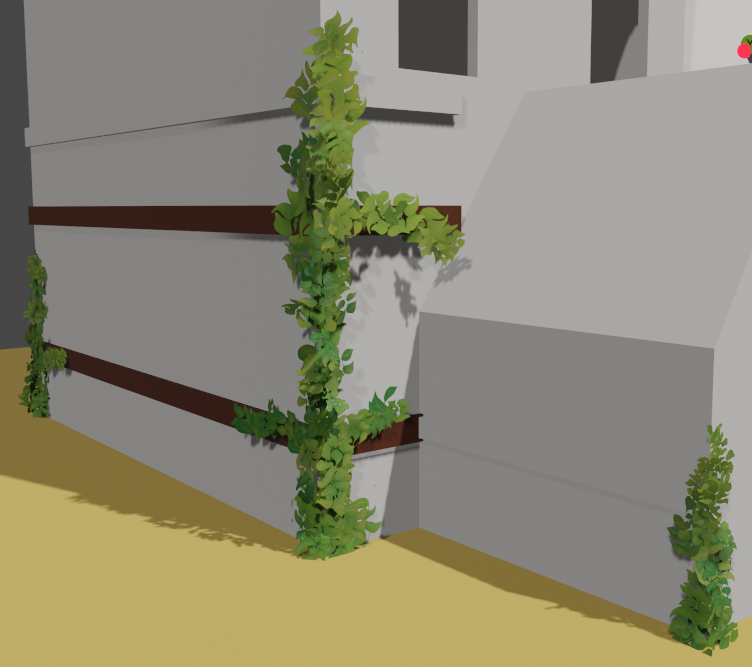
reduced foliage in edit mode with hidden planes
I guess you're right. Focusing on the asset isolated from the other assetsof the scene I may have given it too much geometry for fear it might look to whimsical. However, when I reduced the number of cards too strongly, the fact that they are made of alpha planes stood out quite a bit. But I liked the effect of randomly reducing the number of cards to have a more uneven distribution. In the lower version the ivy tapers in the middle section, which reduces the initial pillar-shape. For the lower version I hid some planes in edit mode. When overlays are deactivated it is possible to use tab for switching between the two versions in object and edit mode. I think it will much depend on how this works with all the assets in place.
Nice work rraisonhomme , I think it's a good place to call this complete! Congrats on finishing the collab with full points (or more) every week 👏👏