This is my Collab2021 WIP thread. Please be gentle...
So I've been testing out different approaches to take when creating the foreground bushes and I've settled on these final two: first, using instanced leaf geometry and second, using alpha mapped billboard planes.
A quick render of the instanced leaf geometry bush:
And one using alpha mapped planes:
Overall, I'm much happier with the modeled leaf geometry. I feel it much more accurately represents the soft, fluffy nature of the foreground bushes in the concept art. However, given that the goal is to have this project run in real time, I'm still researching using alpha mapped planes should they offer better performance in Eevee.
@theluthier
Here's my Foreground bush block-out. After researching several approaches, I settled on modeling the leaf geometry and instancing it via Geometry Nodes.
Here's a screenshot without any materials:
And a quick render with basic materials for visualization:
Those bushes look really clean and the colors are great. Your style reminds me of 'The Witness' and it fits the art style of this project perfectly. How complex is the geometry used?
I think my TreeB could use some of your Geometry Node Miracle Grow towards the top. Thanks for posting your workflow. 👍🏻
This looks very promising! It's got that leafy fluffiness that's missing from the ghibli method. The only missing piece to me is that they feel a bit hollow. Perhaps a simple blobby internal mesh textured like leaves could solve the hollowness. Kinda like the method in this video:
You've earned full points + some extra for testing multiple approaches!
@theluthier
Referencing the stylized bush creation videos that Kent provided for us, I set about updating the foregeround bushes to make them more chunky and, and to better match their appearance from the concept art. This was the result:
These look SO good! The render above doesn't do it justice. I only have a couple notes.
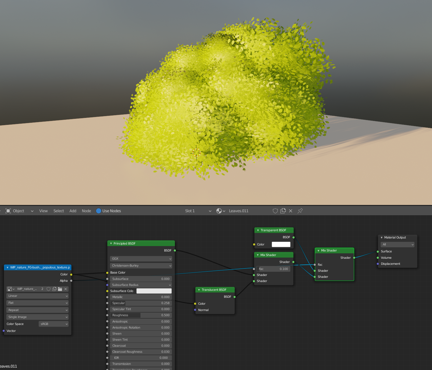
The leaves should have some specular, even if it's very little in the 0.25 -0.35 range. When you add light it really helps to define the shape. Also in the below screenshot is some very subtle translucency mixed in which helps to bring some light to the other side of the leaves as would happen naturally while also making the color blending a bit softer.
I would also love to see more color variation from far away. I think the leaves look perfect up close, but once you zoom out it starts to look a bit blobby and mushy. Perhaps varying the color of each leaf super softly and also some larger 3d procedural noise could be of some use here.
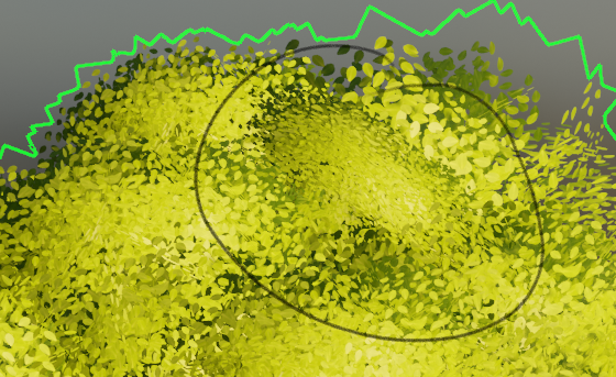
There's also this one random spot that looks like it's not as attached and the leaves feel squashed compared to everything else, so it kind of sticks out:
Full points for this week, keep up the great work!
@jlampel
For week 3, I made the material enhancements suggested by Jonathan Lampel: added specularity (0.25), translucency and subtle color variations to the leaf texture. As seen below, this instantenously improved the render: individual leaf shapes are much more "readable" here, as is the overall bush silhouette.
I wasn't quite sure on how to go about using a larger 3d procedural noise as Jonathan suggested. And my attempt to incorporate the gradient texture from Kent's Thursday casual stream also hit a brick wall. Added to Week 4 homework research.
Great work aartifact , this does indeed look better!
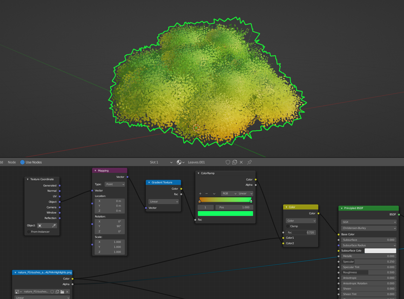
To get the procedural textures to work, you'll first need to apply rotation and scale. Then, you can use the object coordinates like so:
Hope that helps!
And even with the leaf cards joined, still very low poly: 2578 triangles.
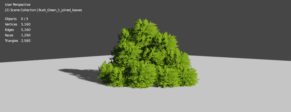
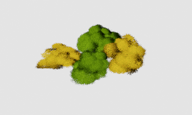
@jlampel , I'm not sure if they fit the stylization of the spice vendor's house. This is how they appear in Kent's block-out scene:
Looking good! I'd say it absolutely fits the style. There are just a couple things I would recommend before calling it complete.
Try varying the size and shape of each clump so that it doesn't look like identical spheres stacked together.
Filling this hole on the back of the bush:
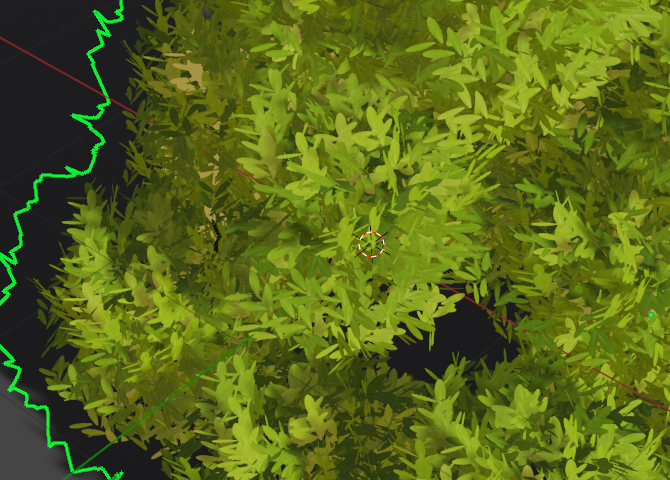
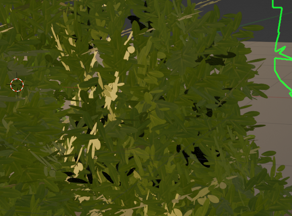
Checking for any faces that are too close together that will cause z-fighting and flicker black:
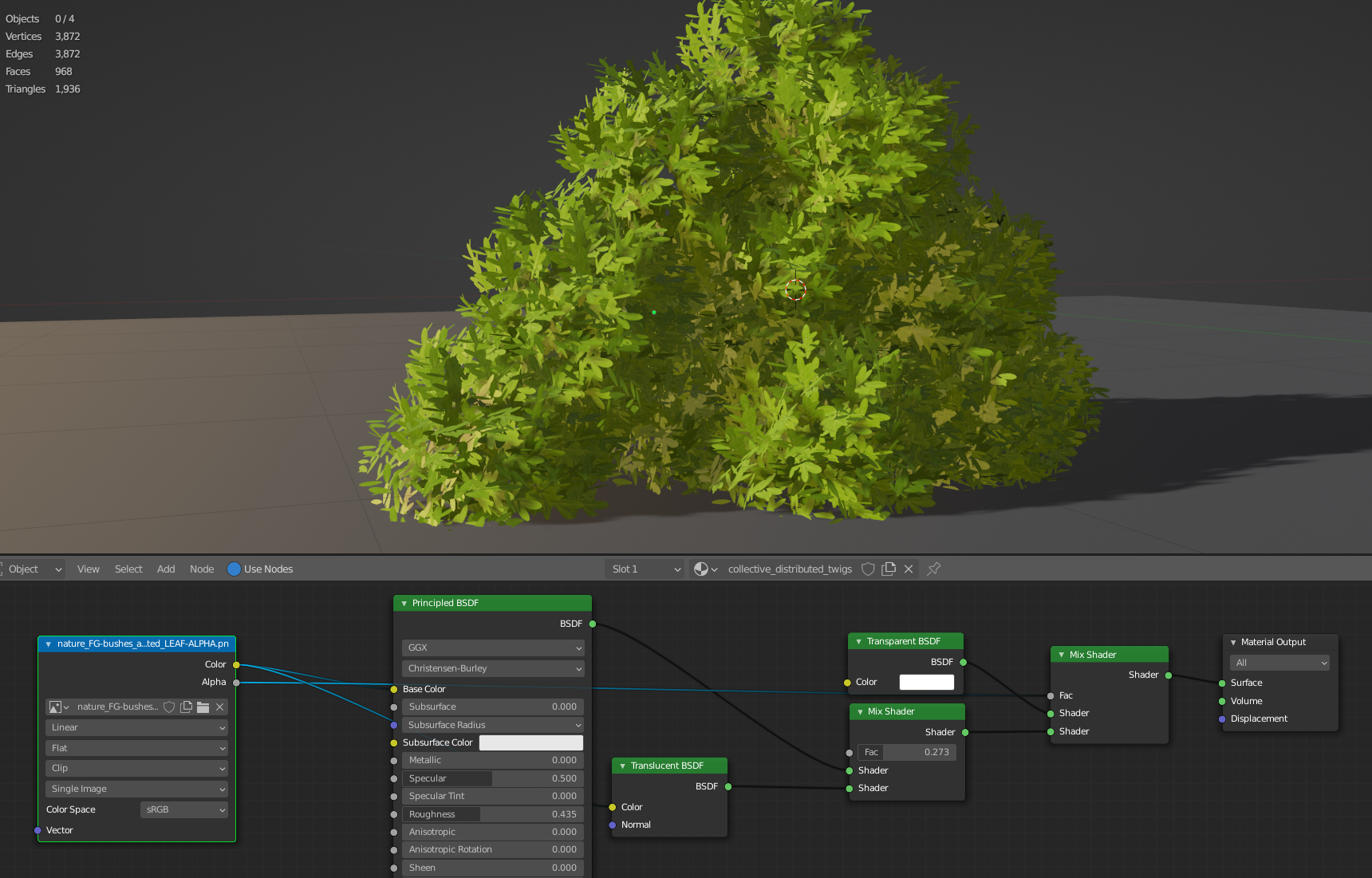
Using some translucency so that it appears softer overall:
And finally, you could try adding some color through a procedural gradient or noise texture if you have the time.
Excellent job thus far, and I think with those final touches it'll be perfect!