This is an on-going thread documenting my progress through the 2021 Collab Project.
This is a perfect blockout for week 1 iironsoul. I know this was probably very easy for you to accomplish, but I intended week 1 to be easy for the sake of getting comfortable with the collab environment. Don't worry, next week will be more involved!
You get full points for week 1 homework. Nothing to strongly critique at this point 👍
Just a quick reminder. We still need a name for our team? What's your vote?
1) Shabby Chic
2) All Access(ories)
3) Shabby Fresnel Chic
4) The Stan Dalones
@theluthier and ![]() duerer
duerer
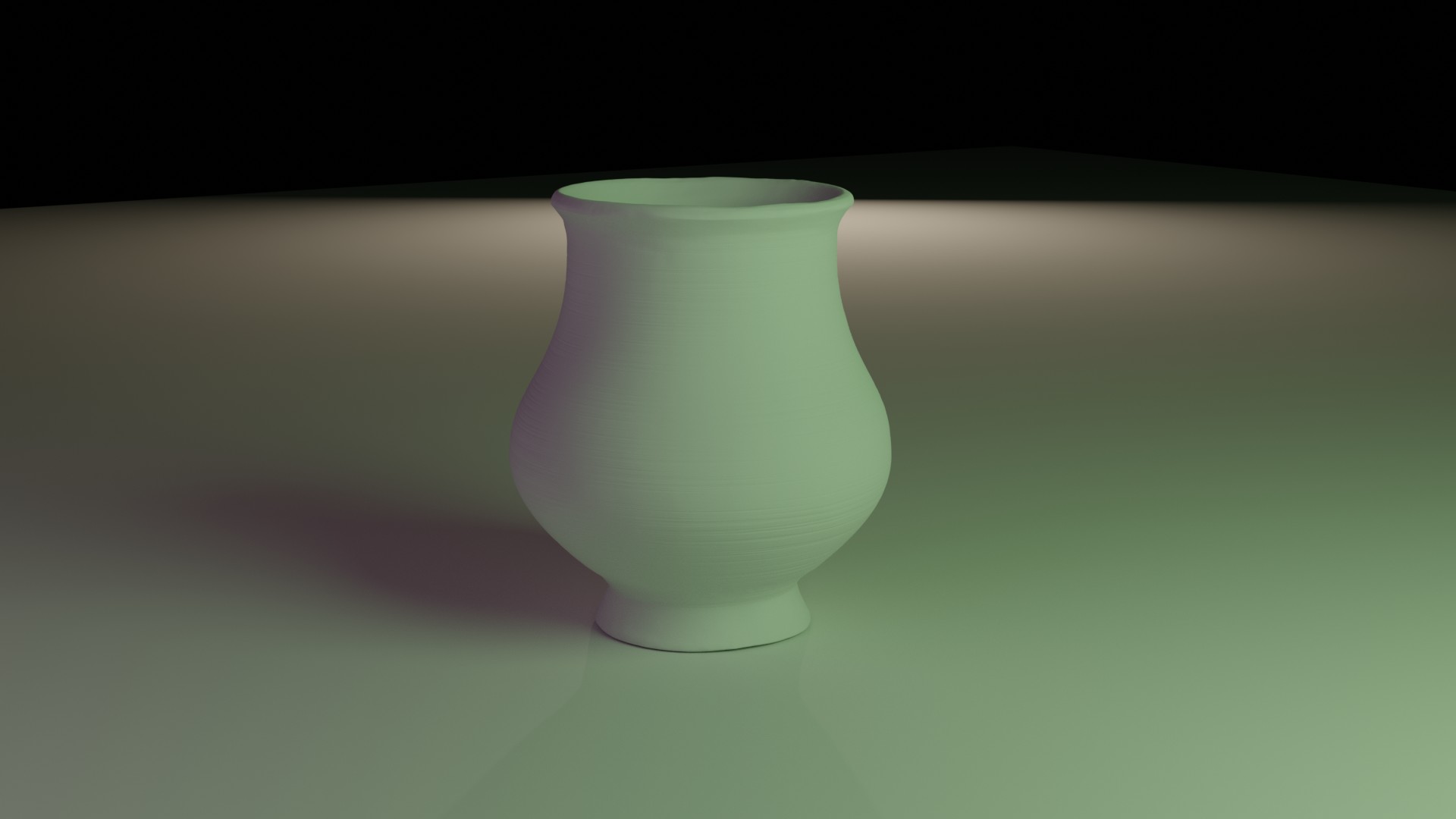
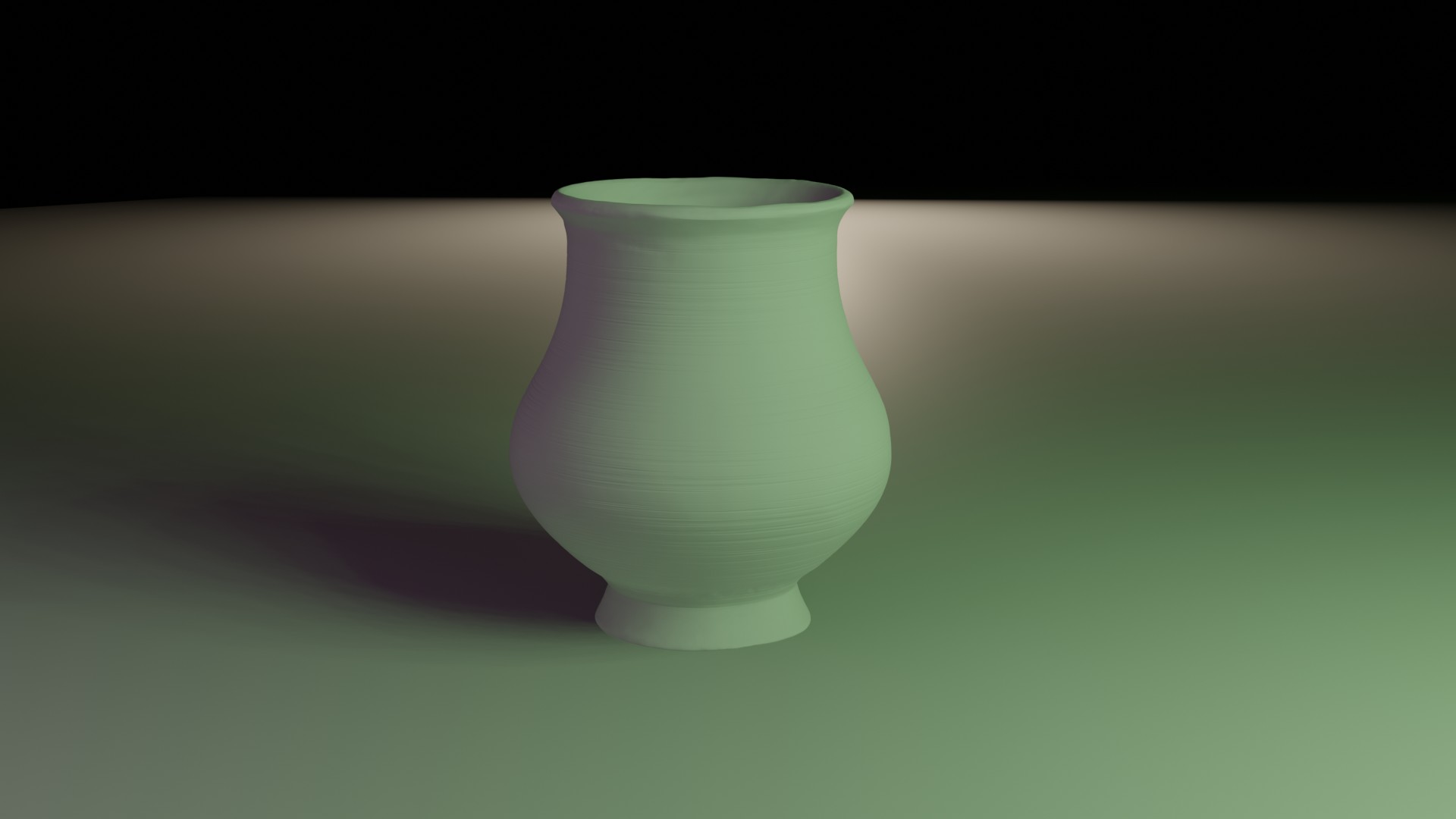
Cycles:

Eevee: Here is my sculpted version for week 2.
I had a good time experimenting with textures and all the various types of brushes, masking etc etc etc.
I had to redo my base mesh because i uh... lost the previous one.
As always, I'll be happy to redo any work as it's good practice if the style doesn't fit with the rest of the submissions. I won't upload the blend file until after I learn how to bake the sculpted detail down because the blend file is 250MB at the moment.
I also had a go at setting up a lighting scheme.
This looks really good iironsoul! I'm so glad to read that you enjoyed the process. Willingness to redo any work: Keep that attitude and it will serve you well. I really struggle with redoing work even though it's always better the second time 😅
My only note is that the sculpted accents feel really subtle to the point of being hard to identify. I think it's the presentation though: Straight diffuse surfaces commonly downplay such details so they could be fine if see with a different material.
Now would be a great time to copy + paste your vase into the placeholder WIP file I set up for you:
SPICE-VENDORS-HOUSE/SCENES/MODELS/WIP/ACCESSORIES/ACC_Standalone/WIP_acc_vase-B_ironsoul_00.blend
This way I can see the file myself instead of images only and then also link it into the assembly file.
Well done, iironsoul 😀! The necessity of exaggerating sculpted details so that they are well noticable in the final shading is something that I think, Kent @theluthier already mentioned in his "Modeling Realistic Characters with Blender" course here when sculpting skin details. Skin is certainly a special case with its "Subsurface Scattering" but the example of Andrea's ![]() elubie cart here shows that this "sculpted details blurring" also applies to a certain degree to other shaders.
elubie cart here shows that this "sculpted details blurring" also applies to a certain degree to other shaders.
@theluthier ![]() duerer
duerer
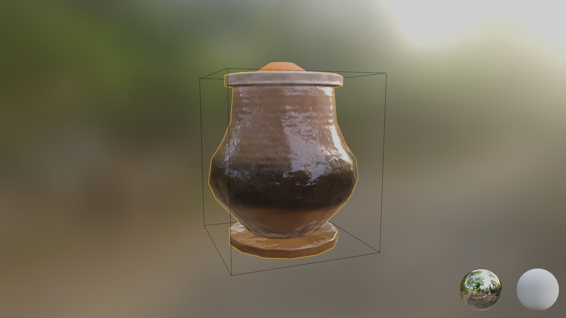
Here is my submission for week 3. I changed things yet again. I'm not super happy with it. I do like the fact I painted in all that texture detail into the geometry (then baked it to normals so it isn't 500MB), and it does look pretty cool. I'm just not totally satisfied with how it looks aesthetically in keeping with the rest of the styling.
Perhaps you can address this in the next stream instead of giving me a personalised response here because I think theme/style is going to be something that a lot of us will be struggling with.

Overall I'm happy with my effort, development of my knowledge of workflows and specific tools (got a lot better at sculpting), but I'm not satisfied with where it's at but I'm not sure how to go about improving it.
I reckon after feedback I'll go and redo the entire workflow right from basemesh and come up with something a lot better.
sculpt and texture looks good would probably add more roughness to it like these pots ,(https://www.google.com/search?q=terracotta+pots&rlz=1C1CHBF_enUS922US922&sxsrf=ALeKk00uUlVtEpxto50YooQqt2C6XiSPpg:1619235885494&source=lnms&tbm=isch&sa=X&ved=2ahUKEwigrIze-5XwAhWnCjQIHa7hBFEQ_AUoAnoECAIQBA&biw=1718&bih=1126) (https://www.alamy.com/stock-photo-african-pots-for-sale-15338038.html) (https://abstract.desktopnexus.com/wallpaper/1365475/)

@theluthier ![]() duerer
duerer
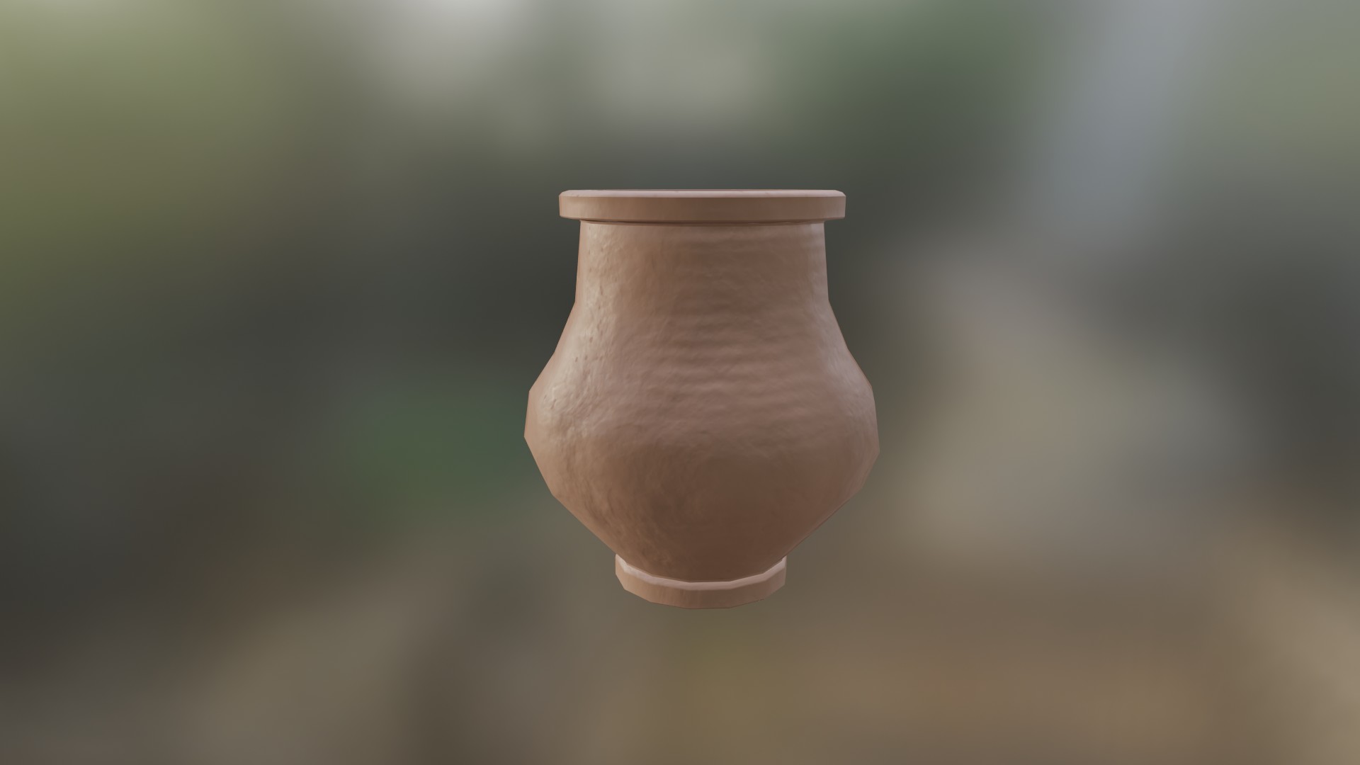
This is my week 4 submission. I pulled down the roughness quite a lot but still left that slight sheen you see on terracotta pots.
I also reduced the normal strength a little.
I reshaped the base a bit as well.
Finally I redid the colour layer to be a mottled terracotta pattern.
You can consider this my final submission for the collab for grading, although I am going to continue to make vases until I have mastered the process because I am not 100% satisfied with this. If I were to grade myself I would give it a 30% satisfaction.
I definitely see value in redoing the vase workflow in order to improve further which will also give me transferrable skills to other types of models.
Thank you very much for this collaboration experience, I hope we can do another one (with some tweaks to the process to make it better) this year because I truly believe the collaboration format is the best way for beginners and experts alike to build the skills and knowledge needed to succeed in the cg world.
I'll be around.
Nice vase, great progress you made and i sure look forward to more :)
iironsoul Great work, iironsoul 😀👍! Creating such an asset and making it look well, isn't easy, but you went through the whole process and created a beautiful vase! I'm looking forward to your next creations and to the next collaboration with you😀! I agree with you that such a collaboration helps developing the own skills😀!