This is an on-going thread documenting my progress through the 2021 Collab Project.
Hi all, a little late to the party but I've been able to at least get started finally. Here's the sign from the house accessories. It didn't make sense to me that it would be hanging off two sticks (or is it supposed to be something else?) so I also made an alternative version with chains instead. Not sure if such deviations from the original artwork are welcome, hopefully our lord and saviour @theluthier can deliver swift judgement.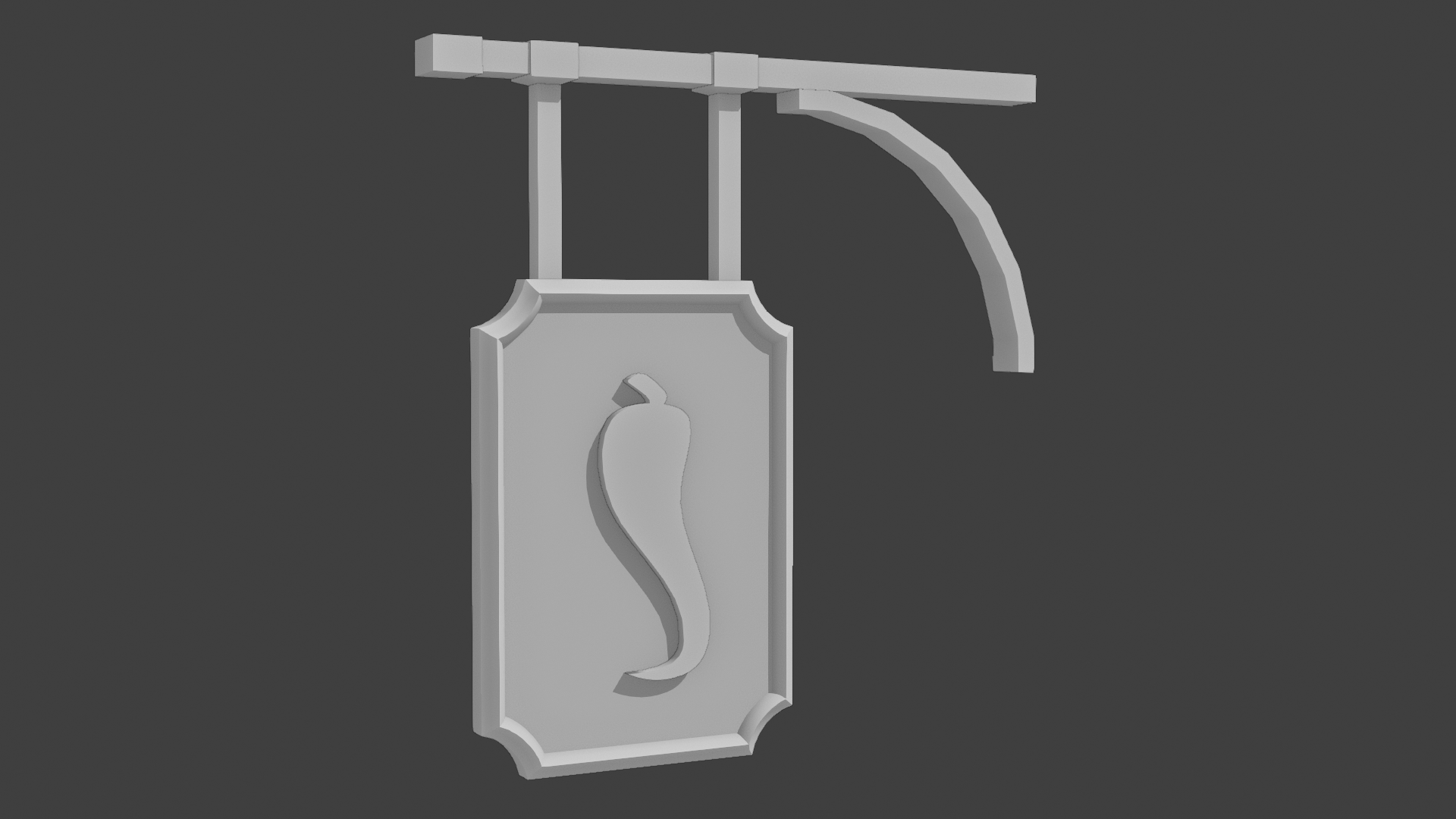
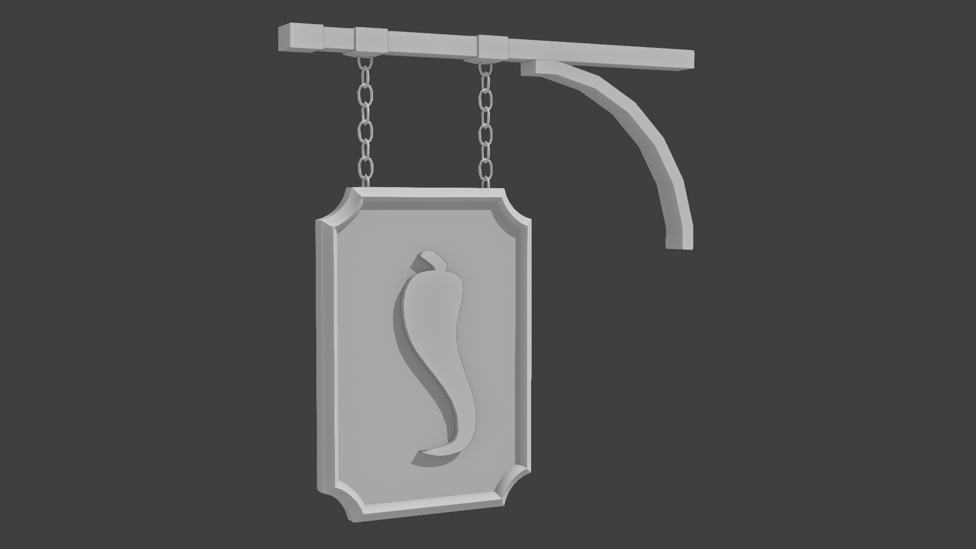
nice work , i love those chains its giving a nice touch and also could make it move cause of the wind ;p
@theluthier This would be my homework for week 1, but I'm submitting super late (here) so I understand if only the previous post can be considered.
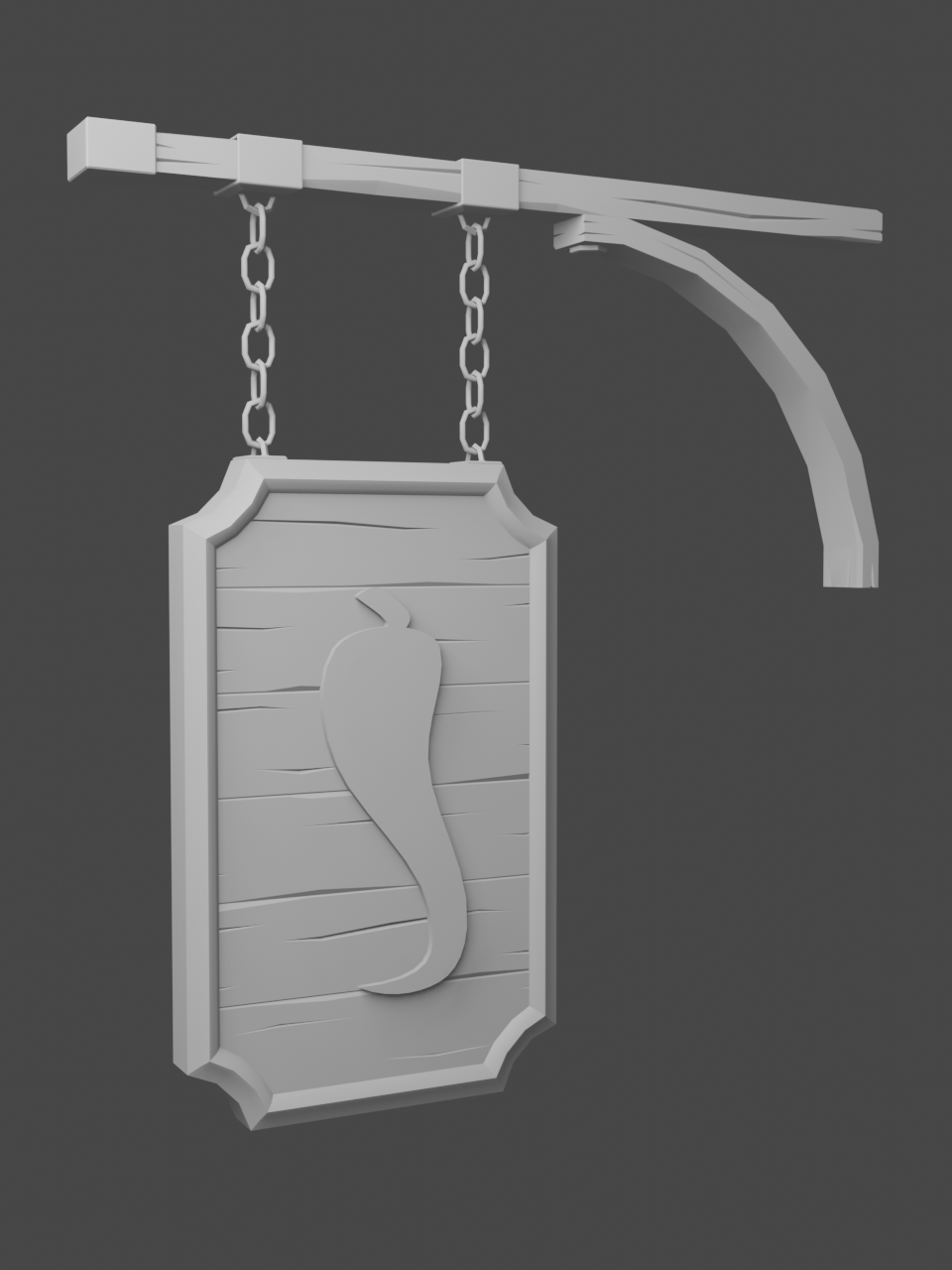
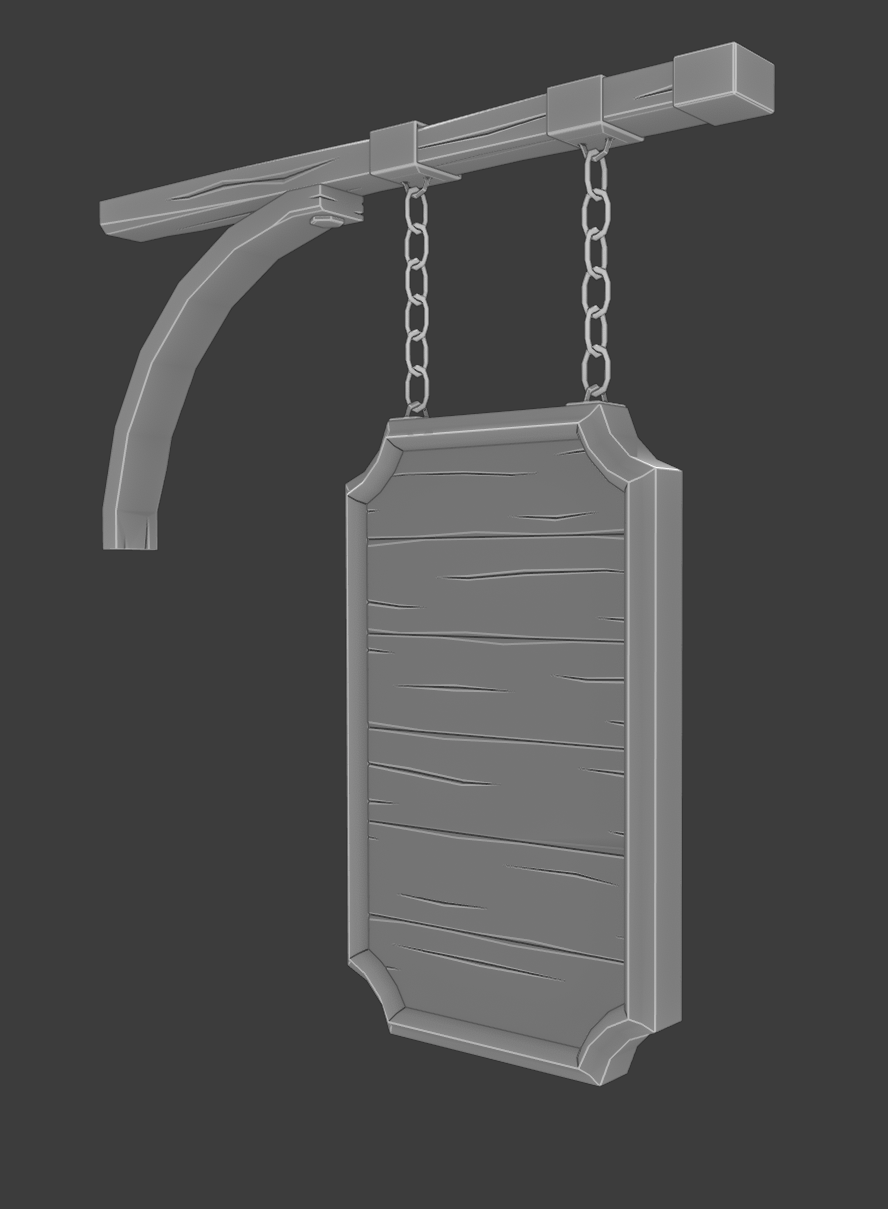
Hi again, thanks for the comments. Since last time, I've adjusted proportions a bit and added wood detail. I'm not happy with the way the metallic bits on the beam look at the moment, I'm hoping I can make them look more interesting with some sculpted detail next week. I've stuck to the chains, as it makes more sense to me and I think it does look a bit nicer. This deviation might, again, not be desired so I'll happily change it back to the original sticks if required.
When looking closer at the hi-res version of the artwork (I've stupidly been looking at a low-res version), I realized that my interpretation of the sign frame having a curved bevel does not fit the artwork, which features a flat frame. I left it for now but it can easily be adjusted to match the artwork.
TL;DR here's my week 1 homework submission!!
It seems I've saved one of the best for last! So sorry for the delay. Apparently 100+ homework submissions takes a long time to grade 😅
I absolutely love the sign you've created, detail and all. Much more than I expected for week 1 so you're getting full points + extra. For week 2, it's arguably that you don't need to add sculpted accents. But I'd like to see you try! My general rule is sculpted accents is always a level-up in quality whether a little or a lot.
Keep up the great work llusifer!
@theluthier I'm sorry for going all incognito on you guys, had a hard time getting time to work on the sign last week. I've been working on sculpting for a few days now but it's my first time sculpting something like wood and metal and frankly, I had a hard time getting satisfactory results. I've finally been able to find workflows that work for me and it's starting to come along. Posting some WIPs of some different elements that I'll try to assemble to a final-ish sign by Sunday, just so you know I'm still in the race.
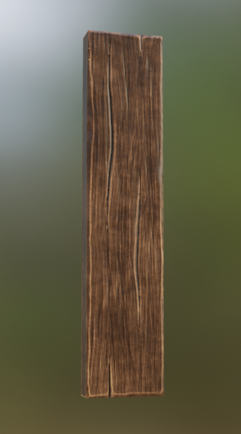
Just a wood plank that will be part of the main board of the sign:
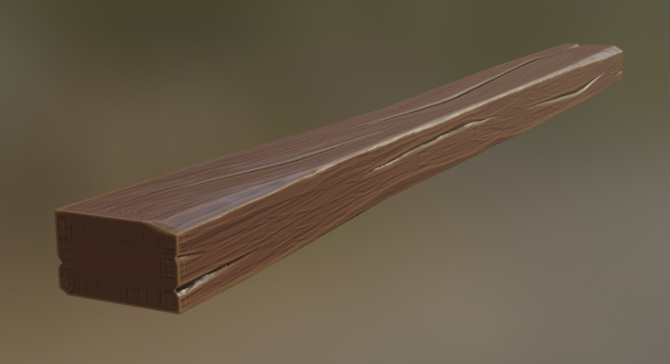
The support beam, needs more surface detail:
Just a test of one of the metal pieces, will redo it but this is more or less how I'm thinking it should look: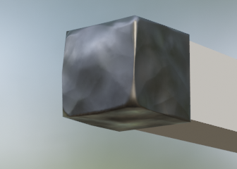
It looks beautiful, but might be a bit too detailed/realistic for the stylized look of the artwork...?
But I am convinced that you will make a great sign, Luis!
Beautiful progress llusifer! I think you're well on your way to a great result.
My only note would be to possibly simplify the wood color texture in the first image:

It looks awesome! But possibly leaning a little too realistic with its granular dirtiness. Keep up the good work!
@theluthier Very late as usual, this a somewhat finalized version of the sign.
I tried to make it more fitting with the style. I agree with you and ![]() spikeyxxx, I went a bit overboard with the dirtiness, this version hopefully looks a bit better!
spikeyxxx, I went a bit overboard with the dirtiness, this version hopefully looks a bit better!
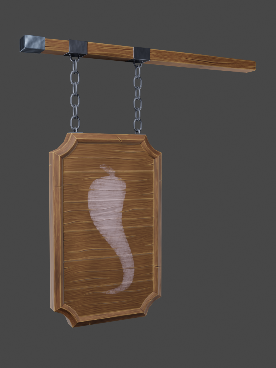 Wasn't sure how to threat the chili, on the artwork it looks like it might be painted on so I went with that. The beam support is missing, still have some work to do on that one. Will hopefully update tomorrow. Will also sync the file on Drive.
I LOVE IT! ![]() jaivatur is going with a carved wooden pepper. I really like that we have both interpretations of the art.
jaivatur is going with a carved wooden pepper. I really like that we have both interpretations of the art.
Please get your .blend and textures synced to Google Drive asap! I'm eager to see it in the scene 🤩
llusifer - Luis, I’d like to comment on our exchange yesterday in the blog. My initial “showcasing” posts were from older work, which I had wanted to document our collaborative project’s progress through the different stages of development. Even though it was not in real time. You protested by pointing out that your most recent work should be showcased. I want you to know that you were absolutely right. At this stage of the project, we should be celebrating our accomplishments. You put me back on track and I sincerely thank you.
My only regret is the wasted use of the Dune meme. I love the facial expressions and I struggled in how to use it. I had posted it, reconsidered your input, and then removed it. It can’t be used again. So, I am sorry, but I am dumping it here, in your WIP.
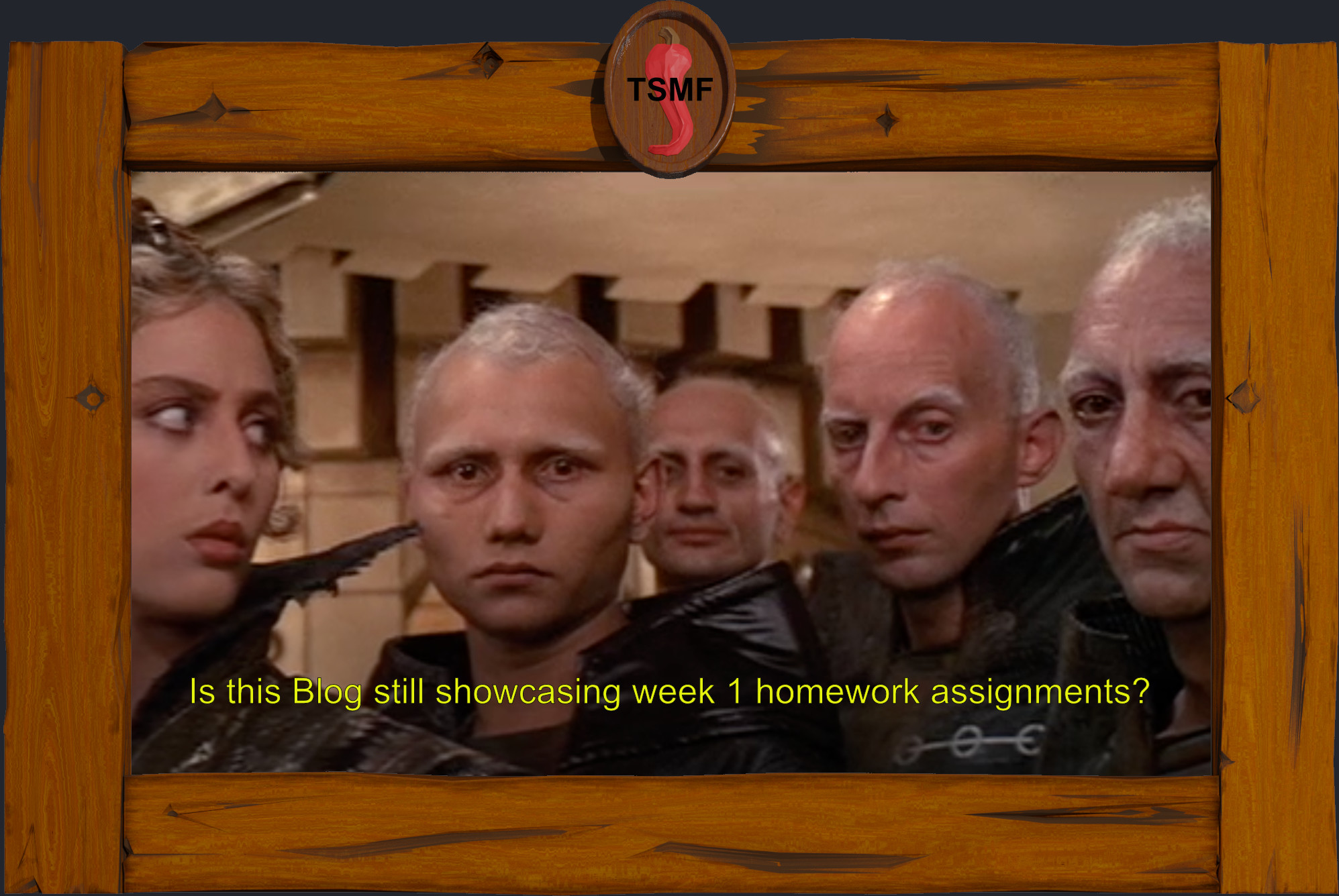
Also, you made a great sign!
Again, thank you for your feedback!
Cheers
Splat
llusifer You synced your .blend + textures perfectly - thank you! The sign looks fantastic 🤩
Thanks for contributing to the project! It's been a pleasure working with you 🤝
Thanks guys, ![]() jaivatur I hope to see a finished version from you too!
jaivatur I hope to see a finished version from you too!
No, thank you for setting this up for the community, it's been a blast! I'm sorry for not keeping up with the schedule, many parts of the process took way more time than I had anticipated. On the flip side, this has forced me to learn many lessons that I didn't even know I needed.
I'm glad the sync worked without any issues, I was a bit worried! Just one question about the cavity maps: I remember you said you expect us to provide them along color, normals, etc, do you still need them? Since I incorporated them in the color texture, I'm not using them for anything currently and I figured I could leave them out but if you still need them just let me know!