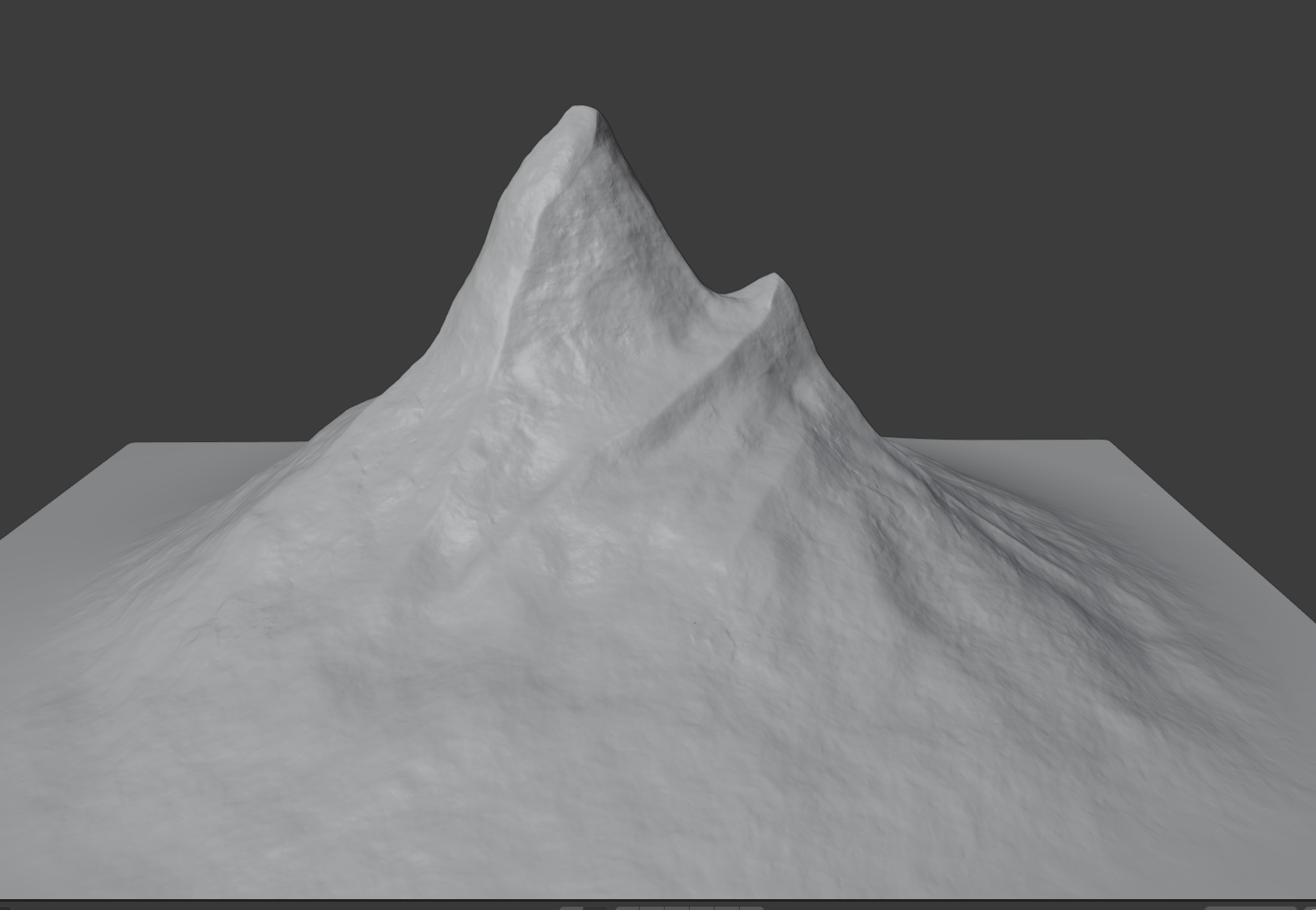
Hey ddanmelt , good job so far. Not sure what the plan is for the mountains, but poly count maybe an issue. Any thoughts on how you might overcome this? Some of the BG team are heading towards rendering an image and adding as a image plane. Another thought is delete the far side, so you only have one side that faces the camera and bake high poly detail to a low poly mesh. We really need some confirmation from the @theluthier on the future of this project, If the time of day is to change the plane method falls down.
Hey @adrian2301 , thanks! Yes, I was concerned about the poly count--this is the retopo version :)
I guess there are several ways I can reduce it. Removing the back half or baking, as you mentioned are good suggestions. Not knowing the path for the "fly through", I figured it would be best to model for any angle to the camera. If the background isn't going to come into play in the final presentation, I can go as far as outlining it and let the texture/shaders do all the work.
Massive reduction in number of verts. And maintained the ruggedness of the mountain look. can't wait to see this at the later stages with texture and shading applied. Nice work.
Fantastic ddanmelt! So far you're the first mountain I've seen sculpted. Kudos for delving into retopo as well. Way ahead of schedule 👏
I think the mountains will be *very* optimizable for the final polycount. Maybe as low as 1000 triangles. The vast majority of their detail will be in normal maps / textures. The expectation is that mountains only need to look good from the foreground zone (immediate area surrounding the house). Still given their size, I think they should be 3D instead of flat cards.
Don't worry about optimal geometry yet though. Week 2 I'd like to see you focus on sculpted detail. There's room for a lot of mountainous detail in sculpt form to be baked down.
Thank you @theluthier. Looking forward to see what I can make out of this !
Thanks for the kind words @adrian2301! As promised, I am truly learning from participating in this event and seeing all of the amazing talent from everyone involved. Inspiring!
You are an inspiration also, your positivity and willingness to take up the challenge is outstanding.
I was part of COLLAB2020 and learned so much from others and by participating in the event, it's an experience not to miss and with a teacher like @theluthier we can only succeed.
@theluthier
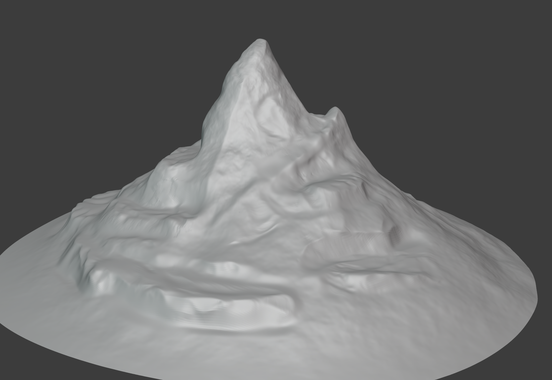
Hello, here's my week two submission for Mountain 'N'
 Moutain 'N'
ddanmelt One of my first Week 2 grades - Nice! The good thing about your mountain is I immediately recognize which one it is from the art 👍
I often see shapes in 2 contexts: Macro and Micro. Macro is the broader shapes that affect the silhouette where Micro is finer details that give a shape tangibility but don't affect the silhouette much if at all. Currently your mountain is heavier on the micro and lacking a bit in the macro. I.e too much texture stamping and not enough broad shape / silhouette changes.
Now I understand why you went here: Frankly there's not a lot of macro detail in the tiny sliver of the mountain that we see in the art. And arguably you've matched this sliver quite well. But when we see this approach applied to the entire mountain, it's less appealing.
I'd like to see more macro shaping before adding micro details (texture). I looked into your file (thank you for syncing!) and it took a solid 30+ seconds to open due to using dynamic topology. Multires is sooo much more efficient. So I took the opportunity to record a video of me:
This is just a work session so there's no commentary and I recommend speeding up playback. Hopefully it helps illustrate what I mean by the feedback above. Honestly I didn't take the adjustments far enough. There's a lot of areas underdeveloped especially neglecting the base of the mountain.
You're welcome to continue working from the new version I saved (WIP_nature_BG-mountain-A_danmelt_01.blend) or redo the work yourself. Check out the file size savings: 214 MB with dyntopo vs 34 MB with multires!
Truly amazing @theluthier ! Thank you for this. I still have much to learn :).
Love the way you did the retopo.. I'll run through this on my own, but doubt I'll get it to look as good as you did.
I know how busy you are and really appreciate you taking the time! Big THANKS!
@theluthier , I've come to the realization that I just don't have the artistic eye for this. I really appreciate your help, but I need much more practice.
@theluthier here's my resubmission. I took a shot at it. Let me know what you think.

Thank you @adrian2301 you're too kind. @jlampel is the man! The latest shader course was awesome.
ddanmelt My apologies for the late feedback
I've come to the realization that I just don't have the artistic eye for this. I really appreciate your help, but I need much more practice.
Don't give up when you're so close! You're definitely on the right track. Your mountains have some solid layers building up. My only note is to do a refinement pass to sharpen and "crisp" up the shapes.
It's a little on the "mushy" side as a sculpture which is common for an in-progress sculpt. Get in close, armed with your scrape brush, and make sure everything reads sharp and rocky. You can do this 👍
This video uses a much older version of Blender but the concepts still hold true. See if it helps push you to the finish line!
PS: I don't see a WIP file for you in the google drive. Please make sure you add your model so I can link it into the assembly scene.