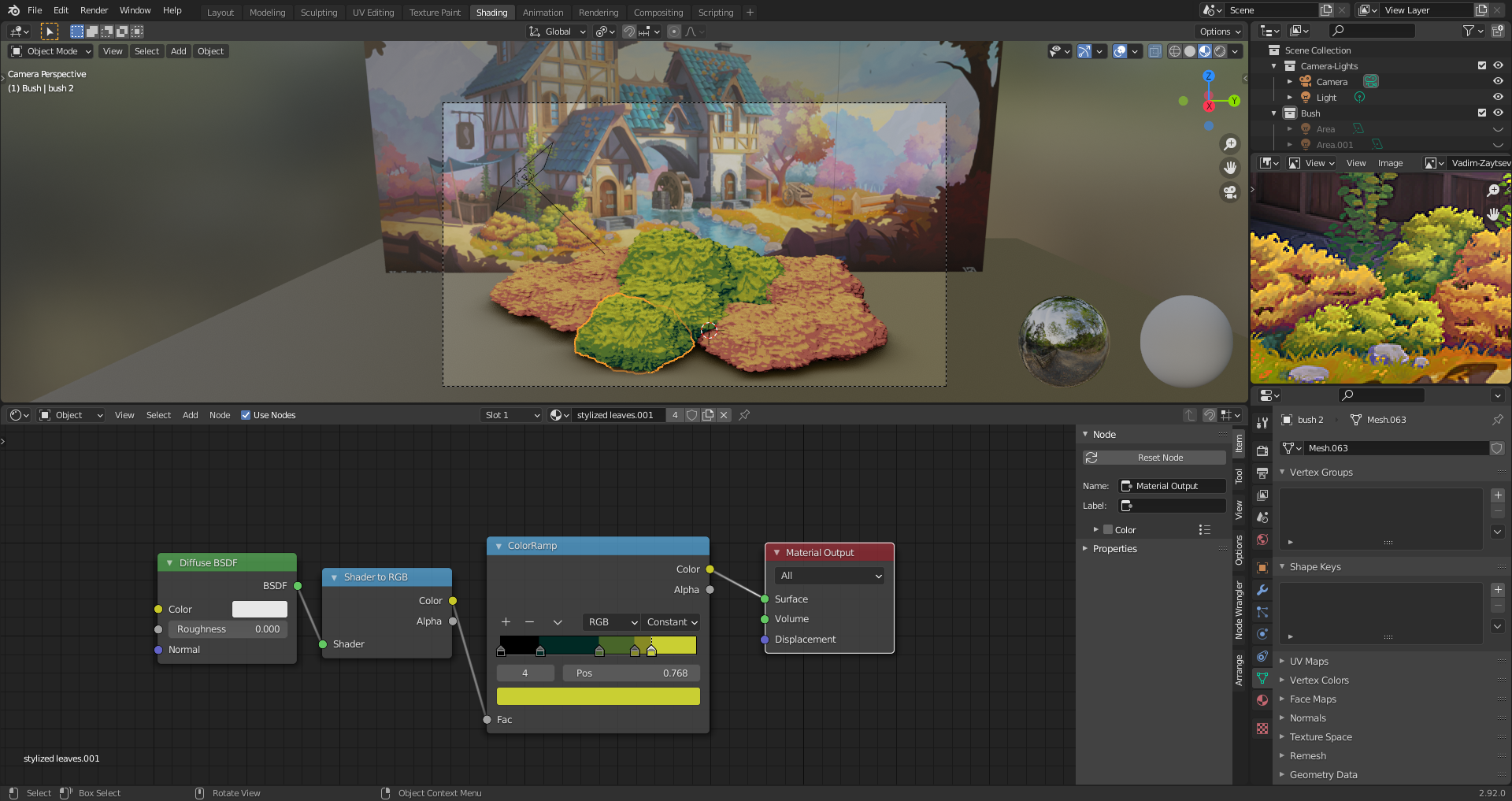
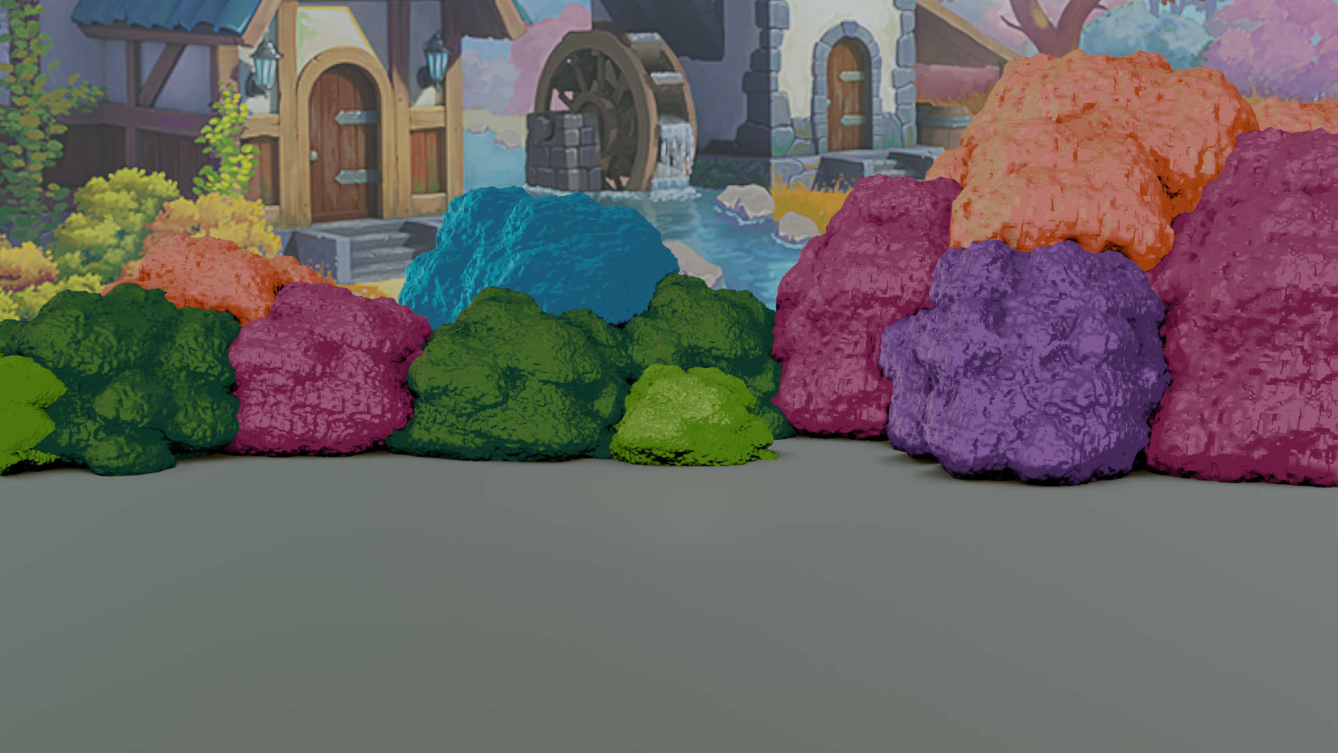
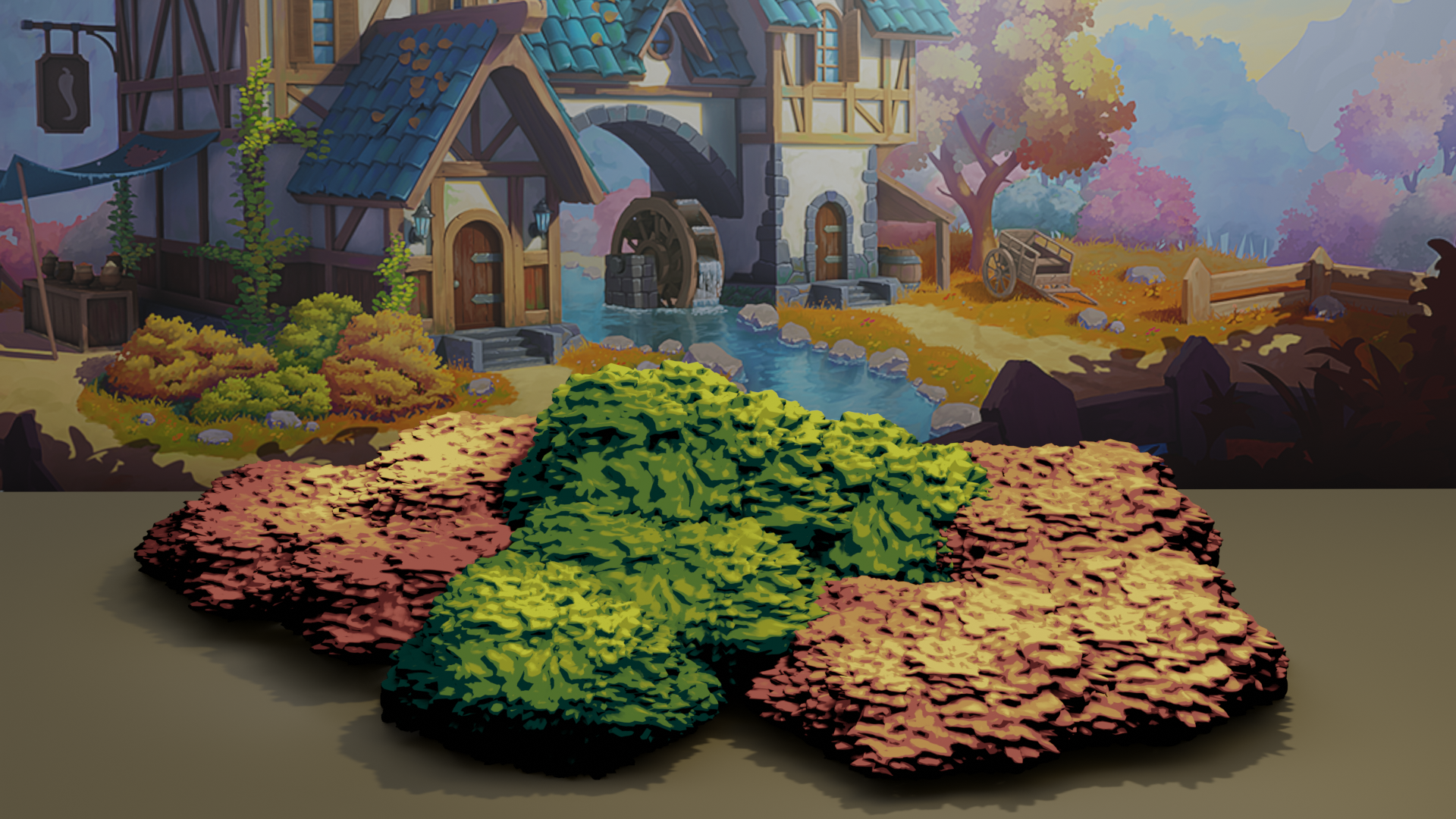
Here's my first try at the bushes. I used meta balls to get my shape. Converted them to mesh. Fixed polygon issues then added a displace modifier and used a multi leaf texture I made. I also used a smooth modifier to soften the effect.

Here is the Materials I used

Looking good already, Karen.
You might wanna scale everything up on the Z-axis a bit.
(And change your title 🤣 2012 was 9 years ago...we didn't have Collabs back then...)
Great work so far, i agree with spikeyxxx , scaling on the X axis will give more height to it to match the reference even further :)
love the approach you took.
This comes already close to the reference 👍! The colors are looking great! I also agree with ![]() spikeyxxx in scaling the bushes a little bit along the Z-axis.
spikeyxxx in scaling the bushes a little bit along the Z-axis.
ok fluffier, got it 😜 I will work on that. I just realized tho that I made the wrong bushes. I thought I was signing up for the bushes in front of the house. Instead I have the ones way in back. So, I start over 😵
we all love fluffy stuff, or at least i do :p.
Aw, but you get to learn the technic even better this way :D
Fluffy unicorn :D , nice work btw on those bushes . the green ones looks amazing , i think with the other color the black should be also a lighter darker collor (now its a bit too blackish)
but amazing work Karen :D
Could you get more of a cauliflower/broccoli look, like the green bushes?
The green ones look fantastic!
Those bushes look awesome. The green bush somehow reminds me of Studio Ghibli :D
Homework Submission - Week 1
@theluthier My apologies I was reading in discord. And saw I was supposed to post my image and point / ping you.

Great week 1 work ![]() ketre! Bushes are not an easy task so I respect you for tackling a challenge.
ketre! Bushes are not an easy task so I respect you for tackling a challenge.
If I'm honest, I prefer your earlier bush tests than what I see in the homework submission:

To me these read more bushy. They're a bit high in contrast but the shape and appeal is much better imo. The only thing that's lacking is a "leafy-ness". The blobby bumps work well at a glance but for foreground bushes, the illusion breaks down fairly quick.
Perhaps a layer of alpha-mapped cards on the outside of the bush could finalize the effect. Here's a video touching on the technique:
It's not Blender unfortunately but hopefully the concept is clear enough to imagine implementing with your bushes.
Hey ![]() ketre , looks like you were off to a good start! I would recommend taking a crack at the image plane method mentioned by Kent so that all the bushes and trees can look similar enough to tie together as a cohesive scene. Ping me whenever you're ready to submit for week 2!
ketre , looks like you were off to a good start! I would recommend taking a crack at the image plane method mentioned by Kent so that all the bushes and trees can look similar enough to tie together as a cohesive scene. Ping me whenever you're ready to submit for week 2!