this will be my homework submission forum thread
Homework week2:
https://cgcookie.com/questions/14215-collab2021-wip-sheila#answer-52188
Week 3 and 4 thread
https://cgcookie.com/questions/14215-collab2021-wip-sheila#answer-52808
end thread
https://cgcookie.com/questions/14215-collab2021-wip-sheila#answer-53333
This is my first pass of the cart. I had some issues with it in the beginning so had to redo it. Since 5 other people are doing the cart I tried to give it a little extra of my own interpretation. I still want to do the connection between the wheel shaft and the bottom of the card and add some more bolts. The next part is making the planks more interesting.
Tagging
@theluthier
Is this ok or do you want it exactly like the picture? ( I used non-destructive modefiers so can still change it)
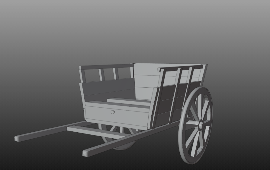
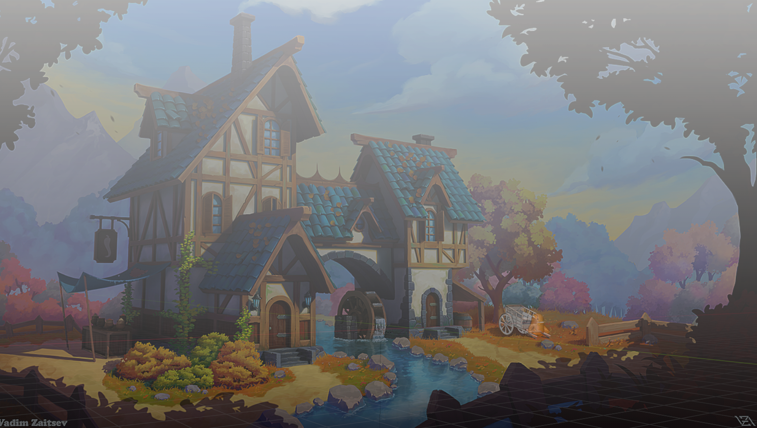
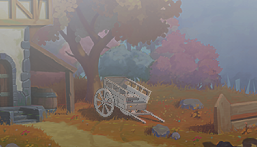

Melvin can sit in the card or pull the cart
![]() sheila5 Yes the first (angled) cart does look more characterful compared to the straight version.
sheila5 Yes the first (angled) cart does look more characterful compared to the straight version.
I guess it depends on whether or not with think that the Spice Vendor uses this cart solely for vending or if he also uses it on the side to transport hay, which the angled side would (to my mind) accommodate better (the transportation of hay that is).
It all depends on Kent's response, but maybe a cart with a subtle angle (between the 1st and 2nd carts) might be able to both fulfil the artwork and give the cart a slight "stylised character."
Just a suggestion of course.
![]() sheila5 It probably also wouldn't be a bad idea to get the artist's
sheila5 It probably also wouldn't be a bad idea to get the artist's ![]() harbinger_ua thoughts on this topic as well.
harbinger_ua thoughts on this topic as well.
I'm loving it.
But yeah, I mean Melvin could if he wanted to pull his own cart, but he's a wizard, I bet he could make it move all by itself or have some creature of the forest with a good heart help out.
![]() harbinger_ua We are all cheering for you Vadim, our cool concept artist, to help us expand this great universe you created. Thanks again mate.
harbinger_ua We are all cheering for you Vadim, our cool concept artist, to help us expand this great universe you created. Thanks again mate.
Homework Submission - Week 1 - Cart
I'm going to continue the next fase on the cart as is. So this is my submission for the homework for fase 1 @theluthier
next part is sculpting the wooden planks

Great work, ![]() sheila5 👍! The angled version looks more like I would expect a real world cart. I'm looking forward to your sculpted version 😀!
sheila5 👍! The angled version looks more like I would expect a real world cart. I'm looking forward to your sculpted version 😀!
![]() sheila5 Just a quick reminder. We still need a name for our team? What's your vote?
sheila5 Just a quick reminder. We still need a name for our team? What's your vote?
1) Shabby Chic
2) All Access(ories)
3) Shabby Fresnel Chic
4) The Stan Dalones
When you reach a point, where you can't see any wood, you went too far.
Think you are in the green here. ;)
![]() vincav81 I think, that details like the rivets are later baken into textures and then mapped onto the low-poly version.
vincav81 I think, that details like the rivets are later baken into textures and then mapped onto the low-poly version.
Wonderful work this week ![]() sheila5! I'm glad Vadim blessed your angled version. I too affirm that direction. Love it.
sheila5! I'm glad Vadim blessed your angled version. I too affirm that direction. Love it.
You get full points from me this week. Your cart will be an incredible canvas for sculpted detail in week 2 🤩
Lol ![]() bun-bun is right. You're not at the "too many rivets" threshold. Looks great!
bun-bun is right. You're not at the "too many rivets" threshold. Looks great!
Homework Submission - Week 2- Cart
well that didn't go fast because my pc started lagging more and more. In the end I used simplify and flat view
I've uploaded the wip file hope it won't crash the computer of whomever is going to look at the homework
The cart is far from perfect but I don't have a year to finish it ;)
***
update I've added some more detail on the wheels which will be visible in the next file
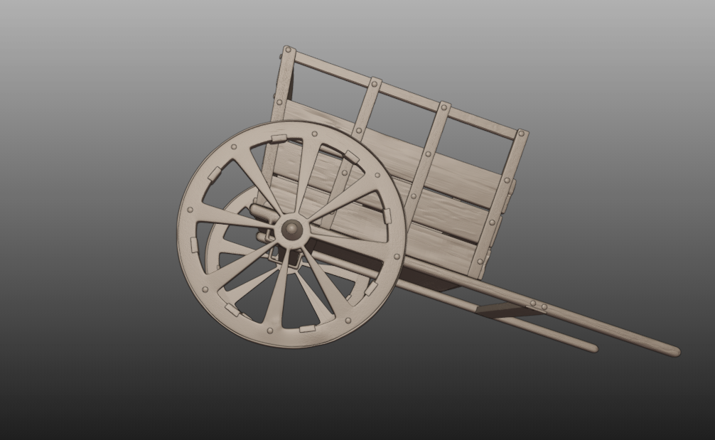
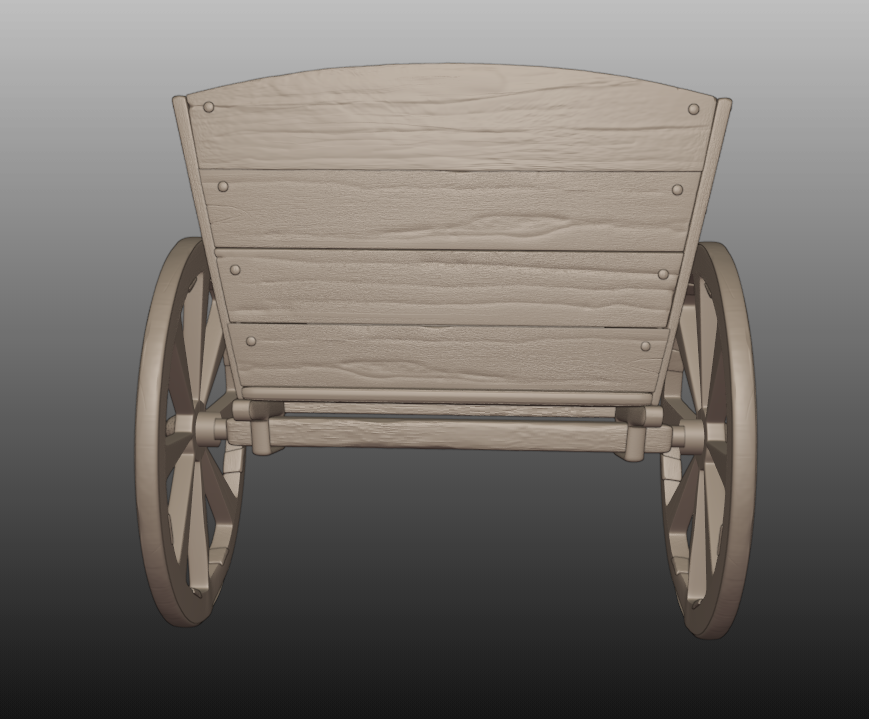
Nice sculpting, and I love the way you connected the wheels to the cart.