This is an on-going thread documenting my progress throught the 2021 Collab Project.
Homework Submission - Week 1 - Roof
@theluthier
Well, here's my roof blockout !
I started at first with only the reference image , but then in the middle of the process I thought about checking the GoogleDrive and ended up linking the WALLS collection from the House_blockout_02_kent.blend file.
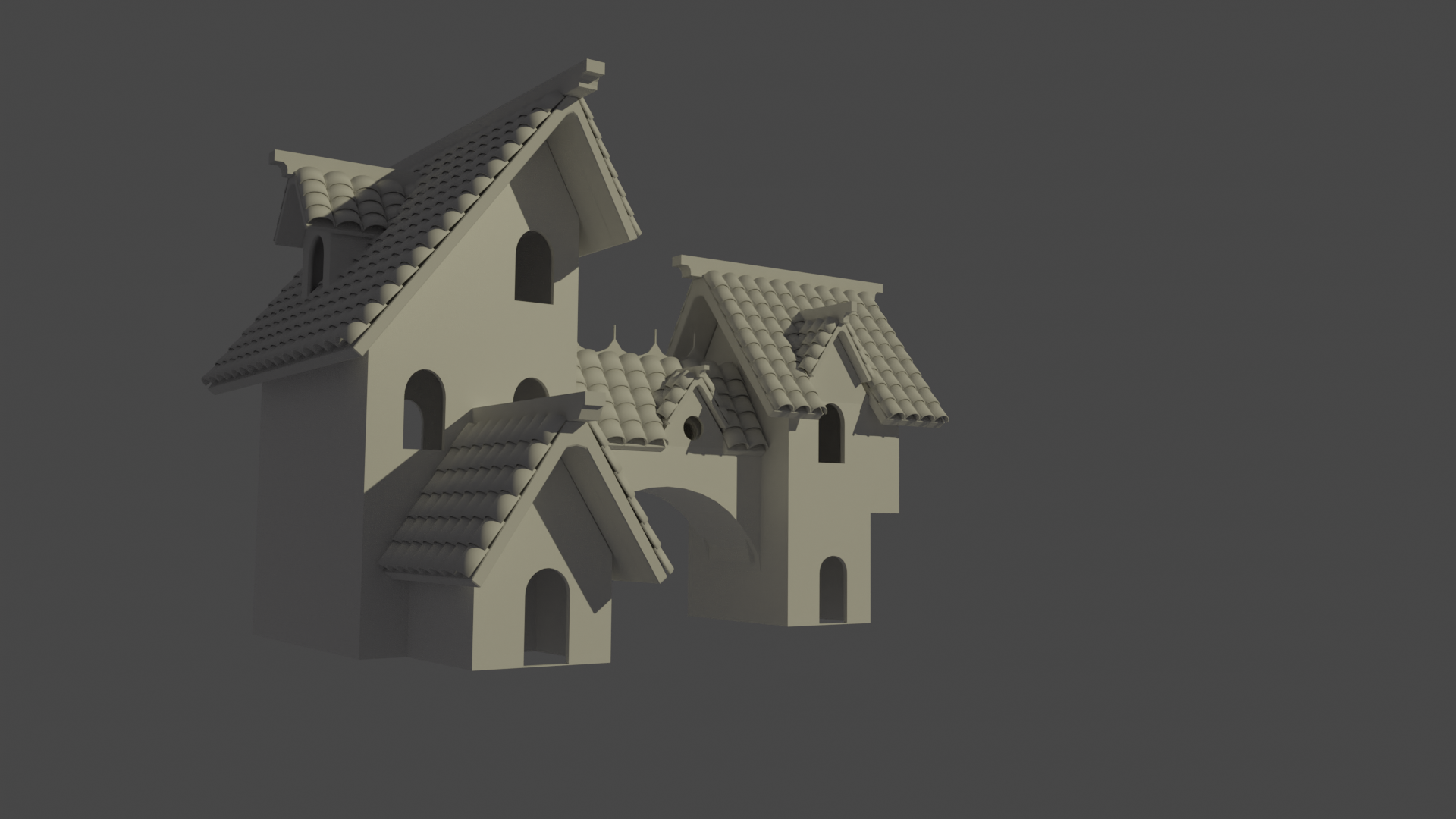
At first I planned to just have 3 meshes per roof (at the exception of the larger left roof): the support beam, the tiles, the upper beam.
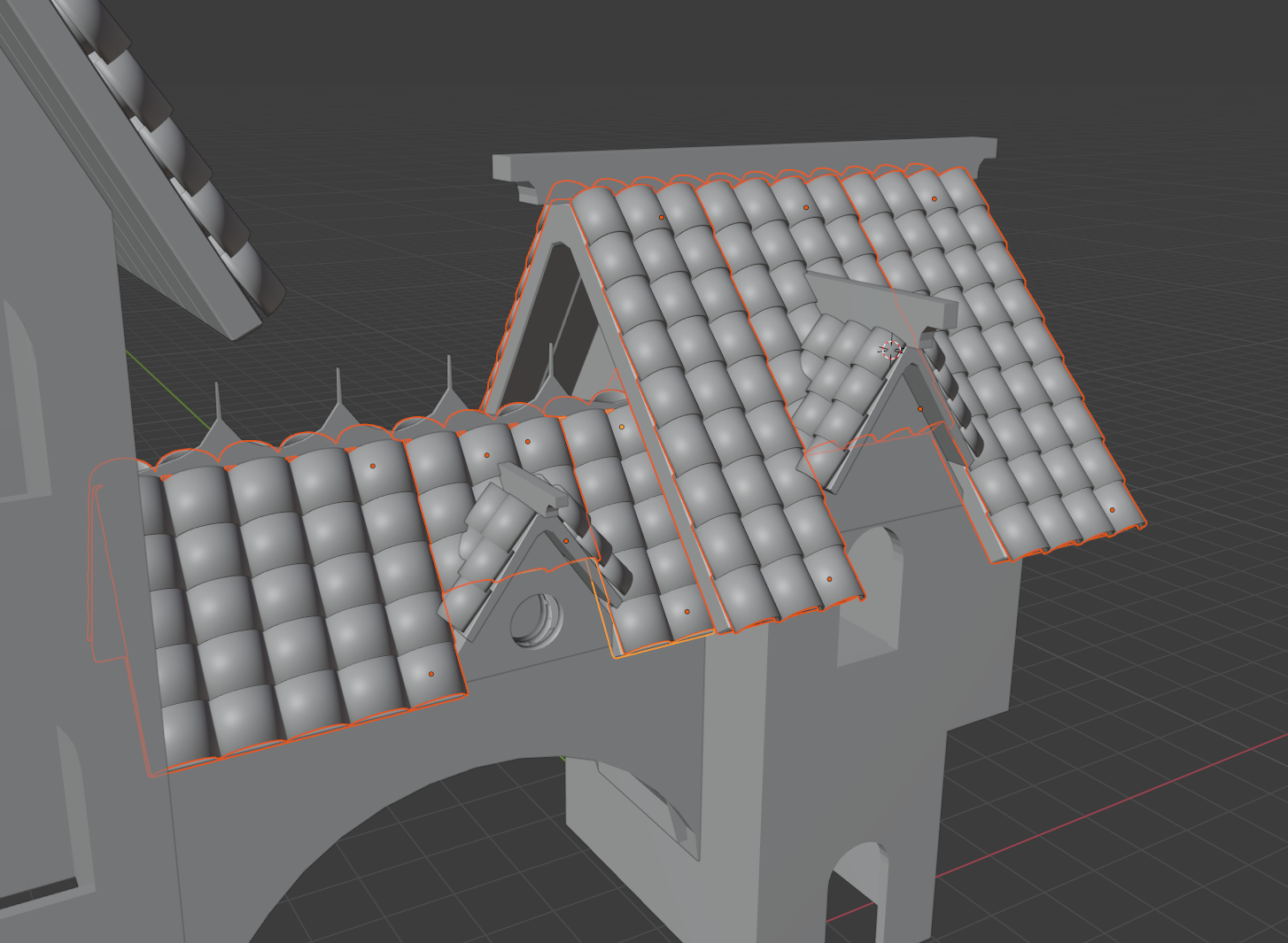
But I realized as I got to the roof in the middle that wouldn't work as we have the other little ones that "break" the roof, so I ended up splitting into separate meshes. Not sure if that's the best way to do something like this! Here's a screenshot to see what I'm talking about:
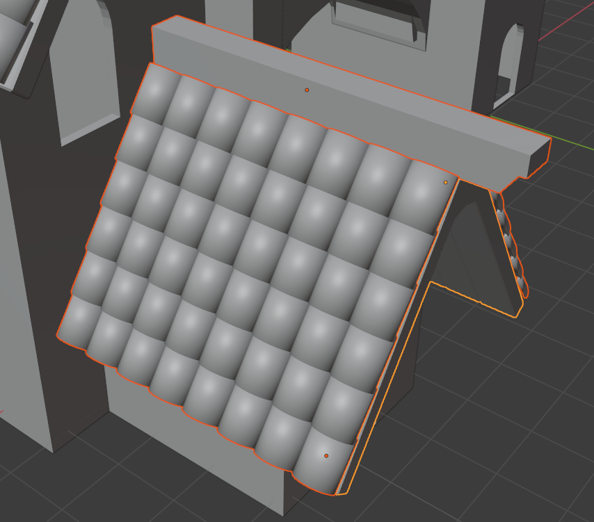
Compared to for example the entry roof:
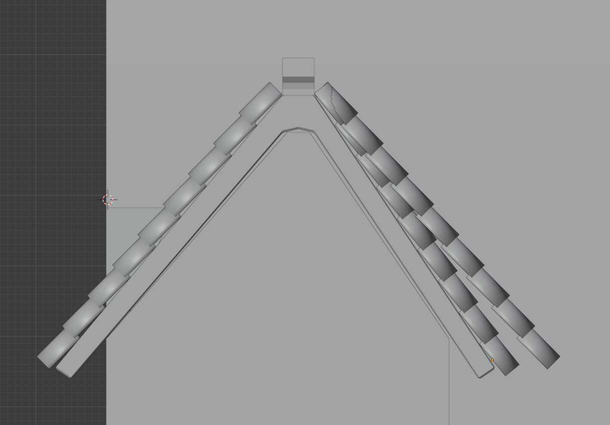
Something else I realised was that the block out's right building had a non-symmetrical roof, so the Mirror modifier was not usable for that one when it came to the tiles, unfortunately. I think it's been mentioned and that we'll be waiting for a final official blockout :)
Overall, I feel satisfied for a start, but looking at what ![]() andybegg has done on his part I can't help but wonder if I'm not way out of my depth ^^' Still, I'm eager for next week (I actually have half a day off too so I'll get to work more than I could this week :D) and glad I'm part of this whole project \o/
andybegg has done on his part I can't help but wonder if I'm not way out of my depth ^^' Still, I'm eager for next week (I actually have half a day off too so I'll get to work more than I could this week :D) and glad I'm part of this whole project \o/
Hey buddy,
Looking great!
I've been doing blender for a few years now.
The projects not about skill level, but working together in a team.
If you're ever stuck, want some tips, you can always drop me a message.
Keep up the good work. :)
Thanks man ^^
What do you think about a talk via Discord at one point if that sounds good to you ? I'd love to like "debrief" how you've done all you've done, your process etc :)
I am glad you are asking some good questions nnavik so far that is looking great for a blockout. Your tiles feel a little more beefy. One thing will be to get the randomness down so the grid is not perfectly aligned. And next will be the wear and tear but there's time for all of that.
I'm so confused...I have a grade recorded for you nnavik along with a vivid memory of giving feedback to you, and yet there is no evidence of this 🤔 It wouldn't be the first time I typed out feedback and forgot to his "Add Reply"
My apologies. Allow me to catch up: Your roof blockout looks great! Definitely worthy of full points for week 1. Keeping things separate and *modular* is a very wise way to build assets like this. As in only build , let's say, 6 roof tiles and duplicate / instance them across the roof instead of having to manage hundreds of individual tiles. Similar only build a few roof boards and beams that can be duplicated.
Is this the way your roof is structured?
Hey Kent !
No worries for the feedback, I can only imagine how much work you've got managing the whole collab.
Now, concerning the second week. Andy (andybegg) has been really cool and agreed to have a call last Thursday for a debrief, as I thought his version was so well-made I figured I could learn a lot about how to tackle a model such as the roof. Which brings me to your remark about keeping things modular (which is actually a term I just learned ^^).
It was "modular" in the sense that the roof boards were separate from the beams as well as the roof tiles. BUT, each roof's set of boards and set of tiles were one mesh respectively, and the rest was done only through Array modifiers. Which, as I later understood, is really not what we want in terms of making things look good by having variety (differents tiles per roof, different boards, etc). It's one of the things that Andy had explained to me, about the whole "Linked duplicating" things, and rotating the models to have different faces/sides while actually having one base mesh. So, I figured I'd re-do the whole thing, with that in mind, before getting into the sculpting. I signed up for this collab to learn, so if I only listened to the advice without actually applying them, what's the point, right ?
Of course, life has a tendency to throw my plans out of the window these last few weeks, and I didn't get to do anything of what I had planned in time. I also got to discover that the auto-save feature of Blender apparently never worked either, which led me to lose some work.
Anyway. I just submitted to the drive an "improved" version of my blockout (WIP_house_roof_navik_01), which only contains the roof planks. But at least, if you check the mesh data of some, you'll see it's LongPlankA, LongPlankB, with also the Medium and Small versions.
I hope I'll get to do the same for the rooftiles early this week so that I can jump into the Sculpting, and catch up with the third week. But I'll be honest, I might be short on time as I have a job interview next Monday.
So, I apologize for not having submission for the week 2. I'll do my best for week 3. I'll try and be there for tomorrow's stream.
nnavik This collab is as much for you as it is for others. If life gets in the way that is understandable.
My recommendation is to submit what you have each week and keep going and learning. The main point here is growth. If you are growing then this entire collab was successful!
No need to apologize nnavik! I'm so happy to read that you had a call with ![]() andybegg about his roof's structure. Linked duplicates is a hugely beneficial thing to learn about. Redoing the roof sounds like the right call and kudos for heeding the advice.
andybegg about his roof's structure. Linked duplicates is a hugely beneficial thing to learn about. Redoing the roof sounds like the right call and kudos for heeding the advice.
I see your new WIP version and it's off to a great start. Reaching out for help and starting over is very commendable. I'm going to give you full points for the effort and discipline in building things a better way 👍
Thank you both ![]() blanchsb and @theluthier for your kind words :)
blanchsb and @theluthier for your kind words :)
I've just had a surge of motivation (coupled with insomnia, perfect combination :D) and spent some hours on the modelling re-work.
So, here's what I did:
I only did pairs of beams instead of sets of three as I felt it was a whole lot already. For the roof tiles, I used a total of 8, but 5 of which are actually all the same, so that the majority of the tiles made by the Point Instance geometry node are "good" tiles. The 3 others are there for a bit of variety with small breaks in them.
There were 2 things that took me a lot, lot longer than what it should have been. :
- First, I had setup a BASE_MESHES collection, separated from the rest, which contains the meshes from which I'd duplicate everything else. After I had modeled all those, I wondered why the actual roof's meshes were not similar. As if the bevel modifier I was using was not applied to all the duplicates. That's when I made the mistake of launching myself into manually beveling each of the base meshes, thinking "ah well I should have applied the modifier before link-duplicating them".
- Second, I was not experienced with "manually" beveling meshes. I don't know what happened in my head but I figured "hey the modifier's probably applying a bevel on everything, right ?". So, that's what I did. Selected all faces, beveled everything. "Doesn't look so bad" I thought. After I did the same for every model, and only then, I realized... the shading was off, because beveling everything meant double edges everywhere. I checked back Andy's wip post, and saw that I had indeed far, far too many vertices in some places. So I went back and fixed (or at least tried I'd say) all the meshes, reducing the number of segments in each one of them. Based on what was said during last week's stream, I left triangles when there were some. I did remove any n-gons though.
And so, here's a screenshot of all the base meshes. Yes, it's completely inspired by Andy's WIP post :)
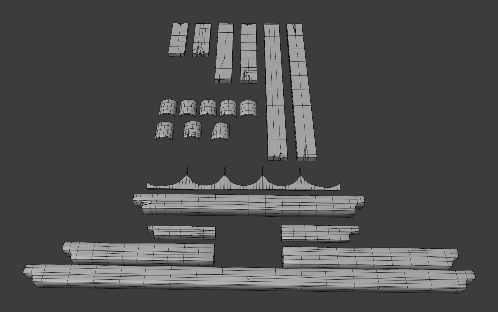
Things I learned:
Anyway. With all that I think next time I work on this I'll start the sculpting :) I made a WIP_house_roof_navik_02.blend file with the updated meshes and also a better organisation. Later !
These are big skills / concepts to learn nnavik! So much of 3D is trial and error. Trust me, we've all been there and still go through it pretty regularly. I'm thrilled to hear of your surge of motivation - keep that fire lit 🤜💥🤛
You've got a great library of minimal pieces. Following Andy's lead you'll realize the power of minimal pieces to construct a maximum product. Keep up the good work!
What a great post nnavik
I'm really looking forward to the sculpted details WIP posting!
Homework Submission - Week 2 - Roof
I wasn't sure if this submission should be titled as week 2 or 3, but decided for 2 since it's the sculpting work I should have done last week ^^'
Fun fact, I had tried to start sculpting with my mouse at first but quickly realised that it was far from optimal, and was lucky enough to have a friend of mine agree to lend me her tablet for a few days :D I think it really helped me not to get frustrated too much x)
Here's a screenshot of what I think is the final product (the four tiles without sculpting will be duplicates of the first on the left):

I really enjoyed this, and at least now I know I need to buy a tablet for the sculpting :p
Among the issues I encountered, here's a screenshot of something that happened quite often, and I haven't been able to find out what exactly caused this "seam" to sometimes appear while I was sculpting.
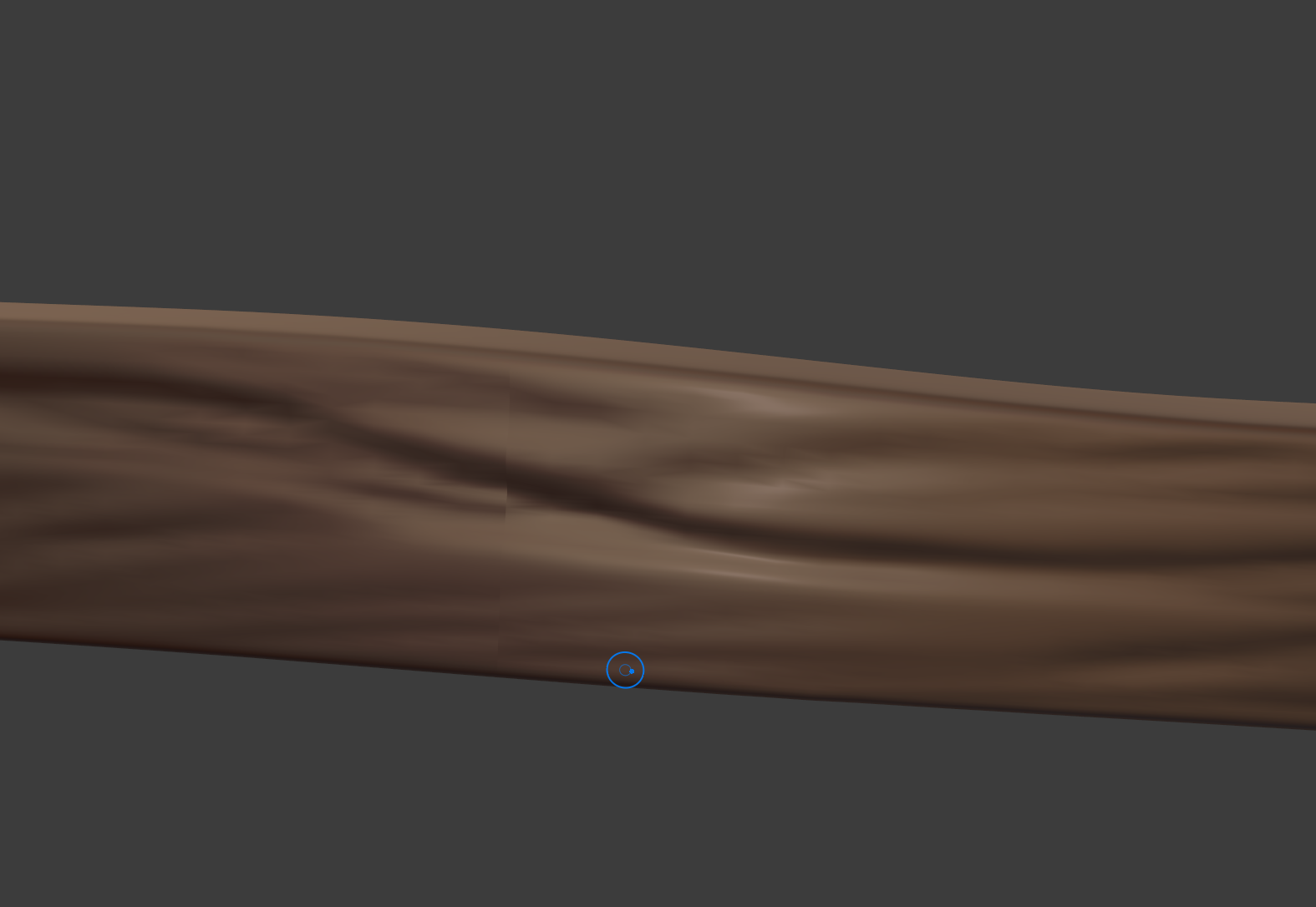
Another mistake I kept doing for far too long before realizing it was that I used the multi-res modifier without high enough subdivision values. I did most of the wood beams before thinking about trying a level 5 subdivision (instead of 3), and so I kept wondering why a lot of my brush stroke looked kinda "meh" and "pixellated". Had to go back and redo almost each one of them, but then I also realised some of the planks (one of the smaller ones and one of the medium ones) had some geometry issues, with crossing edges and not really correctly placed vertices. I did my best at fixing those too.
Anyway, not the greatest sculpting I'm sure, but for a first time, I'm still quite proud of how it looks ^^ I should have a bit more time next week so I hope I'll be able to catch up with the rest from there :) Thanks for reading !
You're making such good progress nnavik! I have to say how much I admire you regrouping, rebuilding, and persevering through this asset. It's absolutely showing in your results 🤝
RE: That weird seam when sculpting - I get that sometimes as a viewport shading artifact. Usually sculpting in that area or tabbing in and out of object edit mode will "refresh" the shading on the sculpture. It's annoying for sure but thankfully only appears briefly in my experience. Are you finding this to be true?
I never would have guessed your weren't using a tablet to sculpt - very impressive mouse sculpting work! Unless you're sculpting with a trackpad in which case....unbelievable trackpad sculpting.
Your sculpting is progressing very well. Already it's reading like wood. All it needs is some clarifty / refinement of the details. Make sure you tighten crevices and use the scrape brush to rough up the edges. Here's a GIF of a before + after to illustrate what I mean:
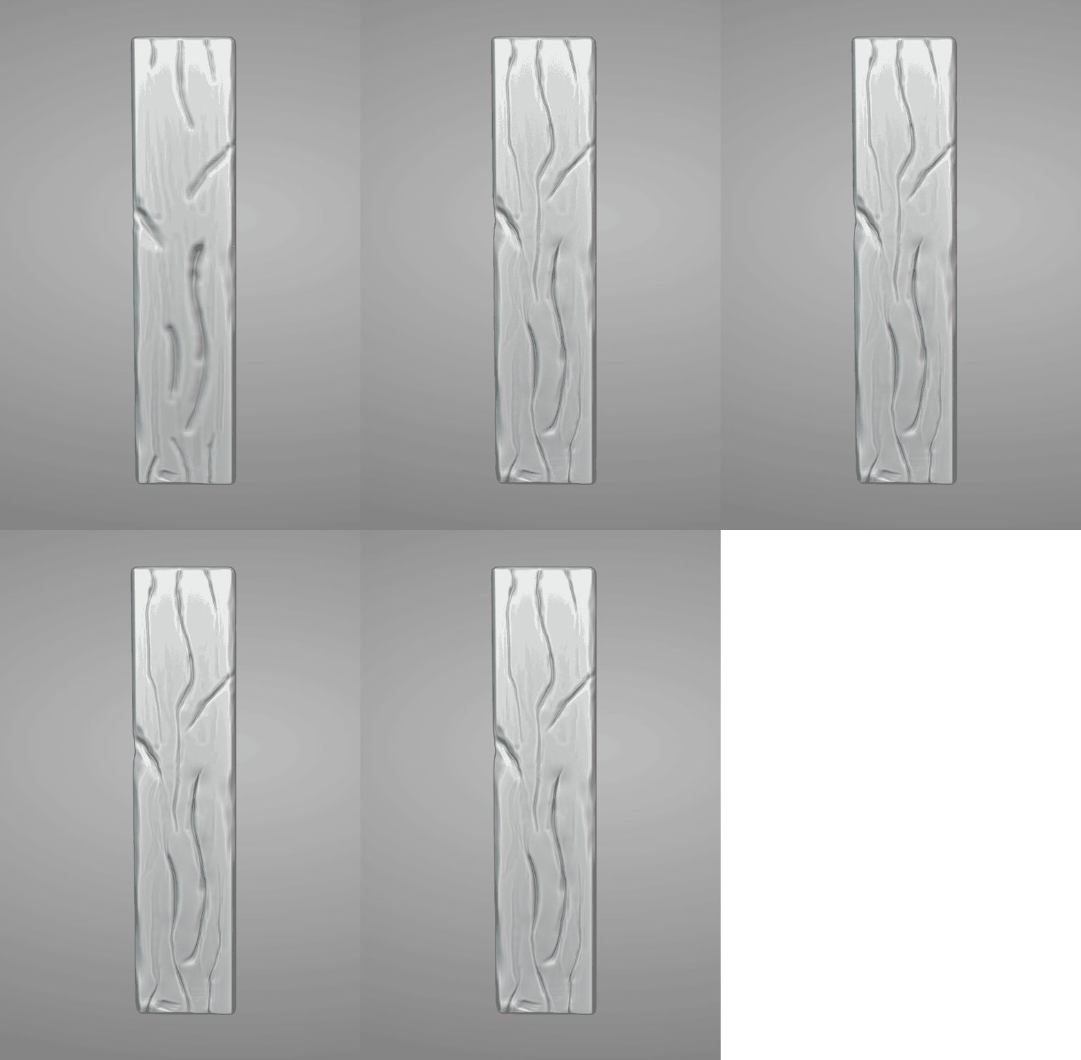
Hello! Sorry for the delayed answer! (thanks ![]() blanchsb for pinging me via the asset list)
blanchsb for pinging me via the asset list)
I tested the switching in/out of the Edit mode and yes, it seems to be enough to avoid the weird seam :)
Also I think you misread my post, I did use a tablet to sculpt, thanks to a friend who lent me hers! But now I know that if I want to do more sculpting work I have to buy my own, there's now way I'd sculpt with just the mouse x)
I've taken a day off on Friday so that I can spend some time on improving everything. I know I've got a whole lot to catch up on ^^'
Thanks a lot for the gif :D
Small update on my sculpting work
So, I started this morning trying to follow your advice @theluthier , and make the cracks and crevices more refined, and I just couldn't manage to do it properly, kept circling around without getting the sculpting to look better. At one point I tried to use the Scrape tool with the Sculpt Plane option set to Z-Plane to " flatten" back the borders of the cracks but it just did not look right:

Those are LongPlank_A (top) and LongPlank_B (bottom); LongPlank_A being in the first sculpt version. LongPlank_B here is what I got before getting a lunch break.
I kept looking back at your gif and at the style sheet from the Google drive, in the end I decided to remove and add back the multires modifier and start from scratch. I ended up with this:

I think it's a lot better, and so here are two things I think I did wrong on the first sculpt version:
Here's a screenshot of what I have for now:
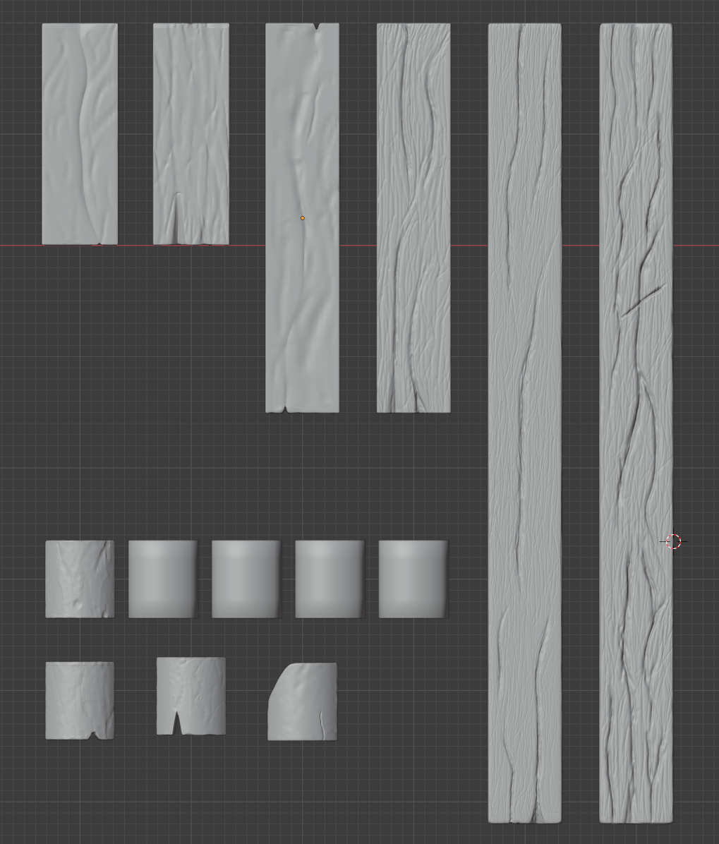
I did the same for those two improved planks (LongPlank_A / MediumPlank_B), and re-started the sculpting from scratch. I'm considering now whether to also do the same for the rest, or if I should spend some time to try again improving the existing sculpt. Any advice on this point would be really welcome :)
That's all I got for now, I'll continue a bit more tonight and over the weekend, I think!
nnavik It is amazing to see the difference in the planks. Your sculpting skills are kicking into "high gear" and the new boards are very impressive! The normal and cavity maps are going to look fantastic.
You're on the right track nnavik! Crevices look much better and overally improved wood aesthetic.
The only suggestion I have for your wood is to tighten the crevices so they're not broad. You can do this with the Pinch brush + locking the axis that aligns with the depth of your crevice. If your boards are lying flat on the grid floor, you would lock the Z axis when sculpting:
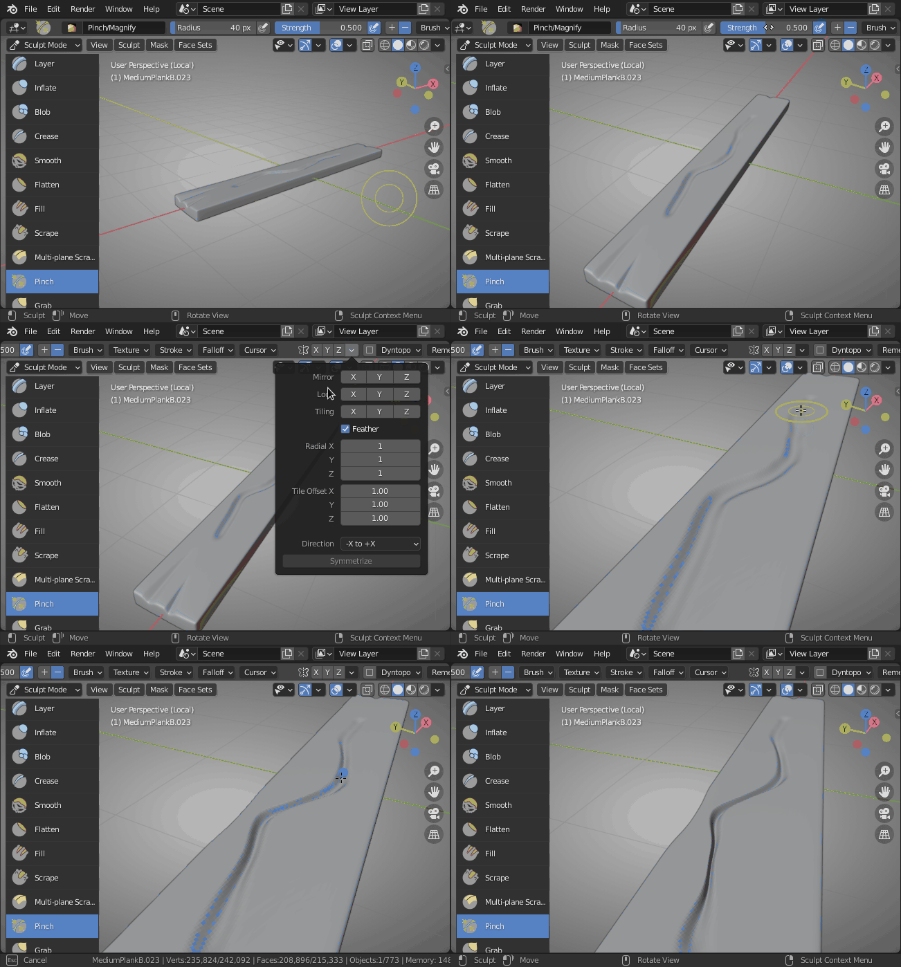
If they're facing forward then you would lock the Y axis. This will pull the crevice closer together while maintaining the depth.
Other than that you're wood looks good to me! 👍
Hey !
![]() ullreym Thanks for your words man :D I think I can say now I enjoy the sculpting aspect of 3D modelling ^^
ullreym Thanks for your words man :D I think I can say now I enjoy the sculpting aspect of 3D modelling ^^
I also have an even deeper respect for the professional artists doing high quality sculpt work now :p
@theluthier Thank you for the advice :o I'll keep that in mind next time I do wood sculpting :D
I encountered some topology issues when I started re-working on one of the meshes which made me waste a bit of time as I discovered it half-way through sculpting it ^^" It was caused by one of the mistakes I mentioned previously actually, when I beveled everything...
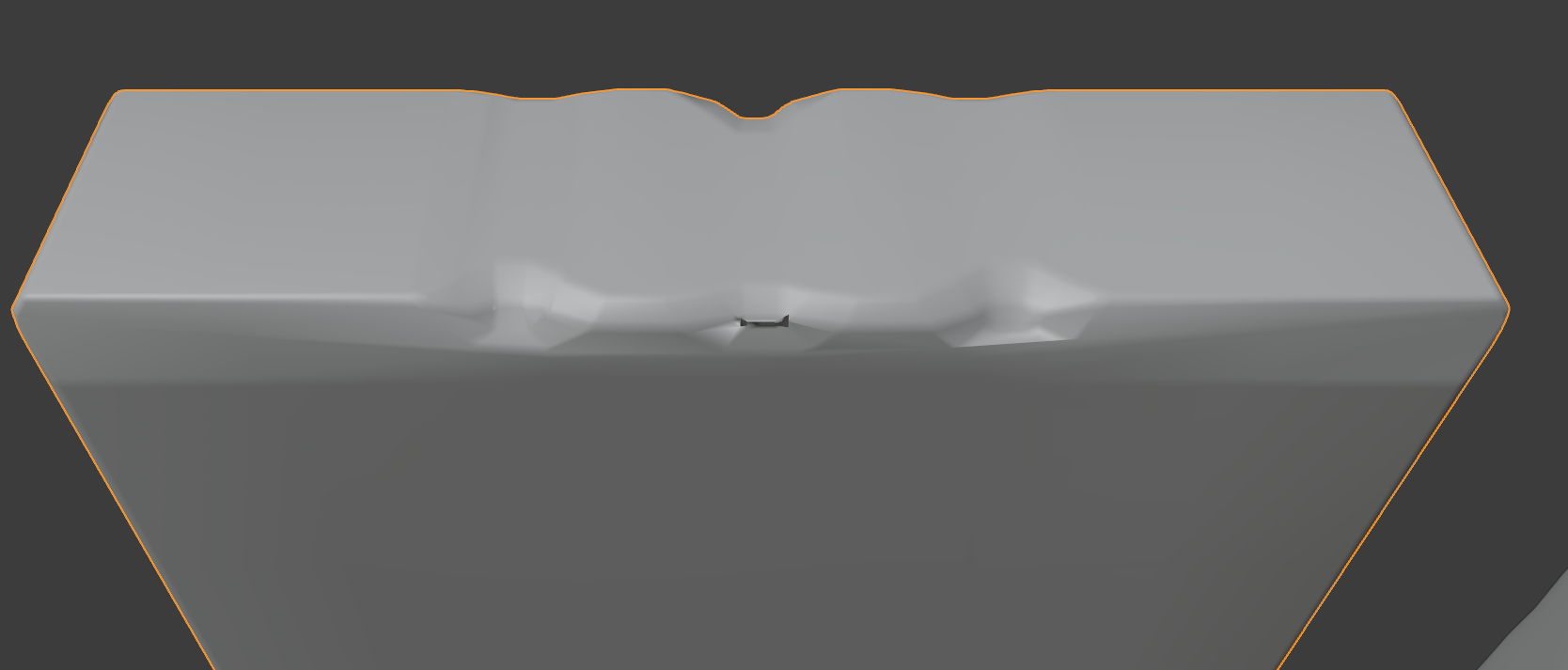
But, at least now I think I'll be able to fix modelling mistakes :D
I also could not figure out why sometimes the sculpting was not "homogeneous" in terms of details:
Here's the top part of one mesh:
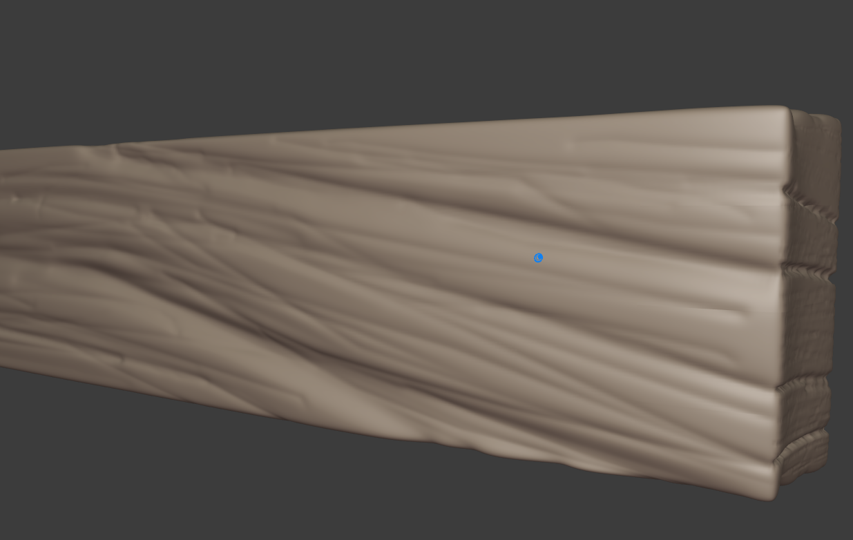
And here's the side of the mesh (right side of the previous screenshot):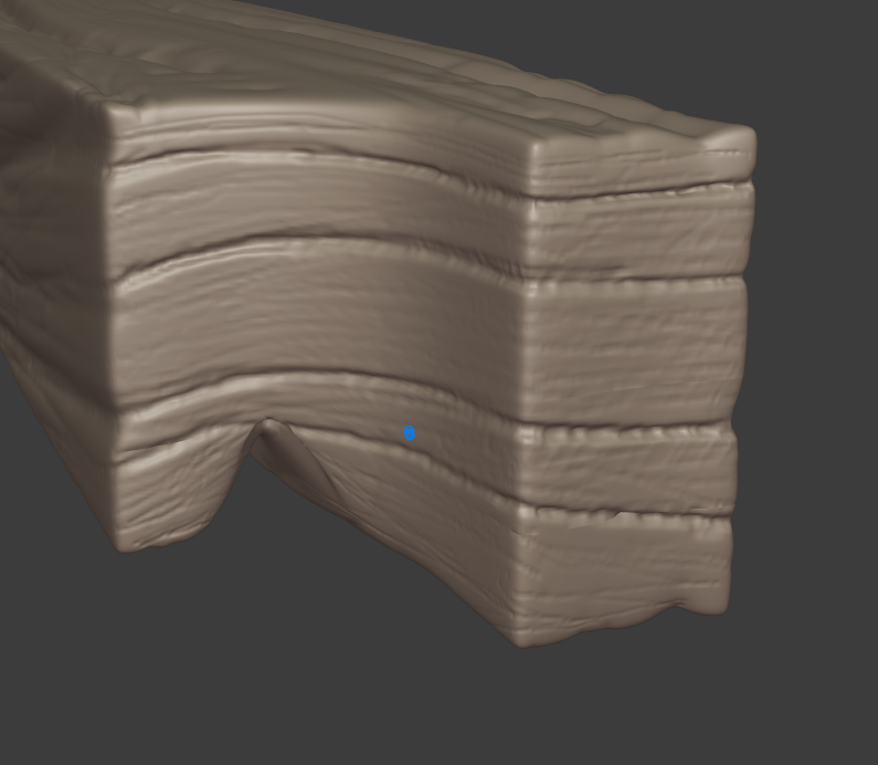
Fortunately it's not a part that would be zoomed as closed as this in the final scene so I figured it would be acceptable just like this, but if anyone knows I'll be glad to hear ^^
Anyway, I'm still quite behind schedule, but here's the improved sculpting work (didn't make too much change on the tiles) \o/
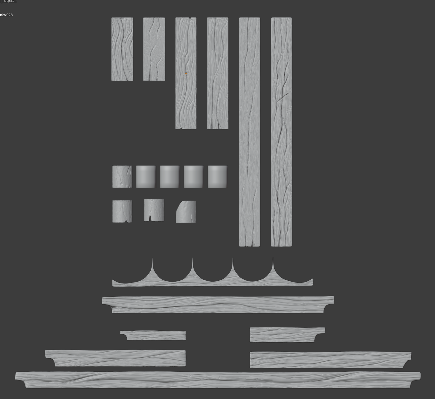
I think now I'll have to figure out how to find some time to watch the week3 livestream ... (I think I mentioned in a previous post I had an job interview to prepare for; I now have a take-home project to do for the second step of the evaluation process :tired:)
In any case, thank you again Kent for this project, I know I'm learning a lot, and enjoying it !
Hi again people!
Time has been limited these days.. But, I still managed to put a few hours into Blender :)
First things first, I fixed the part of the roof that was asymmetrical based on the information given by ![]() blanchsb on Discord. That was easy. But of course, things wouldn't be interesting if everything ran smoothly :p
blanchsb on Discord. That was easy. But of course, things wouldn't be interesting if everything ran smoothly :p
I realized there was actually a whole part that I missed:
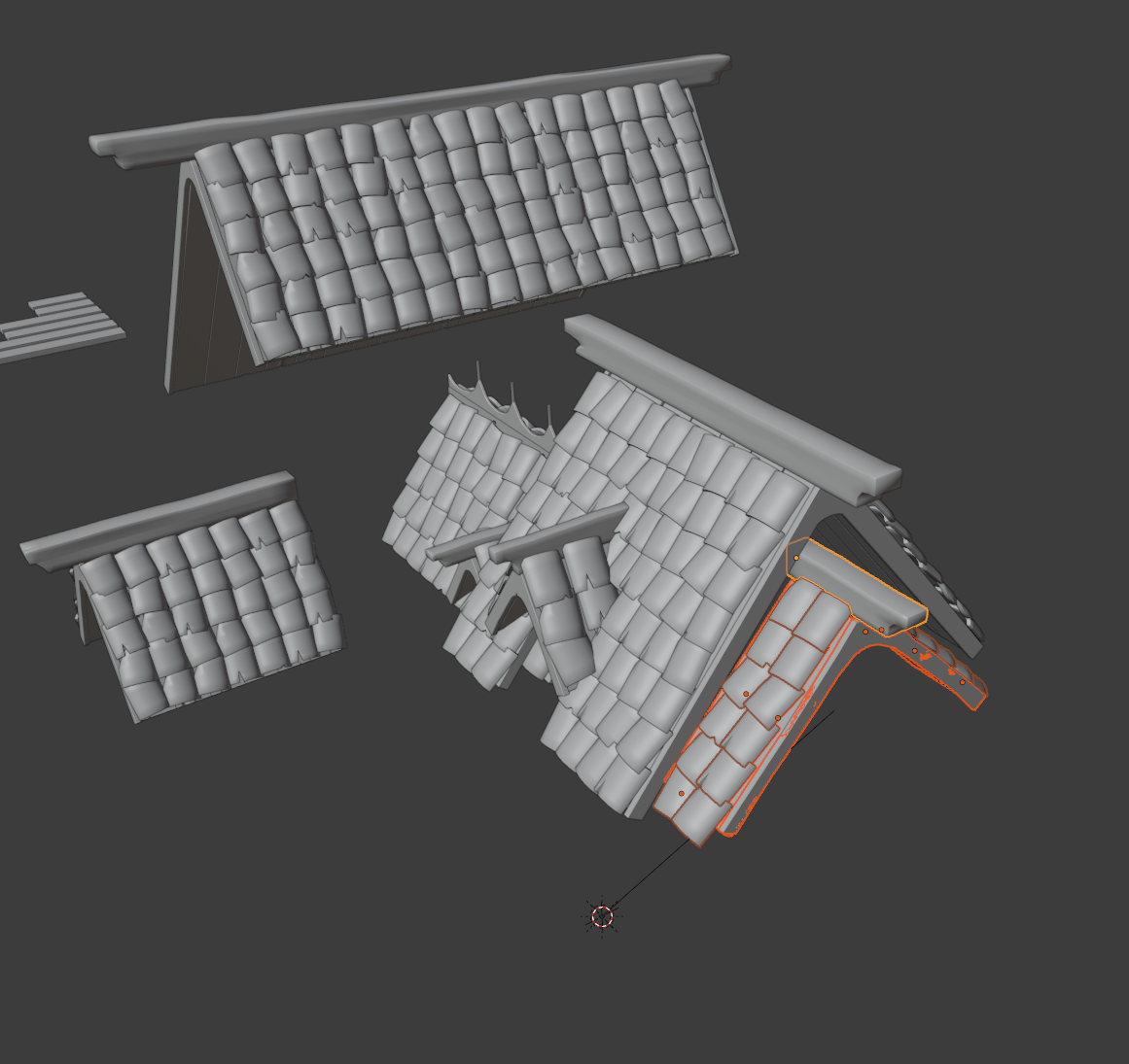
But, that was alright. Not that much time was spent on that.
Then I decided to check ![]() andybegg 's WIP thread, as his work pretty much guided me right from the end of the first week, to see if there was anything I should be aware of when it came to the whole baking/texturing process. I'll admit, it was with a little frustration that I discovered I did the exact same mistake and forgetting the sculpting for some meshes:
andybegg 's WIP thread, as his work pretty much guided me right from the end of the first week, to see if there was anything I should be aware of when it came to the whole baking/texturing process. I'll admit, it was with a little frustration that I discovered I did the exact same mistake and forgetting the sculpting for some meshes:
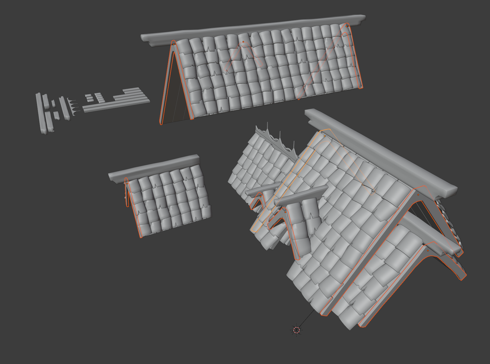
I think it's simply because contrary to the wooden planks and tiles, there are none that are duplicates, so I did not have them in my Base_Meshes collection (the group in the background).
Anyway, I decided to put that aside for now, and give the baking a try, so thanks to the streams being recorded I went back and checked the week3 livestream.
At first I made the mistake of UV unwrapping all the meshes into one textures, which gave less-than good-looking normal maps, with really not refined details . I kept going back into the stream to see if I had missed anything, and at one point it clicked: my meshes' textures were lacking texel density. So, I tried to separate the wooden planks's UVs from the other meshes, giving this normal map:
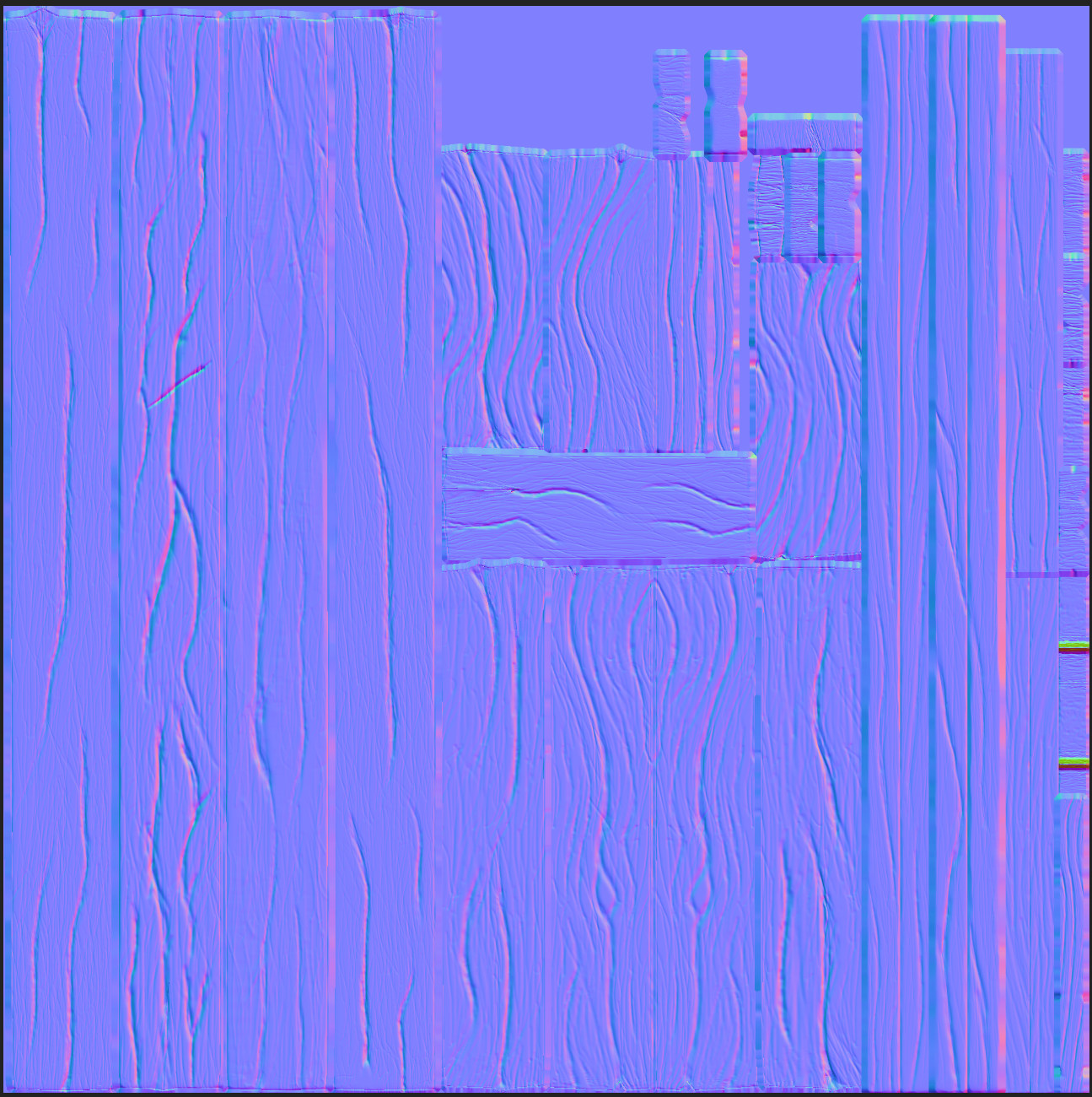
There are those bad spots on the right side, but after checking where they were on the mesh and thinking about the fact that the camera would probably never go up close to the planks, I figured it would be okay to leave them like so. Of course if you tell me I should go back and fix those I'll try.
But hey, here's what it looks like it rendered !
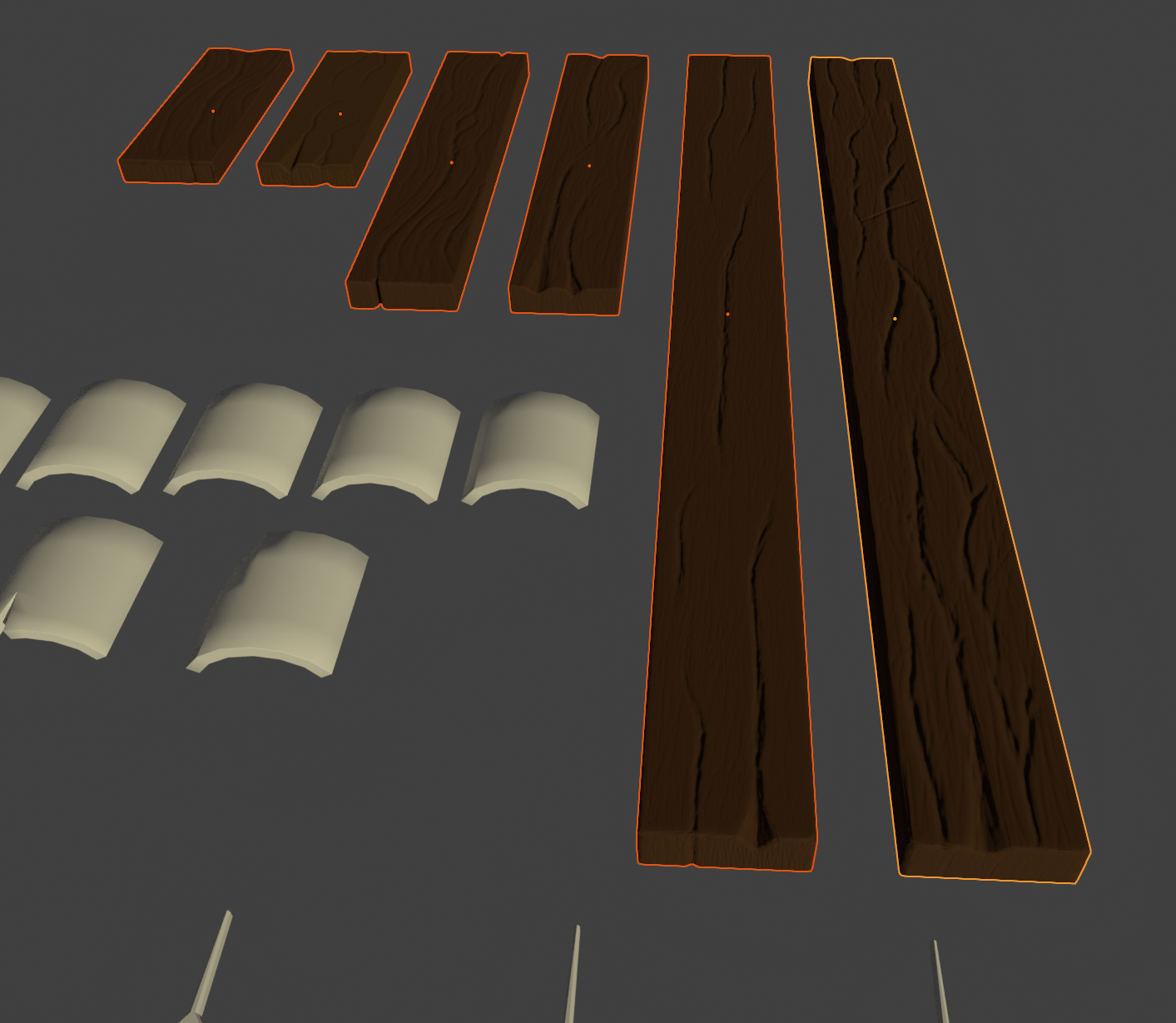
And thanks to the linked duplicates (probably one of the best things that I learned about since the project started), without additional work, here's how it looks on the roof itself :D
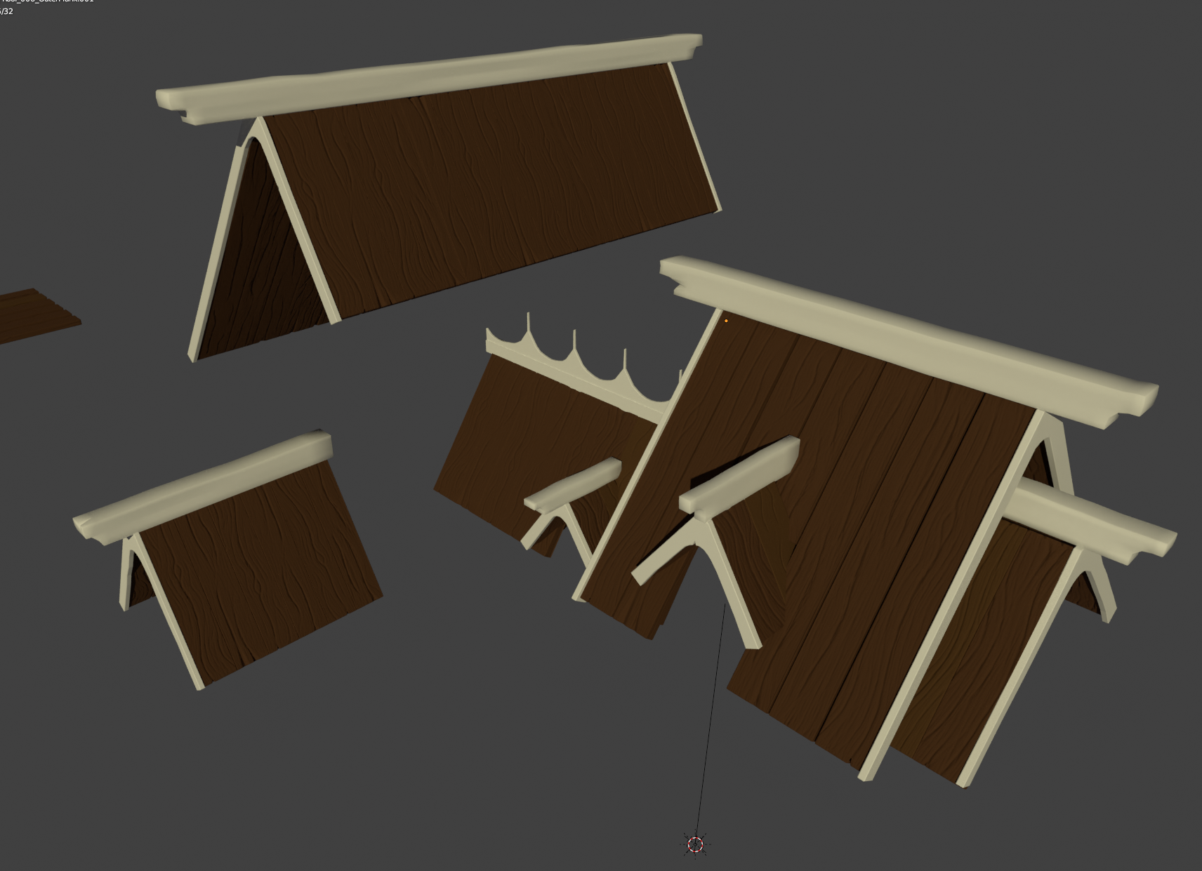
I think that's it for this update.
I'm sorry that it's taking me so long to progress, but between my day-job, working on the take-home project/preparing additional interviews for the company I applied to, and just life in general, I don't get as many Blender sessions as I would like to ^^'
Not giving up on this though :) I'll try to complete the sculpting for the outer planks, and make the rest of the textures for next time.
(not mentioning @Kent as it's not the final update)
Excellent nnavik . Yes you are on the right track. Just remember to keep the color palette in mind for the Wood and Tiles. I am sorry that time has been against you but you have really done great with the wood my friend. Soo much progress to see here.
Don't worry about the normals if you know how to fix them. I'd say only go back if you need to learn "WHY" the color on the right didn't match up. This is after-all a great way to train yourself.