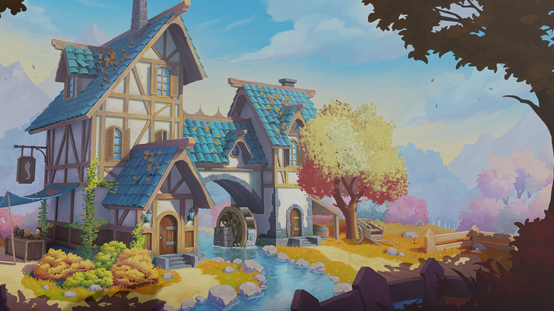
This is an on-going thread documenting my progress through the 2021 Collab Project
Hi,
Nice yo meet you!!
My name is dani, How do wnat us to split the work?
Hope you don't mind me lurking about...but I think the "splitting work" idea is a good one. One that I will keep in mind as a suggestion to others.
You two are welcome to tackle the same tree together if you like. Alternatively with pretty much all the nature assets there will be room for multiple variants. If 6 people signed up for FG tree A it would be reasonable to use all of them to populate the final scene given the area needed to cover.
Just wanted to say either way works great!
Nice! I'm really looking forward to the direction everyone takes for the foliage.
awesome job , cool tree you made :D look forward to the collored version :D (perhaps you could even sculpt a bit of the wood part of the tree to give it more detail
Absolutely brilliant results for week 1 ![]() danitufi! You get full points and then some for multiple tests.
danitufi! You get full points and then some for multiple tests.
As I mentioned during the stream yesterday, the only thing missing for me is a leafiness to the ghibli clumps. I think a layer of alpha-mapped leaf planes on the surface of the ghibli clumps could be ideal. This video features the technique: Chunky inner geometry + alpha mapped cards on the exterior:
Thank you very much, @theluthier for kind words!!
this is very flattering and motivating to hear, thanks for video for the next steps excited to get on it!
Homework submission - week 2 - Tree A FG
@theluthier
Leaves progress:
after that trunk sculpting...
This look sooooo promising! I asked the same thing on the team thread where you posted, but is this a combo of alpha-mapped leaves on top of the ghibli blobs?
If you could post a breakdown of your model structure that'd be great. Better yet if you could copy + paste your model into the WIP placeholder, that way I and everyone can look at the structure ourselves: /SPICE-VENDORS-HOUSE/SCENES/MODELS/WIP/NATURE/FG/WIP_nature_FG-tree-A_danitufi_00.blend
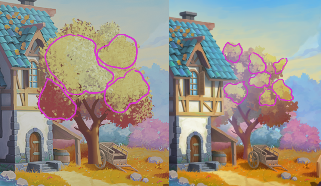
To me this is 90% there. Just some small stylistic adjustments and auditing of its performance. Stylistically the main difference I see in the art is the appearance of smaller clusters:

Smaller clusters and I think you've nailed the look. Kudos on color matching so closely too 👏
PS: I'm giving you full points for week 2 but indeed I'd love to see the trunk sculpted eventually! :)
@theluthier
Thank you very much Kent!!!
I have posted my replay on the team thread, I will upload the project as well ASAP.
I totaly agree with you on the clusterd size and will add some more shadows,
I wanted to give focus to the leaves, next task is sculpting and stylizing the trunk for sure!!!
Thanks ![]() danitufi! I'm trying to play around with your tree but I can't figure out how to adjust the leaf material. I see the collection instances but I can't find my way to the source to adjust its material...
danitufi! I'm trying to play around with your tree but I can't figure out how to adjust the leaf material. I see the collection instances but I can't find my way to the source to adjust its material...
Can you point me to the source for the leaf collection instances?
@theluthier
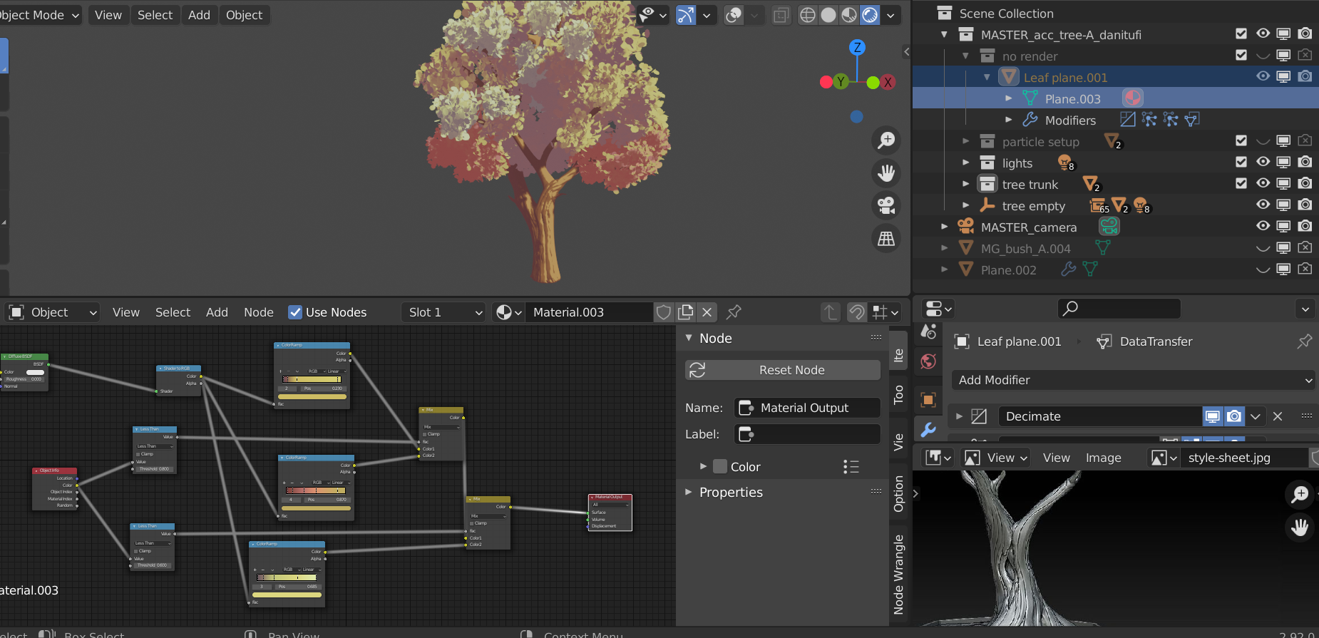
Hi Kent, In collection: "no render" =>
the leaf plane is the origan of the leaves collection, you can control his material and adjust the shape of the leaf itself in edit mode.

Yes yes YES - that sculpt is looking fantastic. Keep up the good work ![]() danitufi!
danitufi!
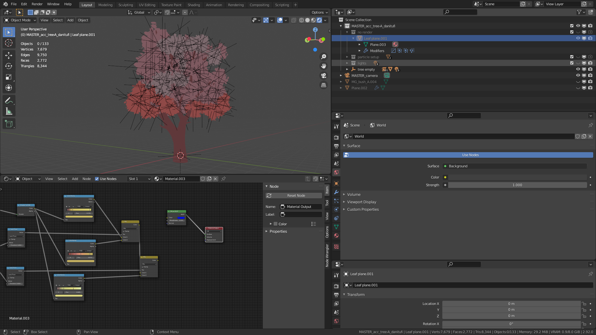
Also thanks for the advice about your file setup. I'm still confused because I drastically changed the material of the leaf plane.001 object but still don't see a difference:

I added a bright blue diffuse node to the material yet the leaves remain the same. Also it appears that there's multiple materials applied to the leaf clusters (various shades of red). Hence why the various materials have multiple users but I can't find those users...