Week 1 - WIP Submission. FG - Tree (E)
Tried to Matchup as close as I could. I used the Skin Modifier. I think I'm going to try using the geometry nodes for the leaves.
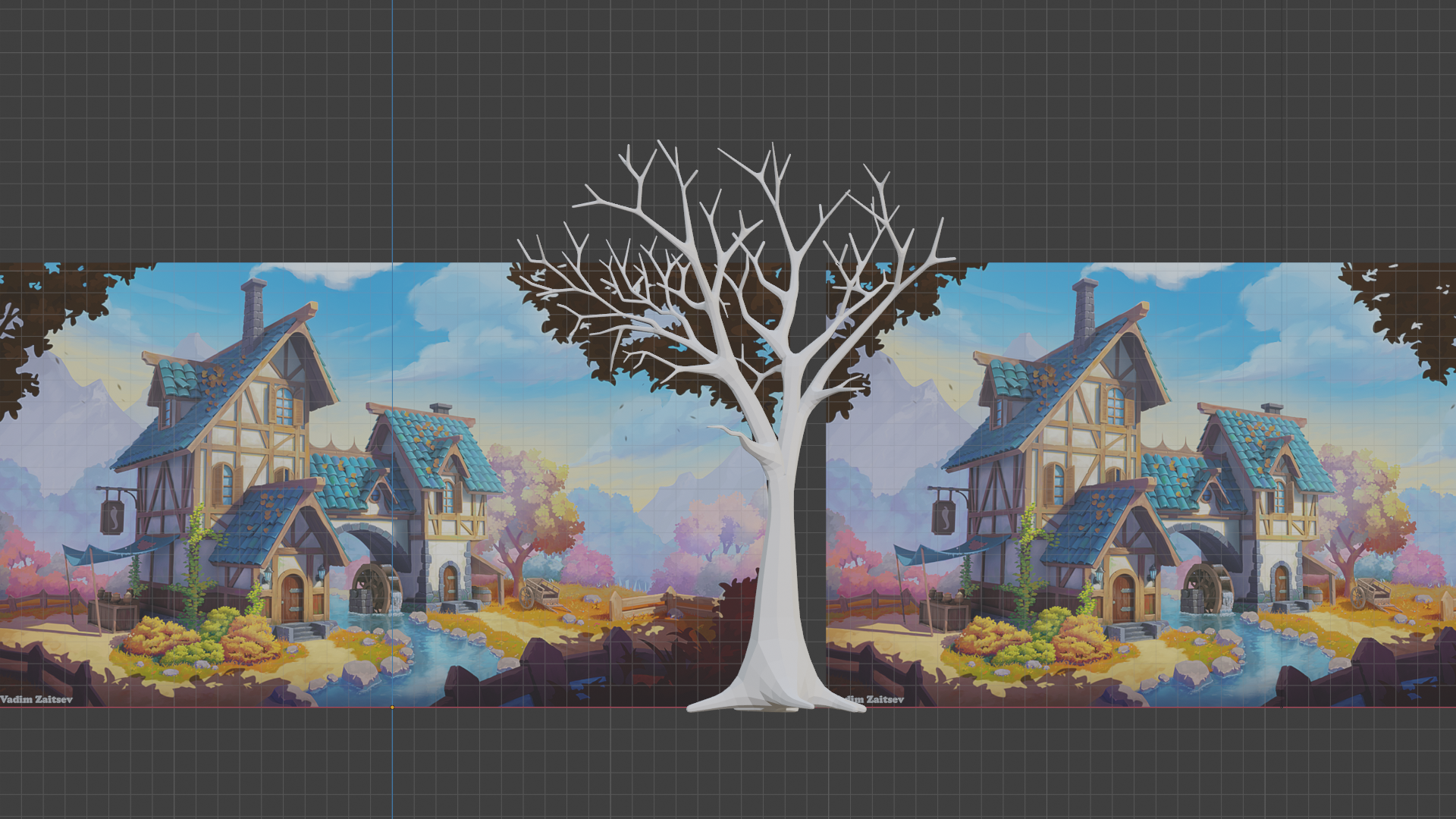
Angle Shot

Looking great!
Don't forget to @theluthier to your homework submission (or is this still a WIP?).
Holy matched tree limbs, Batman! Very impressive commitment to authenticity ![]() notcastanza. Way closer than I ever anticipated. You've easily earned full points + a little extra for the effort 👍
notcastanza. Way closer than I ever anticipated. You've easily earned full points + a little extra for the effort 👍
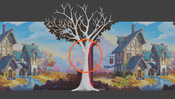
My immediate question after seeing the first image was "But how does it look in 3D..." and I'm thrilled to see that you thought of that alredy. Looks awesome. My only note is that the center of the trunk feels awkwardly thin, like it would break trying to support the branches. I recommend thickening that up a bit and you're golden:
One other thing: Sculpting detail is going to look so good on this! However if you sculpt the whole trunk + branches you're going to have a very busy week. I recommend only sculpting the area of the trunk I've highlighted in blue:
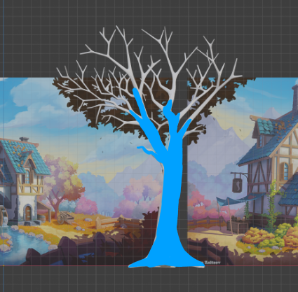
Very little chance the camera will be up in the branches close enough to see such detail. You should probably separate the non-highlighted branches into they're own mesh for sculpting. Otherwise they'll lag your sculpting experience big time.
![]() notcastanza I am liking how your TreeB is turning out. I like how you doubled the concept art to get the other side of the tree. 👍🏻
notcastanza I am liking how your TreeB is turning out. I like how you doubled the concept art to get the other side of the tree. 👍🏻
Week 2 - WIP Submission. FG - Tree (E)
@theluthier ![]() spikeyxxx
spikeyxxx
I widened the trunk a little.
I baked the highpoly to the lowpoly and then cleaned it up with texture painting. I still need to work on the leaf branches but I feel like the profile is close to the image. However, I messed up my camera angle but from front view the tree still matches the image.
I'm leaving the high poly tree in my blend file. Not sure if you wanted that included. I'll need to figure out the Google Drive thing.
Multiple Lighting
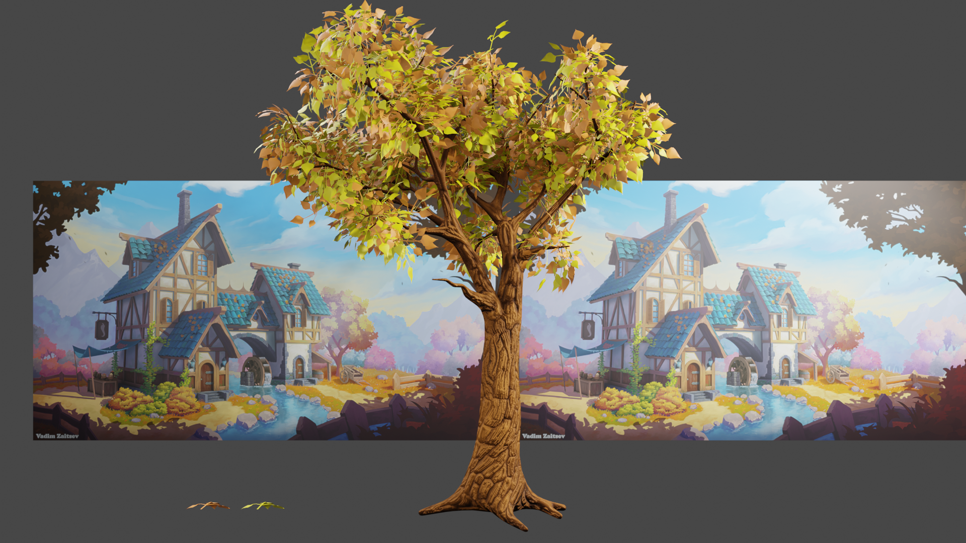
Single Lighting
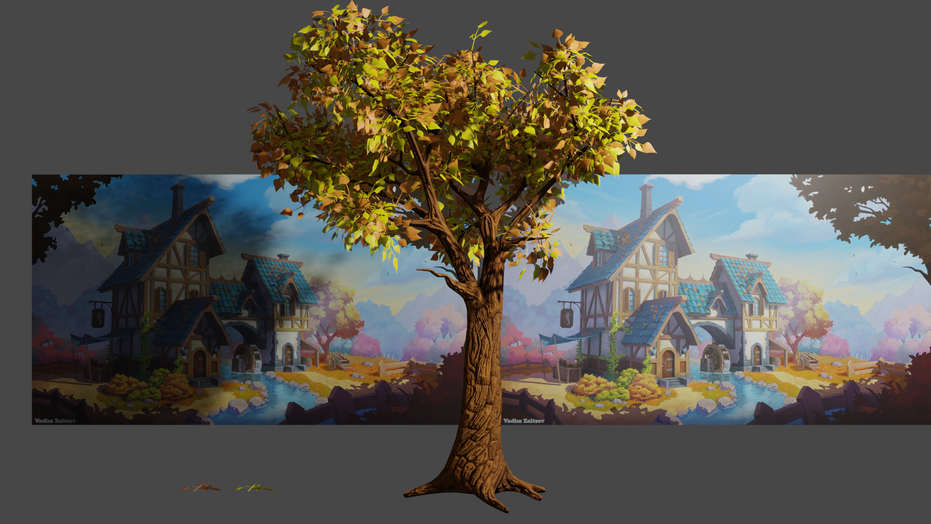
OH MY GOODNESS!!! I spent a good 2 hours on texture painting the bark this morning. I forgot to save the image file. Oh the sadness. Dang Dang Dang.
Well, deep breath and smile. It is a new day.
And, as long as I need to go in and redo some things, I'm planning on looking at my lowpoly tree with fresh eyes. I am going to take this week and clean up all of the unnecessary edge loops. I'm going to manually create seams and focus on getting a really tight texture map and new bake.
Time to make some lemonade.
This is looking great! Easily full points for this week. Sorry to hear about the bark texture - I've done that too many times! I'm encouraging the other folks making trees to go the image texture on planes route, but since yours is right up close to the camera for the main shot I think individual leaves like you have it is fine. If you want to optimize at the end by baking out the colors and normals onto a more simple object that would be awesome, but I don't think it's a crucial requirement for this one. I would love to see some basic textures on the leaves and branches though once you have the trunk and bark wrapped up.
Again, this looks amazing, so keep up the excellent work!
Thanks! I just finished up cleaning up the mesh on the lowpoly. Went from 30k (I think) down to 7k faces. Now I'm creating seams manually. I think I'll get a much better result on the texture map. I'm trying to my time this round to make sure it is done correctly.
![]() spikeyxxx @jlampel
spikeyxxx @jlampel
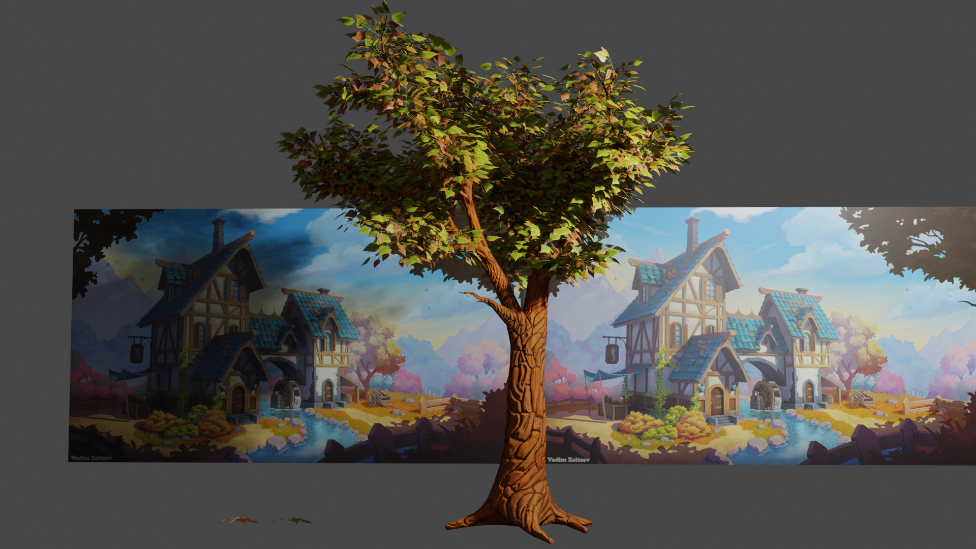
Finished the second baked texture and touchups. I'm pleased with how the 1024 texture looks on the low-poly model. I also painted the leaf texture. I hope it fits the style. I'm not sure what else it needs.
Multi-Light
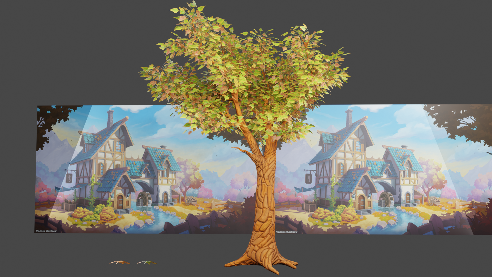
Single-Light
Leaf Texture
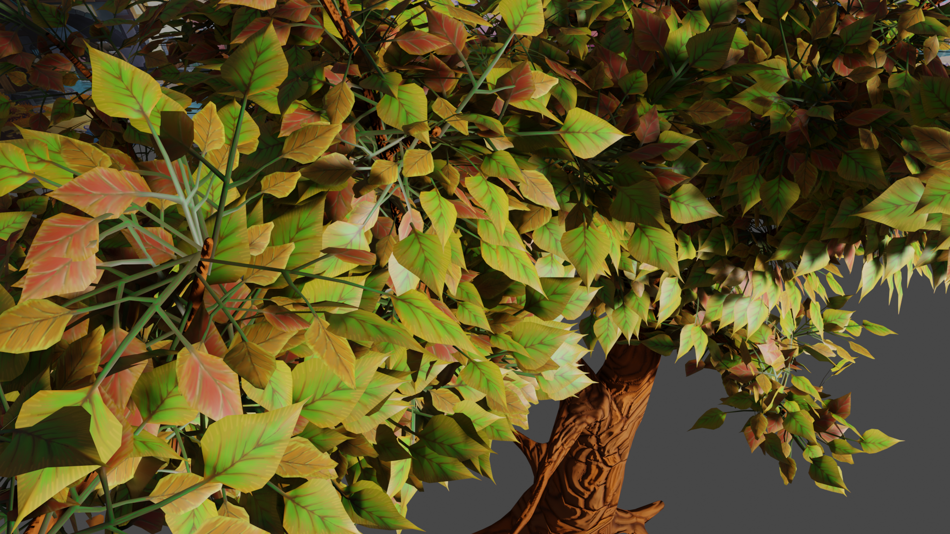
Closeup of Texture
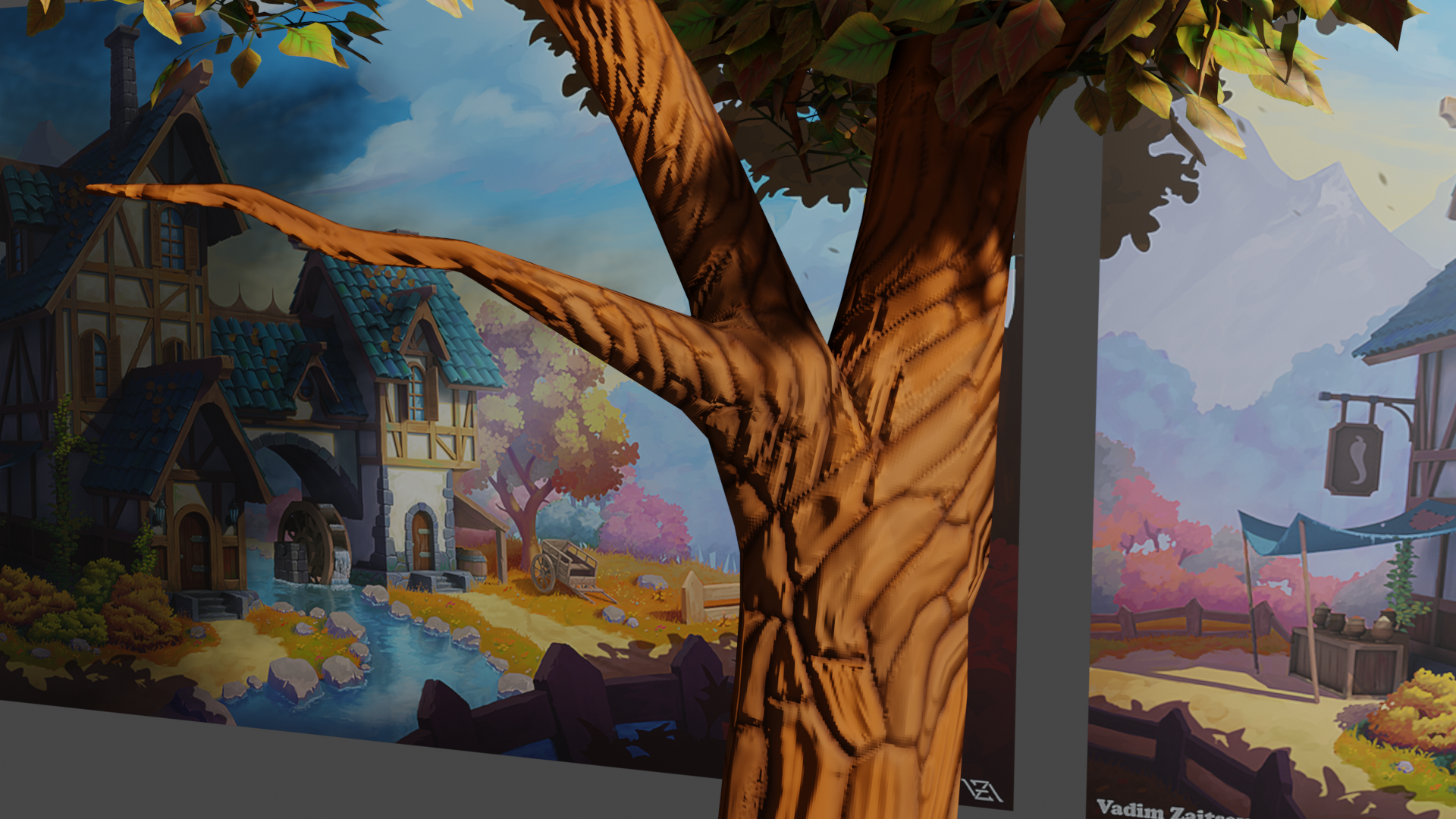
I think it looks great, Ben!
If anything, then the leaves are even too realistic (like a photo texture, against a hand-painted bark)...but Jonathan has the final say in this ;)
Nice work! I like the texture on the leaves - I don't think it's in danger of being too realistic. Overall I think there are just a couple things that could be improved:
I took a closer look at the UVs and I think this area needs to be cut like this (or similar) to minimize stretching:
Before:
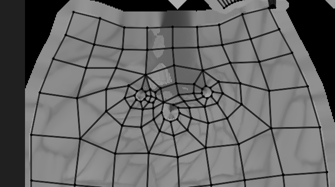
After
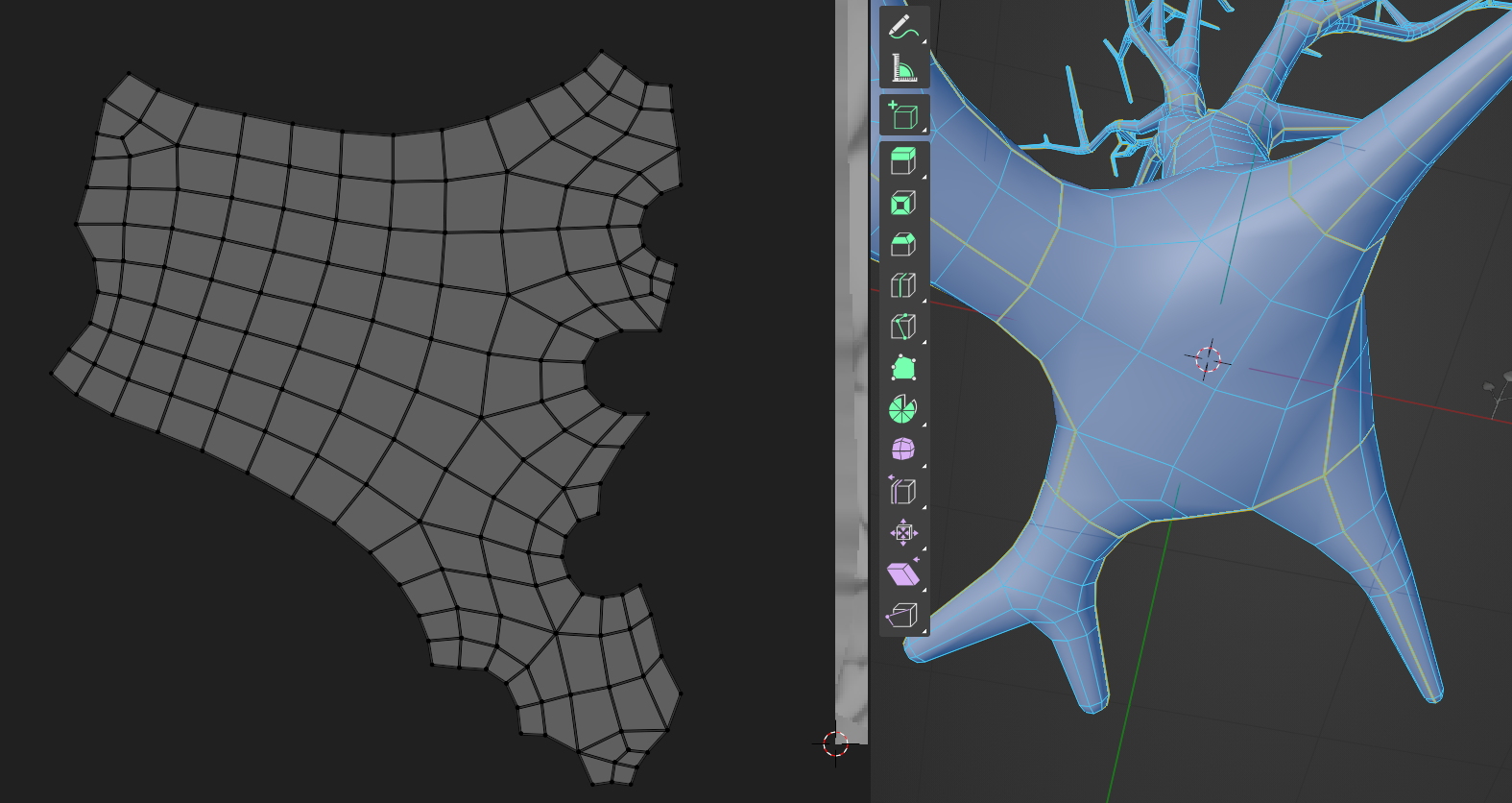
There's also one branch that is super squished vertically:
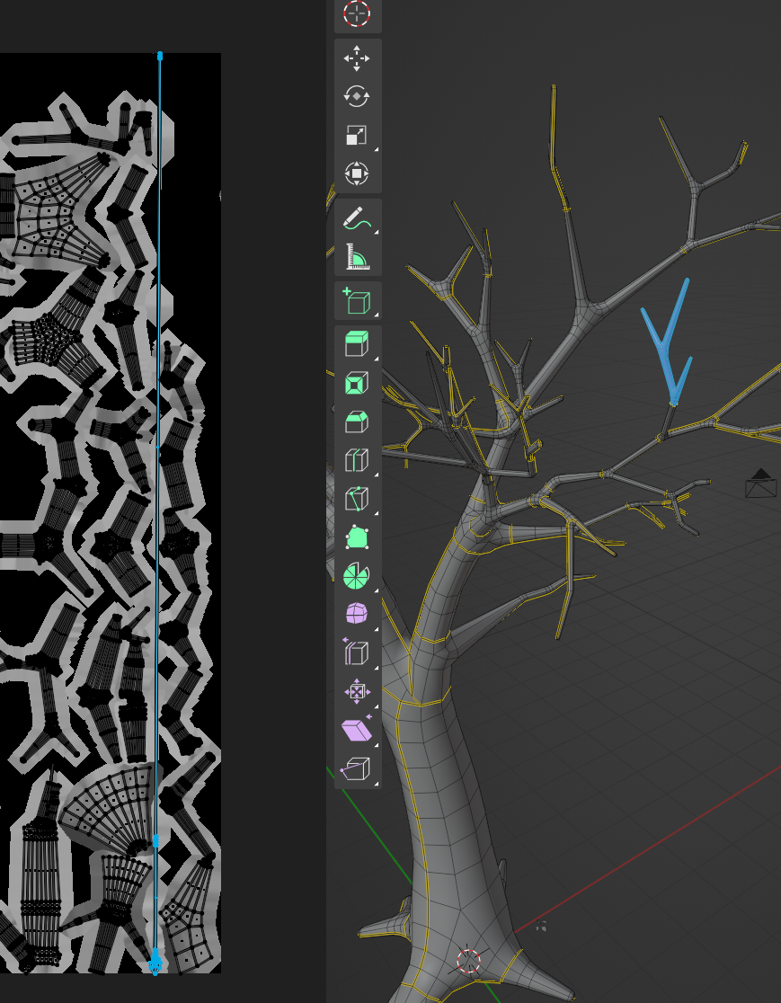
You could also use UV Packmaster or something to get a tighter result, but that's not required since I don't think there is a free alternative:
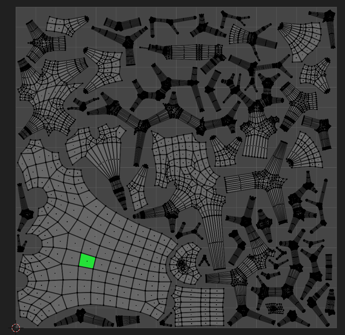
Overall though, the texture is just too low resolution for this to be directly in front of the camera. Zooming in shows individual pixels pretty quickly, as well as some serious stretching on the top left branch:

To get more resolution, in addition to just using a larger image, you could significantly scale down the UVs for any parts of the branches that are covered by leaves since those will be barely visible.
Once the texture is the right size, I would try to add more large and small scale details. At the moment you have a good foundation of medium scale details with the voronoi-like bark, but it needs a larger overall pattern that runs up or twists around the tree and a smaller pattern similar to what you started here:

Hope that helps, sorry I didn't catch the UV issue earlier, and keep up the great work! This is a really tough asset and you're on the right track.
@jlampel ![]() spikeyxxx I haven't had much time this week yet. I did fix some of the UV stretching issues that you mentioned. I picked up UVpackmaster and also hardops and boxcutter because they look fun. They've been on my to-buy list for quite some time. I'm hoping to have some time this weekend to re-sculpt and bake to the new UVs on the lowpoly. Hopefully I won't have as much texture painting to do with using a higher resolution texture.
spikeyxxx I haven't had much time this week yet. I did fix some of the UV stretching issues that you mentioned. I picked up UVpackmaster and also hardops and boxcutter because they look fun. They've been on my to-buy list for quite some time. I'm hoping to have some time this weekend to re-sculpt and bake to the new UVs on the lowpoly. Hopefully I won't have as much texture painting to do with using a higher resolution texture.
Would you recommend 2k or 4k resolution?
2K should be enough, that is 4 times the space you had before, together with a better use of that space, you should be fine.
You're doing great!